SpeedCurve is now part of the Embrace family! There are no changes to how you use our products. Our founder Mark shares what this means...
NEW: Exploring RUM sessions

If you want to understand how people actually experience your site, you need to monitor real users. The data we get from real user monitoring (RUM) is extremely useful when trying to get a grasp on performance. Not only does it serve as the source of truth for your most important budgets and KPIs, it help us understand that performance is a broad distribution that encompasses many different cohorts of users.
While real user monitoring gives us the opportunity for unparalleled insight into user experience, the biggest challenge with RUM data is that there's so much of it. Navigating through all this data has typically been done by peeling back one layer of information at a time, and it often proves difficult to identify the root cause when we see a change:
"What happened here?"
"Did the last release cause a drop in performance?"
"How can I drill down from here to see what's going on?"
"Is the issue confined to a specific region? Browser? Page?"
Today we're excited to release a new capability – your RUM Sessions dashboard – which allows you to drill into a dataset and explore those sessions that occurred within a given span of time.
Sampling RUM: When and why it's a good idea

I confess, I’m not a statistician. While I pride myself on the 'A' I received in my college statistics class, admittedly it was on a pretty steep curve. That said, I’ve been looking at performance data for many years and have found myself on both sides of the debate about whether or not the practice of sampling performance data is inherently a good or bad idea.
When it comes to real user monitoring (RUM), I’m convinced that the marginal cost of collection, computation, storage, etc. is not always great enough to warrant a practice of collecting ALL THE THINGS by default.
Like any experiment, how you sample RUM data – as well as how much data to sample – depends on the answers you seek. While certainly not an exhaustive list, here are some questions you might ask when looking at implementing a sampled approach to real user monitoring...
New LUX JavaScript Dashboards

As organizations work to improve performance for users around the world on slower networks and devices, the focus on JavaScript continues to grow. LUX's new JavaScript dashboards help to identify the problems and solutions for creating a fast, joyous user experience.
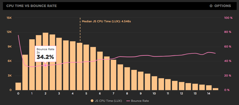
LUX is SpeedCurve's real user monitoring product. We launched it two years ago with four dashboards: Live, Users, Performance, and Design. Today we've added two more LUX dashboards: JavaScript and JS Errors. These new dashboards let you see the impact JavaScript has on your site and on your users with new metrics, including First CPU Idle and First Input Delay, and new features, such as correlation charts that show you how CPU time correlates with bounce rate.
Using RUM to track CPU time
It's exciting working at SpeedCurve and pushing the envelope on performance monitoring to better measure the user's experience. We believe when it comes to web performance it's important to measure what the user sees and experiences when they interact with your site. A big part of our focus on metrics has been around rendering including comparing TTI to FMP, Hero Rendering, and critical blocking resources.
The main bottleneck when it comes to rendering is the browser main thread getting blocked. This is why we launched CPU charts for synthetic testing over a year ago. Back then it wasn't possible to gather CPU information using real user monitoring (RUM), but the Long Tasks API changes that. Starting today, you can track how CPU impacts your users with SpeedCurve's RUM product.
More RUM metrics in your Favorites dashboards
SpeedCurve comes with a great set of dashboards for Synthetic and RUM. But we know that one size does not fit all when it comes to data charts, which is why we've invested so much work into the Favorites dashboards. For customers who use RUM, it provides a place to create custom charts that combine metrics from synthetic and RUM.
We just added some new RUM metrics in Favorites to allow for even more customized monitoring:
- Page Views – The number of page views, including Single-Page-App page transitions
- Sessions – The number of unique sessions
- Session Length – The number of page views per session
- Bounced Sessions – The number of sessions that only have one page view
- Bounce Rate – The percentage of bounced sessions out of the total number of sessions
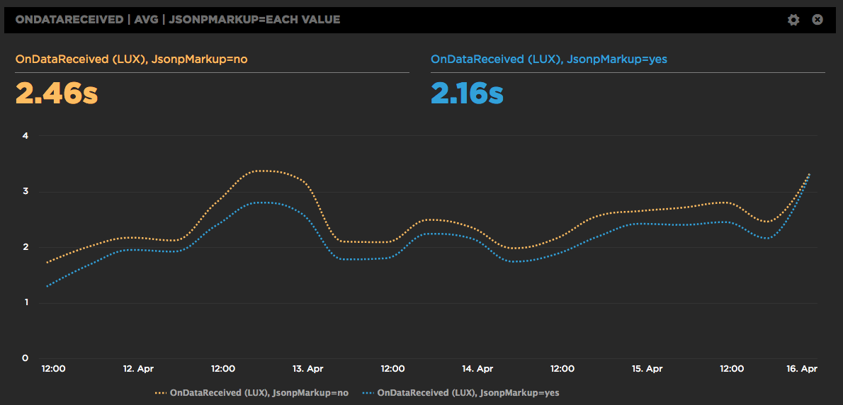
A/B Testing JSONP and the Preloader with RUM
SpeedCurve is a SPA (Single Page App) so we construct the charts dynamically using JSONP. It works great, but we're always looking for ways to make the dashboards faster. One downside to making requests dynamically is that the browser preloader isn't used. This isn't a factor for later SPA requests, but on the first page view the preloader might still bring some benefits. Or maybe not. We weren't sure, so we ran an A/B test. Long story short, doing the first JSONP request via markup caused charts to render 300 milliseconds faster.