SpeedCurve is now part of the Embrace family! There are no changes to how you use our products. Our founder Mark shares what this means...
Are your retail landing pages killing conversions?

You've probably started to notice retail campaigns for Halloween, Thanksgiving, and even Christmas! Online campaigns are pricey, so the landing page should be the MOST scrutinized page of your site — but too often it's an afterthought.
I tracked the rendering times of campaign landing pages for leading retailers to see how they compare — who's fast, who's slow, and what's causing their page speed bottlenecks.
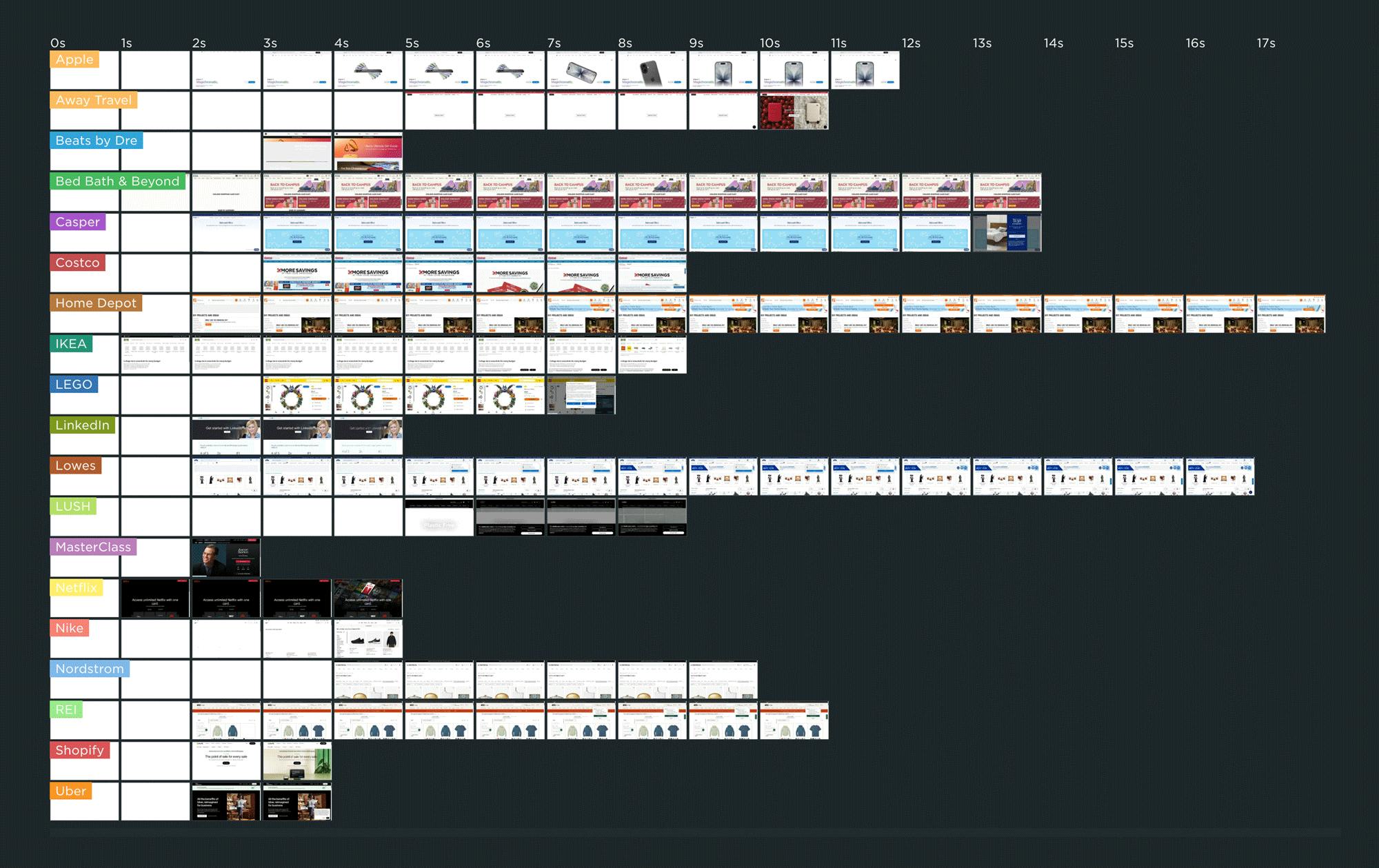
As you can see in this competitive benchmarking leaderboard, rendering speeds varied across pages ranging from Apple to Uber. The fastest campaign page — which belonged to IKEA.com — started to render in about 1 second, which is great to see.
But for many of the other pages, it was common to wait 3 or 4 seconds — or longer! — to see meaningful content.
In this post, we'll cover:
- Why the speed of your campaign landing pages matters... possibly even more than most of the other pages on your site
- Why performance issues on campaign landing pages often go unnoticed
- Common performance issues on landing pages
- A deep dive into the landing page for one of the sites I tracked
- Who should be responsible for the performance of the landing pages on your site?
- What you can do to make sure your campaign landing pages stay fast
How do Long Animation Frames affect user behavior?

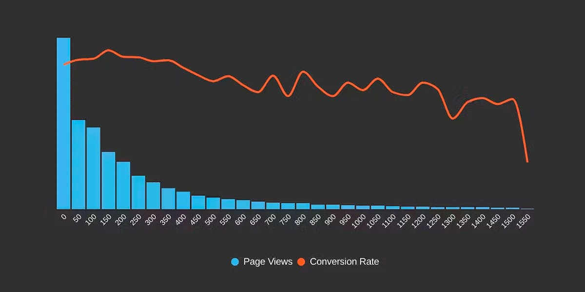
What's the point of a performance metric that doesn't align with user behavior – and ultimately business outcomes? Looking at four different retail sites, we compared each LoAF metric for desktop and mobile and correlated it to conversion rate. We saw some surprising trends alongside some expected patterns.
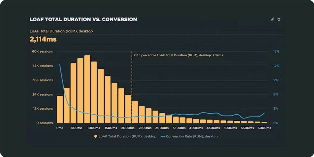
We recently shipped support for Long Animation Frames (LoAF). We're buzzing with excitement about having better diagnostic capabilities, including script attribution for INP and our new experimental metric, Total Blocking Duration (TBD).
While Andy has gone deep in the weeds on LoAF, in this post let's put the new set of metrics to the test and see how well they reflect the user experience. We'll look at real-world data from real websites and find an answer to the question: How do Long Animation Frames affect user behavior?
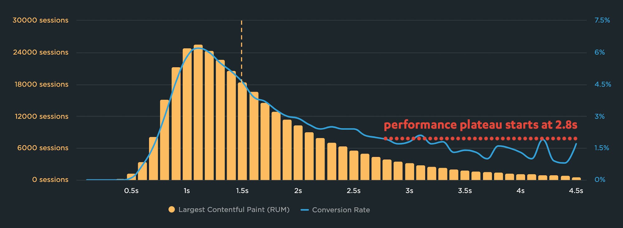
Why you need to know your site's performance plateau (and how to find it)
Have you ever wondered why your site got faster, but your business and user engagement metrics didn't improve? The answer might lie on the performance plateau.
Have you ever asked yourself these questions?
"I made my pages faster, but my business and user engagement metrics didn't change. WHY???"
"How do I know how fast my site should be?"
"How can I demonstrate the business value of page speed to people in my organization?"
The answers might lie with identifying and understanding the performance plateau for your site.
Page bloat update: How does ever-increasing page size affect your business and your users?
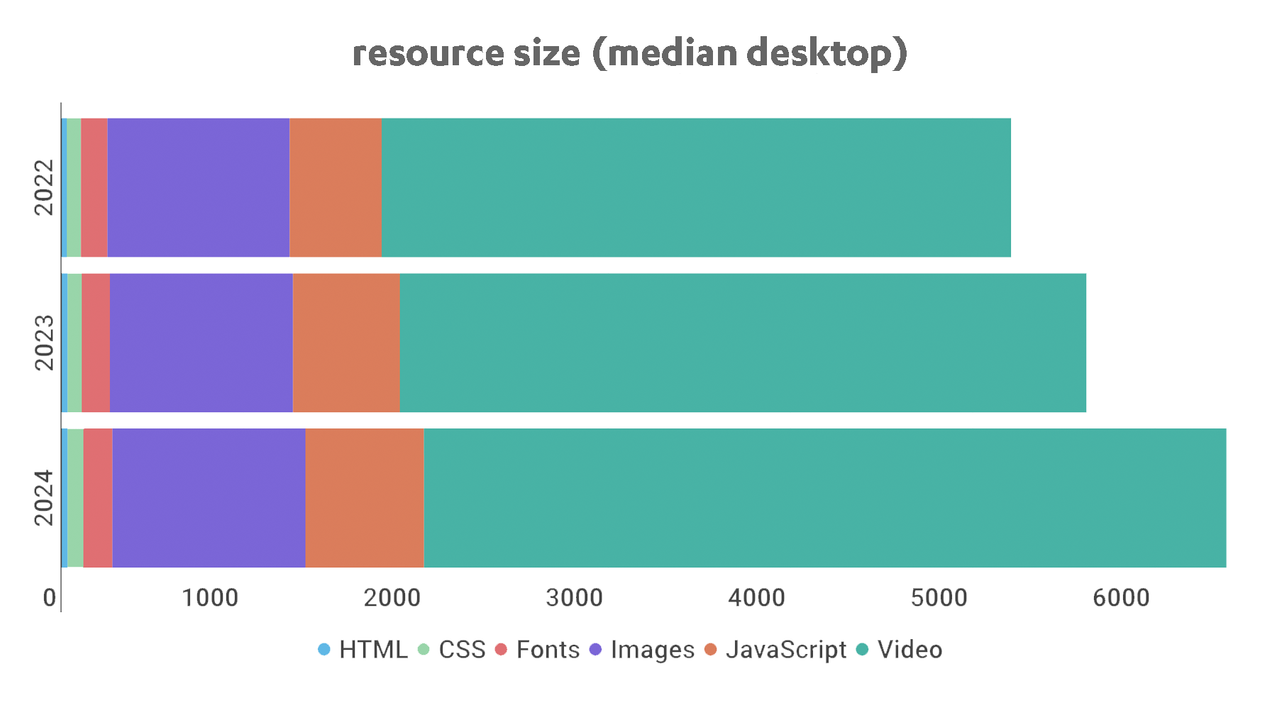
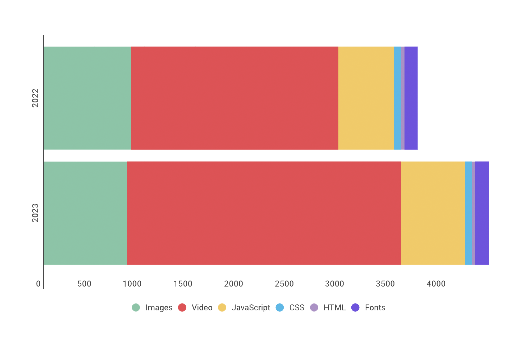
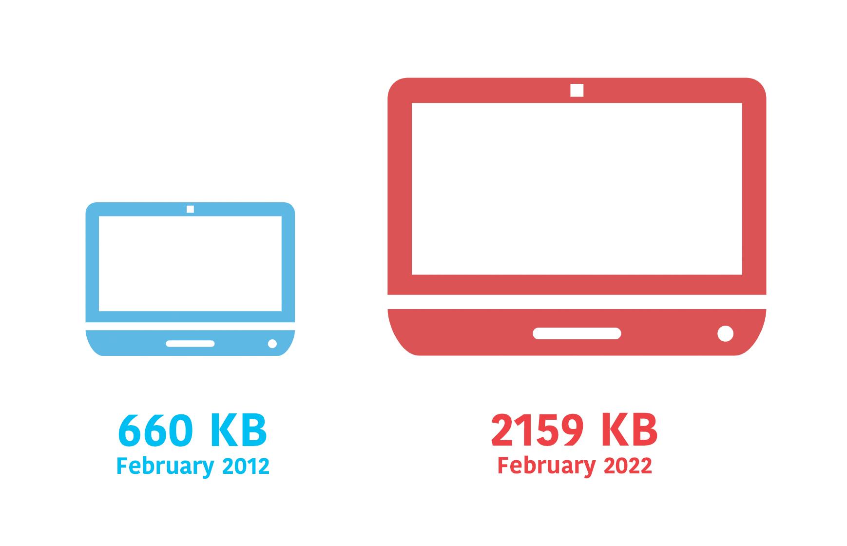
The median web page is 8% bigger than it was just one year ago. How does this affect your page speed, your Core Web Vitals, your search rank, your business, and most important – your users? Keep scrolling for the latest trends and analysis.

For almost fifteen years, I've been writing about page bloat, its impact on site speed, and ultimately how it affects your users and your business. You might think this topic would be exhausted by now, but every year I learn new things – beyond the overarching fact that pages keep getting bigger and more complex, as you can see in this chart, using data from the HTTP Archive:
In this post, we'll cover:
- How much pages have grown over the past year
- How page bloat hurts your business and – at the heart of everything – your users
- How page bloat affects Google's Core Web Vitals (and therefore SEO)
- If it's possible to have large pages that still deliver a good user experience
- Page size targets
- How to track page size and complexity
- How to fight regressions
15 page speed optimizations that sites ignore (at their own risk)
A recent analysis of twenty leading websites found a surprising number of page speed optimizations that sites are not taking advantage of – to the detriment of their performance metrics, and more importantly, to the detriment of their users and ultimately their business.

I spend a lot of time looking at waterfall charts and web performance audits. I recently investigated the test results for twenty top sites and discovered that many of them are not taking advantage of optimizations – including some fairly easy low-hanging fruit – that could make their pages faster, their users happier, and their businesses more successful.
More on this below, but first, a few important reminders about the impact of page speed on businesses...
Hello INP! Here's everything you need to know about the newest Core Web Vital

After years of development and testing, Google has added Interaction to Next Paint (INP) to its trifecta of Core Web Vitals – the performance metrics that are a key ingredient in its search ranking algorithm. INP replaces First Input Delay (FID) as the Vitals responsiveness metric.
Not sure what INP means or why it matters? No worries – that's what this post is for. :)
- What is INP?
- Why has it replaced First Input Delay?
- How does INP correlate with user behaviour metrics, such as conversion rate?
- What you need to know about INP on mobile devices
- How to debug and optimize INP
And at the bottom of this post, we'll wrap thing up with some inspiring case studies from companies that have found that improving INP has improved sales, pageviews, and bounce rate.
Let's dive in!
The psychology of site speed and human happiness

In the fourteen years that I've been working in the web performance industry, I've done a LOT of research, writing, and speaking about the psychology of page speed – in other words, why we crave fast, seamless online experiences. In fact, the entire first chapter of my book, Time Is Money (reprinted here courtesy of the good folks at O'Reilly), is dedicated to the subject.
I recently shared some of my favourite research at Beyond Tellerrand (video here) and thought it would be fun to round it up in a post. Here we're going to cover:
- Why time is a crucial (and often neglected) usability factor
- How we perceive wait times
- Why our memory is unreliable
- How the end of an experience has a disproportionate effect on our perception
- How fast we expect pages to be (and why)
- "Flow" and what it means in terms of how we use the web
- How delays hurt our productivity
- What we can learn from measuring "web stress"
- How slowness affects our entire perception of a brand
There's a lot of fascinating material to cover, so let's get started!
Mobile INP performance: The elephant in the room

Earlier this year, when Google announced that Interaction to Next Paint (INP) will replace First Input Delay (FID) as the responsiveness metric in Core Web Vitals in *gulp* March of 2024, we had a lot to say about it. (TLDR: FID doesn't correlate with real user behavior, so we don't endorse it as a meaningful metric.)
Our stance hasn't changed much since then. For the most part, everyone agrees the transition from FID to INP is a good thing. INP certainly seems to be capturing interaction issues that we see in the field.
However, after several months of discussing the impending change and getting a better look at INP issues in the wild, it's hard to ignore the fact that mobile stands out as the biggest INP offender by a wide margin. This doesn't get talked about as much as it should, so in this post we'll explore:
- The gap between "good" INP for desktop vs mobile
- Working theories as to why mobile INP is so much poorer than desktop INP
- Correlating INP with user behavior and business metrics (like conversion rate)
- How you can track and improve INP for your pages
Does Interaction to Next Paint actually correlate to user behavior?
Earlier this year, Google announced that Interaction to Next Paint (INP) is no longer an experimental metric. INP will replace First Input Delay (FID) as a Core Web Vital in March of 2024.
Now that INP has arrived to dethrone FID as the responsiveness metric in Core Web Vitals, we've turned our eye to scrutinizing its effectiveness. In this post, we'll look at real-world data and attempt to answer: What correlation – if any – does INP have with actual user behavior and business metrics?
What is page bloat? And how is it hurting your business, your search rank, and your users?
For more than ten years, I've been writing about page bloat, its impact on site speed, and ultimately how it affects your users and your business. You might think that this topic would be played out by now, but every year I learn new things – beyond the overarching fact that pages keep getting bigger and more complex, as you can see in this chart, using data from the HTTP Archive.
In this post, we'll cover:
- How much pages have grown over the past year
- How page bloat hurts your business and – at the heart of everything – your users
- How page bloat affects Google's Core Web Vitals (and therefore SEO)
- If it's possible to have large pages that still deliver a good user experience
- Page size targets
- How to track page size and complexity
- How to fight regressions
Sampling RUM: A closer look
Being able to set a sample rate in your real user monitoring (RUM) tool allows you to monitor your pages while managing your spending. It's a great option if staying within a budget is important to you. With the ability to sample real user data, comes this question...
"What should my RUM sample rate be?"
This frequently asked question doesn't have a simple answer. Refining your sample rate can be hit or miss if you aren’t careful. In a previous post, I discussed a few considerations when determining how much RUM data you really need to make informed decisions. If you sample too much, you may be collecting a lot of data you may never use. On the other hand, if you sample too little, you risk creating variability in your data that is hard to trust.

In this post, we are going to do a bit of research and let the data speak for itself. I took a look at the impact of sampling at various levels for three t-shirt sized companies (Small, Medium, Large) with the hope of providing some guidance for those of you considering sampling your RUM data.
In this post, I'll cover:
- Methodology
- Key findings
- Considerations
- Recommendations
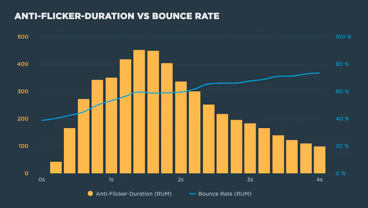
Understanding the performance impact of anti-flicker snippets

Experimentation tools that use asynchronous scripts – such as Google Optimize, Adobe Target, and Visual Web Optimizer – recommend using an anti-flicker snippet to hide the page until they've finished executing. But this practice comes with some performance measurement pitfalls:
- Hiding the contents of the page can have a dramatic effect on the Web Vitals that measure visual experience, such as First Contentful Paint (FCP) and Largest Contentful Paint (LCP)
- Anti-flicker snippets can also affect Cumulative Layout Shift (CLS) and the synthetic equivalent of First Input Delay (FID), Total Blocking Time (TBT).
In this post we'll look at how anti-flicker snippets work, their impact on Web Vitals, and how to measure the delay they add to visitors' experience.
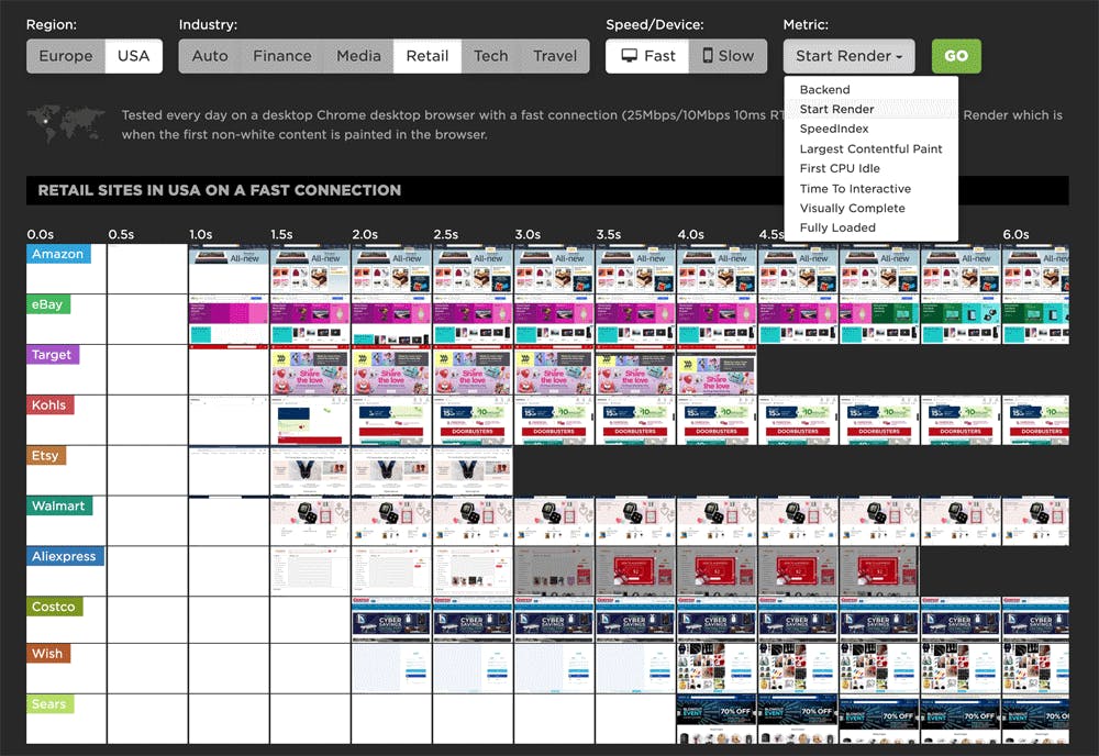
Industry page speed benchmarks (March 2022)
Page Speed Benchmarks is an interactive dashboard that lets you explore and compare web performance data for leading websites across several industries – from retail to media – over the past year. This dashboard is publicly available (meaning you don't need a SpeedCurve account to explore it) and is a treasure trove of meaningful data that you can use for your own research.
The dashboard allows you to easily filter by region, industry, mobile/desktop, fast/slow, and key web performance metrics, including Google's Core Web Vitals. (Scroll down to the bottom of this post for more testing details.)
At the time of writing this post, these were the home pages with the fastest Start Render times in key industries:
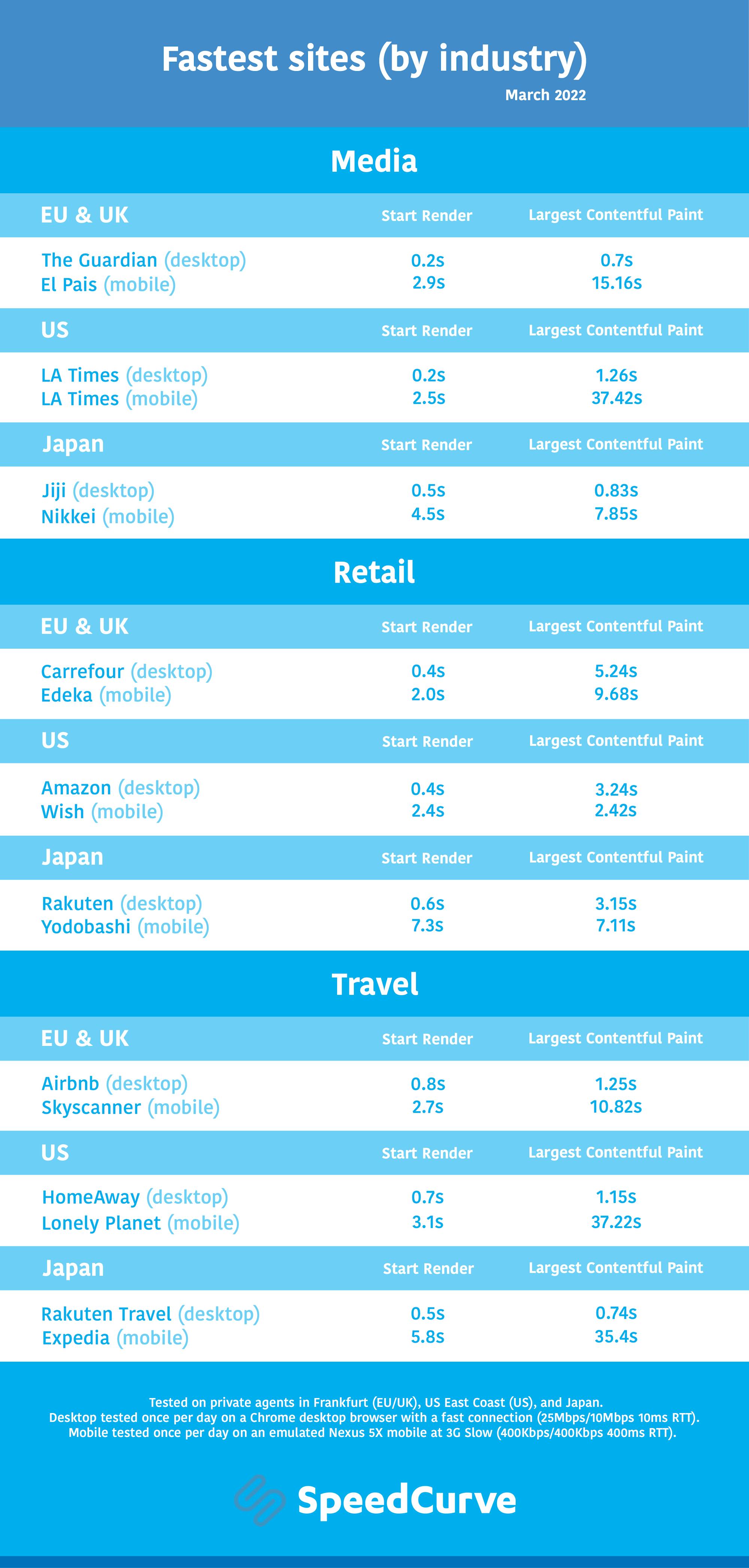
As you can see, I've included Largest Contentful Paint alongside Start Render in this chart, for reasons I explain below.
Ten years of page bloat: What have we learned?
(See our more recent page growth post: What is page bloat? And how is it hurting your business, search rank, and users?)
I've been writing about page size and complexity for years. If you've been working in the performance space for a while and you hear me start to talk about page growth, I'd forgive you if you started running away. ;)
But pages keep getting bigger and more complex year over year – and this increasing size and complexity is not fully mitigated by faster devices and networks, or by our hard-working browsers. Clearly we need to keep talking about it. We need to understand how ever-growing pages work against us. And we need to have strategies in place to understand and manage our pages.
In this post, we'll cover:
- How big are pages today versus ten years ago?
- How does page bloat hurt your business?
- How does page bloat affect other metrics, such as Google's Core Web Vitals?
- Is it possible to have large pages that deliver a good user experience?
- What can we do to manage our pages and fight regression?
Introducing a new resource for the performance community: Page Speed Benchmarks!
Here are some common questions I’m asked when I talk with people about performance:
- Which metrics should I care about?
- What types of devices and connections should I test on?
- Which third parties should I be most concerned about?
- How fast should I be?
- What are some good sites I can use for benchmarking?
Today, I’m very excited to announce the release of a new project that helps answer those questions – and more!
Page Speed Benchmarks is an interactive dashboard that lets you explore and compare web performance data for leading websites across several industries – from retail to media.
With Page Speed Benchmarks, you can do things like:
- See what the different metrics actually mean in terms of user-perceived performance
- Compare how the same page renders on fast vs slow devices and connections
- Understand what makes fast sites fast (and slow sites slow)
- Get insights into how third parties can perform on different sites
- Identify sites you can use for your own competitive benchmarking
If you already like tools like the HTTP Archive, I think you'll love how you can use Page Speed Benchmarks to complement the insights you're already getting. Keep reading to find out how we set up these benchmarks, and how you can mine our test data – even if you're not a SpeedCurve user – for your own performance research.
