Ten years of page bloat: What have we learned?

(See our more recent page growth post: What is page bloat? And how is it hurting your business, search rank, and users?)
I've been writing about page size and complexity for years. If you've been working in the performance space for a while and you hear me start to talk about page growth, I'd forgive you if you started running away. ;)
But pages keep getting bigger and more complex year over year – and this increasing size and complexity is not fully mitigated by faster devices and networks, or by our hard-working browsers. Clearly we need to keep talking about it. We need to understand how ever-growing pages work against us. And we need to have strategies in place to understand and manage our pages.
In this post, we'll cover:
- How big are pages today versus ten years ago?
- How does page bloat hurt your business?
- How does page bloat affect other metrics, such as Google's Core Web Vitals?
- Is it possible to have large pages that deliver a good user experience?
- What can we do to manage our pages and fight regression?
What do we mean when we talk about page size?
When we talk about page size, we're referring to overall page weight and complexity. This includes:
- Size – Total page weight in bytes. Size matters especially to mobile users who have limited and/or metered data.
- Resources – Total number of resources on the page (listed below). The more resources, the greater the complexity and the increased likelihood of rendering delays and blockages.
- HTML – Typically the smallest resource on the page, HTML's performance risk is usually negligible. Having said that, I recently did some digging into a page where the total HTML size jumped dramatically because of a bunch of inline JavaScript, which led to rendering delays, so keeping an eye on HTML size is still a good idea.
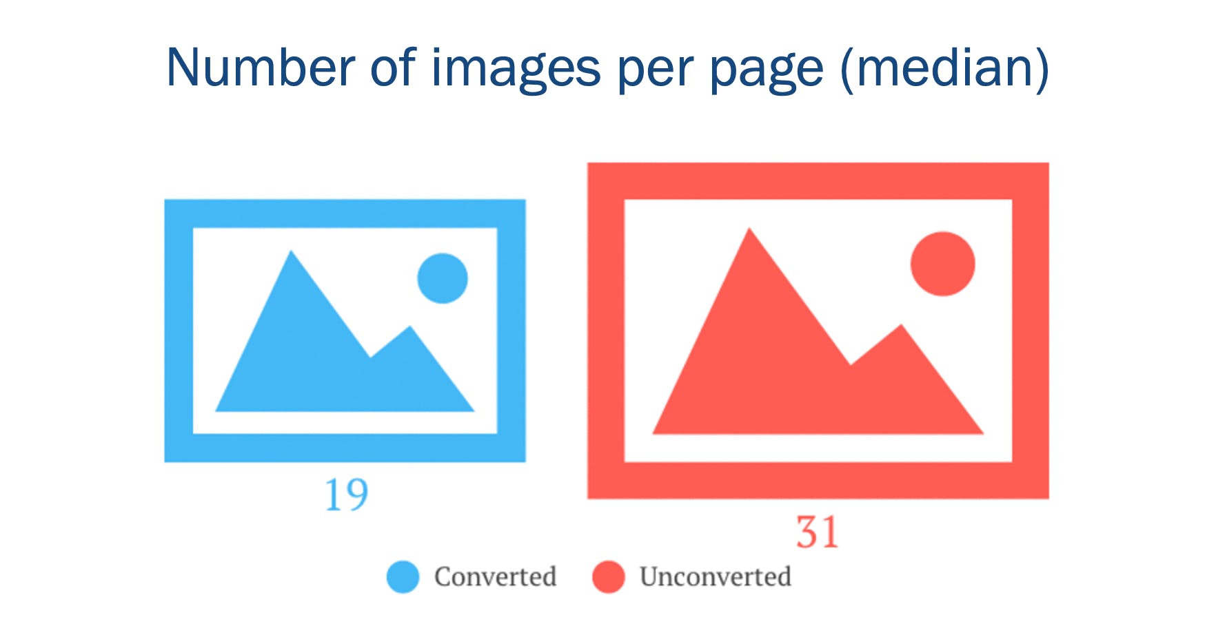
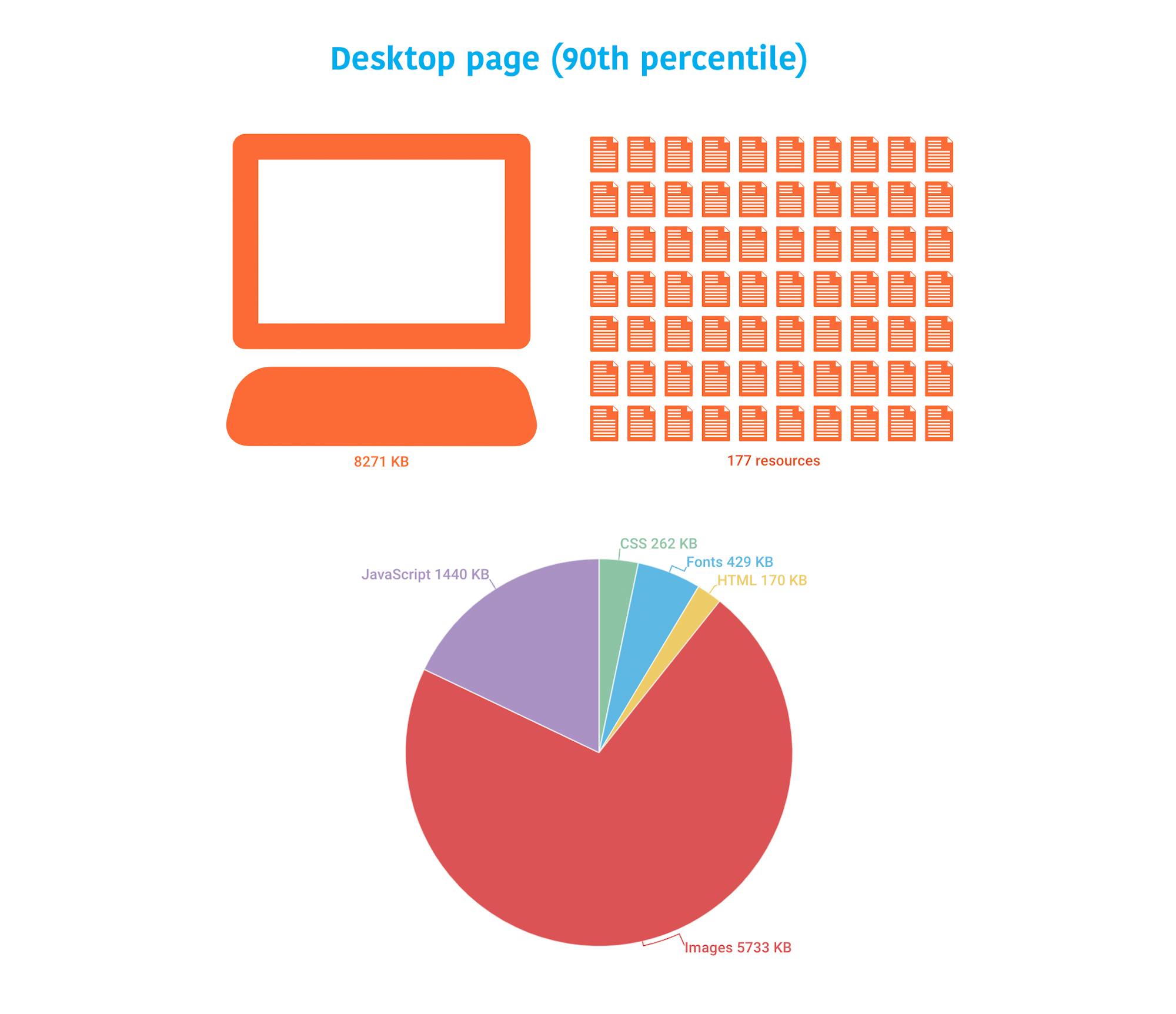
- Images – Often the greatest contributor to page bloat. Looking at the 90th percentile of the distribution of page weight, images account for a whopping 5.7 MB of a roughly 8.2 MB page. In other words, images comprised almost 75% of the total page weight. And if that already wasn’t enough, the number of images on a page has been linked to lower conversion rates on retail sites. (More on that later.)
- JavaScript – A page can have a relatively low JS weight but still suffer from JS-inflicted performance problems. Even a single 100 KB third-party script can wreak havoc with your page. The more scripts on your page, the greater the risk. It’s not enough to focus solely on blocking JavaScript. It’s possible for your pages to contain zero blocking resources and still have less-than-optimal performance because of how your JavaScript is rendered. That’s why it’s so important to understand CPU usage on your pages, because JavaScript consumes more CPU than all other browser activities combined. While JavaScript blocks the CPU, the browser can’t respond to user input. This creates what’s commonly called “jank” – that annoying feeling of jittery, unstable page rendering.
- CSS – Like JavaScript, CSS doesn’t have to be bulky to cause problems. Poorly executed stylesheets can create a host of performance problems, ranging from stylesheets taking too long to download and parse, to improperly placed stylesheets that block the rest of the page from rendering. And, similar to JavaScript, more CSS files equals more potential trouble.
How does page bloat hurt your business?
A Google machine-learning study I participated in a few years ago found that the total number of page elements was the single greatest predictor of conversions. The number of images on the page was the second greatest predictor.
We also found that the more scripts there were in a series of pages in a session, the less likely that session was to convert.
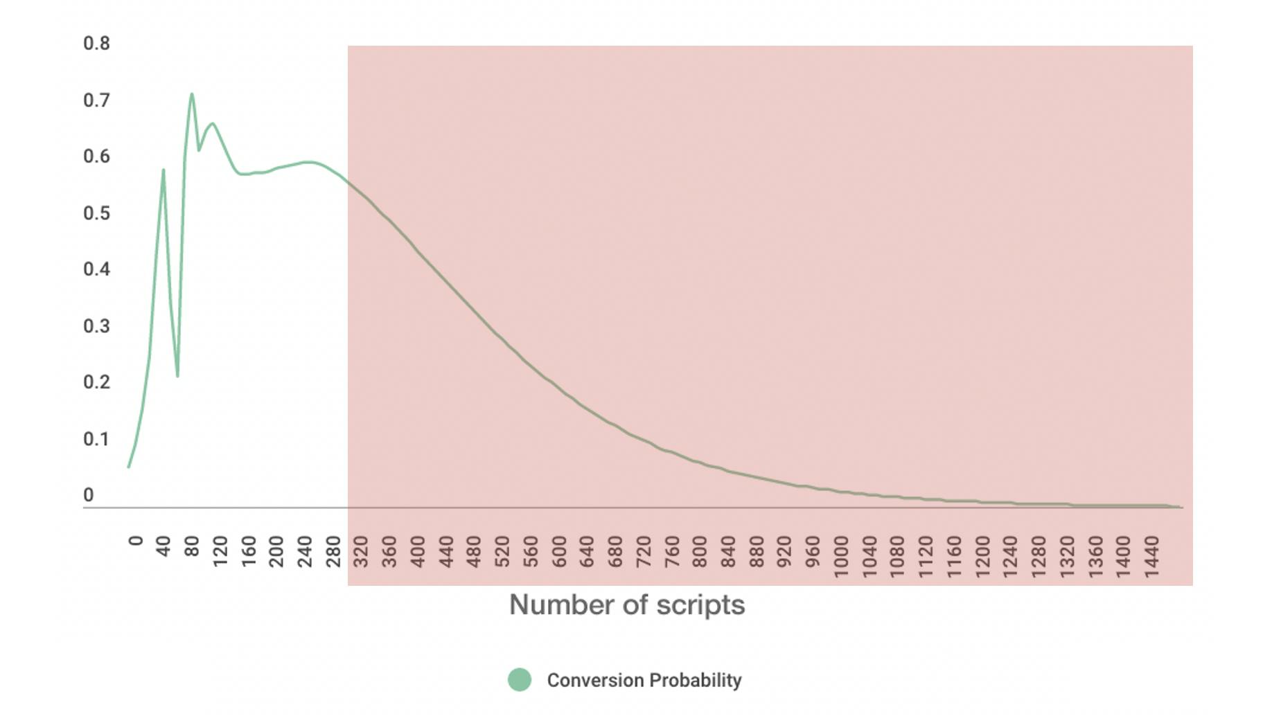
Image size is another issue, as excessive image weight hurts your SEO ranking in Google Image Search. Given that Image Search comprises upwards of 26% of Google searches, this is something you should care about. (You can dive deeper into image optimization and SEO tips in this article in Google Search Central.)
How big are pages today versus ten years ago?
Before we get into these numbers, some background and caveats:
- These numbers all come from the HTTP Archive. It's important to mention that there have been changes to how the Archive collects data over the years. Having said that, looking at data over the past ten years, it's safe to make the observation that pages are definitely trending bigger.
- I intentionally left out the numbers for video, because they seemed inconsistent. For the purposes of this post, they're not high priority, so I'm fine with setting them aside for now.
- These numbers should not be taken as a benchmark for your own site. You haven't necessarily achieved anything great if your pages are smaller than this, nor have you failed if your pages are bigger.
- Not all pages are getting bigger. Many have gotten smaller over the years. Maybe yours is one of them!
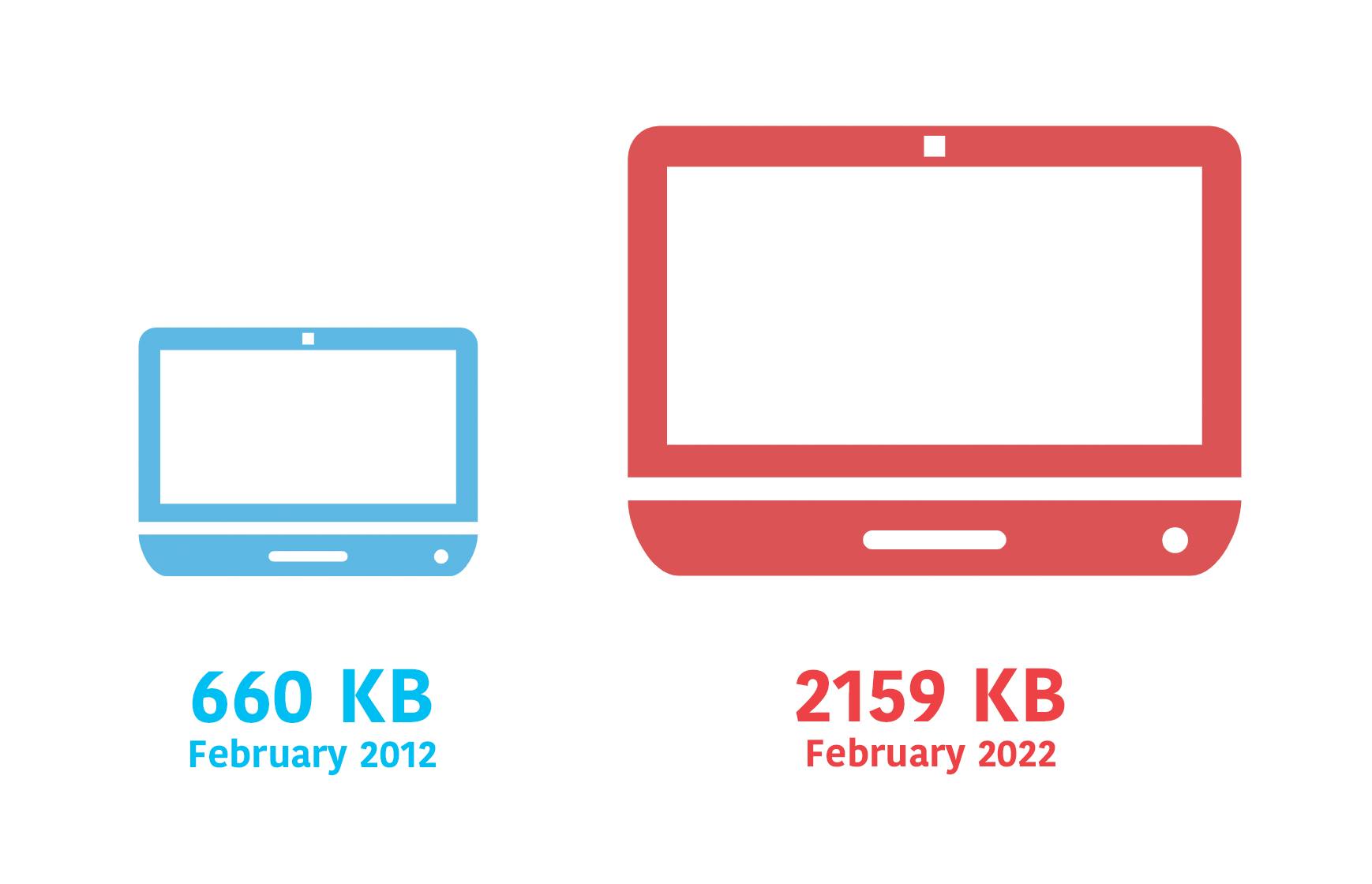
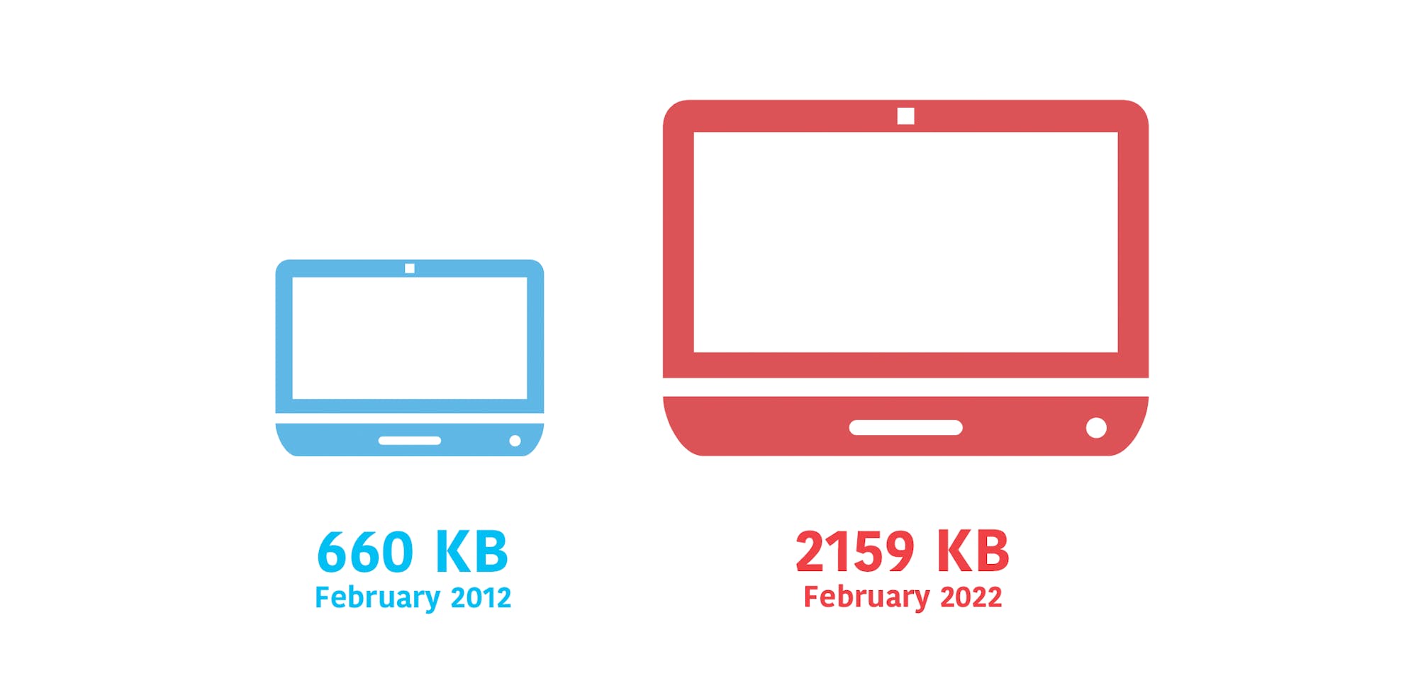
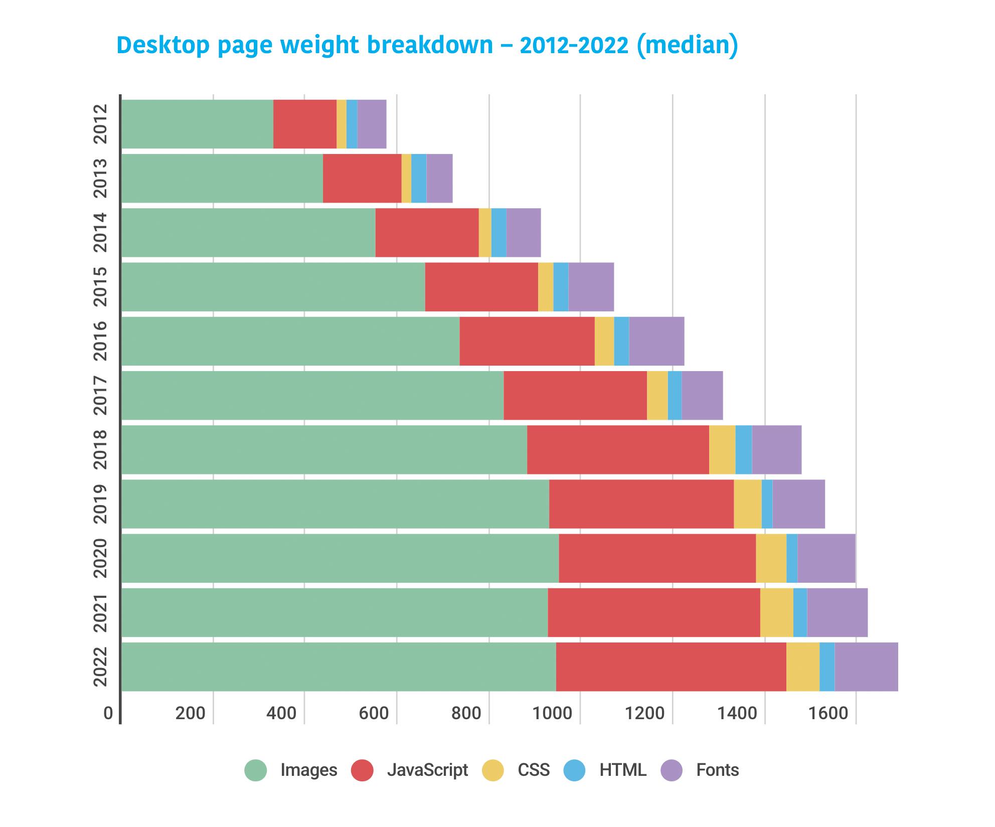
1. The median desktop page is 3X bigger now than ten years ago
As someone who's been watching these numbers for more than ten years, this growth doesn't come as a surprise. The median size of 2159 KB is about what I expected to see, given how many pages I inspect in any given week that are much larger than this.
2. Images and JavaScript comprise two-thirds of total page weight
Predictably, much of this page growth is driven by images and JavaScript. Images account for roughly 945 KB (44%) of median desktop page weight, and JS accounts for about 500 KB (23%).
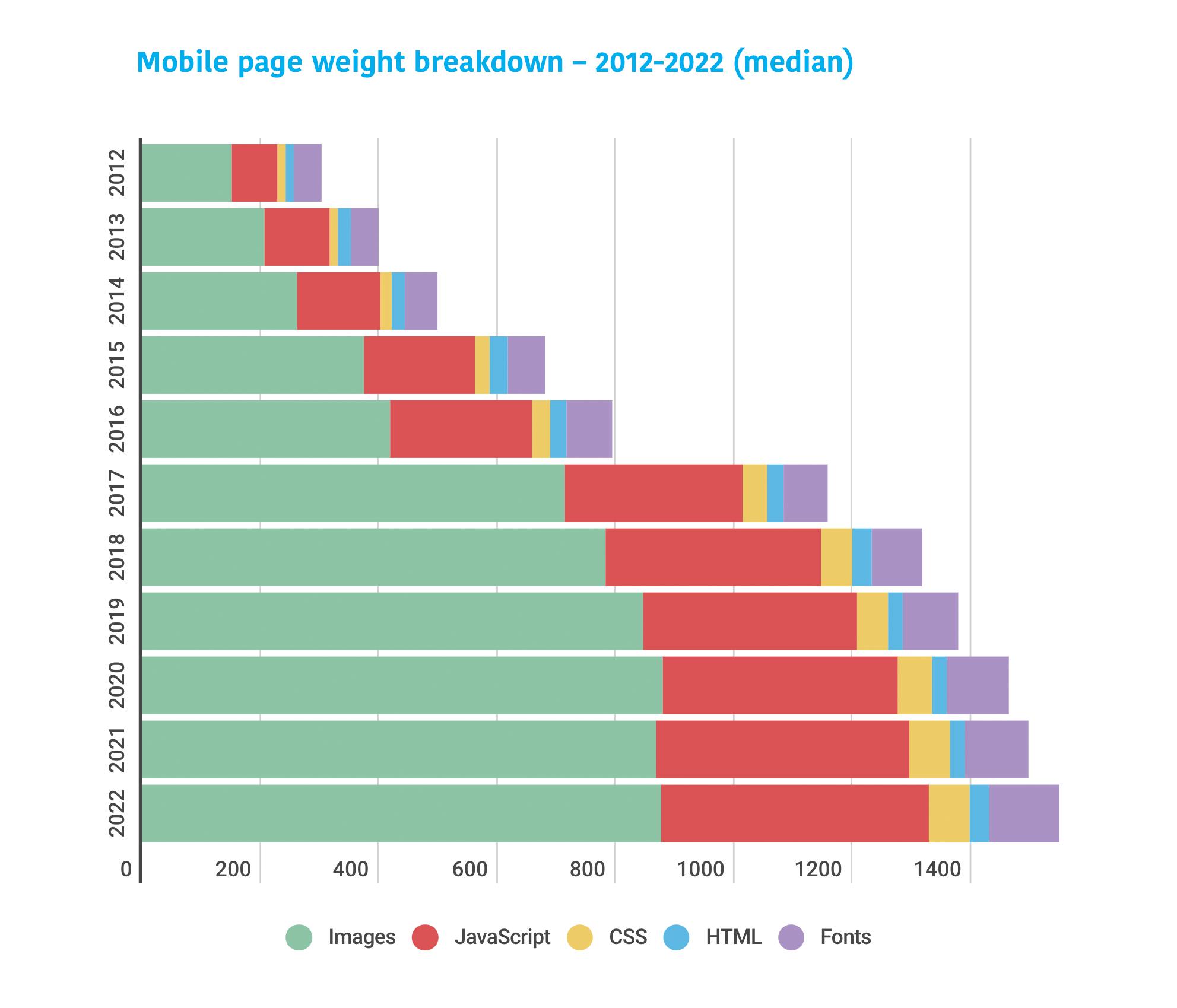
3. The median mobile page is almost 7X bigger than ten years ago
The pages being served to mobile users have experienced massive growth. At 1984 KB, the median mobile page is only somewhat smaller than the median desktop page (2159 KB). While it is possible to have large, robust pages that feel fast, you should care about page bloat in terms of how it affects mobile users, especially mobile-only users who are on older low-CPU devices, or who are dealing with bandwidth constraints or data limits.

4. Images and JavaScript comprise the bulk of mobile page weight
We're serving about 876 KB of images and 453 KB of scripts to mobile – in other words 67% of total page weight. JavaScript is a massive CPU hog, so this is concerning, especially if your users are on older devices with less processing power. (If you're counting on your users having newer devices, you might want to rethink that. In recent years, the smartphone replacement cycle has gotten longer and it looks like this trend is here to stay.)
5. Pages are huge at the 90th percentile, and the bulk is image weight
Focusing on medians is not enough. You should also care about your cohort of users at the 90th percentile. Ten percent of your users may not sound like much, but if your site gets 10 million visitors a month, that means a million of those people are having a really poor experience.
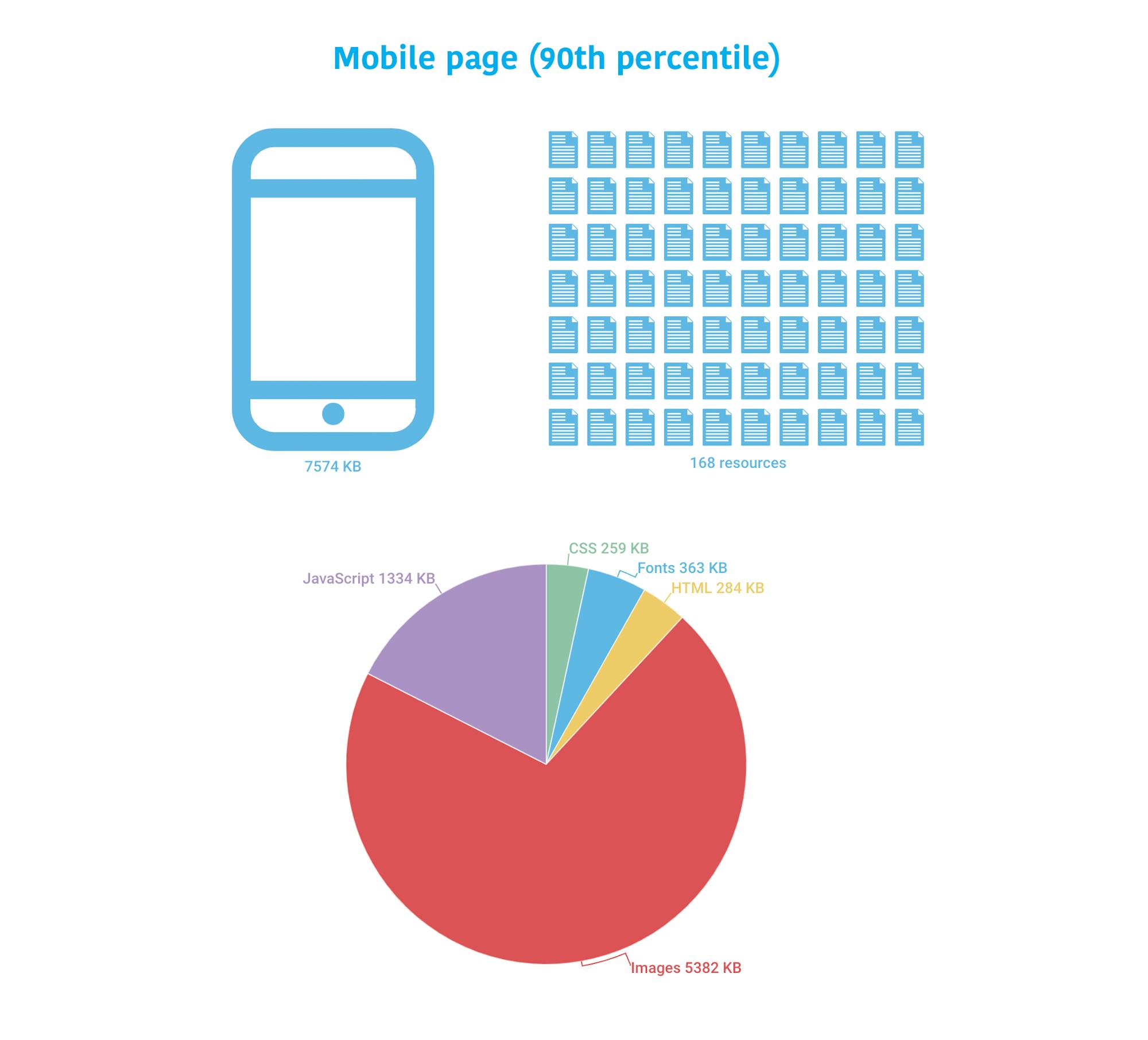
The 90th percentile page served to desktop is 8271 KB and contains 177 resources. Almost 75% of page weight is consumed by images, which add up to more than 5 MB.
The 90th percentile page served to mobile is only slightly smaller, at 7574 KB and 168 resources.
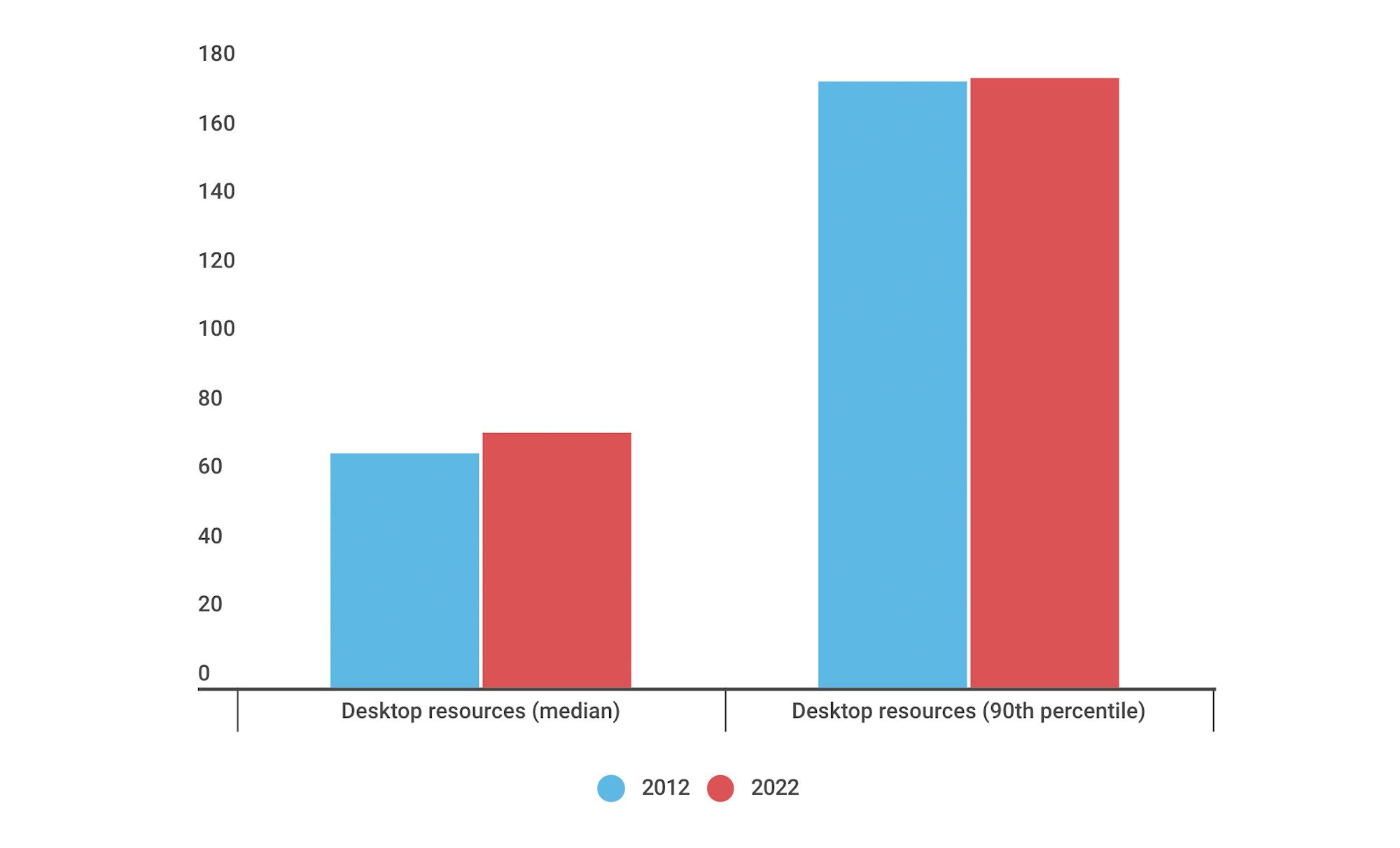
6. The number of resources served to desktop has stayed flat over the years
You can see this relative flatness at both the median and 90th percentile. This actually came as a bit of a surprise. I had assumed that there'd be more significant growth, especially given the growth in total page size. More on that in a bit.
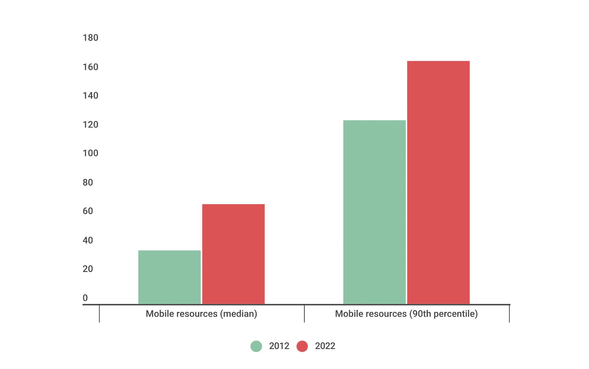
7. But more resources are being served to mobile
No surprises here. We've moved considerably beyond the pared-down pages we used to serve to mobile users a decade ago.
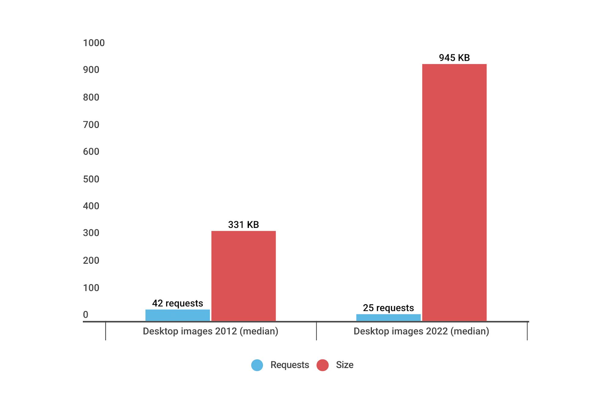
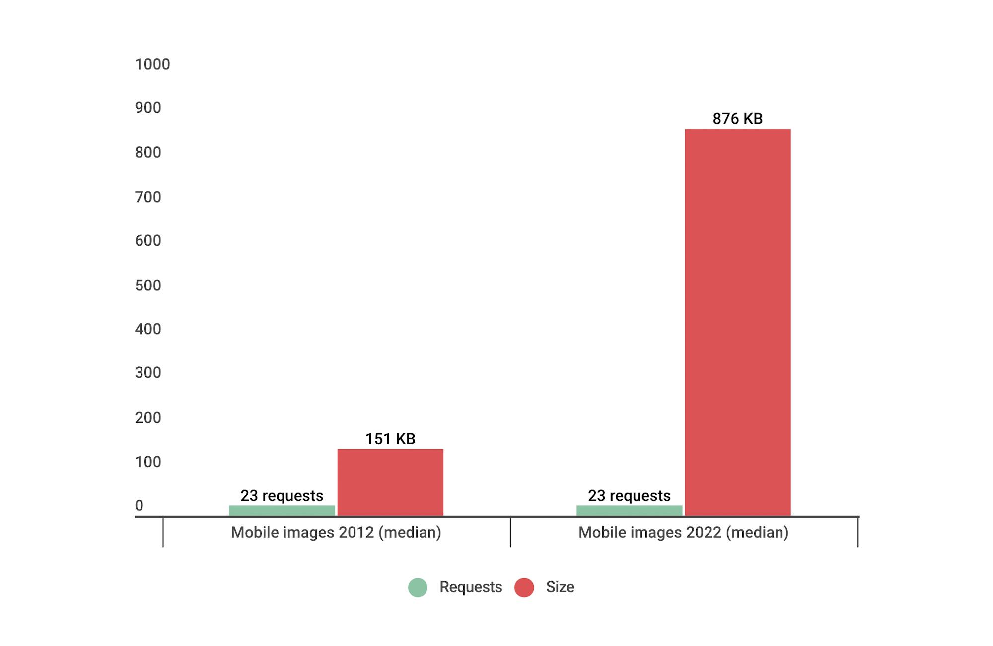
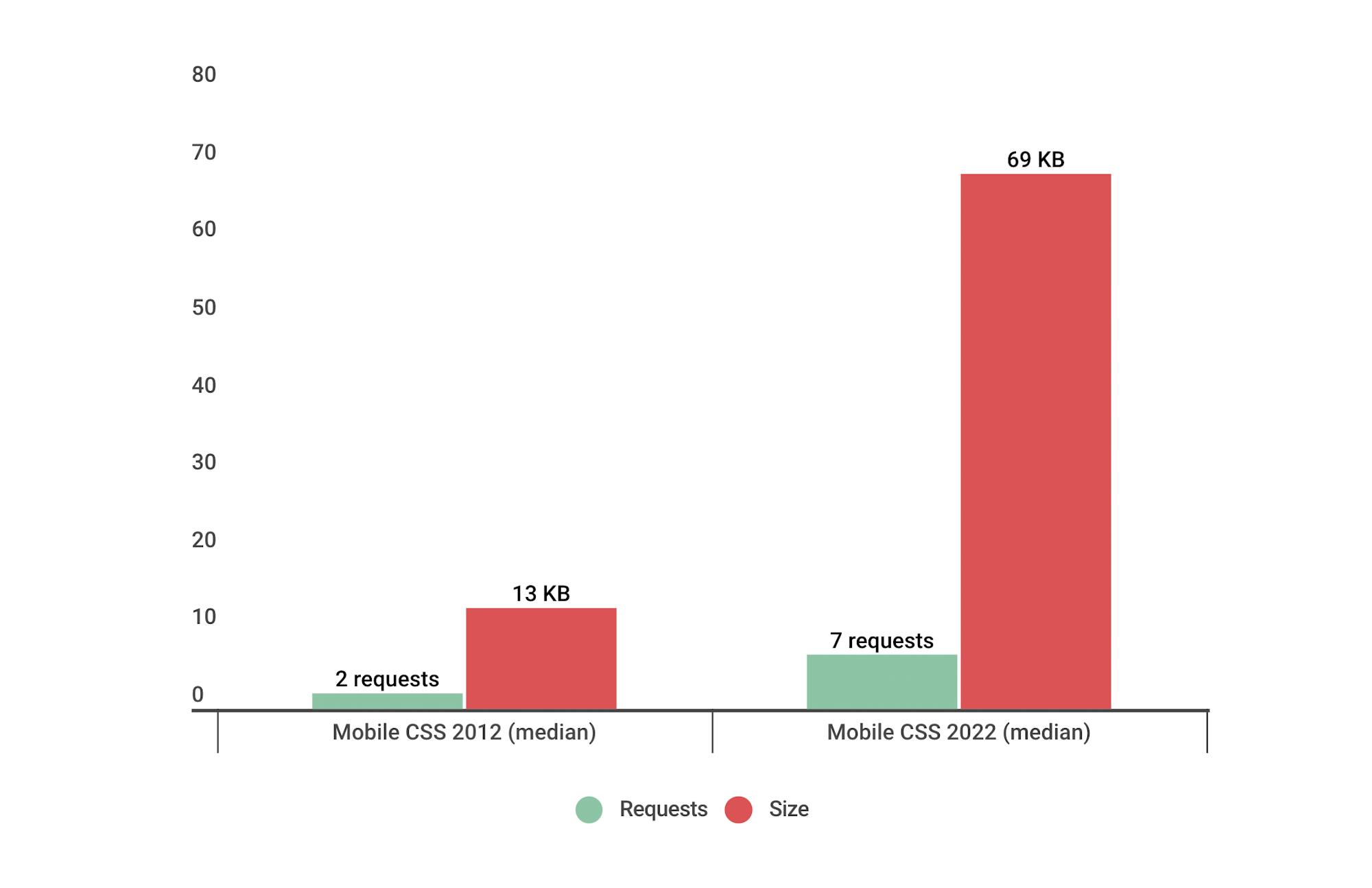
8. Image requests are way down, while image size is way up
We're serving fewer images, but the images we are serving are high-resolution and/or unoptimized. The median page today serves 25 images, compared to 42 images back in 2012. While the number of image requests has reduced dramatically, the combined size has increased almost threefold, from 331 KB to 945 KB.
This trend carries over to mobile. The number of image requests has remained the same, but in this case the total image size has increased almost 6X – from 151 KB to 876 KB.
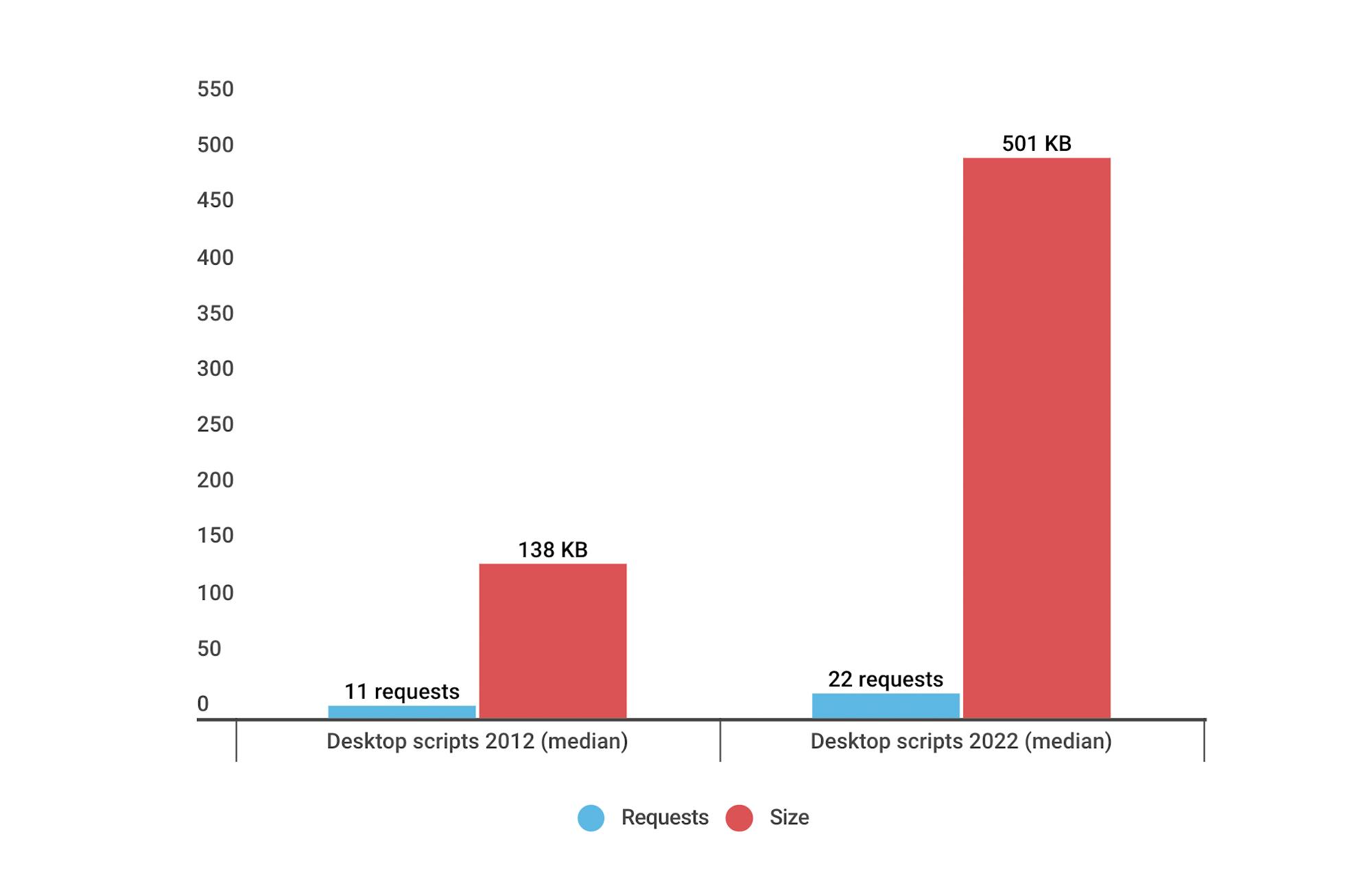
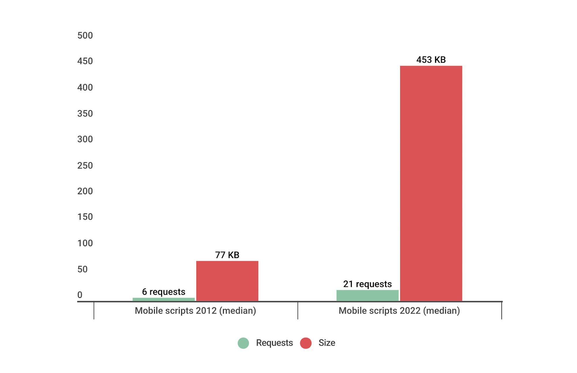
9. JavaScript requests have doubled, while JS size has almost quadrupled
Not only are we serving more scripts than ever – with all the performance risks that those entail – we're also bulking out pages with 500 KB of JS weight.
Mobile pages fare only slightly better with 453 KB of JS weight.
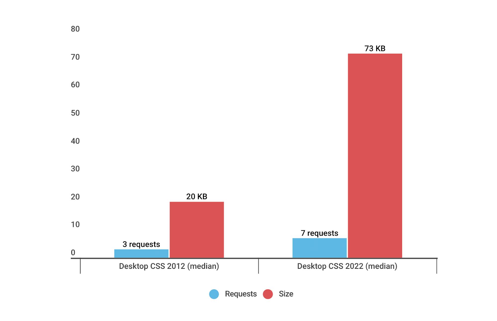
10. CSS requests have more than doubled for desktop and mobile
More stylesheets equal more risk of performance degradation. The amount of CSS on your pages is something to keep an eye on, because problematic CSS can block the rest of your page from rendering.
How does page bloat affect Core Web Vitals?
Google's Core Web Vitals are a set of metrics that are intended to focus on measuring performance from a user-experience perspective. While total page size and weight don't directly affect Web Vitals, there are some nuanced ways that you should think about the number and size of resources you're serving.
Largest Contentful Paint
Largest Contentful Paint (LCP) measures when the largest visual element on the page renders. Page bloat issues that can hurt your LCP time include:
- Slow or blocking scripts and stylesheets that load at the beginning of the page's rendering path can delay when images start to render.
- Unoptimized images with excessive load times. Largest Contentful Paint includes the entire time it takes for the image to finish rendering. If your image starts to render at the 1-second mark but takes 4 seconds to fully render, then your LCP time is 5 seconds. This falls short of Google's threshold of 2.5 seconds for Largest Contentful Paint.
First Input Delay
First Input Delay (FID) measures how quickly a page responds to a user interaction. Input delay happens when the browser's main thread is too busy to respond to the user. Commonly, this is due to the browser being busy parsing and executing large JavaScript files.
There's a lot of unnecessary JS on many pages, and as noted above, JS files have gotten bigger over the years. The more JS on your page, the more potential for slow FID times. As Tim Kadlec said a couple years back in his performance.now() talk When JavaScript Bytes:
JavaScript is, byte-for-byte, the most expensive resource on the web and we’re using more of it than ever in our sites. You can optimize the delivery, the parsing and the execution until you’re blue in the face but you’ll never make it as performant as simply not using it in the first place.
Cumulative Layout Shift
Cumulative Layout Shift (CLS) measures how visually stable a page is. It's a formula-based metric that, put simply, takes into account how much a page's visual content shifts within the viewport, combined with the distance that those visual elements shifted. You can dig deeper into the mechanics of how CLS is calculated, but the human-friendly definition is that CLS helps you understand how likely a page is to deliver a janky, unpleasant experience to viewers.
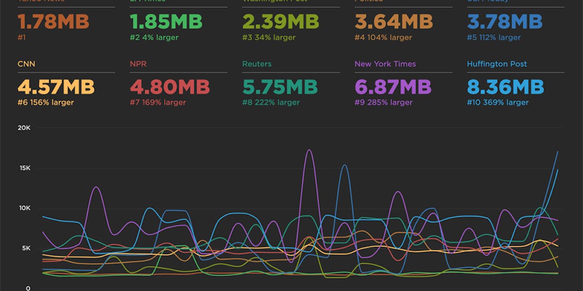
CLS is strongly affected by the number of resources on the page, and by how and when those resources are served. You can see this by looking at the synthetic test result for Sears.com (again, available via our Industry Benchmarks). The CLS score for this page is 1.0468. For context, Google recommends a score of 0.1 or less. Translation: This is a really, really janky page!
These screenshots highlight the most significant visual element shifts:
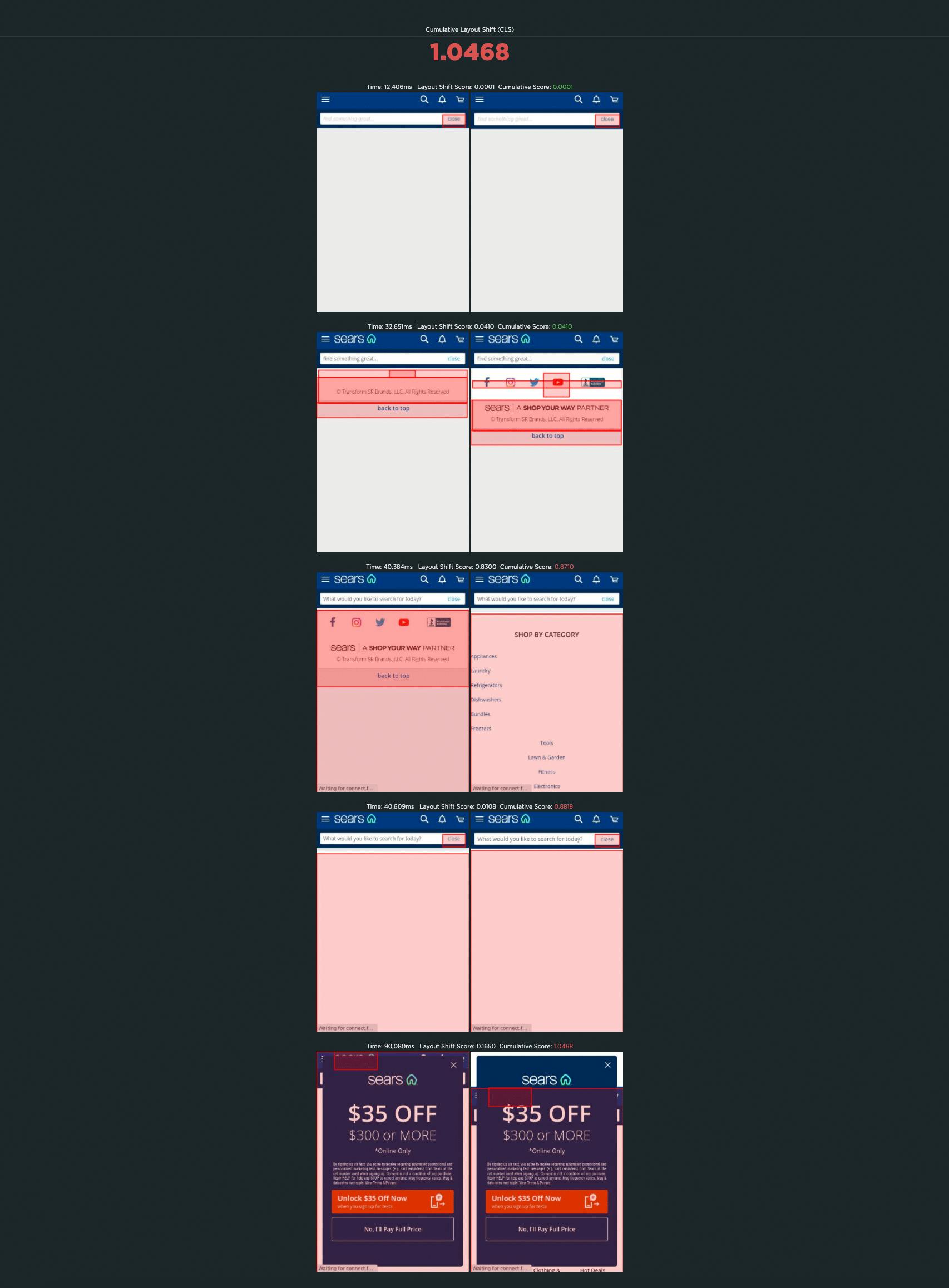
Not surprisingly, this page, while not overly huge in terms of total size (almost 3 MB), contains a massive number of requests. Of those 559 requests, the bulk is images (175 requests), JavaScript (140 requests), and 'other' (133 requests).

Looking at the waterfall chart for this same page, we see that there are:
- 16 requests before Start Render
- 52 requests before Largest Contentful Paint, and
- 62 requests before the Largest Layout Shift (a CLS-related metric that SpeedCurve captures)
That's a lot of requests!
Is it possible to have big pages that deliver a good user experience?
Yes. While page size can be a red flag for real performance issues, if you care about user experience, you need to take a closer look at how your pages are built to see if the size and complexity of your pages actually affect how fast your site feels to your users.
It's not enough to look at crude metrics like total requests and size. You need to know:
- How many of your requests are blocking requests?
- If your page contains blocking requests, how many of them occur in the critical rendering path? That is, how many blocking requests are there before key page metrics like Start Render and Largest Contentful Paint?
- How many of your potentially problematic requests come from third parties, and how do you maintain visibility into how they're performing?
- Are the most important images on your page the first images to render? How quickly do they show up?
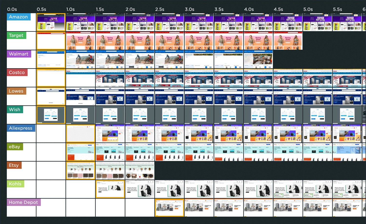
Amazon is a good example of a site that serves large, fast pages. In this recent test run from our Industry Page Speed Benchmarks, you can see that the Amazon home page ranks fastest in terms of Start Render. This is despite the fact that the page contains 410 requests and weighs in at 4,311 KB – far beyond the median sizes shared above. Yet the page has a Start Render time of 0.3 seconds, a Largest Contentful Paint time of 0.48 seconds, and a CLS score of 0.1526.
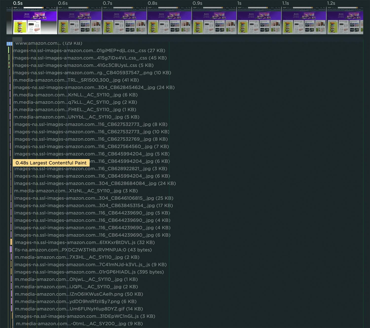
Looking at a close-up of Amazon's waterfall chart (below) reveals why. While there are 38 resources that load before Largest Contentful Paint, only one of them is render blocking, and all of them are extremely lean.
Takeaways
I meet with so many people whose job it is to build and optimize websites. When we look at how their pages are built, I routinely witness their surprise at spotting things like ghost scripts, huge unoptimized images, and blocking resources they weren't aware of. These are smart people. The problem isn't them – it's the scale of their sites, the speed of their release cycles, and the number of people who touch each page.
We're never going to get our lean, pre-1999, under-1MB web pages back. But we can regain control over the pages we have today.
1. Understand the critical rendering path for each page
Your pages probably have a lot of unnecessary junk on them, and some of that junk is unoptimized. Too much stuff means you can't see the forest for the trees. You can have large, complex pages that still feel fast. The key to a good user experience is quickly delivering the most important content first. Here are some great resources for analyzing and optimizing the critical rendering path.
2. Make sure everyone who touches a page understands the performance impact of what they do
All the fancy performance monitoring tools in the world can't help you if you don't have a strong performance culture at your organization. Here are some tips and best practices to help on that journey.
3. Fight regression
Page bloat happens when people stop paying attention. We need to monitor our pages consistently over time.Integrating performance testing into your CI/CD process is a great way to fight regression, especially if you combine this with creating performance budgets. By creating performance budgets for key metrics – such as Start Render, Largest Contentful Paint, and various page size and weight metrics – you can get alerted when they go out of bounds.
4. Don't assume hardware and networks will mitigate page bloat
While some of your users may have newer devices and speedy networks, not all are this lucky. If you're using a real user monitoring tool, keep an eye on your performance metrics at the 75th and 95th percentiles so you have an understanding of your site's less-optimal performance.