Introducing a new resource for the performance community: Page Speed Benchmarks!

Here are some common questions I’m asked when I talk with people about performance:
- Which metrics should I care about?
- What types of devices and connections should I test on?
- Which third parties should I be most concerned about?
- How fast should I be?
- What are some good sites I can use for benchmarking?
Today, I’m very excited to announce the release of a new project that helps answer those questions – and more!
Page Speed Benchmarks is an interactive dashboard that lets you explore and compare web performance data for leading websites across several industries – from retail to media.
With Page Speed Benchmarks, you can do things like:
- See what the different metrics actually mean in terms of user-perceived performance
- Compare how the same page renders on fast vs slow devices and connections
- Understand what makes fast sites fast (and slow sites slow)
- Get insights into how third parties can perform on different sites
- Identify sites you can use for your own competitive benchmarking
If you already like tools like the HTTP Archive, I think you'll love how you can use Page Speed Benchmarks to complement the insights you're already getting. Keep reading to find out how we set up these benchmarks, and how you can mine our test data – even if you're not a SpeedCurve user – for your own performance research.
Interactive, ongoing, and public
Over the past ten years or so, I’ve put a lot of time into researching industry benchmarks for web performance. What makes me especially excited about Page Speed Benchmarks is that all our data is interactive, ongoing, and publicly available.
This means you have access to the same data that we do. You don’t have to wait for us to release monthly reports. And you don’t need to have a SpeedCurve account or any sort of login to start exploring our test results and mining for meaningful data you can use in your own projects. How awesome is that?!
How we set up our testing
- Home pages of 10 leading sites in the US and the EU, in each of the following industries: Auto, Finance, Media, Retail, Tech, and Travel. (We’ll add more later, but we felt like this was a solid start.)
- Tested on our private agents in Frankfurt (for the EU sites) and US East Coast (for the US sites).
- Tested once per day on a Chrome desktop browser with a fast connection (25Mbps/10Mbps 10ms RTT).
- Tested once per day on an emulated Nexus 5X mobile at 3G Slow (400Kbps/400Kbps 400ms RTT). Find out more about why it's so important to test at slow speeds.
- Three tests per test time, with the medians used in the charts.
What you can do with these benchmarks:
1. Learn what the different metrics mean in terms of user-perceived performance.
You can use the dropdowns at the top of the Page Speed Benchmarks dashboard to explore some of the metrics we're tracking. If you want to get more insight, click the "Explore this site" link below each chart to see the test results for any of the sites. There you’ll see a waterfall chart alongside a filmstrip view that shows how the page renders, like this one:
We focus on these metrics in the main Benchmarks dashboard, and from there you can drill down into the individual test results to see many more:
- Backend – The first byte of the base HTML is received by the browser (AKA Time to First Byte)
- Start Render – The first non-white content is painted in the browser
- SpeedIndex – The average time at which visible parts of the page are displayed
- Largest Contentful Paint – The largest element – usually image or video – in the viewport is rendered
- First CPU Idle – The page is minimally interactive (most UI elements are interactive, page responds to most user input reasonably quickly)
- Time to Interactive – The page becomes interactive (displays useful content, UI elements are interactive, page responds to user interactions within 50ms)
- Visually Complete – All content in the viewport has rendered, and nothing in the viewport changes as the rest of the page loads
- Fully Loaded – The page has completely loaded with no network activity for 2 seconds
2. Appreciate the difference between fast vs slow.
It’s inspiring to see how fast a page can be under the right conditions. And it’s eye-opening to see how that same page can suffer on low-CPU devices and slow connections. (Tim Kadlec gives a strong argument for why you should test on slower connections in this excellent post.)
3. Understand what makes fast sites fast (and slow sites slow).
Drill down into the waterfalls for each page to see exactly what separates the fast sites from the slow ones.
4. Get some insights into how third parties can perform on different sites.
This is one of my favourite aspects of this research. More on this to come!
5. Find sites you can include with your own benchmarking
Don’t think of this as "competitive benchmarking" as much as it is “aspirational benchmarking”. Looking at the historical data for each site will give you an idea as to which sites you can benchmark in your own testing. #perfgoals
What we DON'T want you to do with these benchmarks:
1. Don’t confuse these findings with real user data and experiences.
These tests are snapshots, based on synthetic tests, with all the caveats that this entails.
2. Don’t use these results as leaderboards.
Page Speed Benchmarks isn’t a contest or a set of "top ten" lists. These aren’t the fastest or slowest sites on the web. They’re simply a set of sites we’ve chosen to track over time. We’re more interested in digging into the test results to see what we can learn about what makes fast sites fast and slow sites slow.
3. Don’t name and shame.
Every site has bad hair days. For example, highly dynamic sites, such as media sites, serve different third parties throughout the day. A slow start render time could be caused by a single script that our synthetic test happened to capture. Or it could be caused by a temporary backend issue. You get the idea.
Now let’s look around…
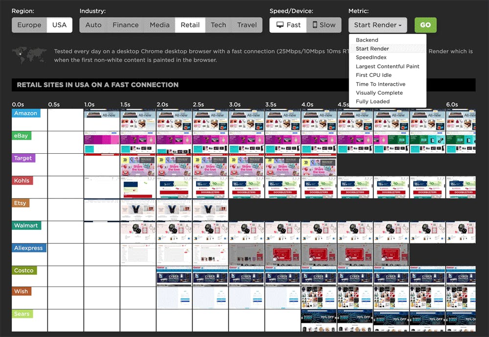
Let’s start by looking at the results for US media sites on a fast desktop connection. This is an interesting group to start with because these sites face some aggressive performance challenges:
- Pages tend to have a lot of content, including heavy images and video.
- Content is consumed on mobile devices, often over spotty connections.
- Media sites are under tremendous pressure to generate ad revenue, so we see a lot of third-party ad services.
- Teams at media organizations are tasked to collect a huge amount of user data, so we see a lot of tracking and analytics tags.
All of the above traits are even more pronounced in the US than in the EU, which is what makes this industry compelling to track if you care about performance.
Which metrics correlate with user-perceived performance?
In previous posts (here and here, for example), we’ve strongly advocated validating your metrics by looking at filmstrip views of your pages rendering. It may challenge some of your assumptions about the relevance of some metrics as proxies for user experience.
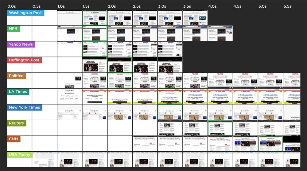
With Page Speed Benchmarks, we can sort sites by how they rank across popular metrics. The highlighted frames in the filmstrips show when each metric is measured. So let’s do that now, looking at a trio of metrics that often are conflated with user-perceived performance: Start Render, Speed Index, and Visually Complete. (Here's a helpful glossary of common web performance metrics.)
Start Render (first non-white content is painted in the browser)
This sorting stacks up pretty neatly from fastest to slowest. This isn’t a huge surprise, which is why it’s a good idea for you to consider including start render as a metric to track.
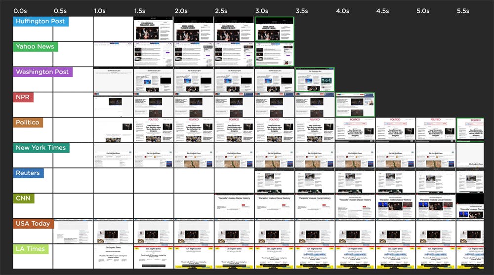
Speed Index (average time at which visible parts of the page are displayed)
This sorting isn't quite as consistent as start render, but with the exception of USA Today at the bottom, seems mostly valid.
Visually Complete (all content in the viewport has rendered, and nothing in the viewport changes)
For this set of sites, visually complete is all over the map. For half the sites, it doesn't fire until after 5.5 seconds, which is why we're not seeing it in this screenshot.
Takeaway: Test, validate, then test some more
The purpose of doing this investigation wasn’t to criticize any of these metrics, but rather to make it clear that metrics that are relevant for some pages won’t necessarily be relevant for others. At the risk of sounding like a broken record, you really need to look at your own data and your own filmstrips to make sure you’re picking the right metrics to focus on for your site.
Now let’s look a bit closer at this same set of US media sites and see what we can learn by drilling down into the test results...
Not surprisingly, all sites are fast on a fast desktop connection.
At the time of writing this post, all ten sites started rendering in less than 3 seconds, and six sites had a start render of 1 second or less. No surprises here.
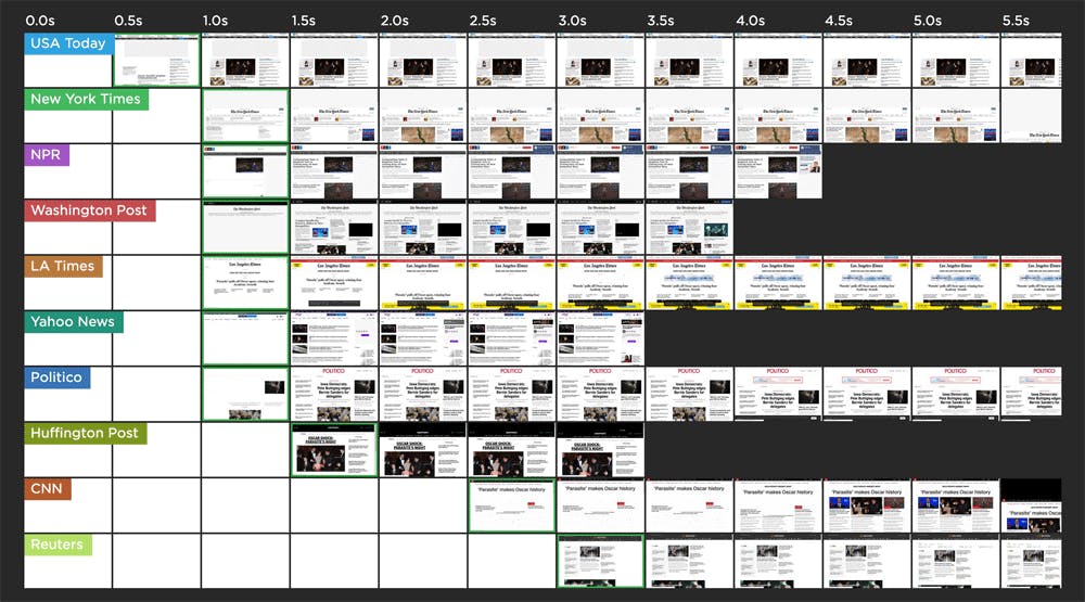
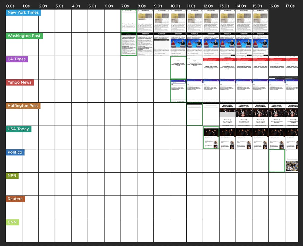
And no surprise, all sites are slow on a slow mobile connection.
Now let’s take a look at how the same ten sites rendered on a slow mobile connection. (Remember: This is an emulated Nexus 5X mobile on a slow 3G connection.) The fastest site didn’t start to render till around 7 seconds, and the slowest start render was at 36 seconds.
Now that we've gotten the obvious observations out of the way, let's ask some meatier questions...
Page bloat is real. But does it always matter?
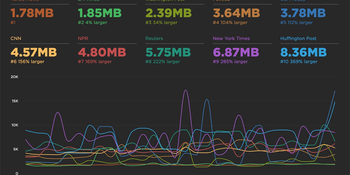
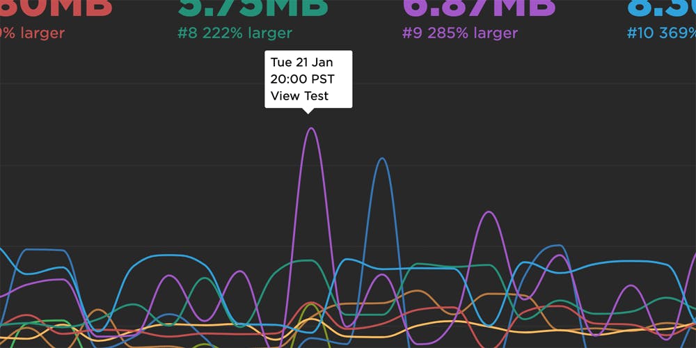
As someone who’s somewhat obsessed (okay, very obsessed) with page bloat, I find it interesting to click through to look at the detailed benchmarks, so let’s do that for the fast desktop group.
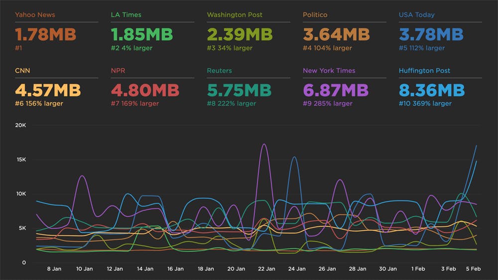
While a couple of pages fall below the HTTP Archive median size of 1900KB, the rest are larger – with two pages topping out in the 6-8MB range. (As someone who’s also obsessed with data usage – I spend a lot of time reading articles while I'm out roaming the world – this is a reminder that I need to be extra mindful of my news consumption when I’m out and about.)
If you’re anything like me, you’re extremely curious about those spikes, so let’s take a closer look. To do that, all you need to do is click on any test point in a time series, and then click the "View Test" link:
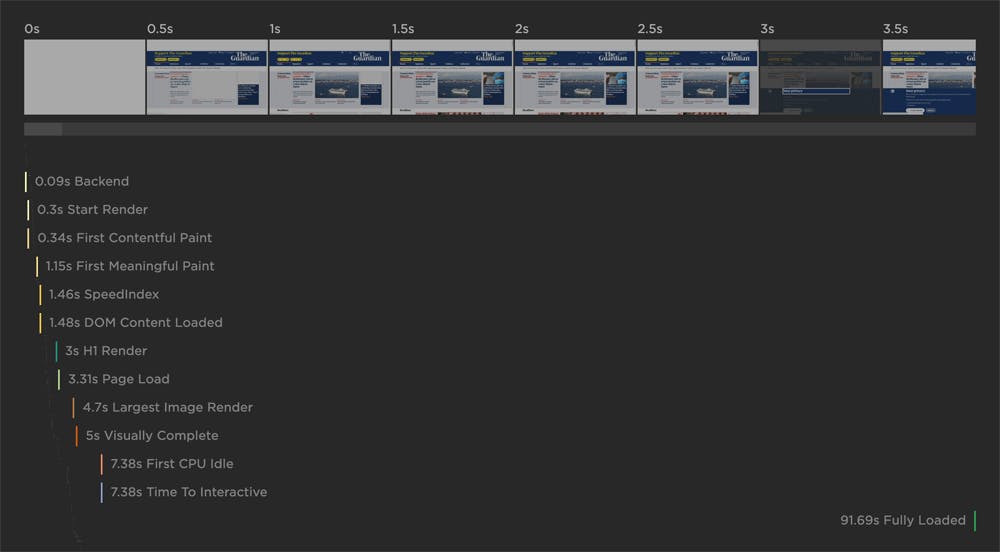
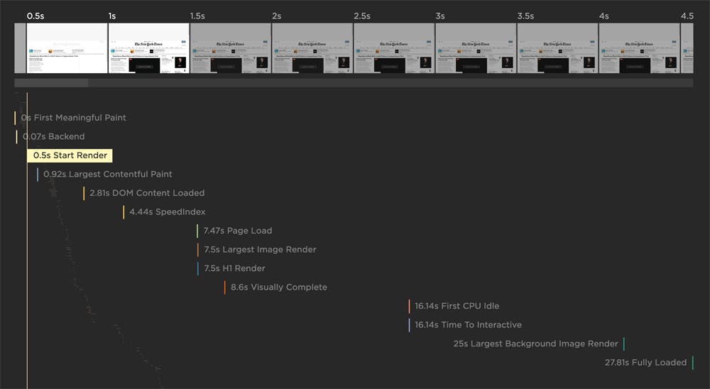
This takes us to a detailed test result for The New York Times, where we can see how popular rendering metrics align with the filmstrip. What’s great to see here is that, despite the total size of this page, the filmstrip view shows that it actually renders pretty quickly – yay!
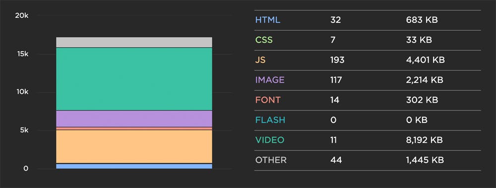
When we scroll down the test results to see the breakdown of resources on the page, you can see that a lot of the weight can be attributed to JavaScript and images – and, notably, 8MB worth of video content.
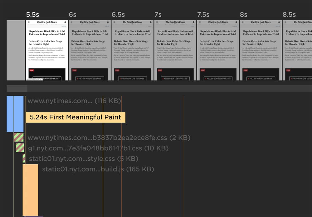
So let’s look into the mobile test results for The New York Times to see what they were serving mobile devices at the same date and time:
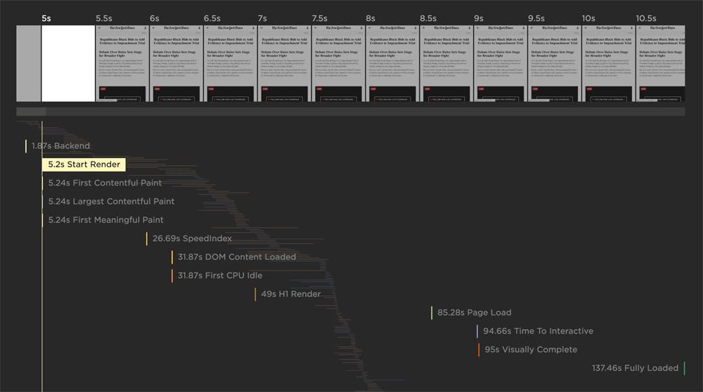
As you can see above, the page doesn’t start rendering until more than 5 seconds have passed. It’s not ideal, but it’s not terrible – again, keeping in mind this is on a slow 3G connection.
Next, let’s open up the waterfall to see what’s happening before the page starts to render:
In these charts, the blue bars represent HTML, so there’s roughly 4.5 seconds of downloading and parsing there alone. The green hashed bars represent blocking CSS. These assets have download/parse durations ranging from roughly 500 milliseconds to 2.5 seconds. So there you go. No big mystery here – just a reminder to optimize/reduce your CSS whenever you can.
We came here to look at page weight, so let’s do that. On the plus side, The New York Times is serving a much lighter version of its home page to mobile, partly thanks to the fact that it’s not serving video content. This is great to see:
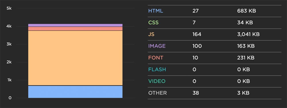
The not-so-good news is that the page is still over 4MB in size, with around 3MB of that coming from JavaScript alone. I’m pretty surprised to see that, as I really expected the bulk of the weight to come from images. Image weight comes in at 163KB, which is good by any standard.
JavaScript is clearly an issue here, so for a bit more fun, we can head over to the JavaScript dashboard (also available via the left-hand navbar). Below you can see a waterfall that focuses solely on JS. (Note that this chart was generated at the time of writing this post. We always shoe you the latest waterfall on the JS dashboard, so what you see when you visit the dashboard will probably look different than what you see here.)
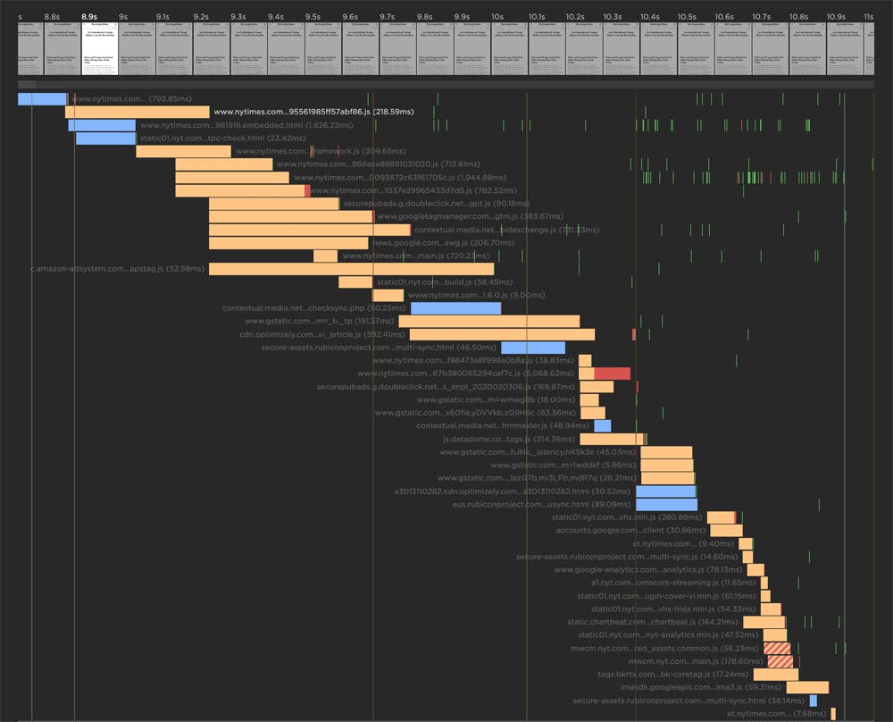
Clearly there’s a lot of JavaScript on this page, but really what we care about is the impact of all that JS on user experience. To help do that, we show you all the scripts that take more than 50ms to execute:
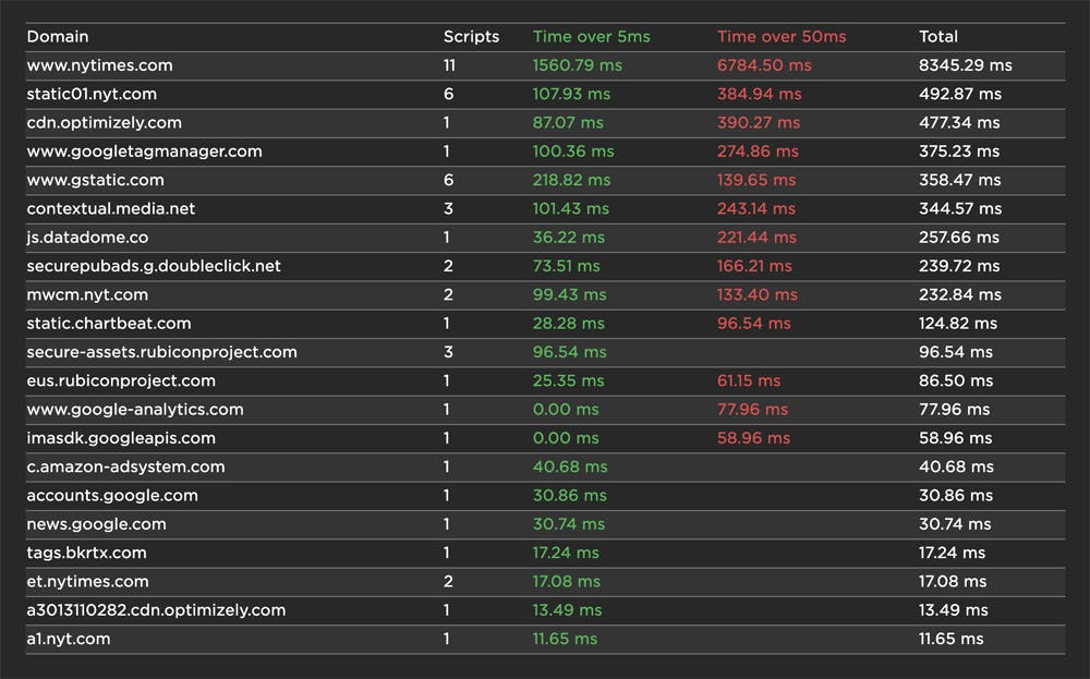
These are Long Tasks – browser events that block the CPU for more than 50ms. Long Tasks make pages feel janky. The more Long Tasks there are on a page, the greater the likelihood that the page will hurt user experience.
Again, keep in mind that these results are for a slow mobile connection – but users on slow mobile connections matter! Remember that people’s devices and connections vary throughout the day. Someone who visits your site on a fast desktop connection when they’re at work could also very well come back when they’re riding the train home from work, using spotty 3G on their phone. Inconsistent performance is frustrating!
We’re veering toward the topic of third-party performance, which is HUGE and merits a separate post of its own, so I’m going to stop here for today. I’m already planning another dive into this data, where I’ll focus exclusively on third parties. And of course, you’re welcome to go ahead and get started without me. :)
Start exploring!
What we’ve covered today is truly just the tip of the iceberg. I strongly encourage you to head to Page Speed Benchmarks and do your own investigation. If you find anything interesting, let me know! And if you have any suggestions or feedback about the benchmarks, I'd love to hear that, too.