Industry page speed benchmarks (March 2022)

Page Speed Benchmarks is an interactive dashboard that lets you explore and compare web performance data for leading websites across several industries – from retail to media – over the past year. This dashboard is publicly available (meaning you don't need a SpeedCurve account to explore it) and is a treasure trove of meaningful data that you can use for your own research.
The dashboard allows you to easily filter by region, industry, mobile/desktop, fast/slow, and key web performance metrics, including Google's Core Web Vitals. (Scroll down to the bottom of this post for more testing details.)
At the time of writing this post, these were the home pages with the fastest Start Render times in key industries:
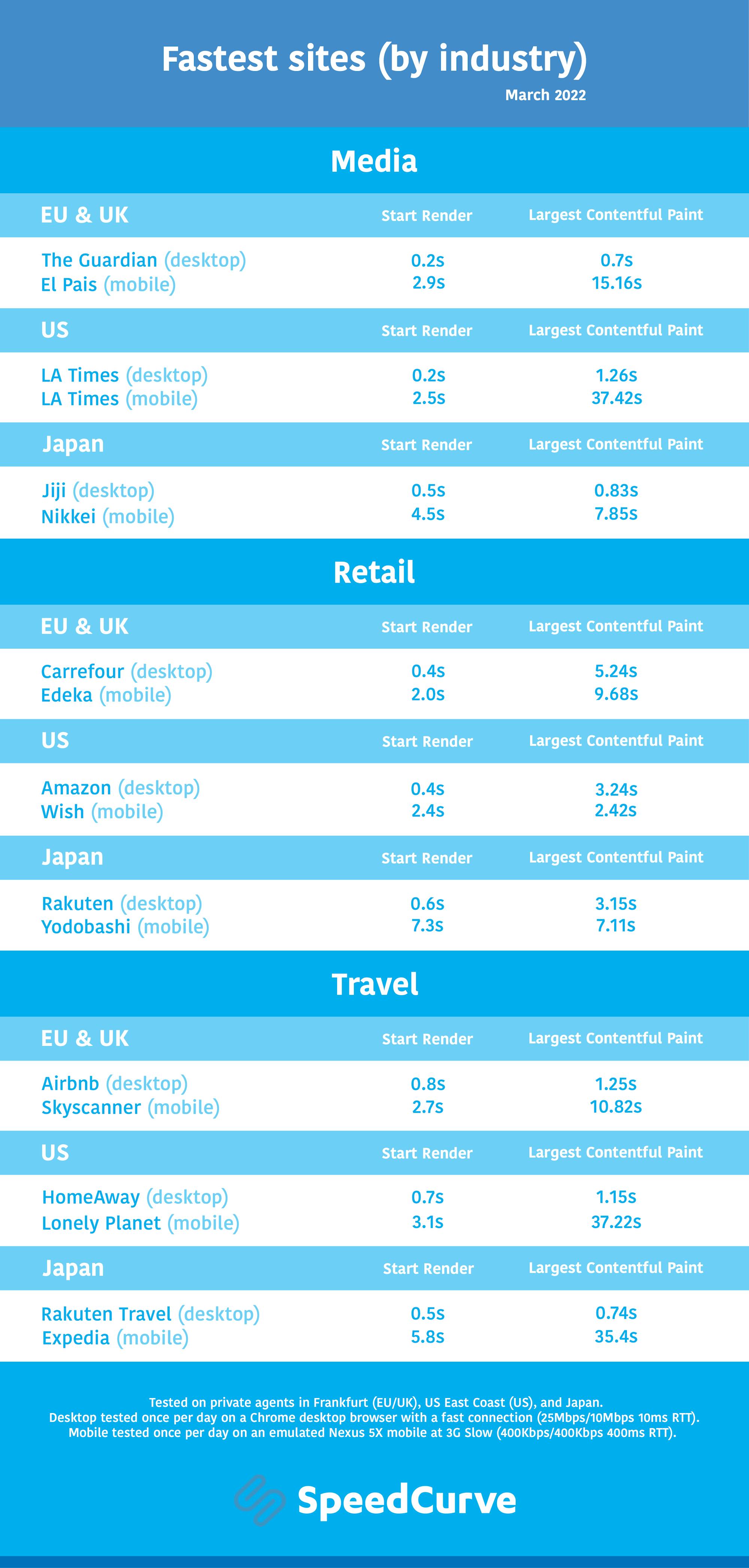
As you can see, I've included Largest Contentful Paint alongside Start Render in this chart, for reasons I explain below.
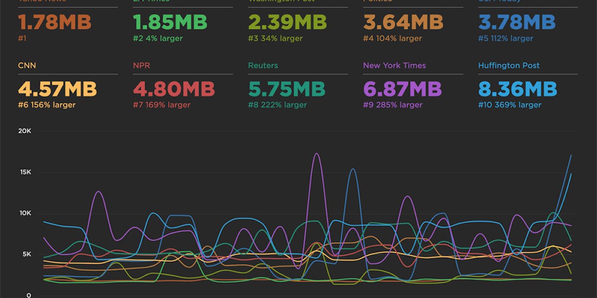
Key metrics
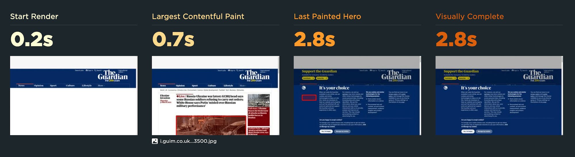
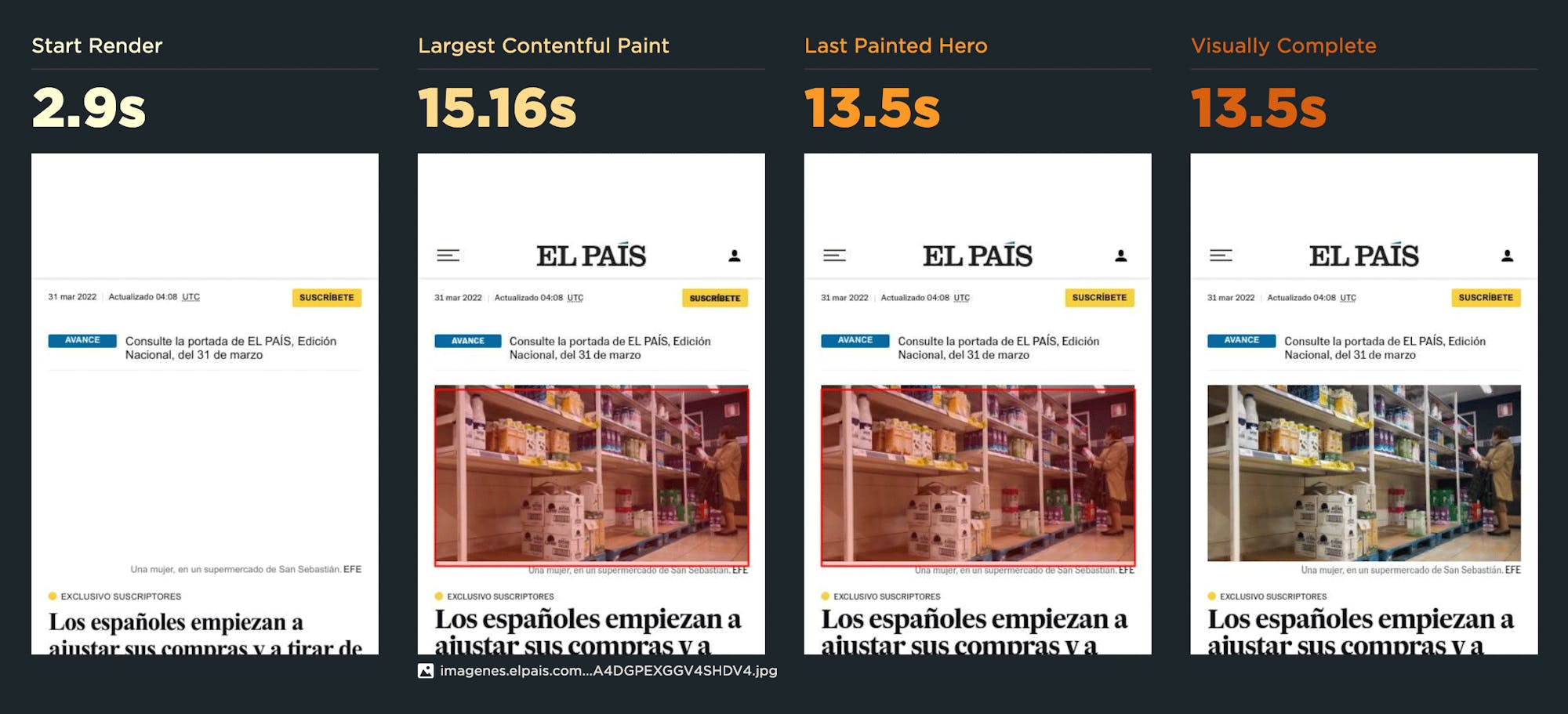
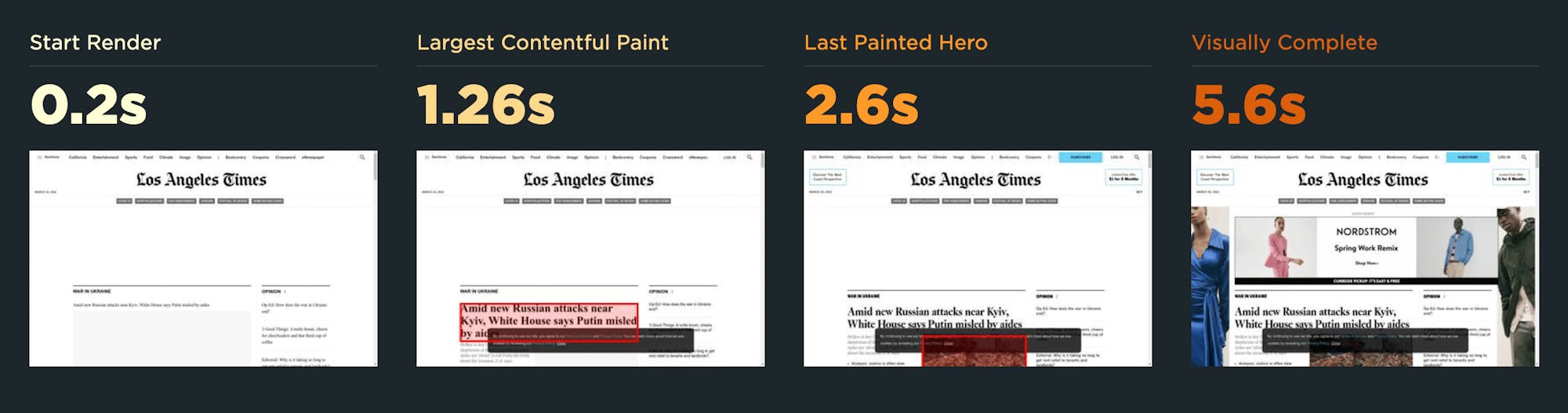
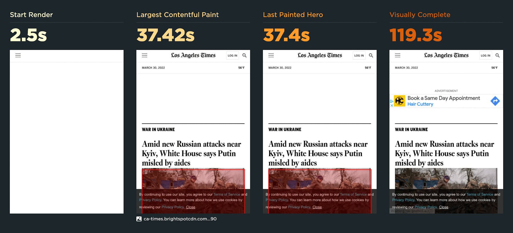
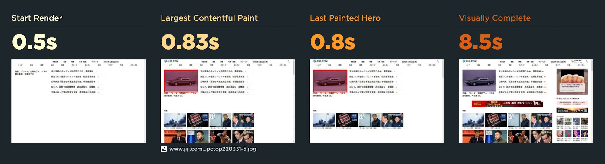
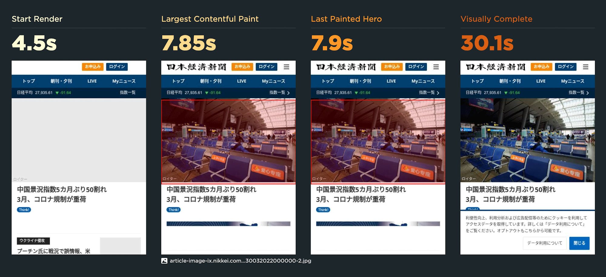
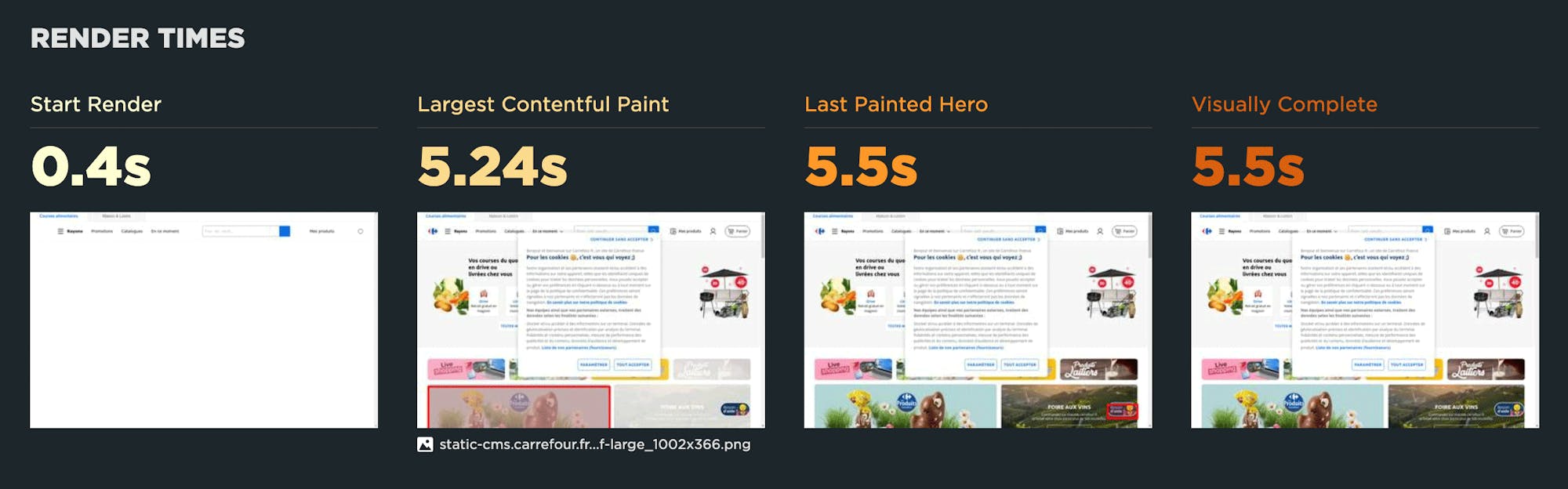
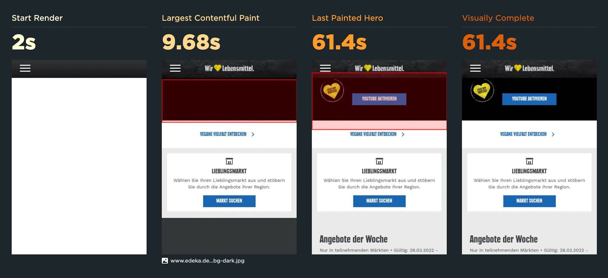
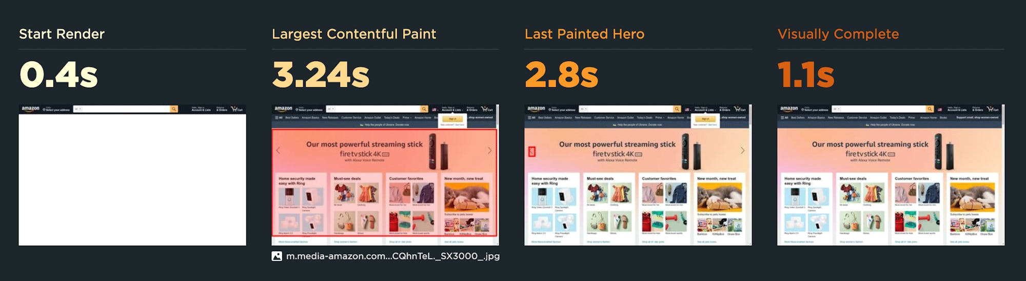
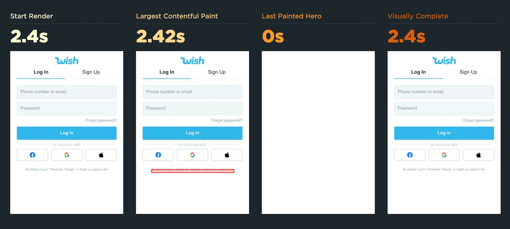
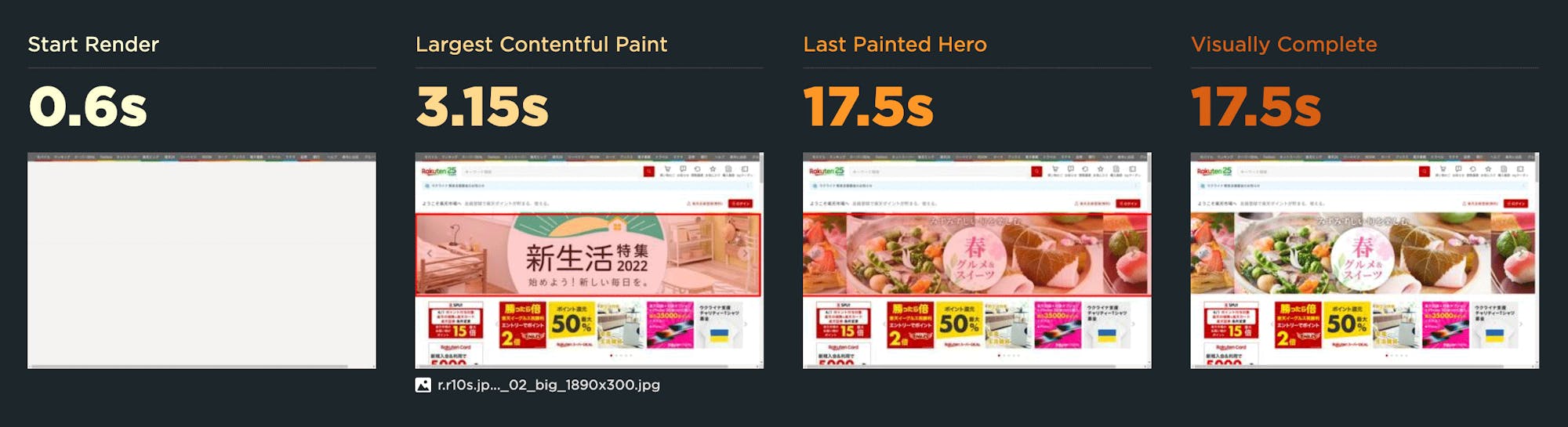
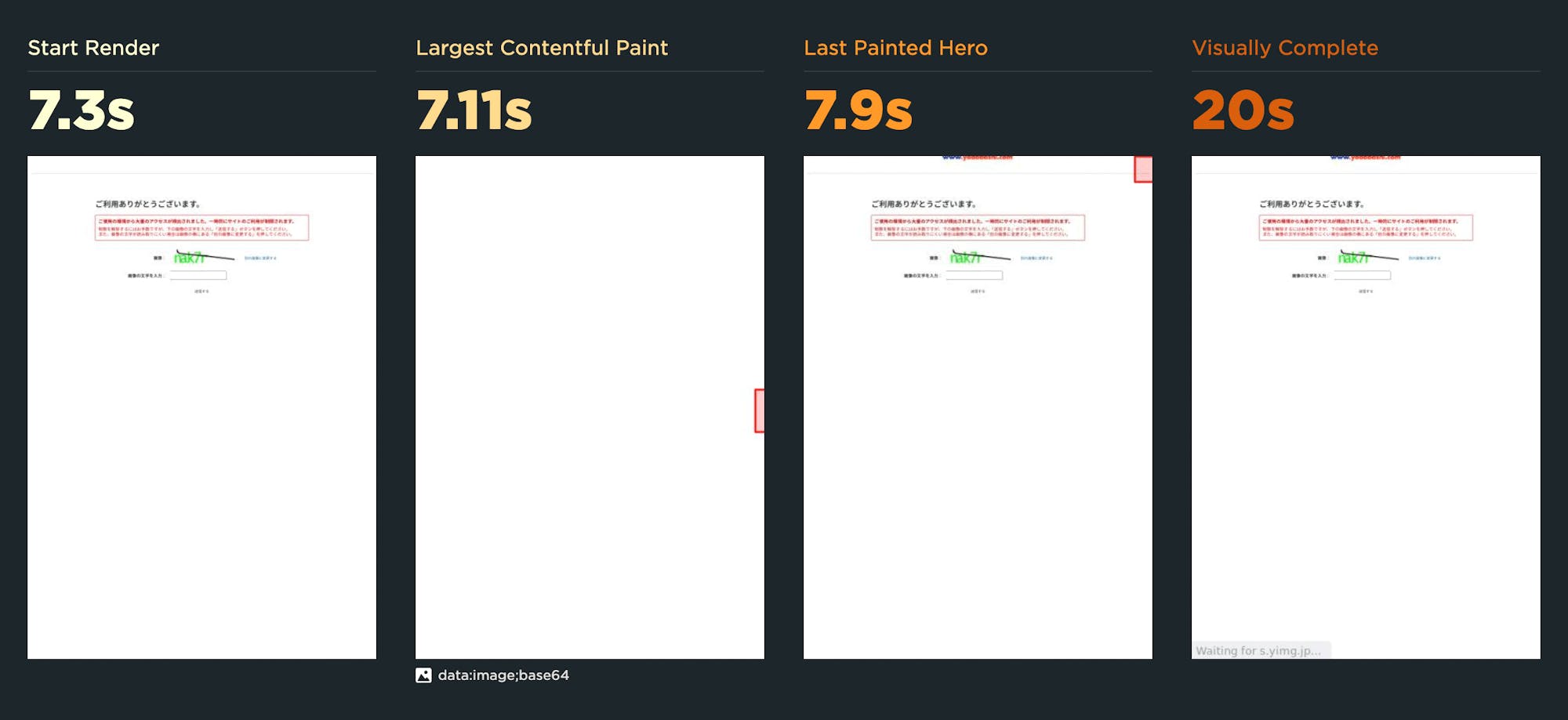
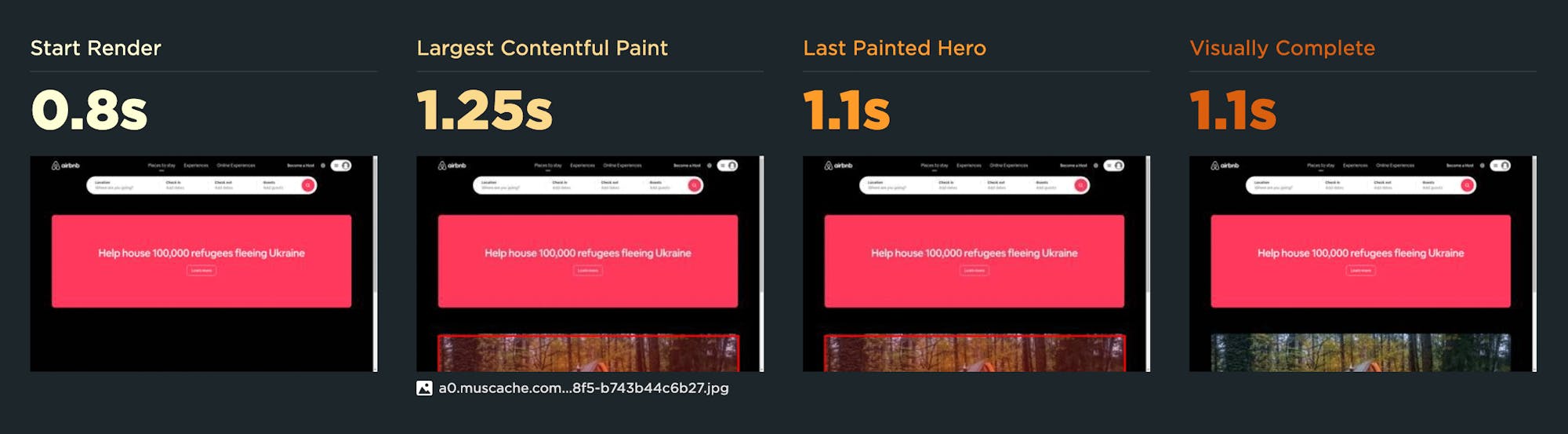
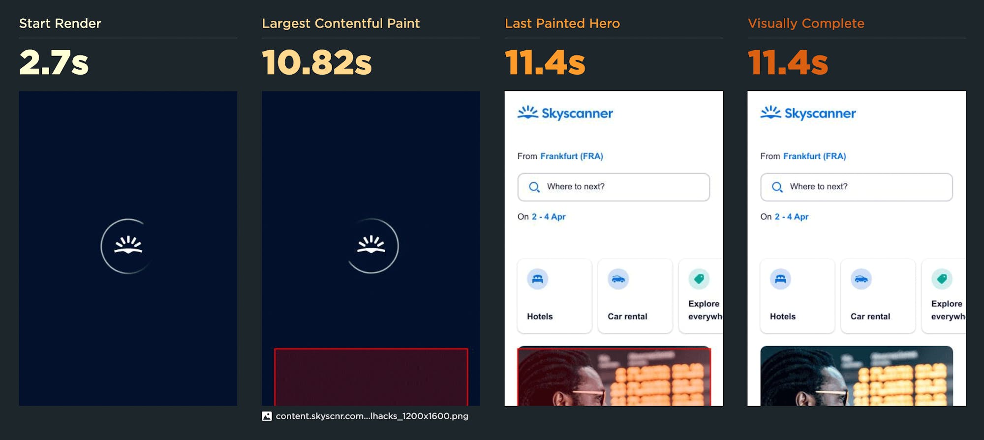
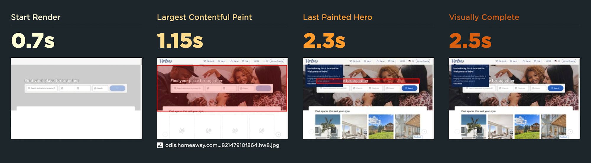
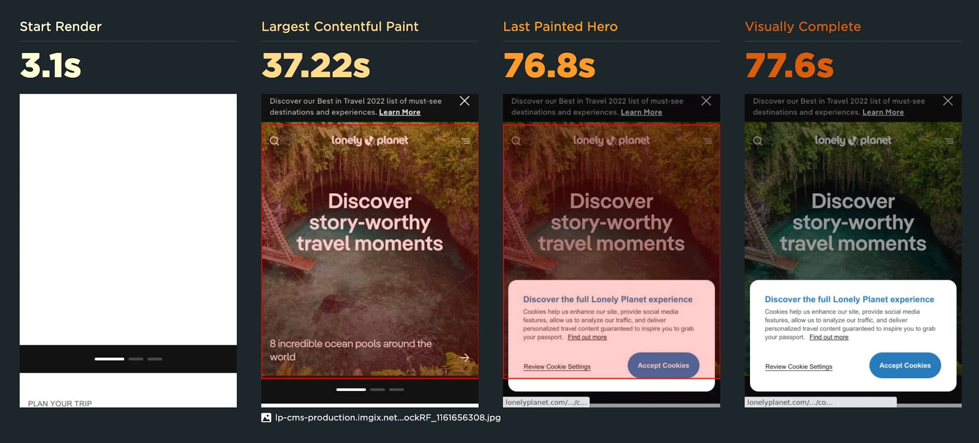
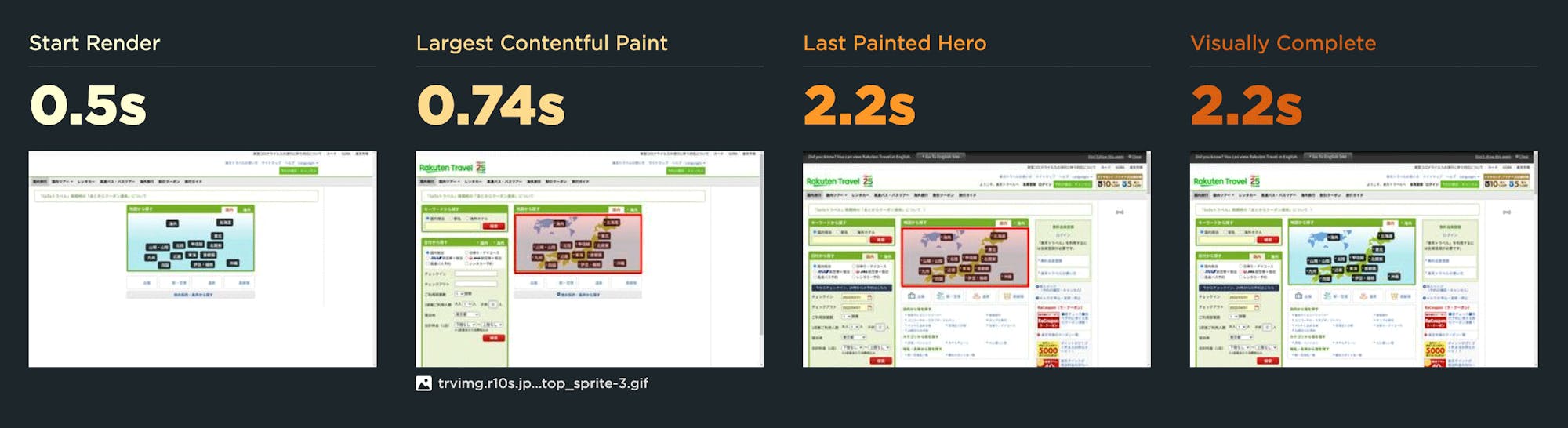
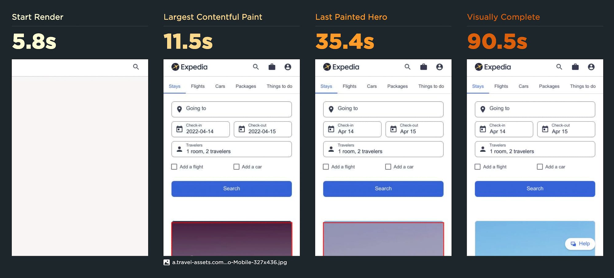
Numbers are good, but visuals are even better. Below you can see the fastest sites – ranked by Start Render time – in each category, along with screenshots taken from their rendering timelines, which show you what the viewer sees at key render moments:
- Start Render – The time from the start of the initial navigation until the first non-white content is painted to the browser display.
- Largest Contentful Paint – When the largest element – usually image or video – in the viewport is rendered. LCP is one of Google's Core Web Vitals, so it should be on your radar, especially if you care about SEO.
- Last Painted Hero – When the last piece of critical content (largest image, largest background image and/or first H1 tag) is painted in the browser.
- Visually Complete – The time at which all the content in the viewport has finished rendered and nothing changed in the viewport after that point as the page continued loading.
These visuals are a great tool for validating the best metrics to focus on for your pages. Looking at the screenshots below, you can really see the disparities between metrics, especially for pages served to mobile.
Fastest Media Sites
UK & EU
The Guardian (view desktop test results)
El Pais (view mobile test results)
United States
LA Times (view desktop test results)
LA Times (view mobile test results)
Japan
Jiji (view desktop test results)
Nikkei (view mobile test results)
Fastest Retail Sites
UK & EU
Carrefour (view desktop test results)
Edeka (view mobile test results)
United States
Amazon (view desktop test results)
Wish (view mobile test results)
Japan
Rakuten (view desktop test results)
Yodobashi (view mobile test results)
Fastest Travel Sites
UK & EU
Airbnb (view desktop test results)
Skyscanner (view mobile test results)
United States
HomeAway (view desktop test results)
Lonely Planet (view mobile test results)
Japan
Rakuten Travel (view desktop test results)
Expedia (view mobile test results)
Takeaways
1. Start Render is an important metric for measuring user-perceived responsiveness.
Visual feedback that something is happening on the page is important to users. This is why it's frequently proven to be a good metric to use when creating correlation charts that map performance to user engagement and business metrics, like bounce rate and conversion rate.
2. If you're not tracking Largest Contentful Paint, you should be... especially for mobile.
To me, the biggest takeaway here is noting the disparity between Start Render and Largest Contentful Paint. Some disparity is to be expected, as Start Render measures when the first pixels start to appear on the page, and LCP measures when the largest visual element (image or video) finishes rendering.
In most cases, the difference between Start Render and Largest Contentful Paint isn't huge for pages served to desktop. Mobile tells a different story, even among the fastest pages we tested. For example:
- LA Times home page had a Start Render time of 2.5 seconds, but its LCP was 37.42 seconds.
- Lonely Planet Start Render was 3.1 seconds, while LCP was 37.22 seconds.
- Expedia had a Start Render time of 5.8 seconds, while LCP was 35.4 seconds.
While those were the most glaring examples, most of the other sites also had significant differences. There's also this gotcha...
3. LCP doesn't always correlate to meaningful content in the viewport... specifically for mobile.
If you're serving a lot of mobile users, you may want to validate that LCP is a valid metric to track – and troubleshoot any issues that are preventing it from being measured correctly.
4. Visually Complete is not a meaningful metric for most sites.
Visually Complete was a helpful metric for its time, but it came with its fair share of gotchas – such as the fact that it sometimes didn't fire until long after the page had fully rendered. You can see examples of this above. While we still track Visually Complete in SpeedCurve for folks who are still using it, we consider it unofficially deprecated in favour of more precise metrics.
Testing details
Here's how we set up testing for the Page Speed Benchmarks:
- Home pages of 10 leading sites in the US, EU, and Japan, in each of the following industries: Auto, Finance, Media, Retail, Tech, and Travel.
- Tested on our private agents in Frankfurt (EU), US East Coast (US), and Japan.
- Tested once per day on a Chrome desktop browser with a fast connection (25Mbps/10Mbps 10ms RTT).
- Tested once per day on an emulated Nexus 5X mobile at 3G Slow (400Kbps/400Kbps 400ms RTT).
- Three tests per test time, with the medians used in the charts.
Create your own custom benchmark dashboard
If you're not already using SpeedCurve, I encourage you to sign up for a free trial and create your own benchmarks dashboard where you can see how your site compares to your competitors.
I also encourage you to check out the entire Industry Page Speed Benchmarks dashboard (no login required). You can drill down into the historical test data for every site. If you spot something interesting, let me know!