SpeedCurve is now part of the Embrace family! There are no changes to how you use our products. Our founder Mark shares what this means...
NEW! Heatmaps now available on Favorites Dashboards

We’re thrilled to announce that you can now add heatmaps to your Favorites (custom) dashboards in SpeedCurve!
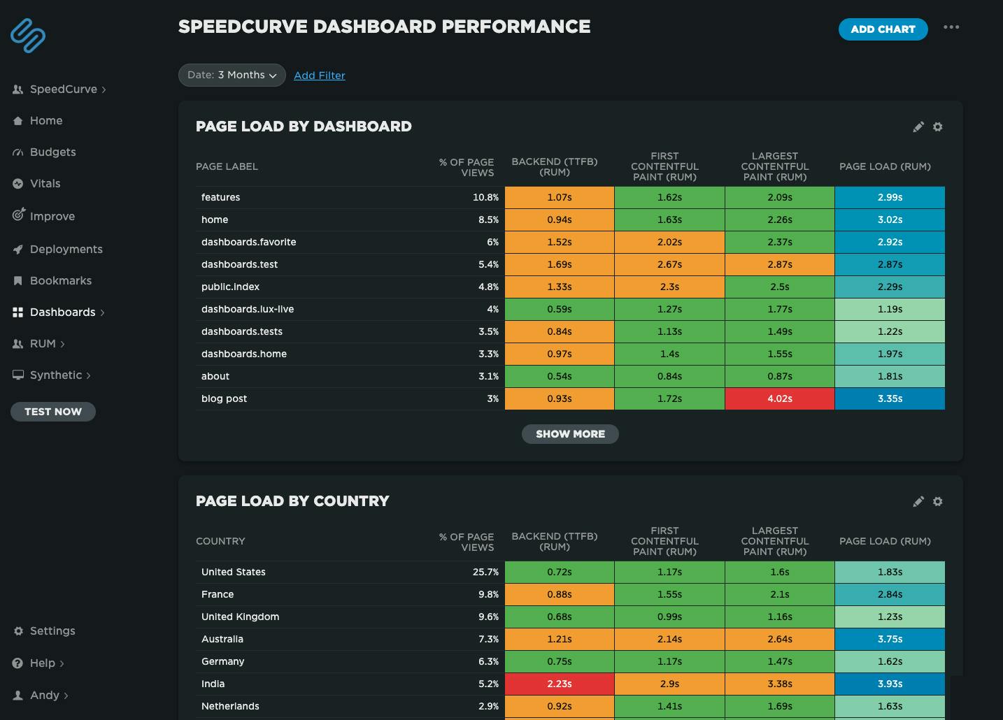 Speedcurve's own performance data for our dashboards. We've got some issues with our blog post page performance, possibly the huge images I've been uploading!
Heatmaps are a powerful way to get an instant overview of where performance issues are hiding across your site. They let you break down your performance metrics (including custom metrics) by different dimensions — including page label, browser, location, and device type — so you can easily spot anomalies and patterns in your web performance data.
For example, you might notice that a specific browser or region consistently loads your site more slowly, or that certain pages are lagging behind the rest. Heatmaps make it easy to visualize and spot those differences at a glance, helping you pinpoint where to focus your optimization efforts.
More RUM metrics in your Favorites dashboards

SpeedCurve comes with a great set of dashboards for Synthetic and RUM. But we know that one size does not fit all when it comes to data charts, which is why we've invested so much work into the Favorites dashboards. For customers who use RUM, it provides a place to create custom charts that combine metrics from synthetic and RUM.
We just added some new RUM metrics in Favorites to allow for even more customized monitoring:
- Page Views – The number of page views, including Single-Page-App page transitions
- Sessions – The number of unique sessions
- Session Length – The number of page views per session
- Bounced Sessions – The number of sessions that only have one page view
- Bounce Rate – The percentage of bounced sessions out of the total number of sessions
By popular demand: Multiple Favorites dashboards!

Rolling out new features is always a blast, and it's extra rewarding when the new feature is a response to a customer request. We've had many conversations with SpeedCurve users who've told us that multiple Favorite dashboards would be a huge benefit for their teams.
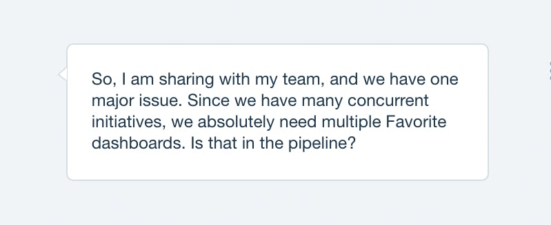
Today, we're very excited to announce that multiple Favorites dashboards are now available. Here's why you need them and how to create them.
Improved Favorites

We've improved the "Favorites" dashboard which now lets you build your own charts which:
- Combine synthetic tests and LUX (real user monitoring) in one chart.
- Choose average, median, or 95th percentile.
- Create charts that have multiple metrics.
- Select multiple values for a filter, eg, browser = Chrome or Firefox, country = UK or US.
- Compare A/B tests in a single chart.
Here's a walkthrough showing you some of the new features:
Build your own charts
We put a lot of thought into curating a thematic set of dashboards that help you understand the performance of your front-end, but sometimes you just want to play with the data yourself and slice 'n' dice the data in all sorts of different ways. We've added a new "Favorites" dashboard that lets you do just that. You can explore the data and build your own charts, then rearrange them and share them with the team to help demonstrate the performance issues you're focused on right now.
Here's a walkthrough showing you how to slice the available data in different ways:
