NEW! Heatmaps now available on Favorites Dashboards

We’re thrilled to announce that you can now add heatmaps to your Favorites (custom) dashboards in SpeedCurve!
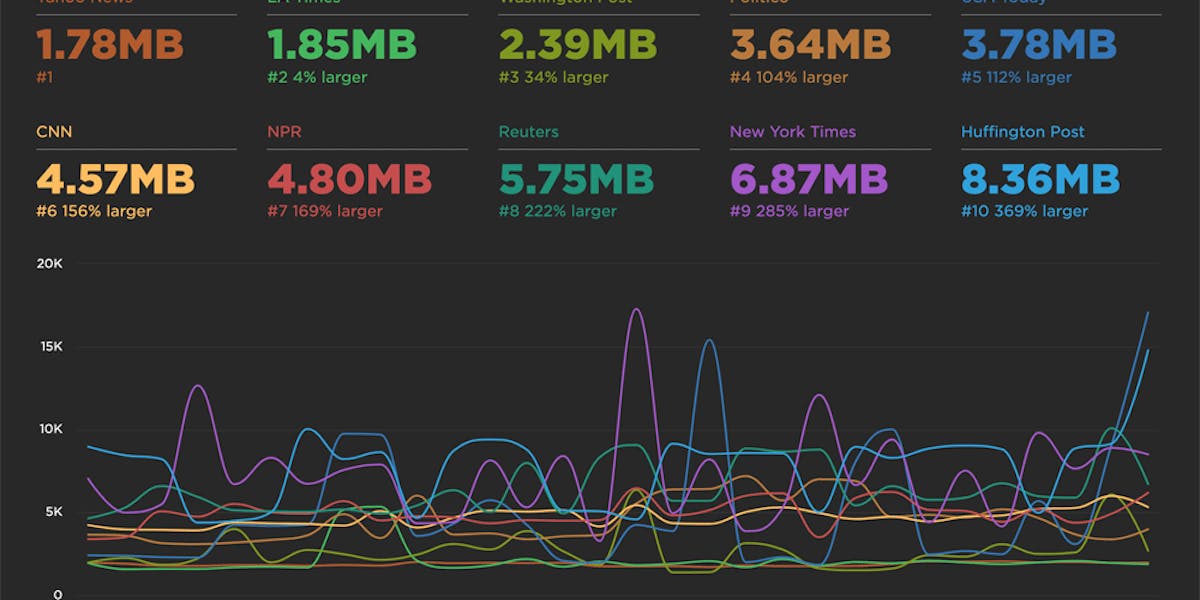
 Speedcurve's own performance data for our dashboards. We've got some issues with our blog post page performance, possibly the huge images I've been uploading!
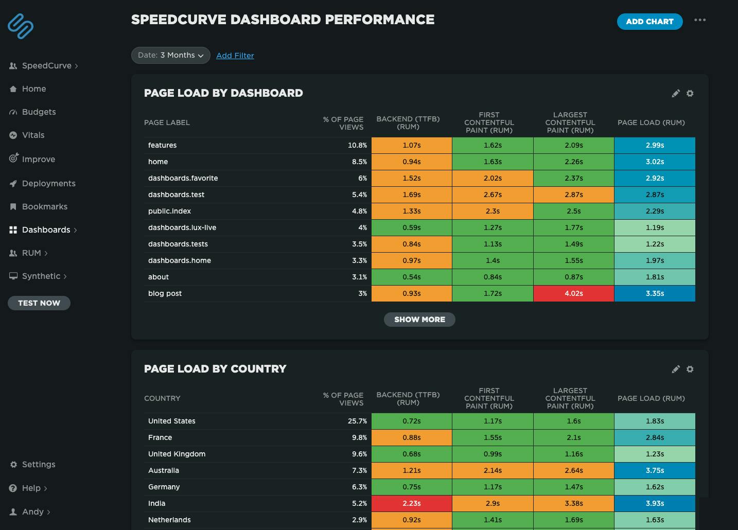
Heatmaps are a powerful way to get an instant overview of where performance issues are hiding across your site. They let you break down your performance metrics (including custom metrics) by different dimensions — including page label, browser, location, and device type — so you can easily spot anomalies and patterns in your web performance data.
For example, you might notice that a specific browser or region consistently loads your site more slowly, or that certain pages are lagging behind the rest. Heatmaps make it easy to visualize and spot those differences at a glance, helping you pinpoint where to focus your optimization efforts.
Smarter insights, less noise
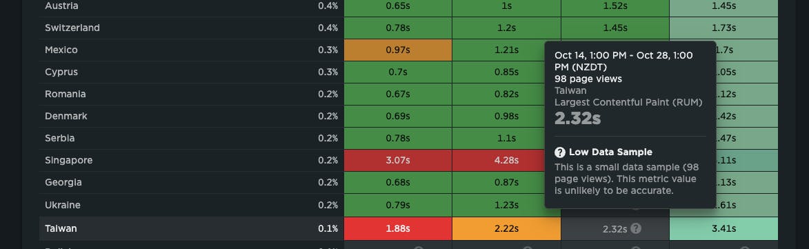
To make sure you’re not chasing false signals, we’ve also added our new low-sample data warning for RUM. This flags when data might be misleading because of a small sample size — helping you focus on real issues, not red herrings.
Start exploring today
We’re really excited about this release and hope you find it as useful (and satisfying!) as we do.
If you're a SpeedCurve user – Log in today and check out your new heatmap chart type in your Favorites dashboards. We think it's a big step forward in identifying where performance issues are in your site.
If you're not yet a SpeedCurve user – Sign up for a free trial then navigate to your Favorites dashboard and add your first chart. Or even better, set up real user monitoring, then navigate to your Favorites dashboard.
Questions? We'd love to hear from you! Send us a note at support@speedcurve.com.