SpeedCurve is now part of the Embrace family! There are no changes to how you use our products. Our founder Mark shares what this means...
Chart sizes and TV Mode

SpeedCurve now has different chart sizes and a special TV Mode to help you build a performance culture in your organisation.
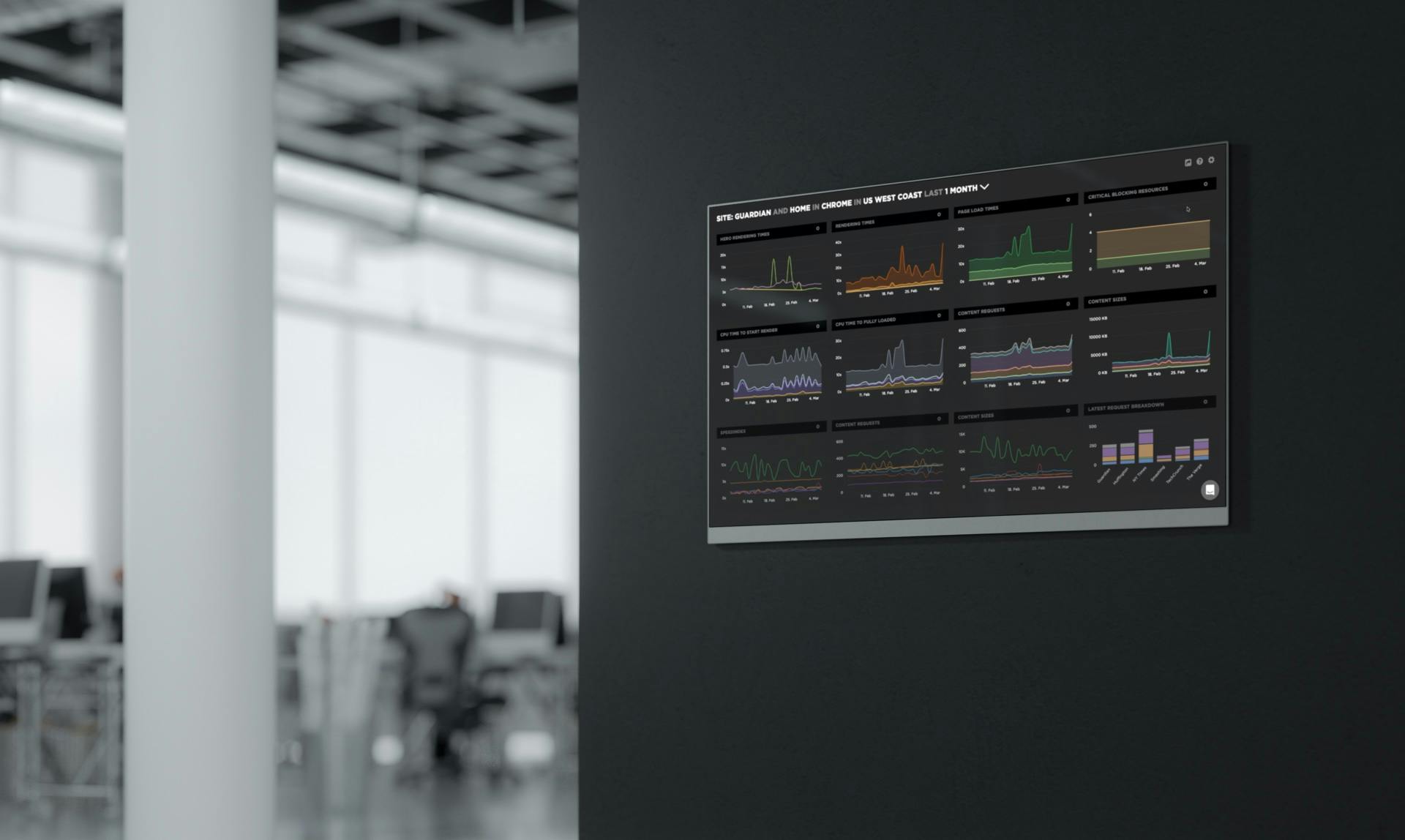
From its inception, SpeedCurve has always been designed to look awesome on the big screen. We see SpeedCurve as not just a tool for debugging web performance, but as a communication tool to rally your organisation around the importance of web performance. SpeedCurve helps bring together the development, design, and management teams, and gets everyone focused on turning your product into a fast and joyous experience for your users.
By popular demand: Multiple Favorites dashboards!

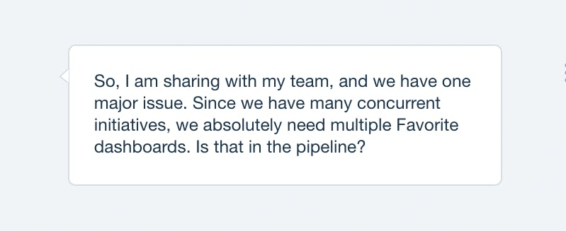
Rolling out new features is always a blast, and it's extra rewarding when the new feature is a response to a customer request. We've had many conversations with SpeedCurve users who've told us that multiple Favorite dashboards would be a huge benefit for their teams.
Today, we're very excited to announce that multiple Favorites dashboards are now available. Here's why you need them and how to create them.
Improved Favorites
We've improved the "Favorites" dashboard which now lets you build your own charts which:
- Combine synthetic tests and LUX (real user monitoring) in one chart.
- Choose average, median, or 95th percentile.
- Create charts that have multiple metrics.
- Select multiple values for a filter, eg, browser = Chrome or Firefox, country = UK or US.
- Compare A/B tests in a single chart.
Here's a walkthrough showing you some of the new features:
Build your own charts
We put a lot of thought into curating a thematic set of dashboards that help you understand the performance of your front-end, but sometimes you just want to play with the data yourself and slice 'n' dice the data in all sorts of different ways. We've added a new "Favorites" dashboard that lets you do just that. You can explore the data and build your own charts, then rearrange them and share them with the team to help demonstrate the performance issues you're focused on right now.
Here's a walkthrough showing you how to slice the available data in different ways:
