SpeedCurve is now part of the Embrace family! There are no changes to how you use our products. Our founder Mark shares what this means...
Measuring the User Experience

SpeedCurve’s sweet spot is the intersection of design and performance - where the user experience lives. Other monitoring services focus on network behavior and the mechanics of the browser. Yet users rarely complain that “the DNS lookups are too slow” or “the load event fired late”. Instead, users get frustrated when they have to wait for the content they care about to appear on the screen.
The key to a good user experience is quickly delivering the critical content.
More emulated devices and improved flexibility

SpeedCurve users may have noticed some changes recently. At the beginning of March we released a major redesign of our Settings UI that gives users more flexibility to get the exact test results they want. The two biggest changes were to the way we emulate devices and to allow different testing configurations for different sites.
Critical Blocking Resources
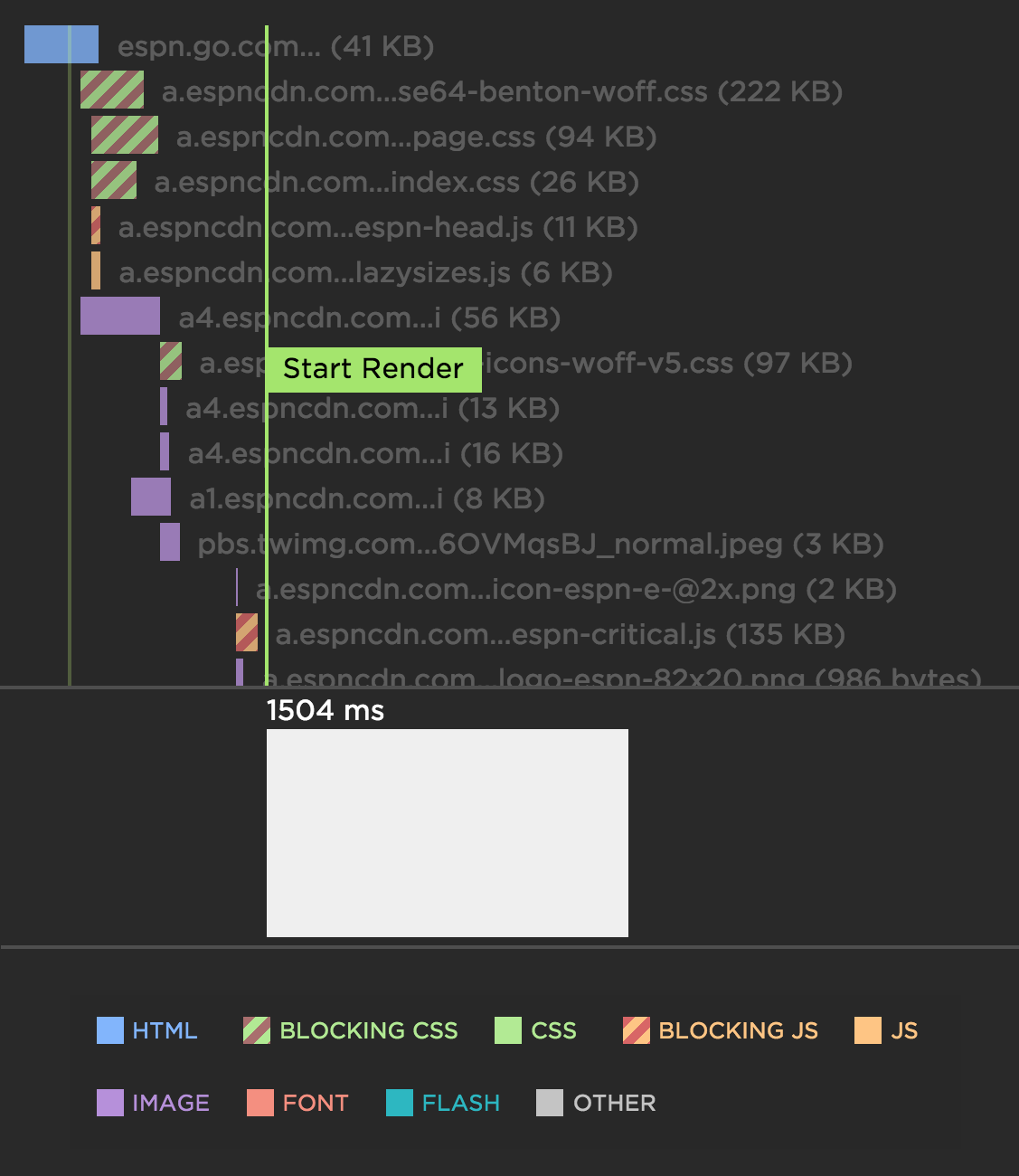
At SpeedCurve, we focus on metrics that capture the user experience. A big part of the user experience is when content actually appears in front of the user. Since stylesheets and synchronous scripts are the culprits when it comes to blocking rendering, we've rolled out some new metrics that focus on these critical blocking resources.
The most helpful innovation we made is to highlight the critical blocking stylesheets and synchronous scripts in our waterfall charts. In the following example waterfall chart for ESPN, notice how the critical stylesheets (green) and synchronous scripts (orange) have a red hash pattern. Not surprisingly, the Start Render metric is delayed until after the last of these critical blocking resources is done loading. The "scrubber" at the bottom of the waterfall (showing the screenshot at that point in time) confirms that rendering has been blocked up to this point. Explore an example of a interactive waterfall chart.
User Timing and custom metrics
If you want to improve performance, you must start by measuring performance. But what should you measure?
Across the performance industry, the metric that's used the most is "page load time" (i.e, "window.onload" or "document complete"). Page load time was pretty good at approximating the user experience in the days of Web 1.0 when pages were simpler and each user action loaded a new web page (multi-page websites). In the days of Web 2.0 and single-page apps, page load time no longer correlates well with what the user sees. A great illustration is found by comparing Gmail to Amazon.
In the last few years some better alternatives to page load time have gained popularity, such as start render time and Speed Index. But these metrics suffer from the same major drawback as page load time: they are ignorant of what content the user is most interested in on the page.
Any performance metric that values all the content the same is not a good metric.
Users don't give equal value to everything in the page. Instead, users typically focus on one or more critical design elements in the page, such as a product image or navbar. In searching for a good performance metric, ideally we would find one that measures how long the user waits before seeing this critical content. Since browsers don't know which content is the most important, it's necessary for website owners to put these performance metrics in place. The way to do this is to create custom metrics with User Timing.
Performance budgets in action
Performance budgets are an important tool for ensuring your site is delivering a great user experience. Steve first experienced performance budgets while Head Performance Engineer at Google. The practice of using budgets to track performance took off with Tim Kadlec's blog post Setting a Performance Budget. The idea is to identify your performance goals and track the metrics that help you achieve your goals.
At SpeedCurve, we give performance budgets first-class status by tracking them in the Site dashboard. Here's an example of tracking a budget for image size.
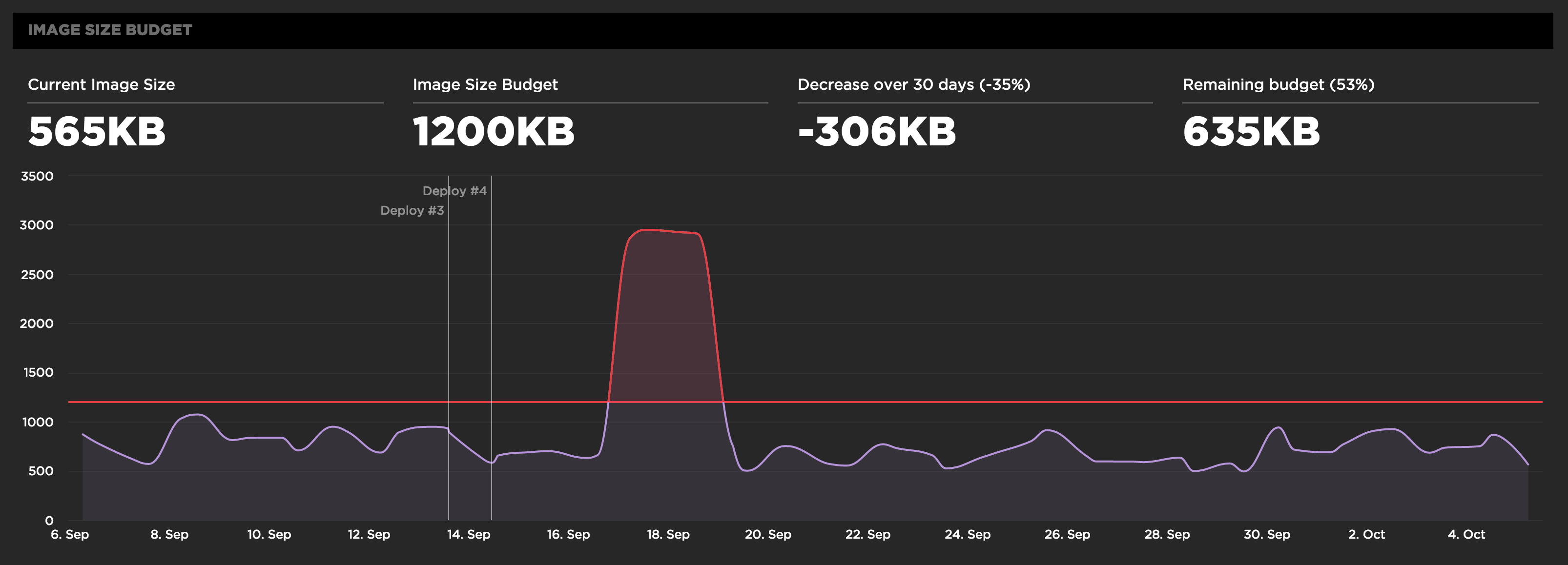
Before setting your performance budgets, you first have to be monitoring your user experience. Only then can you set budgets and thresholds for improving your baseline user experience. This also allows you to quantify the improvements you're making and share success stories across the organization like "We just improved start render by 32% by reducing image requests to half the budgeted amount".
Visual diffs on every deploy
SpeedCurve now provides a visual diff of every deploy. A full resolution PNG is captured for each URL and each pixel is diffed with the previous deploy allowing you to easily spot any visual changes you may or may not have expected.
The key to practising safe continuous deployment is to have a robust set of tools that give you immediate feedback on how your code has changed between deploys and its effect on the user experience. It's often very hard to spot all the visual changes in each deploy, especially in fast moving teams where a lot of the focus is on unit tests and other automated pass/fail systems. Visual diffs bring an increased level of tracking and confidence when you're able to compare any two deploys and see exactly what has visually changed.

We do a visual diff every time you click "Test Now" on the Deploy dashboard or you use the SpeedCurve API to trigger a round of deploy testing. Integrating with the Deploy API is super easy and provides a robust set of metrics and before/after screenshots, visual diffs, waterfall charts, filmstrips and videos for each deploy. You can then compare any two deploys to see exactly what's changed over time.
Multiple teams and multiple users
This week we added support for organizations with multiple teams and multiple users.
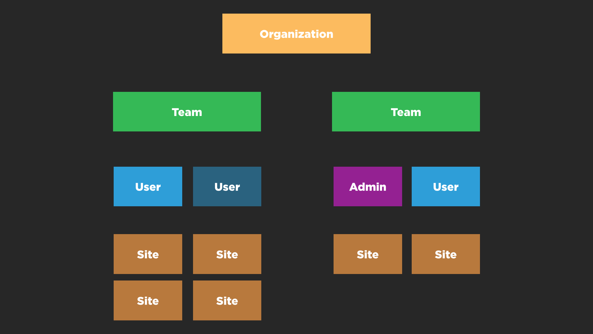
One of the toughest challenges was simply working out what to call the different layers within the SpeedCurve app. Developers can spend years buried inside a data model but at the end of the day the UI has to be intuitive and easy to use! I hope we’ve done that and if not we’d love your feedback.
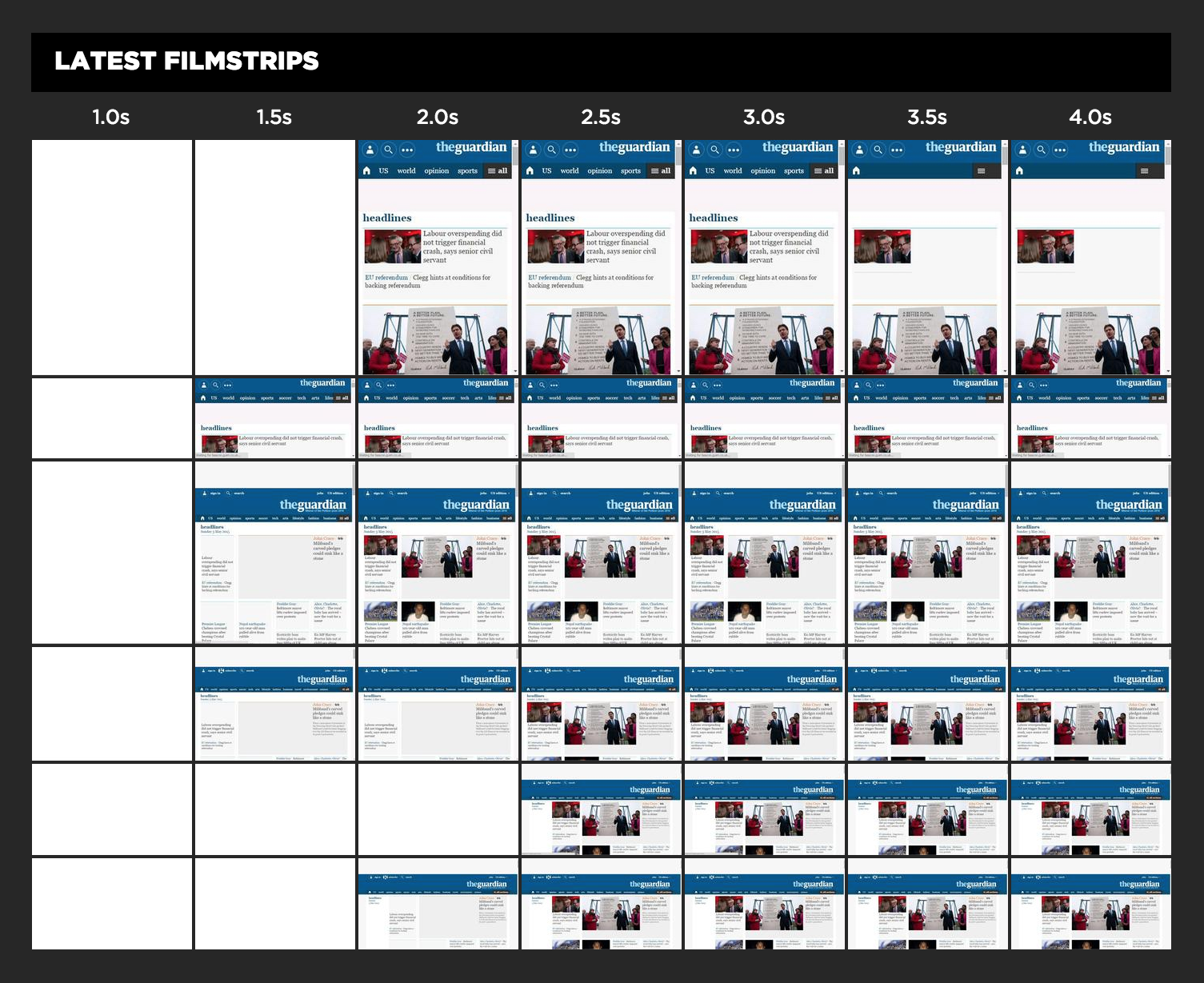
UX Focus for Waterfalls and Third Parties
At SpeedCurve, we want to help designers and developers have better insight into the user experience they're delivering. For websites, this means understanding when the critical parts of the page render and what might be blocking rendering.
We've redesigned our waterfall chart to really highlight the relationship between the assets on the page and their affect on the user experience. Now as you move you mouse over the waterfall chart we show you exactly what a user is seeing at that millsecond while the page loads. This makes it much easier to identify any Javascript or CSS that might be blocking the page from rendering. I recently used this new combined waterfall and filmstrip view to identify a common issue with hero images being delayed.
The language and metrics of UX evolve at Velocity 2015
Originally published on the O'Reilly Radar Blog
I’ve attended four O’Reilly Velocity conferences over the last year, and I was struck by a notable shift in the conversations at Velocity in Santa Clara, Calif. Many speakers and attendees have started to change their language and describe the experience of their websites and apps from the user’s perspective.
The balance has shifted from just talking about how fast or reliable a particular system is to the overall experience a user has when they interact with and experience a product. Many people are now looking at themselves from the outside in and developing more empathy for their users. The words “user” and “user experience” were mentioned again and again by speakers.
Here are recent talks from Velocity and other events that highlight this shift to UX concerns.
Responsive Design Dashboard
The dramatic growth of mobile traffic has created an urgency for websites to adapt to different screen sizes. Responsive design is the preferred technique for making web content adapt to the device on which it's viewed. This approach ensures that the appropriate content is rendered in an appropriate way on phones, tables, laptops, and any other screen being used.
A corollary to responsive design is the need for performance. Delivering content that's customized for a particular device isn't enough if its delivery is slow and frustrating. Indeed, last week Google announced that websites need to deliver their design appropriately and quickly on mobile devices or they will be demoted in Google's search results.
How can you know if your website matches these standards for adaptive content and speed? SpeedCurve's Responsive Design Dashboard answers both questions in one view.