SpeedCurve is now part of the Embrace family! There are no changes to how you use our products. Our founder Mark shares what this means...
Performance tips for building responsive sites

The following article was originally published in the 2013 Performance Calendar. There's 31 great articles to explore in the calendar including Steve Souders's browser wishlist and Tim Kadlec's take on what it takes to create a performance culture.
----
Responsive Web Design (RWD) is now a well established technique yet it’s adoption is still surprisingly low. Guy Podjarny’s recent research shows that only one in eight websites is responsive. Often when responsive sites are designed the approach is primarily from a visual design perspective and teams struggle with the complexity of changing design and navigation patterns let alone any performance concerns, which become secondary. This can lead to serving the same sized assets to all browser widths resulting in a responsive site that is visually scaled but not performance optimised. On average responsive sites at 320 pixels wide are only 8% small than at 1600 pixels wide. Unsurprisingly these performance concerns and a lack of established techniques have made some hesitate when considering RWD adoption.
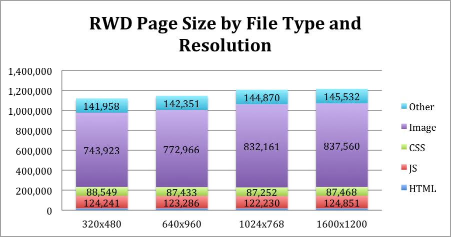
Responsive page sizes across different screen resolutions. Source: Guy Podjarny
Easily add WebP, SVG and Retina responsive images to your site
A lot of sites are now using responsive design techniques to create great user experiences across mobile, tablet and desktop. Unfortunately images are often just set to 100% width with the same large image being delivered to all browsers and platforms. Picturefill was an important step in delivering responsive images and David Newton's fork now extends that approach to include WebP and SVG images in the mix you send down the pipe.
