Performance tips for building responsive sites

The following article was originally published in the 2013 Performance Calendar. There's 31 great articles to explore in the calendar including Steve Souders's browser wishlist and Tim Kadlec's take on what it takes to create a performance culture.
----
Responsive Web Design (RWD) is now a well established technique yet it’s adoption is still surprisingly low. Guy Podjarny’s recent research shows that only one in eight websites is responsive. Often when responsive sites are designed the approach is primarily from a visual design perspective and teams struggle with the complexity of changing design and navigation patterns let alone any performance concerns, which become secondary. This can lead to serving the same sized assets to all browser widths resulting in a responsive site that is visually scaled but not performance optimised. On average responsive sites at 320 pixels wide are only 8% small than at 1600 pixels wide. Unsurprisingly these performance concerns and a lack of established techniques have made some hesitate when considering RWD adoption.
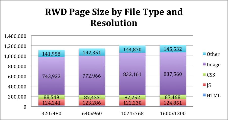
Responsive page sizes across different screen resolutions. Source: Guy Podjarny
However, we do now have a full set of techniques to effectively deliver highly performative sites that not only visually scale across devices but also deliver code and assets tuned to the width of a device. Sites need to be built utilising these techniques from a mobile first (and performance first) perspective.
Here are three key techniques that you can use to optimise performance using mobile as your starting point. Let’s tackle these in order of the page load…
Inline the initial experience (within 14k if possible)
First impressions do count. While it’s easy to throw jQuery, a framework like Bootstrap/Foundation and web fonts on a page you trade ease of use for performance. It’s increasingly a mobile world and your main aim should be to engage users as quickly as possible.
Ilya Grigorik’s recent Velocity conference presentation explored the browser's critical rendering path and highlighted exactly what it takes to deliver a mobile page within one second. Surprisingly you’ve got just one HTTP request and only 14k of HTML to play with to get content in front of users. One of the only ways to achieve this is by inlining any “above the fold” CSS and JS required to render the first screen of content. Recently Grigorik has been championing this approach and the Google Pagespeed Insight rules have been updated to reflect this best practice with recommendations on how to reduce the size of "above the fold" content.
Control and branch the loading of CSS and JS
There are plenty of automated front-end optimisation tools available like modpagespeed and CloudFlare but being a bit old-school and craft-orientated I prefer the ability to control the load order and optimise not only the individual assets but their sequencing as well.
Often responsive sites combine the desktop and mobile CSS and JS into one set of files but this results in delivering unnecessary code to the width you’re viewing. You can optimise what’s delivered by using javascript to detect the width of the page and then request specific styles and javascript appropriate to that width. There might even be whole features or different navigation patterns introduced or removed at different widths to optimize the size of the user experience.
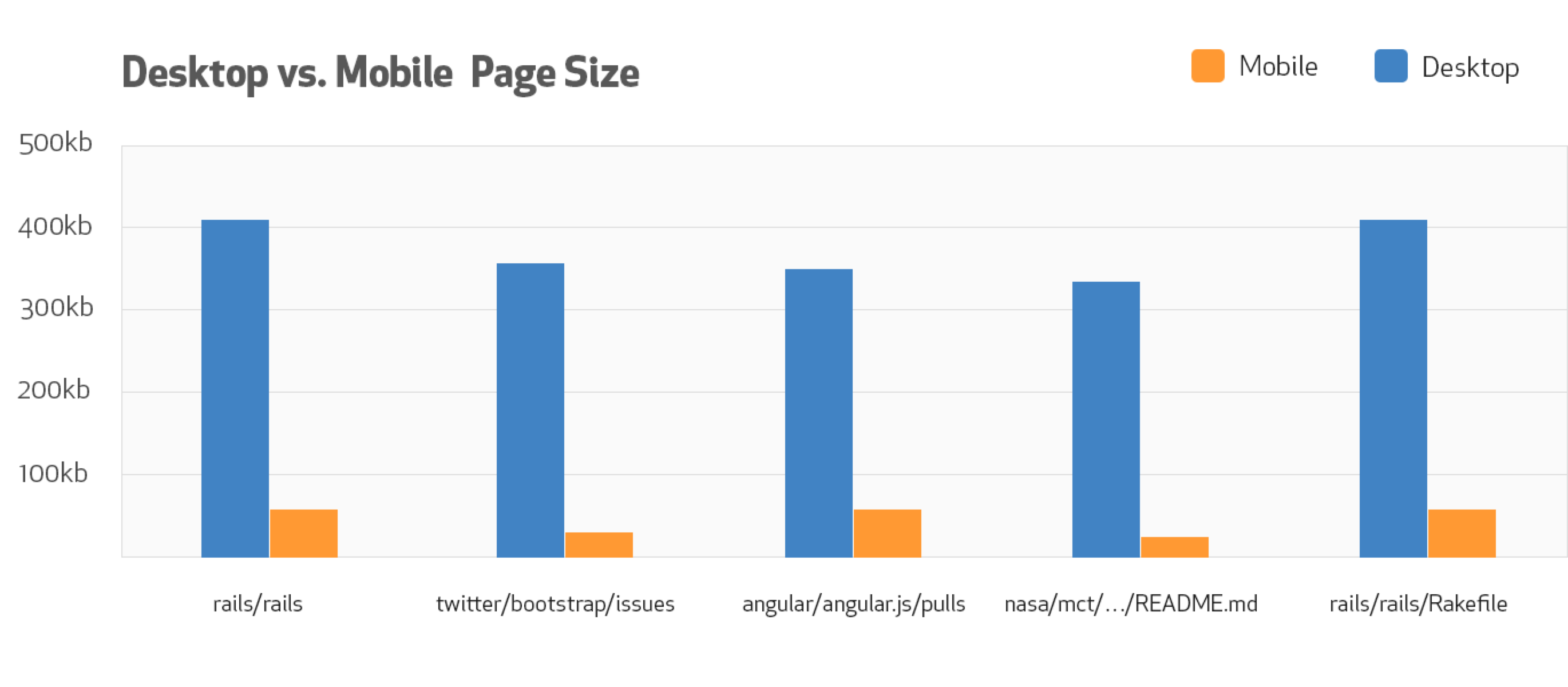
Github write mobile specific CSS and JS resulting in much smaller and faster pages. Source: Github Blog
Here’s a few libraries you can use to enable the decision making and branching of assets as the page loads: eCSSential, Interchange, and good old Modernizer.
Shrink and art direct your images
Images often make up the largest set of assets on a page. There are two key considerations here - serving the right image to the right width and being able to art direct the image for smaller screen sizes, i.e. crop into the focal point of an image for smaller widths.
If possible eliminate an image altogether by using an icon font for icons and small graphics. Alternatively use SVG images for logos and other simple graphics. Both these techniques use vector data rather than pixels so they are small in file size and scale efficiently across all sizes including high resolution retina screens.
However when it comes to photos you need to stick with pixel based formats and this requires switching between different sized images to save bandwidth. Picturefill is an interim polyfill for responsive images allowing you to curate which image gets served to which width.
Often image generation can be a real chore and rather than manually outputting images in different formats and sizes your backend or CMS should be doing the hard work for you. CDN Connect is a promising new service that allows you to transform a single high quality image into many different formats and has an impressive range of methods to crop, filter and manipulate images. All CMS's should be offering this level of image manipulation and caching.
While you’re outputting your images to different formats consider adding WebP into the mix. It’s a new image format developed by Google that’s 30-40% smaller than a jpeg. Currently WebP is only supported in Chrome and Firefox are considering adding support. David Newton has created a fork of Picturefill that adds WebP and SVG detection so you can not only deliver the right size but the smallest format to different browsers.
Case study: the new responsive Guardian site
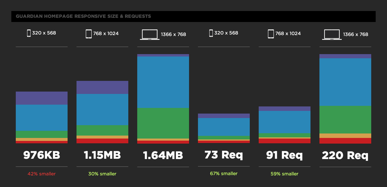
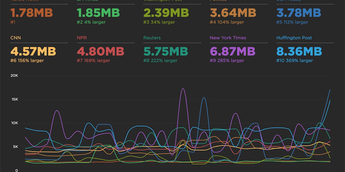
Comparison of page size and assets types across different responsive widths. Source: SpeedCurve
A great example using the above techniques is the new Guardian newspaper website, currently in alpha. On average it’s start render time is 3 seconds faster than the current Guardian site and the mobile width inlines CSS and is 42% smaller overall, leading to a 1 second saving over the desktop width.
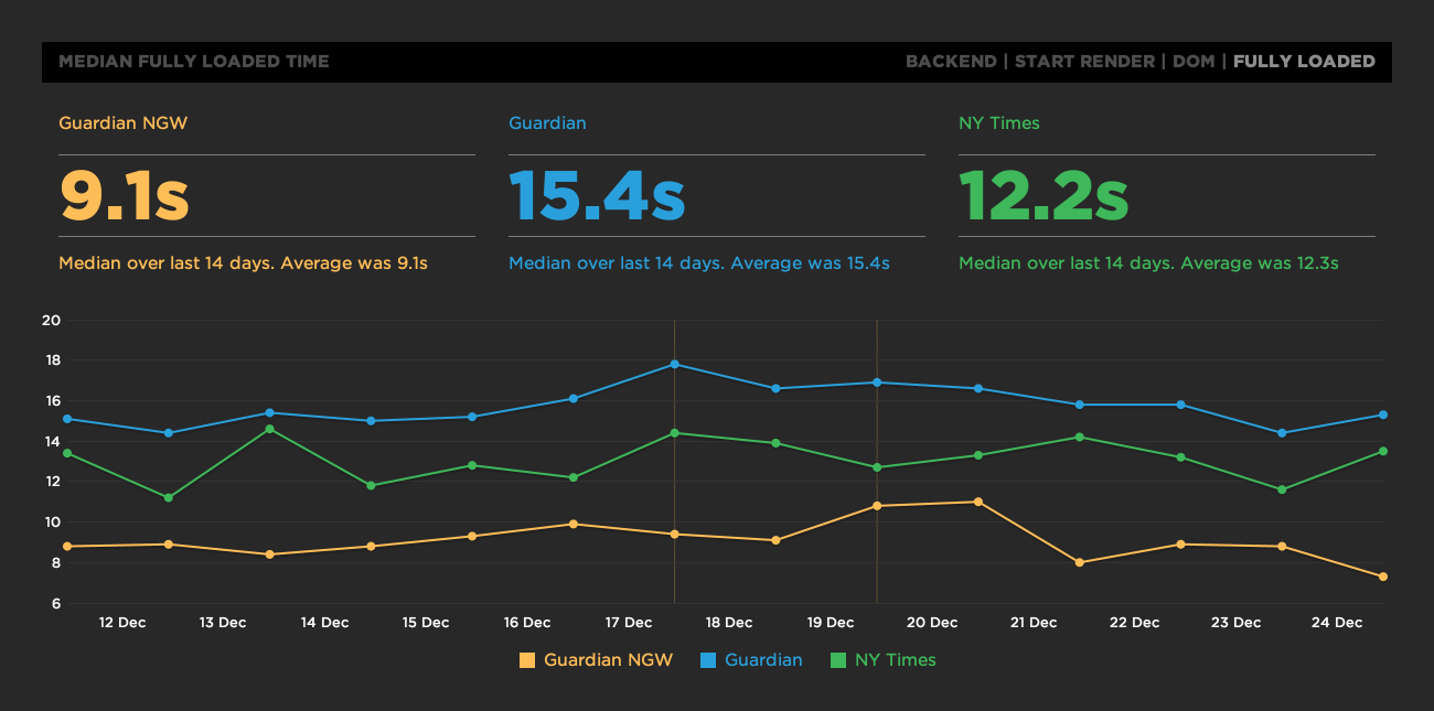
Comparison of full loaded time for new Guardian responsive site (Guardian NGW) vs current Guardian site and the New York Times. Source: SpeedCurve
The Guardian have released their responsive code base on Github so you can easily dig through their development setup and see these techniques in action.
Establish a performance baseline and then go performance first
Performance optimisations like these are often invisible and it can be hard to demonstrate a return on investment without clear metrics in place. Some of these techniques can require a significant amount of work and it’s critical you establish a performance baseline first and then experiment with the techniques above to clearly show the improvements in user experience. There are great tools available to monitor the actual in browser speed and benchmark your site against others.
Putting all these techniques together you can dramatically improve the performance of your responsive site. There’s really no excuse for serving the same large sized assets across all browser widths. Make your responsive website respond not only to changing design patterns but to the browser environment it’s being served into. Go mobile first and performance first when designing and coding your next responsive website!
Thanks to Guypo for his ongoing responsive research and Patrick Hamann from The Guardian for letting me share their SpeedCurve dashboard.