SpeedCurve is now part of the Embrace family! There are no changes to how you use our products. Our founder Mark shares what this means...
More emulated devices and improved flexibility

SpeedCurve users may have noticed some changes recently. At the beginning of March we released a major redesign of our Settings UI that gives users more flexibility to get the exact test results they want. The two biggest changes were to the way we emulate devices and to allow different testing configurations for different sites.
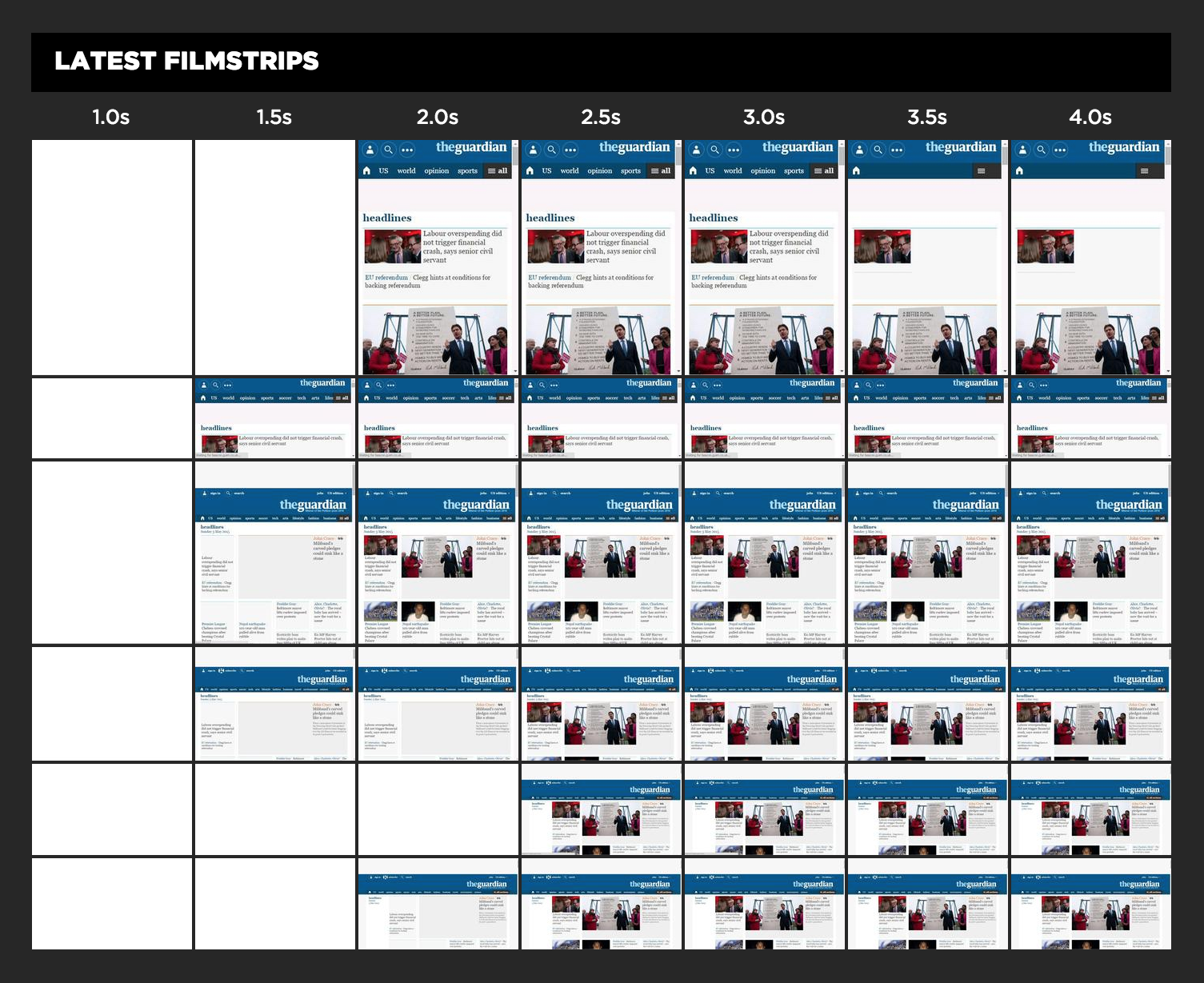
Responsive Design Dashboard

The dramatic growth of mobile traffic has created an urgency for websites to adapt to different screen sizes. Responsive design is the preferred technique for making web content adapt to the device on which it's viewed. This approach ensures that the appropriate content is rendered in an appropriate way on phones, tables, laptops, and any other screen being used.
A corollary to responsive design is the need for performance. Delivering content that's customized for a particular device isn't enough if its delivery is slow and frustrating. Indeed, last week Google announced that websites need to deliver their design appropriately and quickly on mobile devices or they will be demoted in Google's search results.
How can you know if your website matches these standards for adaptive content and speed? SpeedCurve's Responsive Design Dashboard answers both questions in one view.