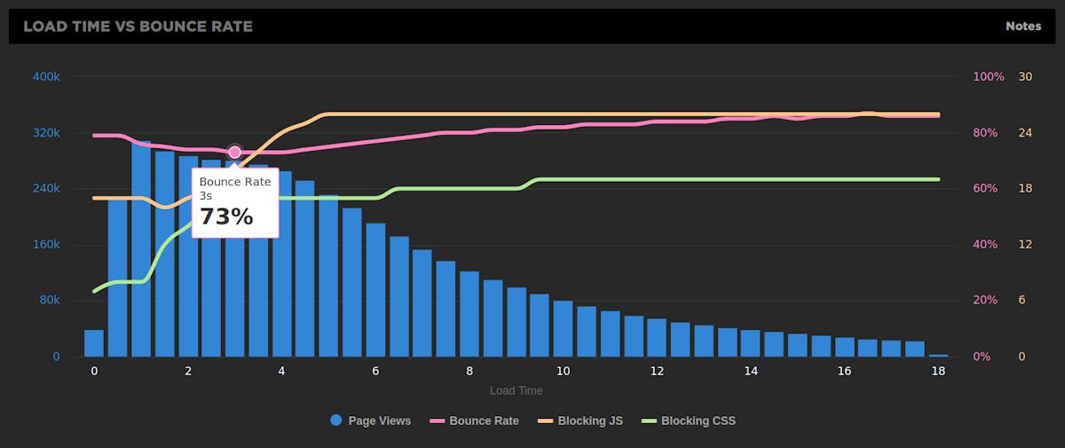
Engagement charts: See correlations between performance and user engagement

One of the best – and worst – things about real user monitoring is that it gives you unparalleled access to massive amounts of user data. The problem is when all this data leads to data indigestion. How do you know where to begin? And how do you know what to leave out in order to present a clear case for performance?
At SpeedCurve, we care about more than just showing you all your data. We want to show you the most important data. And we want to make it easy for you to share that data with people throughout your organization. That’s why we’re excited about the newest addition to our family of visualizations: engagement charts.