SpeedCurve is now part of the Embrace family! There are no changes to how you use our products. Our founder Mark shares what this means...
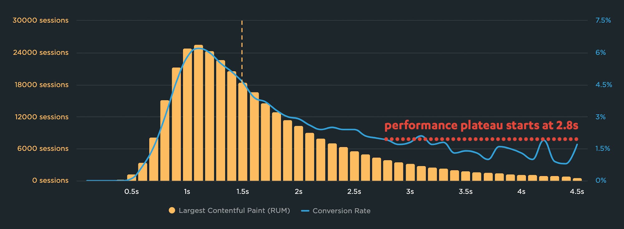
Why you need to know your site's performance plateau (and how to find it)

Have you ever wondered why your site got faster, but your business and user engagement metrics didn't improve? The answer might lie on the performance plateau.
Have you ever asked yourself these questions?
"I made my pages faster, but my business and user engagement metrics didn't change. WHY???"
"How do I know how fast my site should be?"
"How can I demonstrate the business value of page speed to people in my organization?"
The answers might lie with identifying and understanding the performance plateau for your site.
Performance Hero: Alex Russell

Our newest performance hero is passionate, provocative, and unapologetically honest. While he's a true champion for web performance, his impact can be measured more broadly across the web. Join us in celebrating Alex Russell!

Alex Russell has been a strong voice in the web community for as long as I can remember. He's currently a Partner PM at Microsoft, working on Edge. Before that, he spent several years working at Google on Chrome, web standards, and much more.
Not only is Alex an accomplished engineer, he's also an amazing speaker and writer. I last saw Alex on stage at performance.now() in November, where he delivered this inspiring talk that got a lot of attendees talking.
Correlation charts: Connect the dots between site speed and business success
If you could measure the impact of site speed on your business, how valuable would that be for you? Say hello to correlation charts – your new best friend.
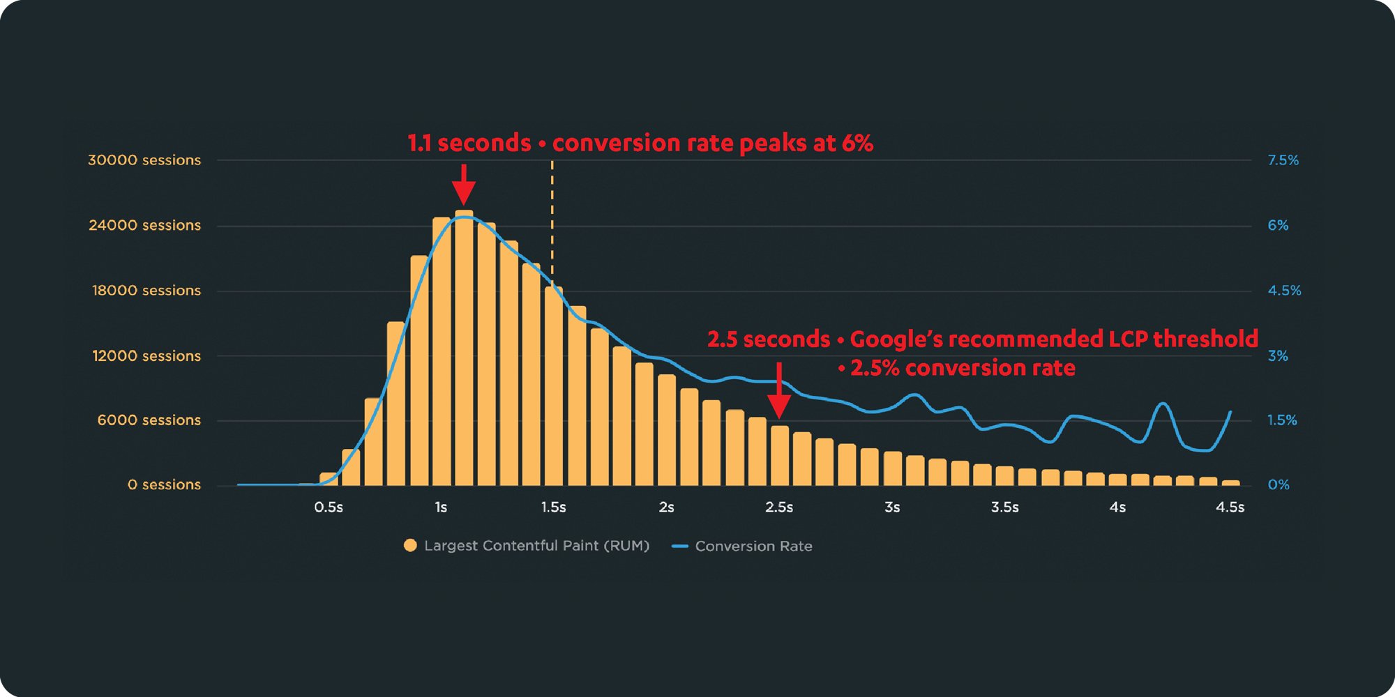
Here's the truth: The business folks in your organization probably don't care about page speed metrics. But that doesn't mean they don't care about page speed. It just means you need to talk with them using metrics they already care about – such as conversion rate, revenue, and bounce rate.
That's why correlation charts are your new best friend.
Downtime vs slowtime: Which costs you more?
Comparing site outages to page slowdowns is like comparing a tire blowout to a slow leak. One is big and dramatic. The other is quiet and insidious. Either way, you end up stranded on the side of the road.

Downtime is horrifying for any company that uses the web as a vital part of its business (which is to say, most companies). Some of you may remember the Amazon outage of 2013, when the retail behemoth went down for 40 minutes. The incident made headlines, largely because those 40 minutes were estimated to have cost the company $5 million in lost sales.
Downtime makes headlines:
- 2015 – 12-hour Apple outage cost the company $25 million
- 2016 – 5-hour outage caused an estimated loss of $150 million for Delta Airlines
- 2019 – 14-hour outage cost Facebook an estimated $90 million
It's easy to see why these stories capture our attention. These are big numbers! No company wants to think about losing millions in revenue due to an outage.
Page slowdowns can cause as much damage as downtime
While Amazon and other big players take pains to avoid outages, these companies also go to great effort to manage the day-to-day performance – in terms of page speed and user experience – of their sites. That’s because these companies know that page slowdowns can cause at least as much damage as downtime.
NEW! Synthetic test agent updates: Chrome, Firefox and Lighthouse


This month, we've made some updates to our synthetic testing agents. In addition to upgrading the underlying operating system, we've added support for:
- Lighthouse 12.3.0 (previously 10.4.0)
- Chrome 133 (previously 126)
- Firefox 135 (previously 128)
Performance Hero: Sergey Chernyshev
We often hear how special, generous, and supportive the web performance community is. This didn't happen overnight. This month, we're excited to recognize someone who has been a huge part of creating the community culture we enjoy today: Sergey Chernyshev.

Whether answering questions on social media, helping someone with a proposal for a conference talk, or simply being welcoming and kind to newcomers, webperf folks are some of the most generous people you could ever hope to find. There are so many folks out there who are organizing, educating, evangelizing, and building great tooling in an effort to improve user experience on the web. Sergey has been doing all of those things earlier and longer than almost everyone!
Six things that slow down your site's UX (and why you have no control over them)
Have you ever looked at the page speed metrics – such as Start Render and Largest Contentful Paint – for your site in both your synthetic and real user monitoring tools and wondered "Why are these numbers so different?"

Photo by Freepik
Part of the answer is this: You have a lot of control over the design and code for the pages on your site, plus a decent amount of control over the first and middle mile of the network your pages travel over. But when it comes to the last mile – or more specifically, the last few feet – matters are no longer in your hands.
Your synthetic testing tool shows you how your pages perform in a clean lab environment, using variables – such as browser, connection type, even CPU power – that you've selected.
Your real user monitoring (RUM) tool shows you how your pages perform out in the real world, where they're affected by a myriad of variables that are completely outside your control.
In this post we'll review a handful of those performance-leaching culprits that are outside your control – and that can add precious seconds to the amount of time it takes for your pages to render for your users. Then we'll talk about how to use your monitoring tools to understand how your real people experience your site.
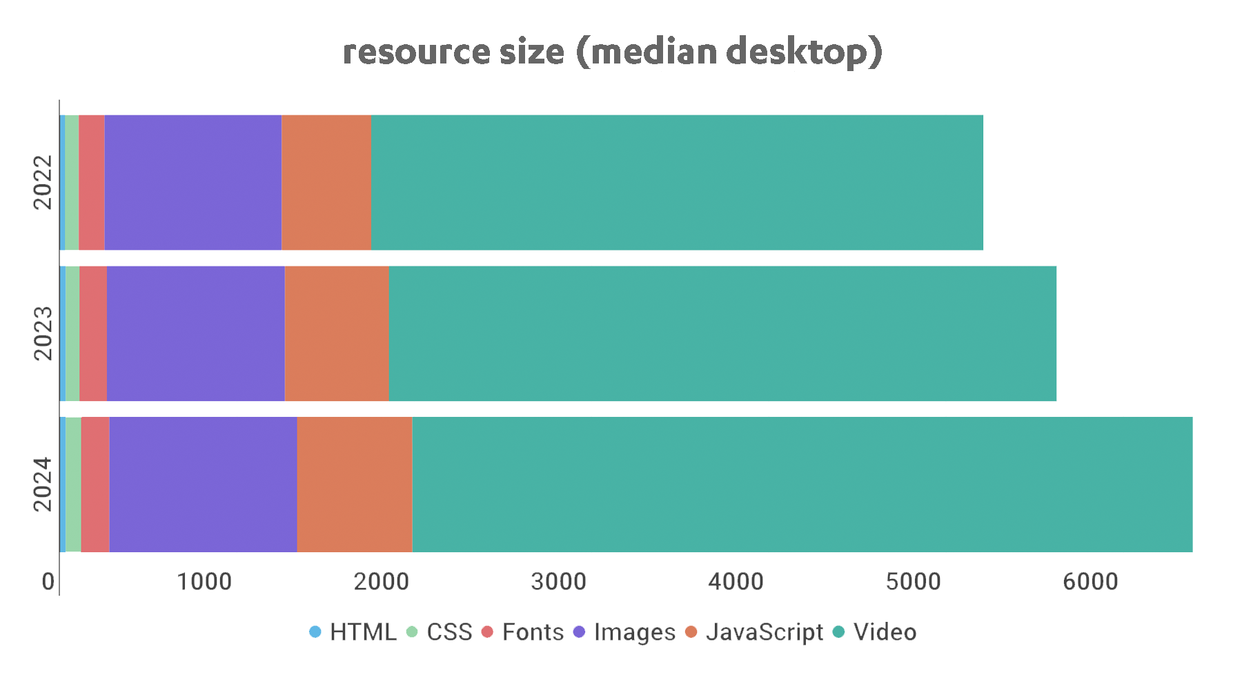
Page bloat update: How does ever-increasing page size affect your business and your users?
The median web page is 8% bigger than it was just one year ago. How does this affect your page speed, your Core Web Vitals, your search rank, your business, and most important – your users? Keep scrolling for the latest trends and analysis.

For almost fifteen years, I've been writing about page bloat, its impact on site speed, and ultimately how it affects your users and your business. You might think this topic would be exhausted by now, but every year I learn new things – beyond the overarching fact that pages keep getting bigger and more complex, as you can see in this chart, using data from the HTTP Archive:
In this post, we'll cover:
- How much pages have grown over the past year
- How page bloat hurts your business and – at the heart of everything – your users
- How page bloat affects Google's Core Web Vitals (and therefore SEO)
- If it's possible to have large pages that still deliver a good user experience
- Page size targets
- How to track page size and complexity
- How to fight regressions
Performance Hero: Annie Sullivan
Let's kick off the new year by celebrating someone who has not just had a huge impact on web performance over the past few years, but who has even more exciting stuff in the works for the future: Annie Sullivan!
 Annie leads the Chrome Speed Metrics team at Google, which has arguably had the most significant impact on web performance of the past decade. We've gotten to know Annie through frequent discussions, feedback sessions, and hallway talks at various events. Most recently we caught her closing keynote at performance.now() in November.
Speaking from experience, driving change at scale from within a large organization can be very challenging. Annie and her team navigate this arduous task with true passion for web performance and for improving the user experience. Read on for a great recap of a recent discussion with Annie and just a few of the highlights that make her a true performance hero.
Our 10 most popular web performance articles of 2024
We love writing articles and blog posts that help folks solve real web performance and UX problems. Here are the ones you loved most in 2024. (The number one item may surprise you!)

Some of these articles come from our recently published Web Performance Guide – a collection of evergreen how-to resources (written by actual humans!) that will help you master website monitoring, analytics, and diagnostics. The rest come from this blog, where we tend to publish industry news and analysis.
Regardless of the source, we hope you find these pieces useful!
