Chart sizes and TV Mode

SpeedCurve now has different chart sizes and a special TV Mode to help you build a performance culture in your organisation.
From its inception, SpeedCurve has always been designed to look awesome on the big screen. We see SpeedCurve as not just a tool for debugging web performance, but as a communication tool to rally your organisation around the importance of web performance. SpeedCurve helps bring together the development, design, and management teams, and gets everyone focused on turning your product into a fast and joyous experience for your users.
Chart sizes
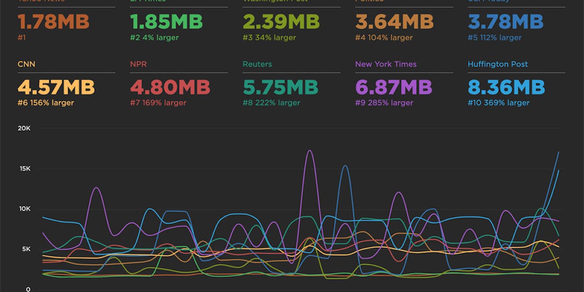
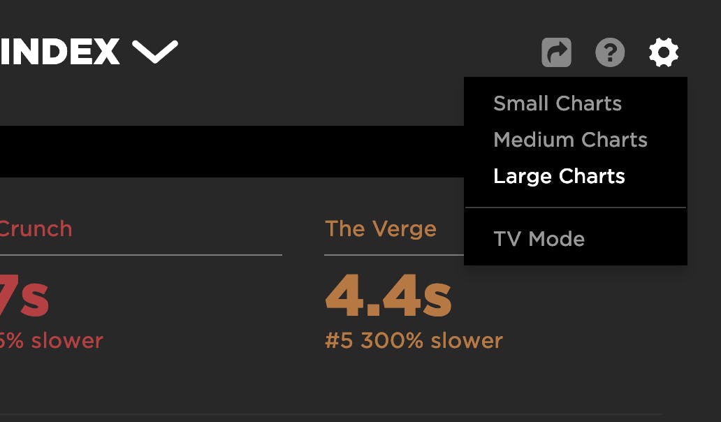
In the dropdown at the top right of each dashboard you can now switch between three different chart sizes. The amount of information shown is tuned based on the chart size. Small charts providing a quick overview of trends in a dashboard, while larger sizes give you a lot more detail and metrics.
TV Mode
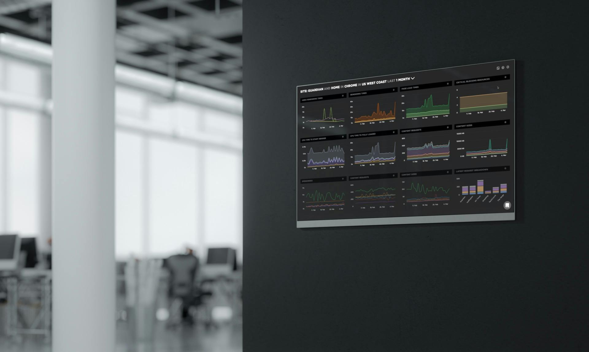
In the same dropdown you can also toggle TV Mode, which turns off the SpeedCurve navigation and lets you focus on just the charts themselves. This is ideal for putting a set of your favourite charts on a monitor in your office. (Pro tip: Many of our enterprise customers do this.) This is a great strategy that can help make your performance budgets visible and build a performance culture in your organisation.
Questions? Feedback?
As always, we welcome your input. We'd also love to learn how your organisation shares performance dashboards and the impact this had had on your business and culture. Let us know in the comments or at support@speedcurve.com.