NEW! A better way to quantify user happiness on your site

The goal of making websites faster is to make users happier. Since user happiness can't be measured directly, we launched the User Happiness metric more than six years ago. We've just released a fresh User Happiness update to reflect changes in web browsers and the overall web performance space!
Back in October 2019, we released our User Happiness metric with the goal of quantifying how a user might have felt while loading a page.
User Happiness is an aggregated metric that combines important user experience signals, gathered with real user monitoring (RUM). To create the User Happiness algorithm, we picked metrics and thresholds that we felt reflected the overall user experience: pages that loaded slowly or lagged during interaction were more likely to make someone feel unhappy, whereas fast and snappy pages would keep users happy.
More than six years later, we've updated User Happiness to reflect changes in web browsers and the overall web performance space. Keep reading to learn more.
Why we updated User Happiness
The web performance landscape was very different when we designed our original User Happiness metric.
Internet Explorer was still one of the most popular browsers. Safari didn't support any rendering-related metrics. Metrics that we take for granted today like Largest Contentful Paint (LCP) and Cumulative Layout Shift (CLS) didn't exist. Neither did Google's Core Web Vitals project!
Some of the metrics that we included in our original formula were cutting edge at the time, but today have fallen out of use:
- First CPU Idle was discontinued in May 2020
- First Input Delay (FID) was discontinued in September 2024
- Long Tasks has more or less been replaced by long animation frame (LoAF) timing
- Start Render (First Paint) is becoming less common, with Largest Contentful Paint (LCP) being preferred
Considering all this, it was obvious to us that User Happiness needed to be modernized.
Our new User Happiness formula takes into account the following metrics:
- Time to First Byte (TTFB)
- DOM Content Loaded
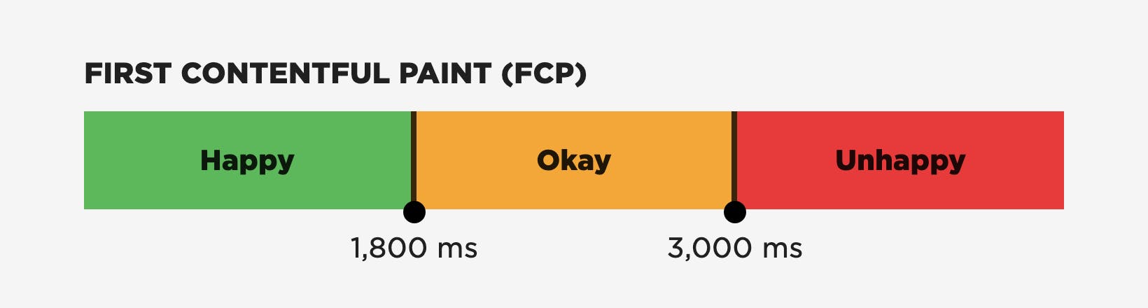
- First Contentful Paint (FCP)
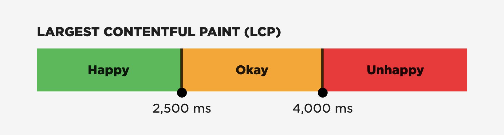
- Largest Contentful Paint (LCP)
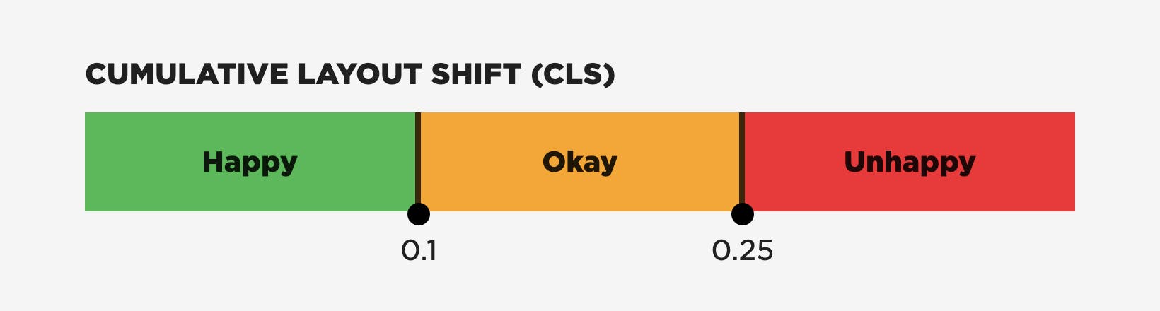
- Cumulative Layout Shift (CLS)
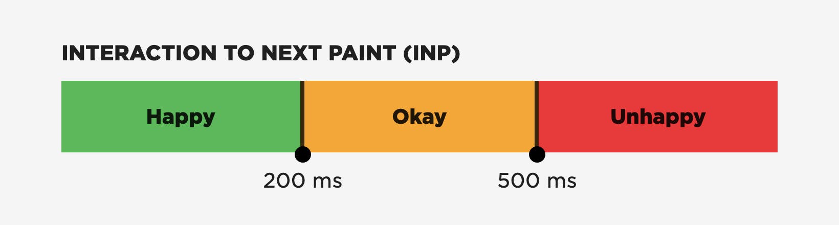
- Interaction to Next Paint (INP)
- Rage Clicks (rapidly clicking the same element in frustration)
- Page Abandonment (leaving the page before the
onloadevent)
The new User Happiness thresholds
Why these metrics and thresholds?
Choosing which metrics should contribute to create a single score or rating is always a interesting exercise. Some metrics are obvious choices, while others provoke long discussions. Examining data tests your assumptions and hypotheses.
After discussion and evaluation, we settled on these criteria for selecting metrics:
- What does the metric actually measure and how does it relate to the user's experience?
- How well known is the metric amongst people who want to measure performance?
- How widely is the metric supported across browsers?
Core Web Vitals (LCP, CLS, and INP)
Even though they're not fully supported across all browsers just yet, the three Core Web Vitals – Largest Contentful Paint (LCP), Interaction to Next Paint (INP), and Cumulative Layout Shift (CLS) – are the obvious metrics to start with as base. They are well known, and with Safari adding LCP and INP support in the near future, they will also be widely supported across browsers.
The next question we considered was "Which parts of the user experience do Core Web Vitals not measure?"
First Contentful Paint (FCP)
We're keen believers that showing content to visitors sooner rather than later is important for a good experience, and we have data to back this view up. First Contentful Paint (FCP) represents this well.
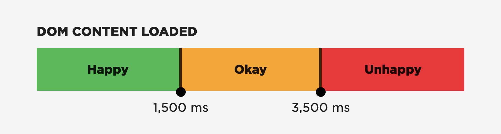
DOMContentLoad (DCL)
There can often be an 'uncanny valley' where a page is visually complete but isn't interactive yet, as deferred scripts don't execute until just before DOMContentLoad (DCL). Executing those scripts early is important.
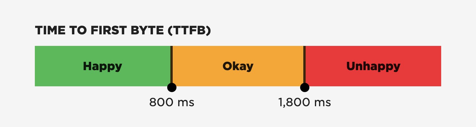
Time to First Byte (TTFB)
Lastly, there's Time to First Byte (TTFB). This probably created more discussion within our team than all the other metrics combined. Ultimately we included it because until the browser has some HTML content, it can't start creating a page. Getting that content to visitors quickly is key to a good user experience.
The thresholds for the timing-based metrics – Core Web Vitals, TTFB, FCP, and DCL – have already been defined by the Chrome team as part of the Chrome User Experience Report. Rather than create a separate set of thresholds, we reused those. (Keep in mind that Google's thresholds are based on aggregate data. You should always look at your own data to determine the best thresholds for your own site.)
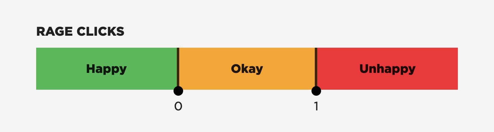
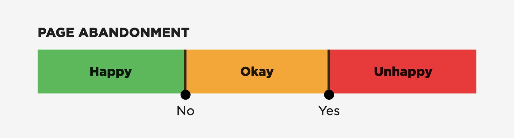
Rage Clicks and Abandonment
We also decided to include some direct signals from the user: Rage Clicks and Abandonment.
- Rage Clicks are when a visitor rapidly clicks or taps on the same spot on the screen. They're a good indicator of frustration.
- Abandonment measures someone leaving a page before it's loaded (load event firing). It can be a hint that a page is loading too slowly.
Future metrics?
We'll probably refine User Happiness again in the future, as there are other areas still to explore. For example...
- Page Reloads — When a visitor reloads a page, it may be a signal they had an unhappy experience.
- Abandonment — This may need refining to use Largest Contentful Paint / Interaction Contentful Paint (ICP) as its end point. On fast retail sites, if a shopper abandons after the product image has been shown, that can be a hint that the product wasn't what they were looking for rather than the page being slow.
How User Happiness is calculated
To calculate an overall rating, each metric is rated Happy / Okay / Unhappy against its own thresholds. Then the ratings are combined.
- If all the metrics are rated as Happy, then the page view is considered to be Happy.
- If any of the the metrics are rated Unhappy, then the view is considered to be Unhappy.
- Anything else is rated Okay.
If a browser doesn't support a metric (e.g., CLS is not currently supported in Safari), then that metric is excluded from the overall calculation.
How to monitor User Happiness
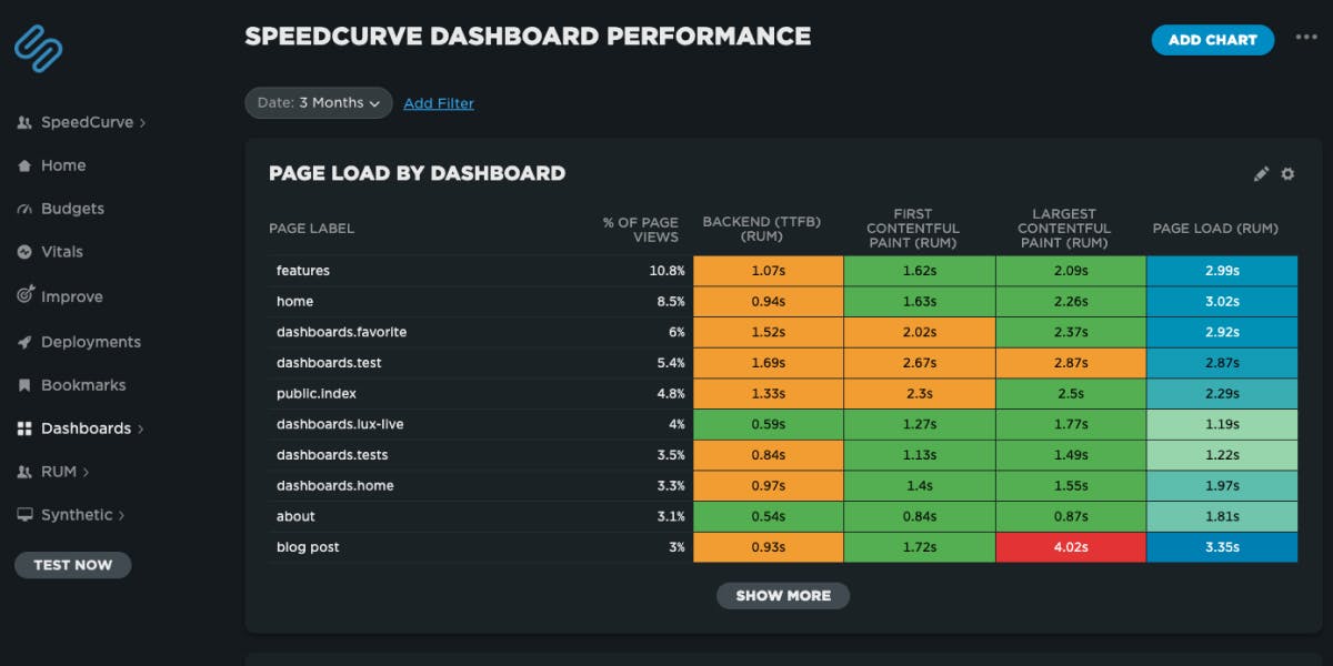
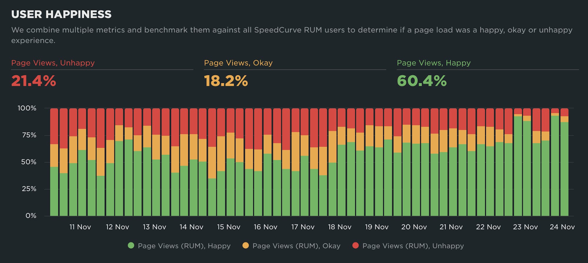
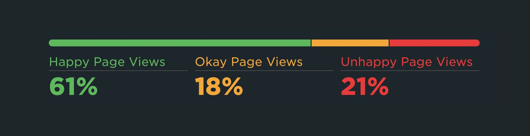
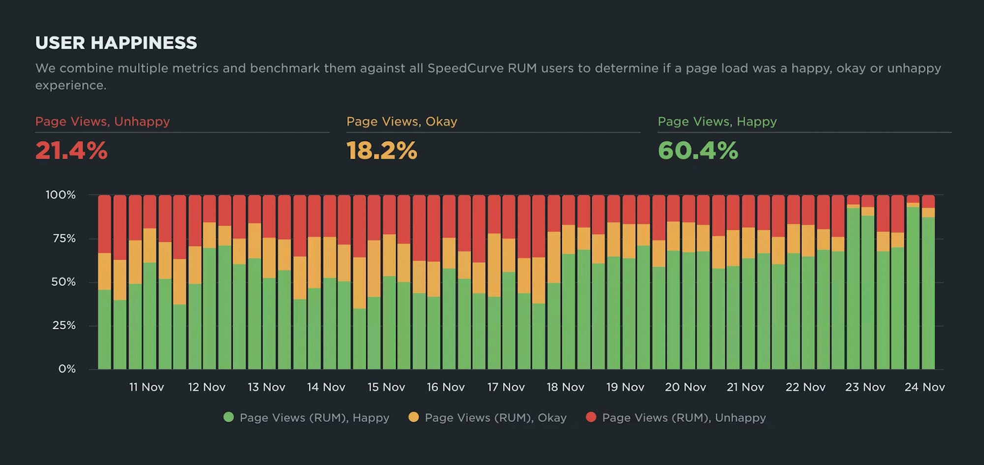
You can see User Happiness charts throughout many of your SpeedCurve dashboards. The way it's presented hasn't changed, but the underlying numbers reflect the new formula. You'll see it plotted as a "traffic light" showing which proportion of your users' page views are Happy, Okay, and Unhappy.
Here are some use cases where User Happiness can be helpful...
See how User Happiness changes over time
We give you up to 13 months of RUM data, so you can investigate why user experience has gotten better (or worse) over extended time periods.
Drill down into underlying causes of user frustration
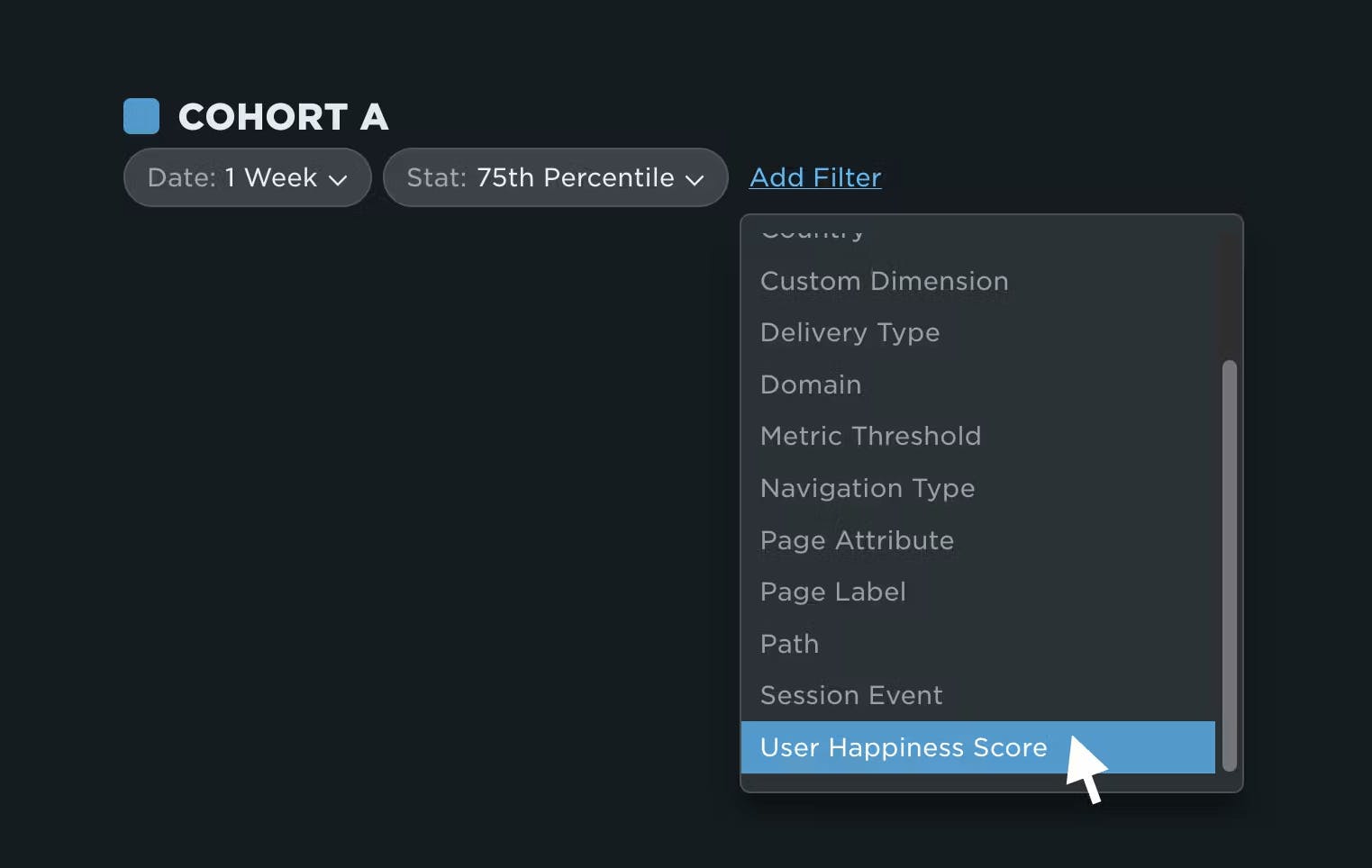
One new place you'll see User Happiness is in your dashboard and chart filters. You can now filter any of your RUM data by User Happiness Score, allowing you drill down and diagnose issues.
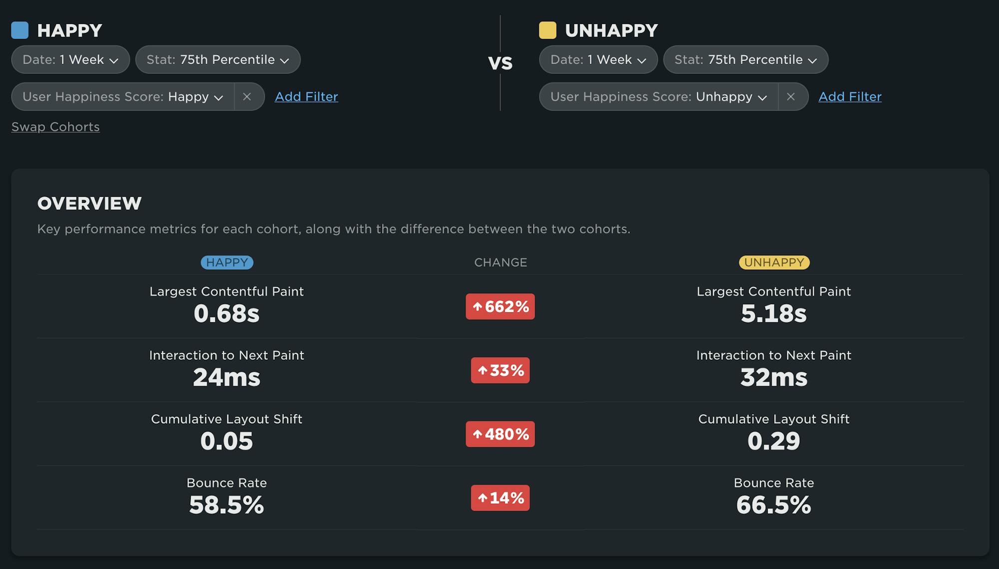
For example, here on the RUM Compare dashboard, I can easily compare Happy and Unhappy page views side by side. This view quickly tells me that LCP and CLS are contributing to my Unhappy score, but INP is below the threshold so I don't need to focus on that.
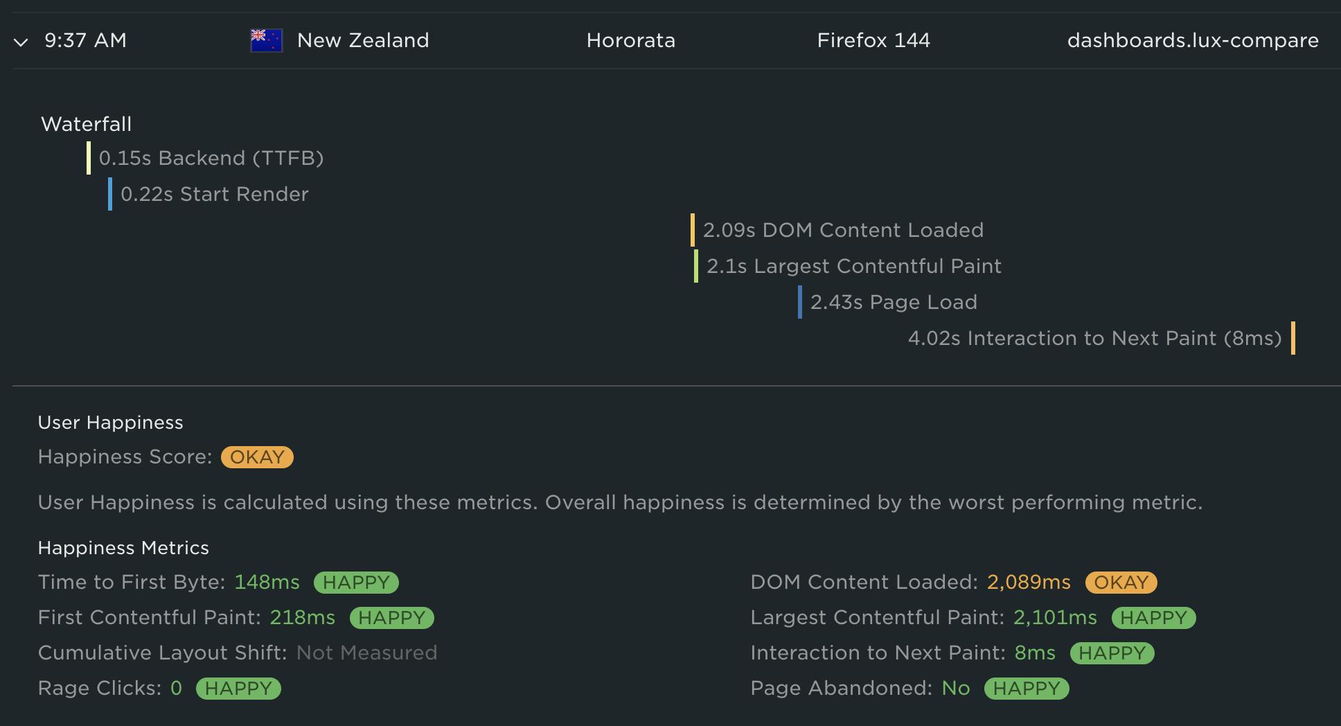
The other new place you'll see User Happiness is at the individual session and page view level. For example, in the RUM Page Views dashboard, when you expand a page view row you will see the individual metrics that make up that page view's User Happiness score. In the case of the screenshot below, the user's 'Okay' score was caused by DOM Content Loaded. All of the other metrics were happy.
The future of User Happiness
We want our User Happiness formula to reflect the real user experience as accurately as possible. As the web performance landscape continues to evolve, we will continuously evaluate the metrics that make up our User Happiness formula and make adjustments as necessary.
At the same time, we recognize the importance of having stable metrics. We don't want you to feel like the goalposts are always moving. We'd love for you to be a part of the discussion. If you have opinions on the User Happiness formula, please send us a note at support@speedcurve.com.
Start exploring today
We’re really excited about this release and hope you find it as useful (and satisfying!) as we do.
If you're a SpeedCurve user – Log in today and check out your User Happiness results in your RUM dashboards. Try doing things like comparing 'Happy' and 'Unhappy' sessions in your RUM Compare dashboard.
If you're not yet a SpeedCurve user – Sign up for a free trial, enable real user monitoring, then check out User Happiness for your site.
Questions? We'd love to hear from you! Send us a note at support@speedcurve.com.