NEW! RUM Compare dashboard

Exploring real user (RUM) data can be a hugely enlightening process. It uncovers things about your users and their behavior that you never might have suspected. That said, it's not uncommon to spend precious time peeling back the layers of the onion, only to find false positives or uncertainty in all that data.
At SpeedCurve, we believe a big part of our job is making your job easier. This was a major driver behind the Synthetic Compare dashboard we released last year, which so many of you given us great feedback on.
As you may have guessed, since then we've been hard at work coming up with the right way to explore and compare your RUM datasets using a similar design pattern. Today, we are thrilled to announce your new RUM Compare dashboard!
With your RUM Compare dashboard, you can easily generate side-by-side comparisons for any two cohorts of data. Some of the many reasons you might want to do this include:
- Improve Core Web Vitals by identifying the tradeoffs between pages that have different layout and construction
- Triage a performance regression related to the latest change or deployment to your site by looking at a before/after comparison
- Explore and compare different out-of-the-box cohorts, such as device types, geographies, page labels, and more
- Analyze A/B tests or experiments to understand which had the most impact on user behavior, as well as performance
- Optimize your funnel by understanding differences between users that convert or bounce from your site and users who don't
- Evaluate CDN performance by exploring the impact of time-of-day traffic patterns
Let's take a tour...
How to compare RUM sessions
In September of last year, we released the RUM Sessions dashboard. Along with the Sessions dashboard, we provided you with the ability to drill into specific datapoints on a time series to explore those sessions, along with the ability to bookmark them. You'll now find the ability to compare sessions from a time series with those existing options.
To compare two different data points from any RUM time series chart, simply click 'Compare Sessions' on two separate data points:
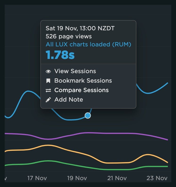
After you've selected two sessions to compare, you'll see a dashboard with those sessions in a side-by-side comparison:
Filtering your data
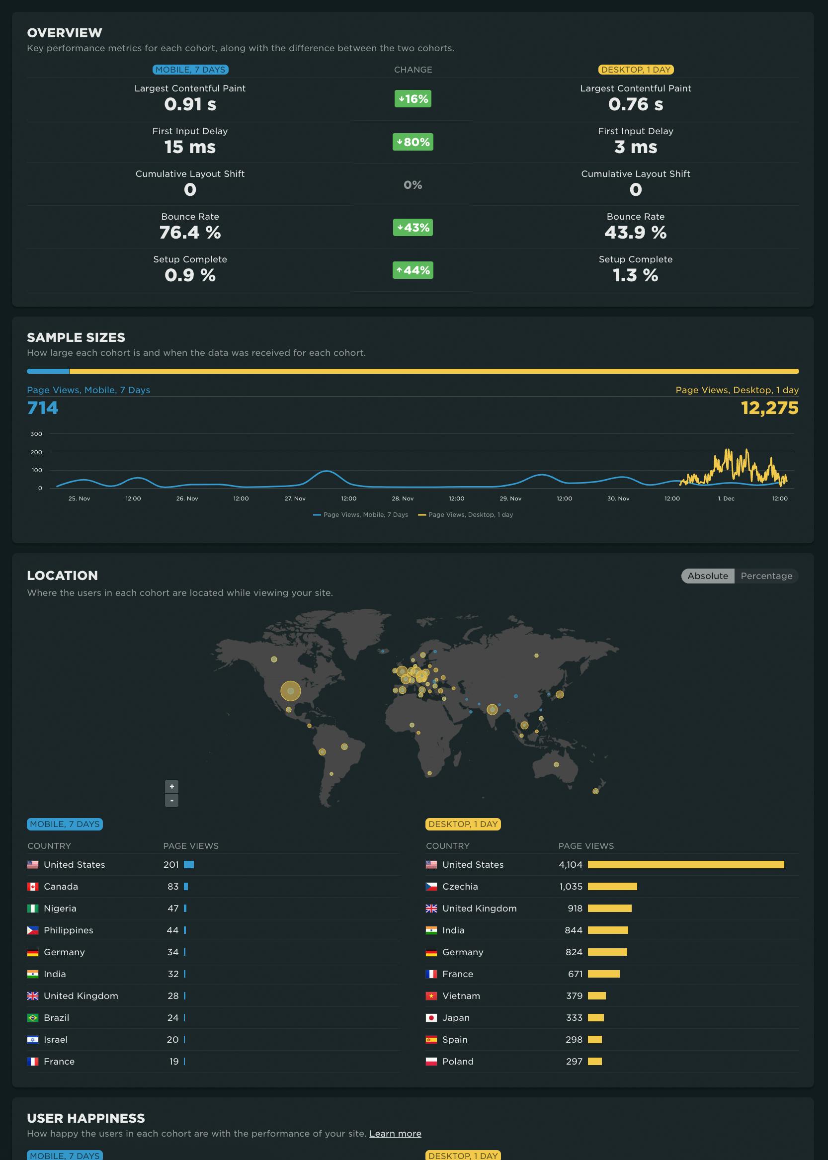
Navigating directly to the dashboard is another option. From the RUM menu in the side navigation, click on 'Compare'. By default you are presented with a view of Mobile vs. Desktop device types:
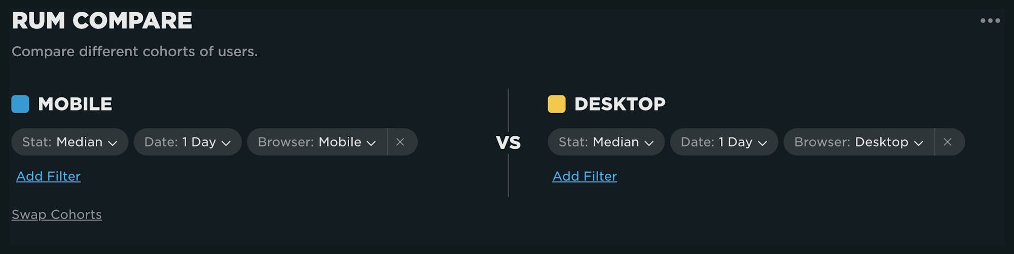
You can alter each of the cohorts by adding and removing filters from the menu for the cohort:
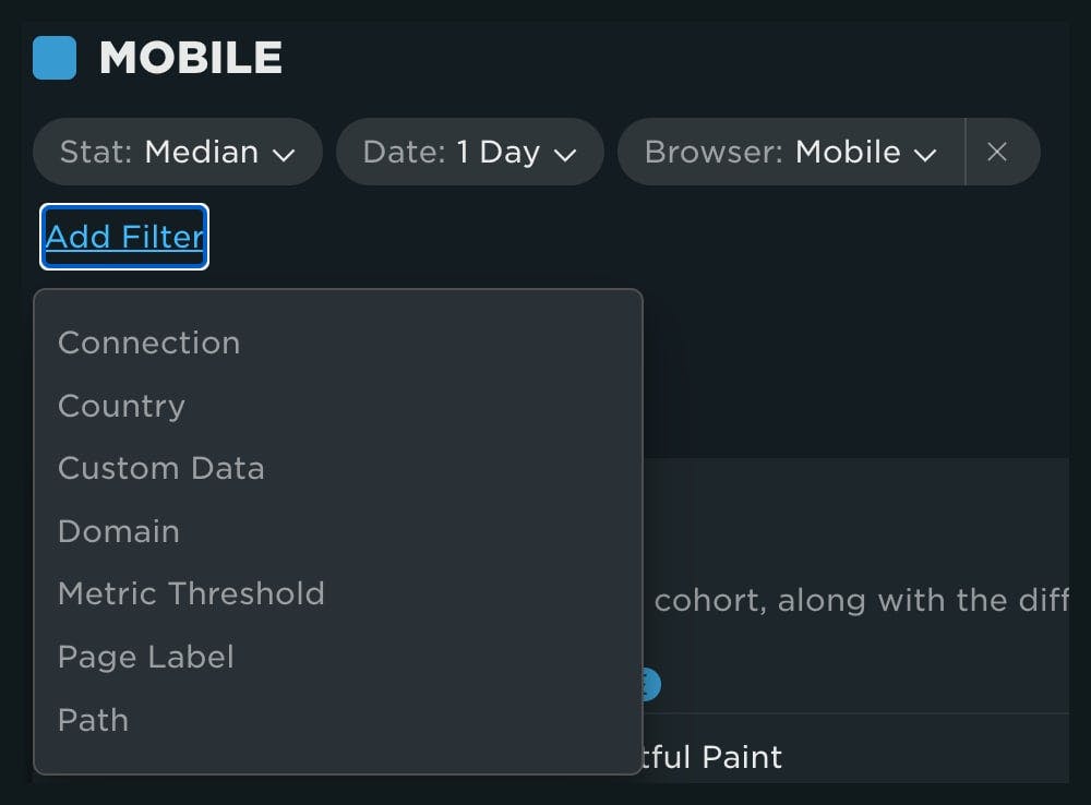
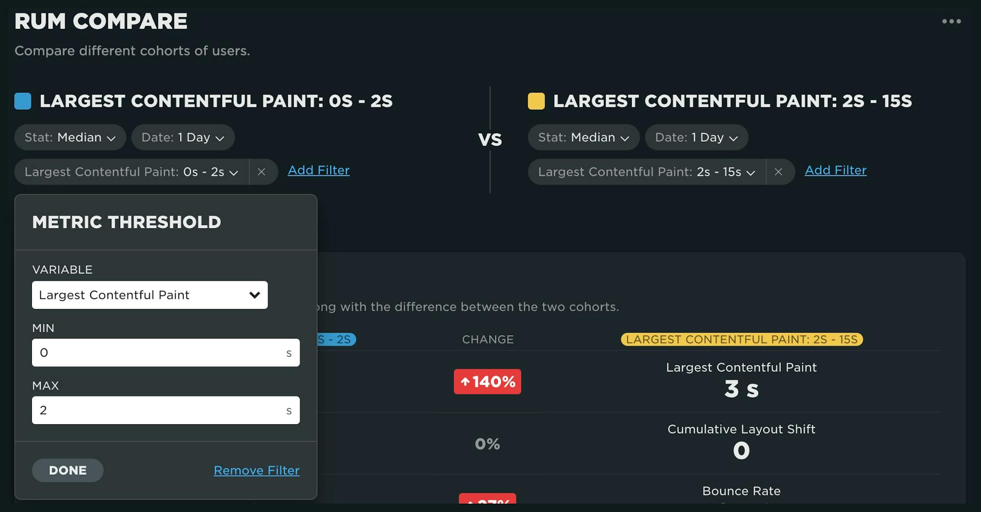
If you're already experienced with our other RUM dashboards, the different options available in your filter will look familiar. The 'Metric Threshold' filter has also been introduced as a way for you to explore 'fast' versus 'slow' sessions for a metric. To use, simply select the metric along with the upper and lower bounds for each cohort.
To demonstrate, let's look at a comparison of fast sessions (0-2 seconds) to slow sessions (2-15 seconds) for Largest Contentful Paint:
Dashboard components
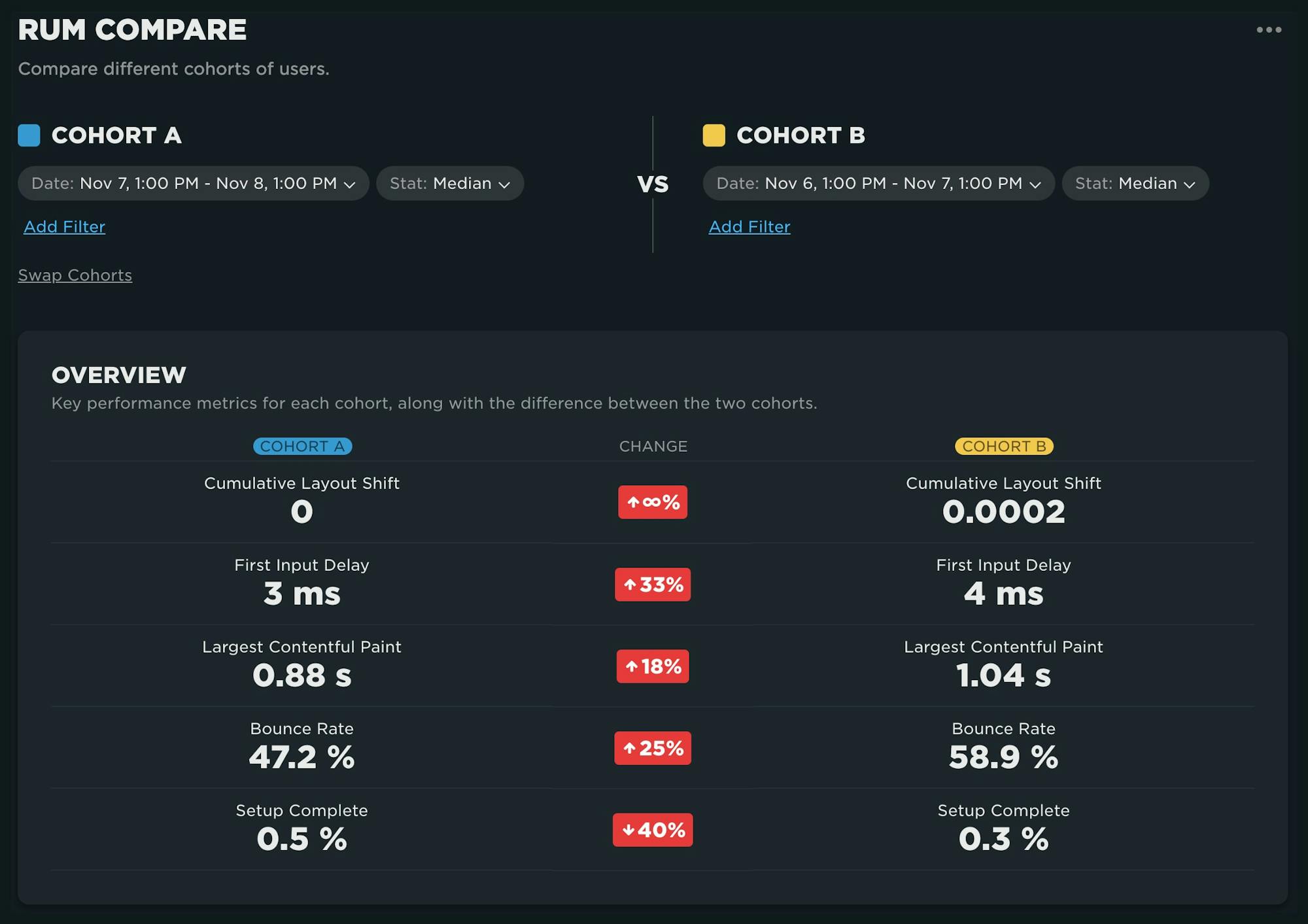
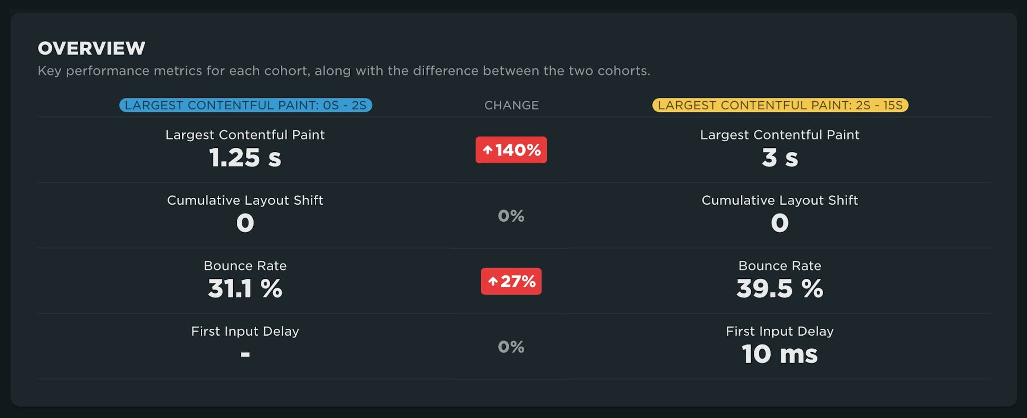
Overview
This comparison highlights the comparison of key performance metrics between the cohorts. Here we can see that the faster cohort has a median LCP of 1.25 seconds, while the slower is at 3 seconds. More importantly, we see the bounce rate is 27% higher for the slower subset of users. Speed matters!
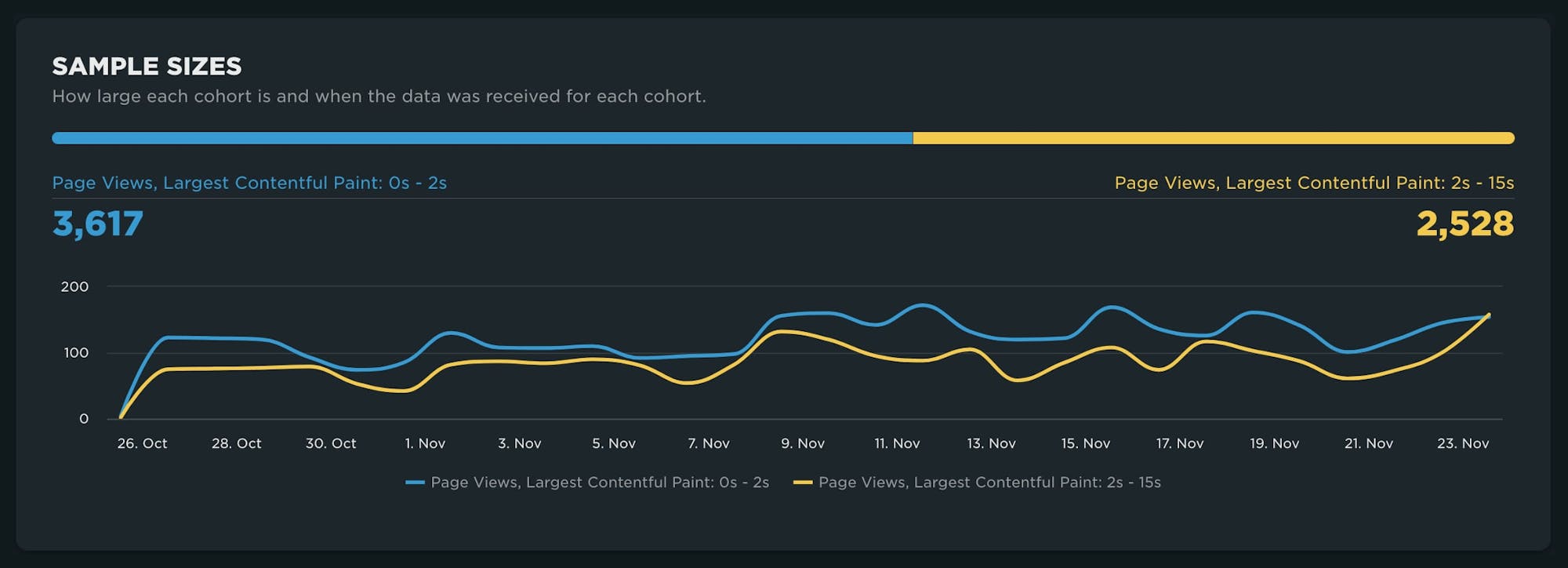
Sample sizes
If you've spent any amount of time exploring your RUM data, you've probably learned that the size of your population matters a lot. This chart lets you quickly discern whether or not you're comparing statistically viable sets of data. While the example below is not a 50/50 split, there seems to be enough data in the slower cohort compared to the faster one to make some valid observations.
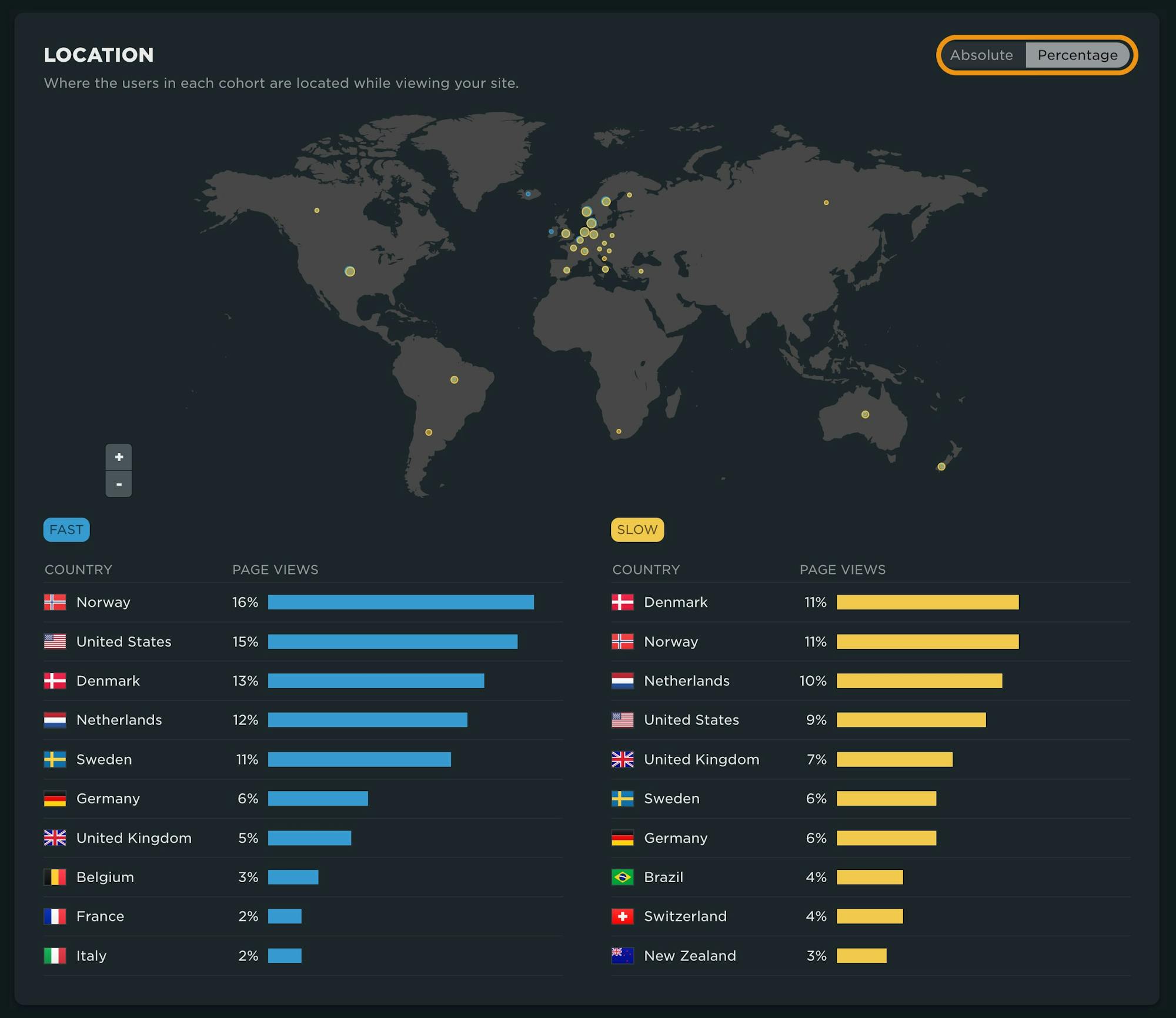
Location
Understanding where your users are coming from and how their experience may vary is a key part of RUM analysis, specifically as you make investment decisions on CDNs or CSPs. While not largely pronounced, in the visualization below you can see there is a larger subset of 'fast' users coming from Norway and the United States. Note that you have the ability in this graph to toggle between an absolute value and a percentage. This is key when you are comparing datasets that are not the same size.
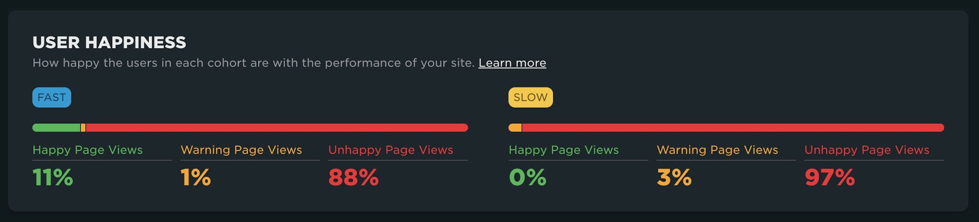
User Happiness
Somewhat self-explanatory, the comparison of your 'Happy Page Views' shown here illustrates a lot more of your slower users in the 'Unhappy' bucket. More can be found on our Happiness Index and how it's calculated here.
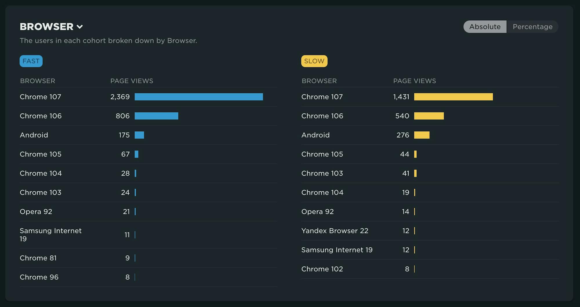
Looking at cohorts by other filters
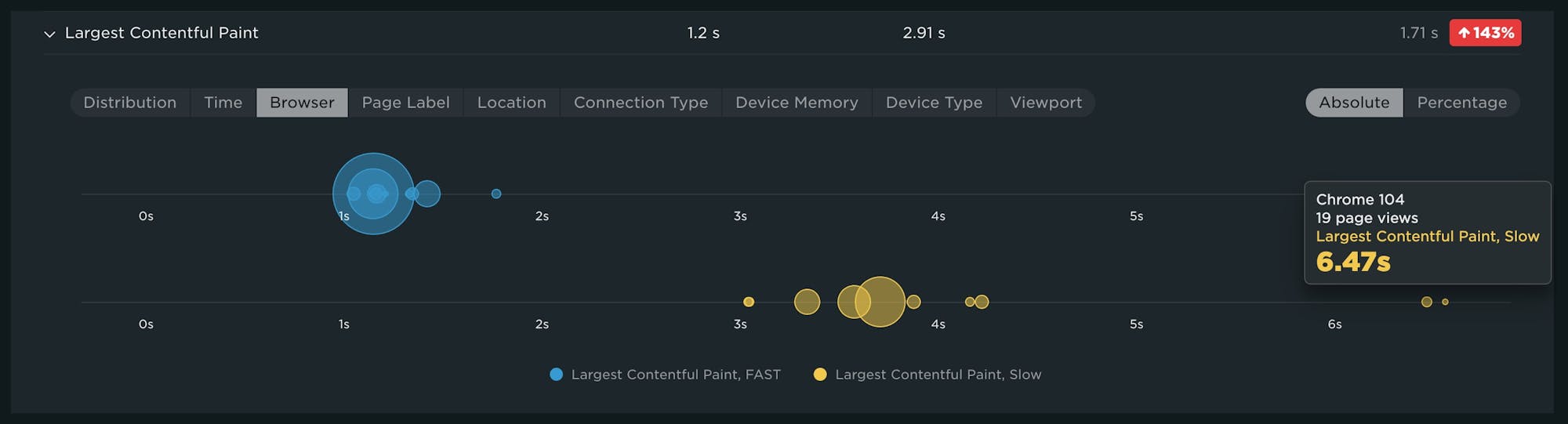
This table breakdown defaults to a breakdown across cohorts by Browser, but there are several other dimensions to explore. In this example, we don't see much of a browser-driven impact to LCP. (If you're wondering where iPhone is, keep in mind that, unfortunately, not all metrics are supported across platforms.)
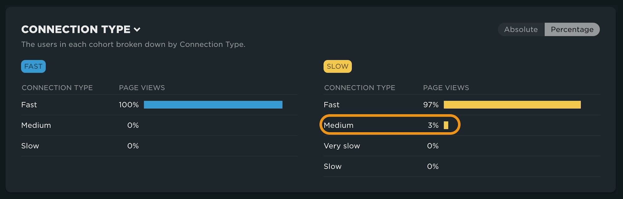
However, here we can see that a breakdown by connection speed highlights that while most of the users are on fast connections, there are a higher percentage of users coming from slower connection speeds in the slow cohort.
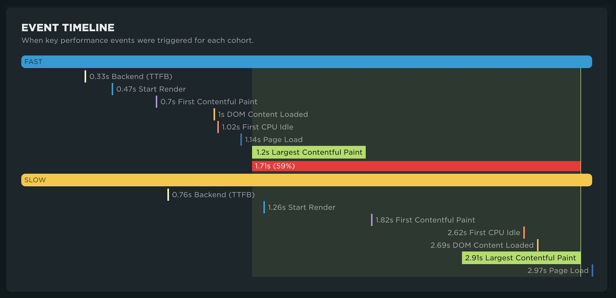
Event Timeline
Your event timeline allows you to compare key metrics between your cohorts. This can be useful in identifying other metrics that may be more interesting or potentially responsible for downstream metrics such as LCP. Backend time here is 500ms slower, which affects ALL metrics.
Metrics
The last, and potentially most compelling, component in the dashboard is focused on metrics. This component contains a LOT of information you can dig into.
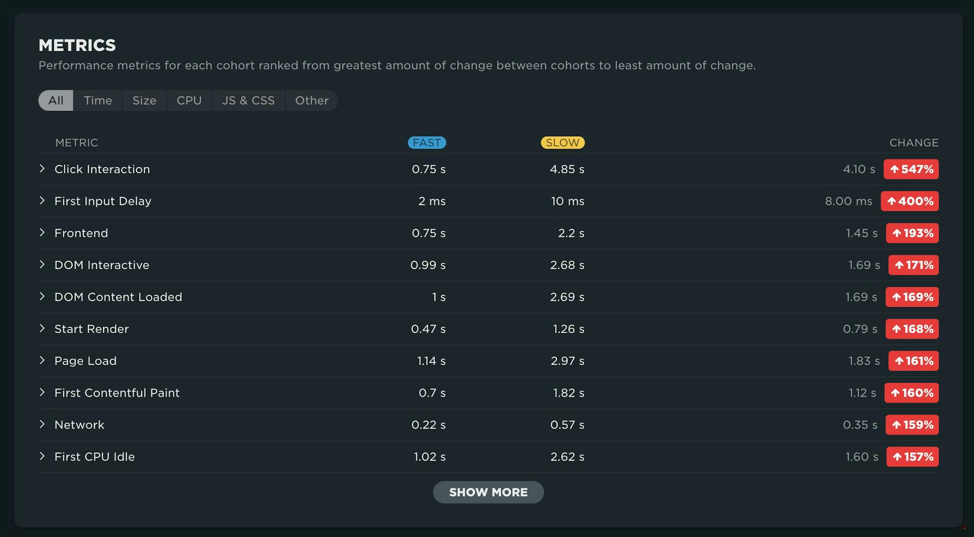
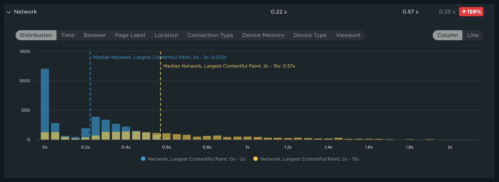
When you expand each metric, you have the ability to look at a comparison distribution, a time series comparison or a breakdown across all of our key dimensions. In this distribution chart, you can see that fast users often have network times of 0 seconds, most likely due to connection reuse.
Stacked bubble charts can help you quickly identify the presence of outliers. In the graph below, a lot of the slow LCP traffic is driven by older versions of Chrome. Oftentimes this can be automated traffic or other non-user traffic.
We welcome your feedback!
Phew! That's a lot of information packed into a single dashboard. We're excited to hear how you put this new RUM capability to work for your site. Drop us a line and let us know what you think!
And if you're not yet using our real user monitoring to learn how actual users are experiencing your site, try our RUM for free!