How do Long Animation Frames affect user behavior?

What's the point of a performance metric that doesn't align with user behavior – and ultimately business outcomes? Looking at four different retail sites, we compared each LoAF metric for desktop and mobile and correlated it to conversion rate. We saw some surprising trends alongside some expected patterns.
We recently shipped support for Long Animation Frames (LoAF). We're buzzing with excitement about having better diagnostic capabilities, including script attribution for INP and our new experimental metric, Total Blocking Duration (TBD).
While Andy has gone deep in the weeds on LoAF, in this post let's put the new set of metrics to the test and see how well they reflect the user experience. We'll look at real-world data from real websites and find an answer to the question: How do Long Animation Frames affect user behavior?
First, what is a Long Animation Frame?
We've covered Long Animation Frames (LoAFs) extensively in a couple of recent posts:
In short, Long Animation Frames are frames with a duration of 50ms or more.
LoAFs can create a poor user experience when a user is waiting for a page to render or when a user is experiencing poor responsiveness, like jank, when interacting with a page.
Because LoAFs affect a page's responsiveness, they also affect a lot of the metrics we measure that are based on the user experience, such as Largest Contentful Paint (LCP) and especially Interaction to Next Paint (INP).
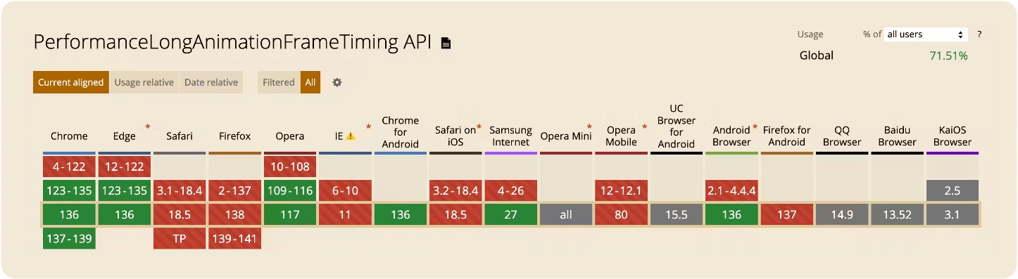
Support for the Long Animation Frames API is currently limited to Chromium.
What are the various LoAF metrics?
Much like its predecessor, Long Tasks, we collect a few different LoAF metrics that can be useful.
The metrics we'll focus on today are:
- LoAF Entries – Total count of LoAFs measured
- LoAF Total Duration – Total duration of LoAFs measured
- LoAF Work Duration – Total duration of non-rendering phases across all LoAFs
- LoAF Style and Layout Duration – Time spent calculating style and layout for the frame
- LoAF Total Blocking Duration (TBD) – Total duration of ALL blocking time for LoAFs
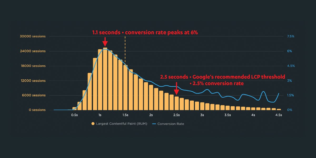
How to use correlation charts to see the impact of LoAF metrics on business metrics
As we've shown before when doing research on INP, correlating performance metrics with business outcomes is a great way to understand user's sensitivity to that metric.
Correlation charts show a histogram of your user traffic, divided into cohorts based on a chosen performance metric. They include an overlay that highlights a related user engagement or business metric – like bounce rate or conversion rate – for each cohort. This lets you quickly spot the connection between performance, engagement, and business impact.
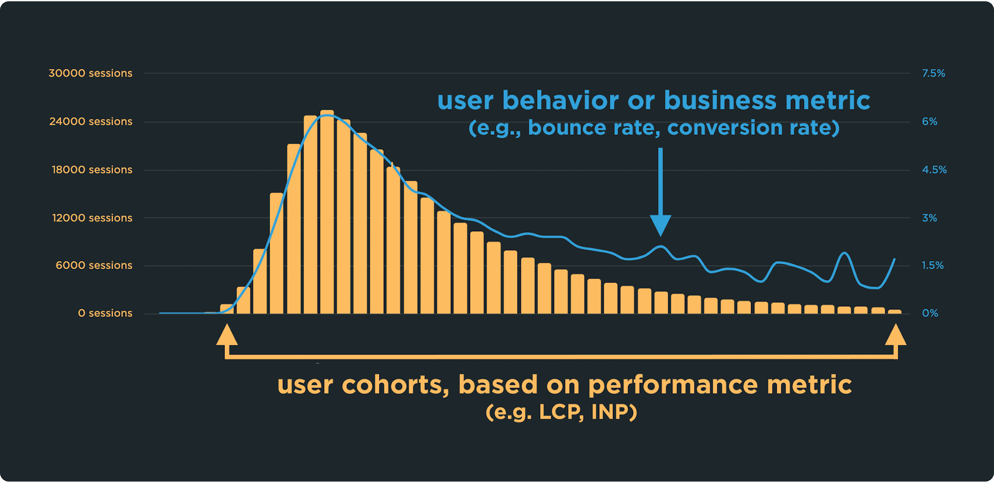
Looking at four different retail sites, we compared each of the LoAF metrics for desktop and mobile. The yellow columns represent the cohorts of visits, broken down by the duration or count of the metric. The blue line shows the conversion rate across those cohorts.
How do LoAF Entries correlate with conversion rate?
The LoAF Entries metric represents the total count of all LoAFs measured.
Across the four sites we looked at, the number of LoAF Entries for desktop users shows a correlation with conversion rates. As the number of LoAF Entries increases, conversion rates decline.
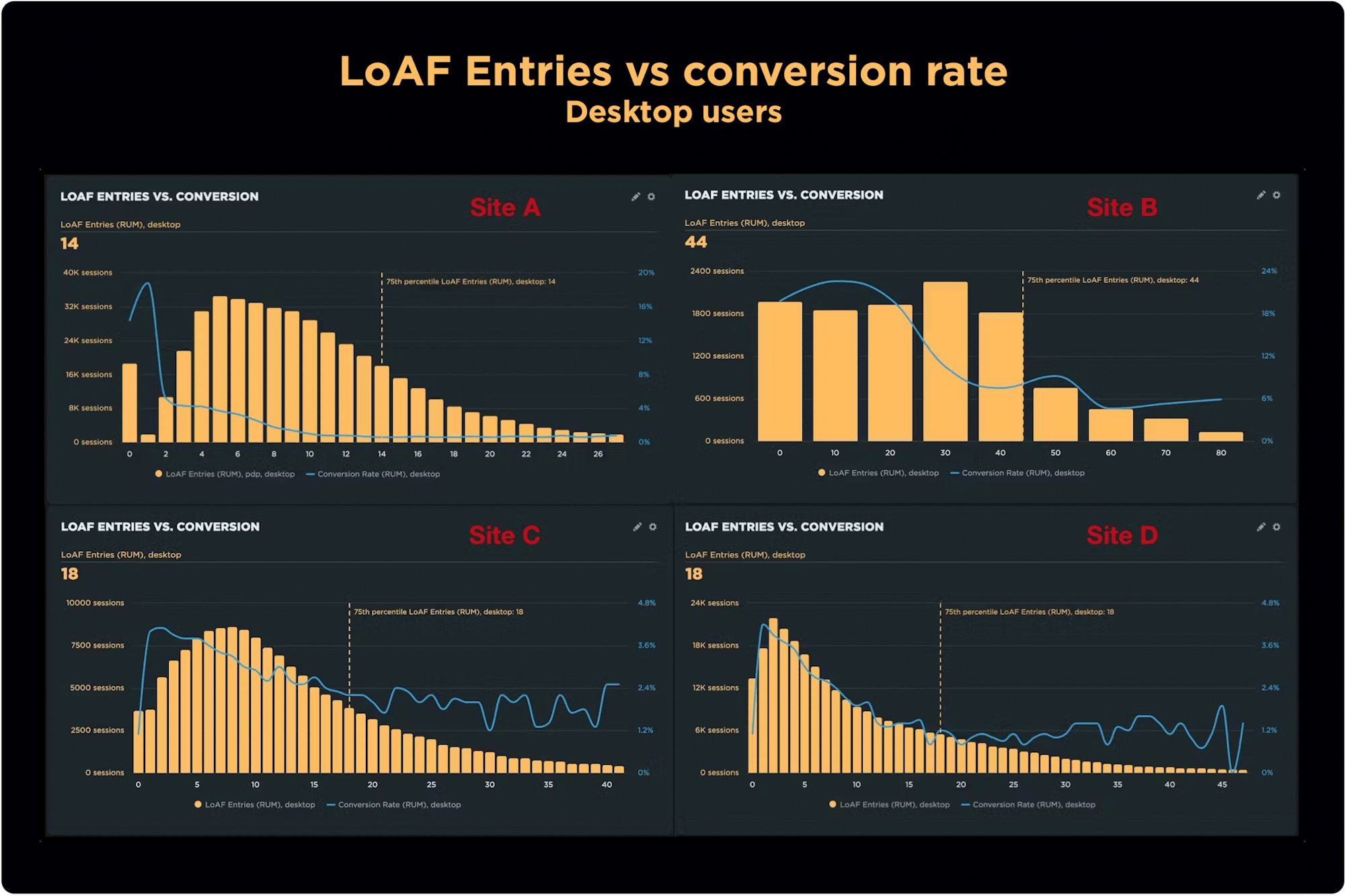
However, the relationship between the two metrics varies across the four sites we observed. For example, Site A shows a sharp decrease in conversion when the number of entries drops from 0 to 10. Meanwhile, Site B shows a more gradual decrease from 0 to 40 entries.
Looking at the same four sites, the relationship between LoAF Entries and conversion rates for mobile users also reflects a correlation.
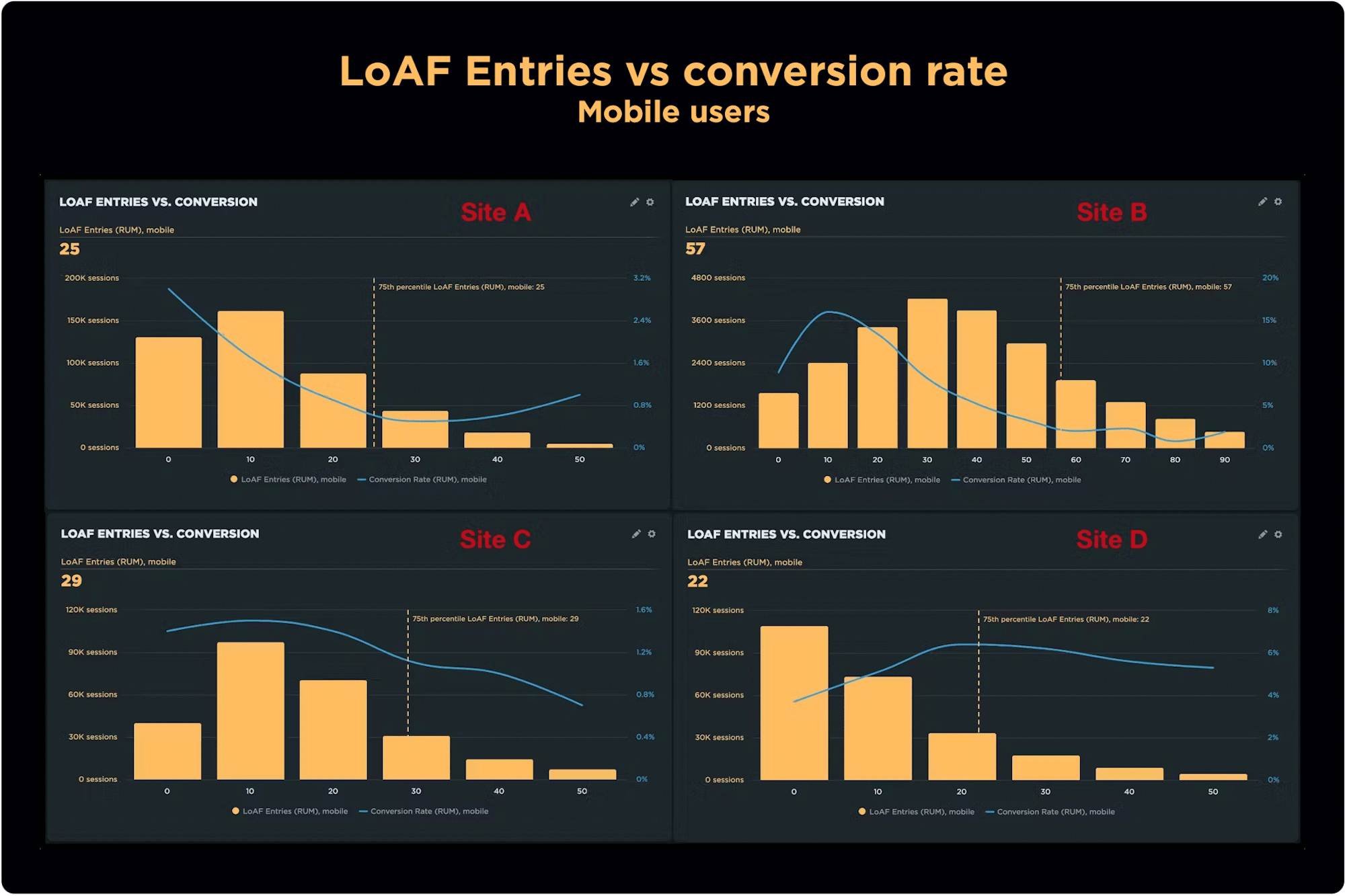
It's interesting to note that the number of LoAFs per site is higher on mobile than on desktop, with up to 90 entries on Site B. This isn't too surprising given the tendency for mobile devices (non-iOS) to use lower-end (slower) processing power.
It's also worth noting that the shape of the curve (blue) is not consistent. For Site A, conversion increases in the long tail and Site C decreases gradually after 20 entries.
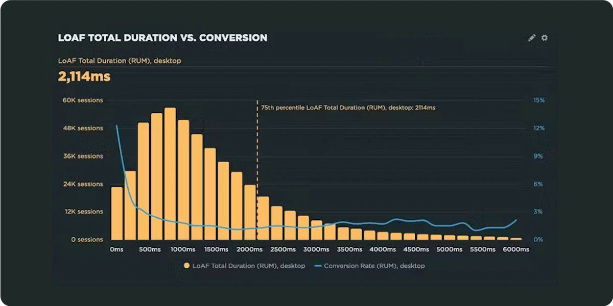
How does LoAF Total Duration correlate with conversion rate?
The LoAF Total Duration metric represents the total duration of all LoAFs measured. Total Duration shows a strong relationship with conversion rates on desktop.
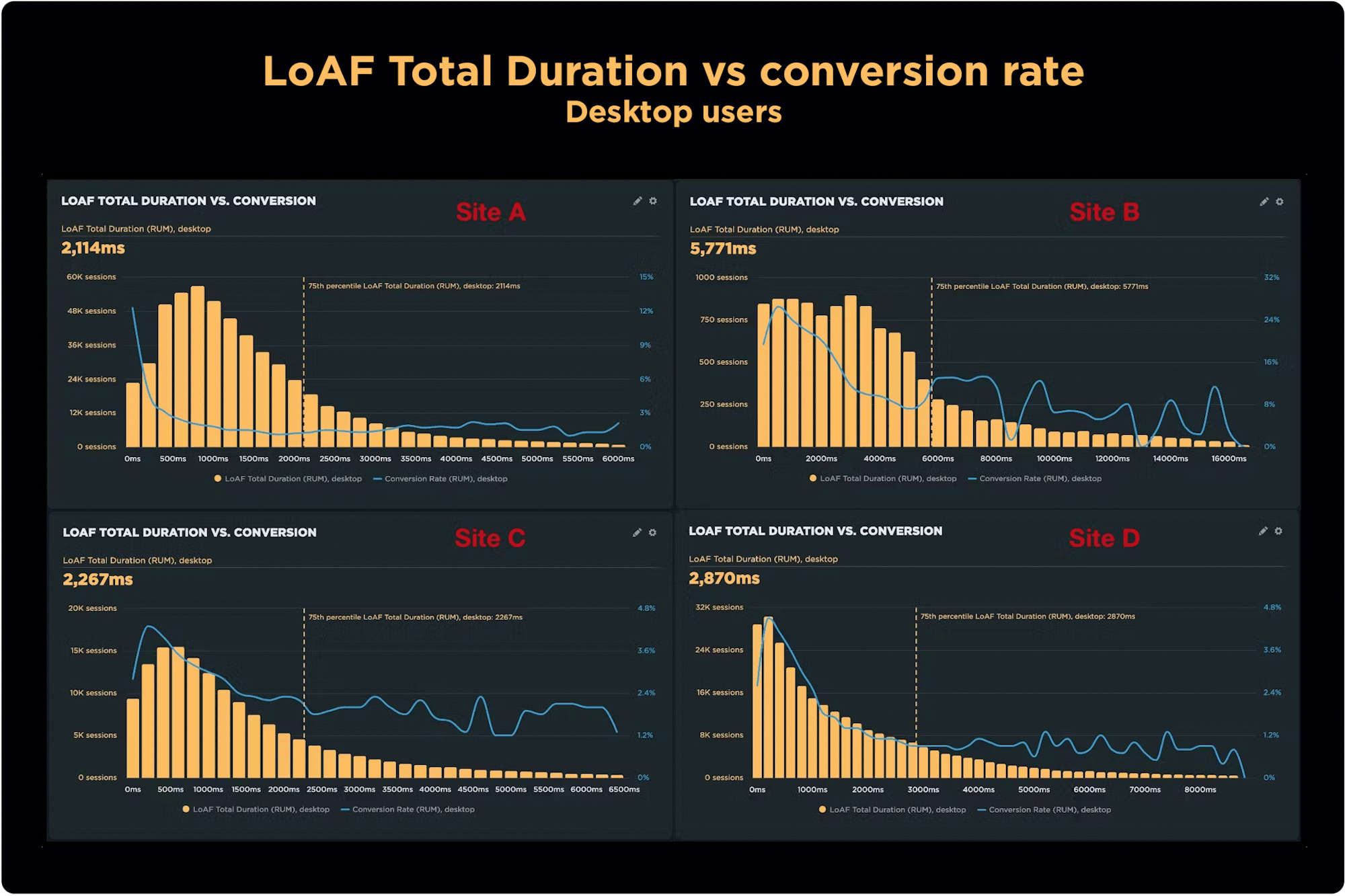
As seen with mobile for LoAF Entries, Site A is very sensitive – the blue line drops suddenly from 0ms to 500ms. The value for Total Duration is much higher for Site B than the other three sites.
Moving on to mobile, the relationship between Total Duration and conversion rate on mobile is very similar across all four sites.
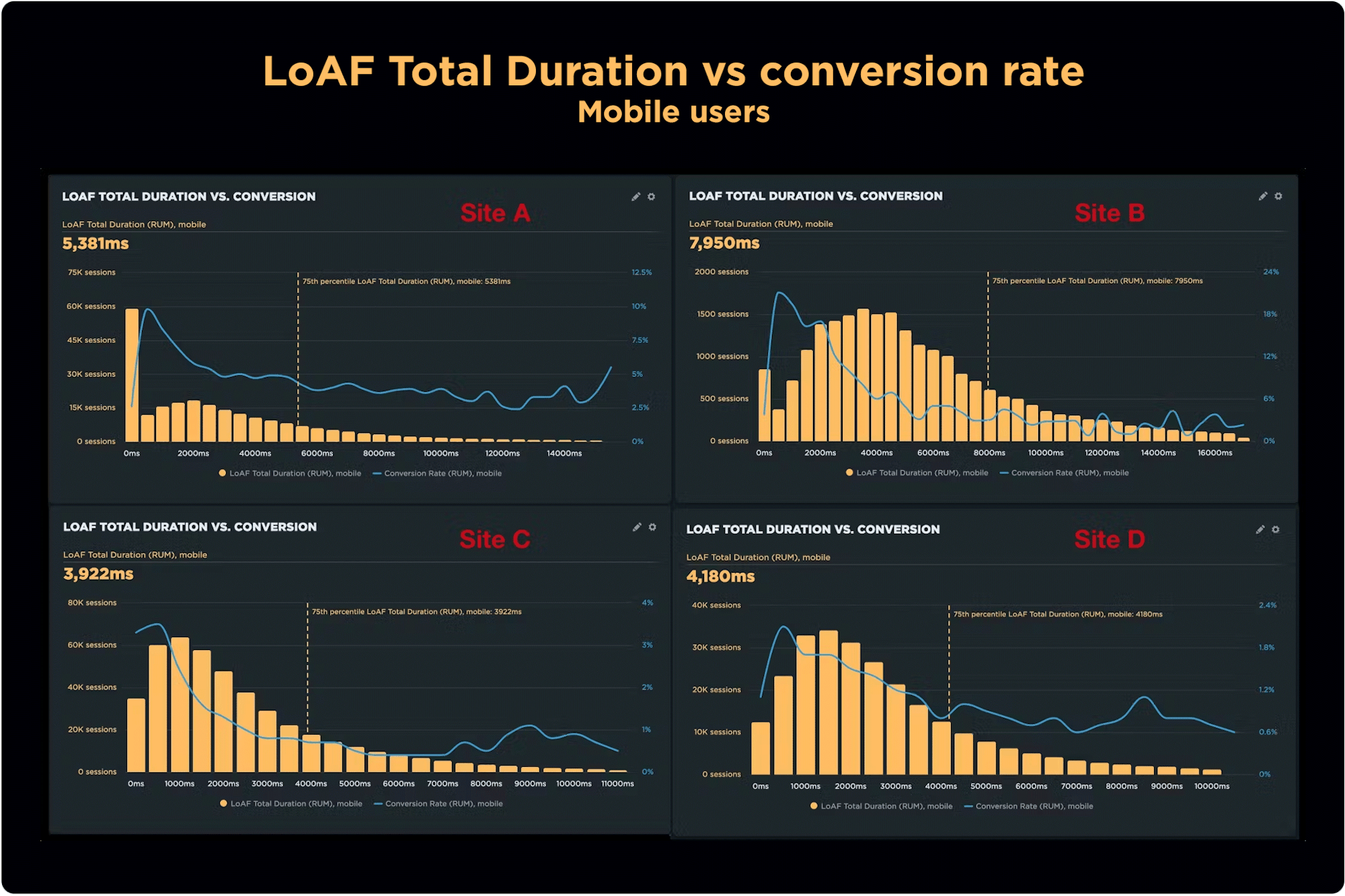
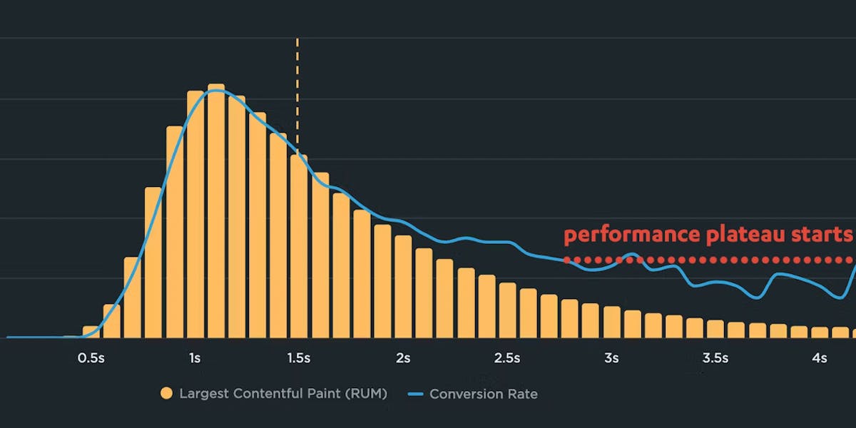
It interesting to note that, for all four sites, you begin to see the performance plateau at around 4000ms, when conversion rates level out after a sharp decline.
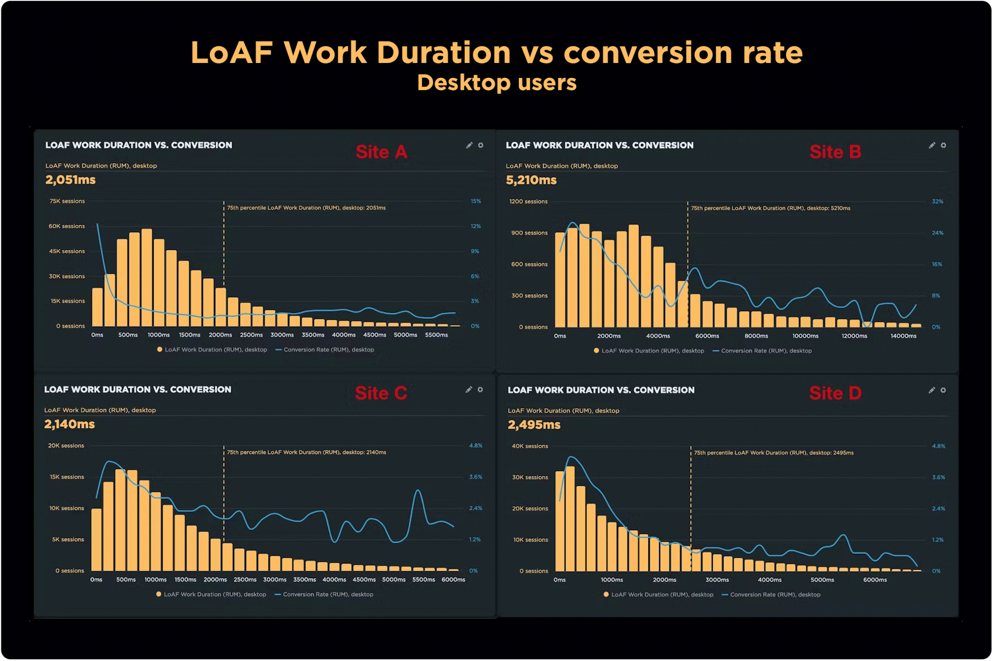
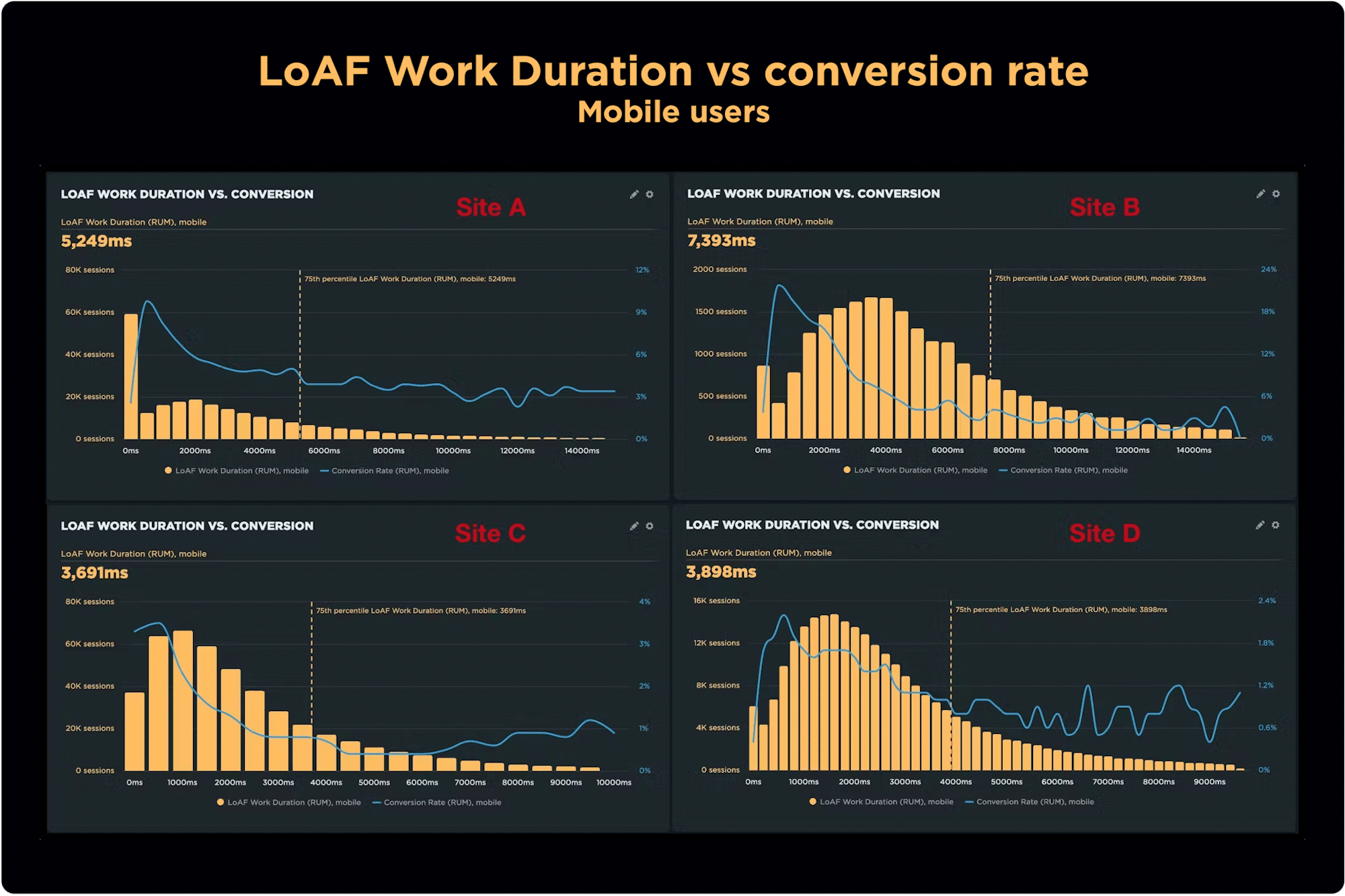
How does LoAF Work Duration correlate with conversion rate?
LoAF Work Duration measures the total duration of non-rendering phases across all LoAFs.
Spoiler alert! LoAF Work Duration (and LoAF Style and Layout Duration, further below) all follow the same pattern seen in Total Duration above. I've shared the charts here without further commentary.
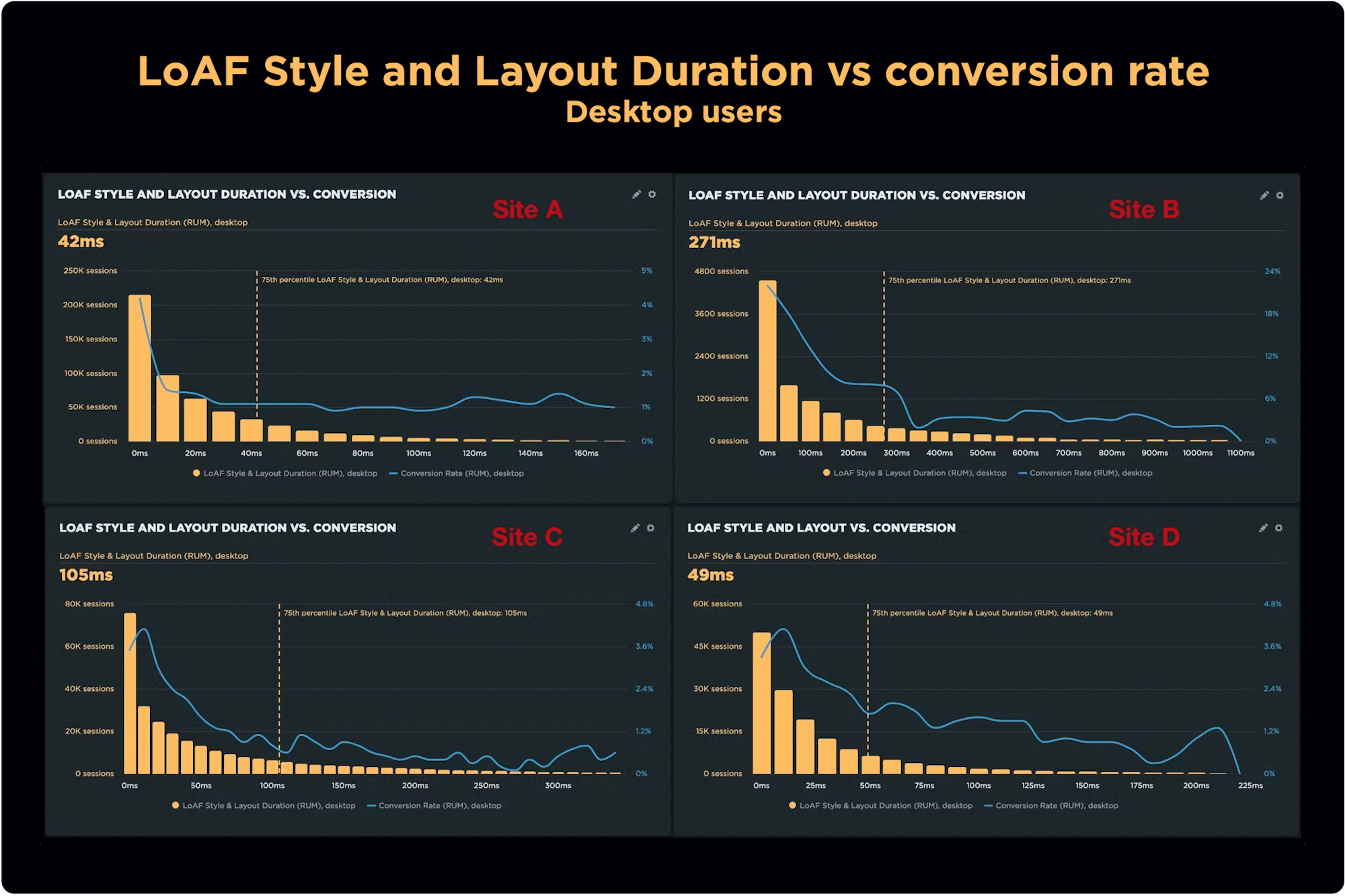
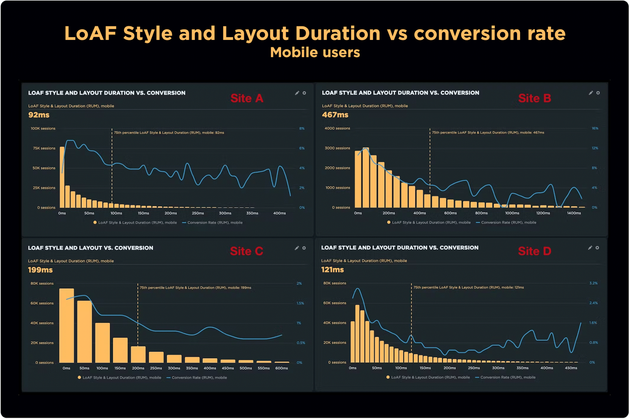
How does LoAF Style and Layout Duration correlate with conversion rate?
LoAF Style and Layout Duration (SLD) represents the total time spent calculating style and layout for the frame. As said earlier in this post, this metric follows the same pattern seen in Total Duration and Work Duration.
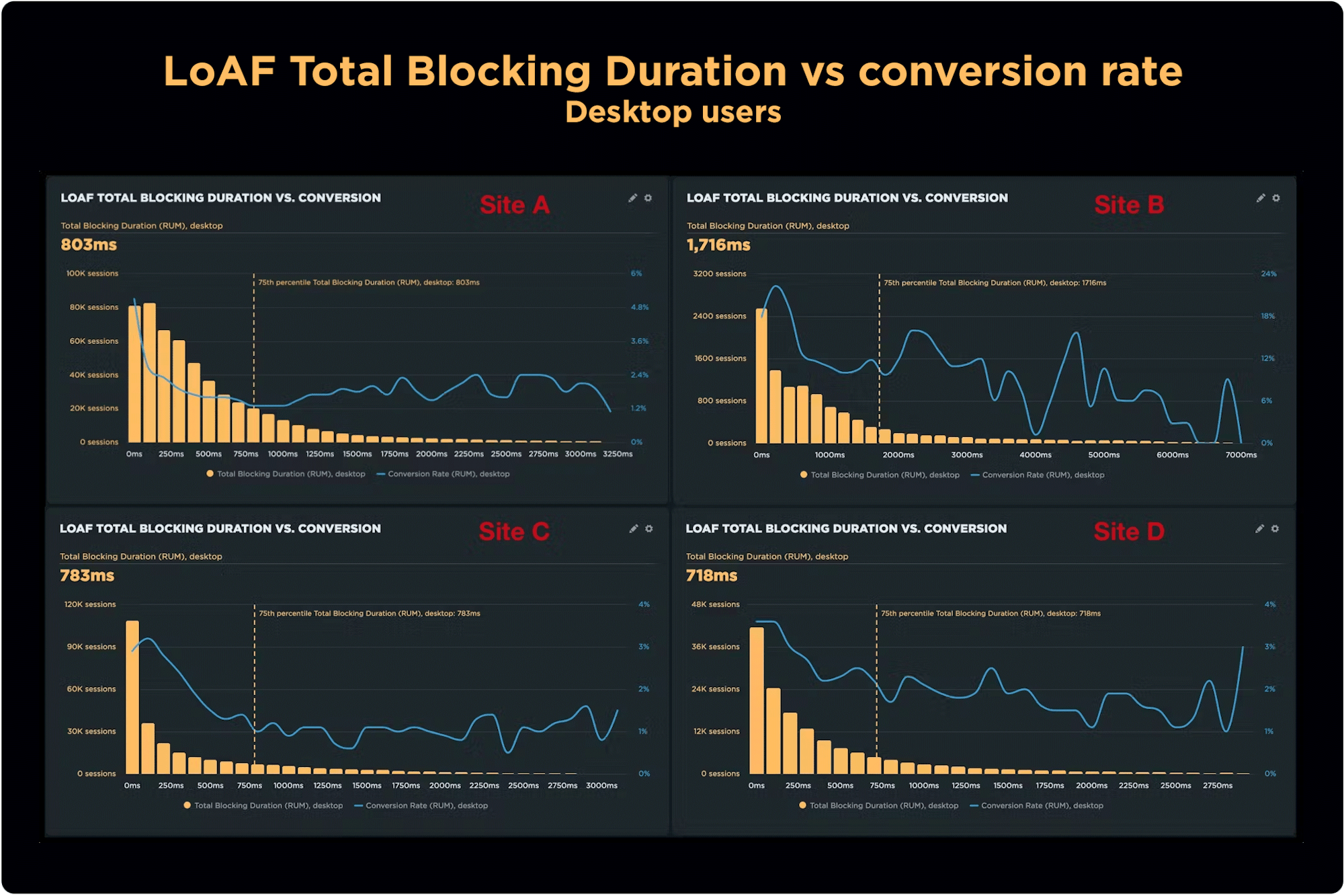
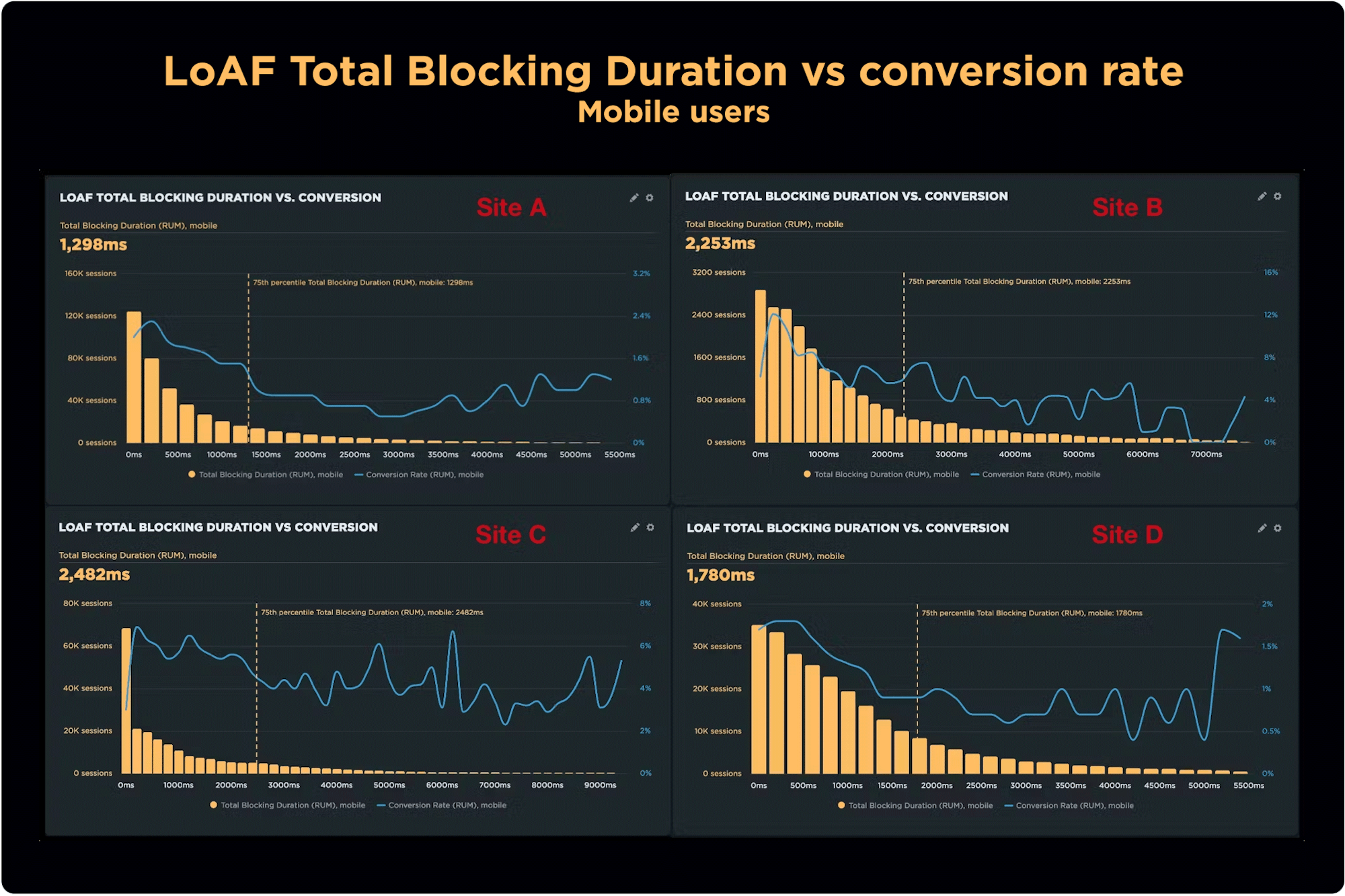
How does LoAF Total Blocking Duration correlate with conversion rate?
LoAF Total Blocking Duration (TBD) is the total duration of all blocking time for LoAFs. It's important to mention that Total Blocking Duration is a beta metric. This is mainly because we are still learning about it and observing how useful it is.
For both desktop and mobile, TBD showed a correlation with conversions. However, the relationship was varied across all sites. Site A shows conversion improving in the longtail for both mobile and desktop. Site B shows a strong correlation until around 700ms, after which it becomes extremely volatile.
Key takeaways
Observation 1: LoAFs are worse on mobile
This isn't surprising, given that LoAF support is basically limited to Android devices. Lower power + JavaScript = more LoAFs with longer durations.
Observation 2: Generally speaking, conversion rate tends to suffer as LoAF metrics degrade
There is an overall negative correlation between LoAF metrics and conversions. However, I think it's a stretch to say that ALL of these metrics are good metrics. LoAF Entries on mobile may not have as much impact on conversions as other duration metrics. Similarly, LoAF Total Blocking Duration seems to be a bit of a moving target in the longtail. The remaining duration metrics have a much more consistent and predictable pattern.
Observation 3: Consider focusing on LoAF Entries and LoAF Total Duration
What I like about this recommendation is that it gives you two distinct types of metric to investigate: a numeric metric (total entries) and a time-based metric (total duration). It's important to look at your own RUM data to draw conclusions about your own sites. This investigation suggests that you should consider focusing on LoAF Entries and LoAF Total Duration when you create your own correlation charts.
Observation 4: All sites are different
It was a little surprising to see such different results across four sites. Generally speaking, Site A performs better than the others and as a result has a very different conversion curve. Site B shows the most opportunity for improvement and also saw conversions drop off early, long before the 75th percentile for each metric.
Observation 5: But the performance plateau was surprisingly similar across sites
For Total Duration, the performance plateau started at around the same point – 4000ms – for all four sites. This means that reducing Total Duration from, say, 8000ms to 6000ms might be a worthy goal but it may not move the needle on conversions. (But you should still consider this a great achievement as one of the steps in your performance optimization journey!)
Measuring LoAF metrics in SpeedCurve
It's easy to create your own correlation charts in SpeedCurve. If you add your own conversion data, you can easily recreate the LoAF correlation charts above. Alternatively, you can create a correlation chart with bounce rate out of the box.
You'll see LoAF data throughout your SpeedCurve dashboards. Take a look at the most recent product release for details.