SpeedCurve is now part of the Embrace family! There are no changes to how you use our products. Our founder Mark shares what this means...
Business Success
Core Web Vitals
- Getting Started With CWV
- Largest Contentful Paint (LCP)
- Interaction to Next Paint (INP)
- Cumulative Layout Shift (CLS)
- How to Use Core Web Vitals Subparts
Optimization Techniques
- Web Performance Budgets
- Diagnose Time to First Byte
- Optimizing Images
- Optimizing JavaScript
- Third-Party Web Performance
- Critical CSS for Faster Rendering
- Optimizing Single Page Apps
- Caching for Faster Load Times
Metrics & Charts
How to Read a Synthetic Waterfall Chart
A waterfall chart is an essential diagnostic tool for your web pages. If you care about how fast your pages load and what might be slowing them down, then you need to have at least a basic understanding of waterfall charts.
Image by Freepik
Pages can be slow for a myriad of reasons, from a sluggish back end to latency to unoptimized third-party scripts that block the rest of the page from rendering. If your site feels slow, you can quickly run your own tests using your synthetic monitoring tools. From those tests you can generate waterfalls and get a good idea of where the problem lies before you flag the problem with other members of your team.
This post is for people who are interested in performance but don’t necessarily have a lot of technical know-how. It’s for people who want to crack the hood and learn:
- Why pages behave the way they do
- How to begin to diagnose performance issues before sending out red-flag emails to everyone on your team
- How to talk about performance with other people in your organization
What is a waterfall chart?
A waterfall chart is any diagram that represents data that is generated cumulatively and sequentially across a process. A performance-specific waterfall chart lets you see the series of actions that occur between a user and your server in order for that user to view a specific individual page of your site.
Each page resource — from HTML to images, CSS, JavaScript, and other scripts — is represented in its own bar on the chart. The waterfall shows the moment when each resource is called from the server straight through to the moment when it has been downloaded and rendered in the browser.
(If you’re a project manager or someone accustomed to using Gantt charts, performance waterfalls are somewhat similar in that they depict a cascade effect among interdependent page elements. For example, a page can’t begin to download resources until it has completed its DNS lookup and established a TCP connection.)
Waterfall charts are an essential tool for understanding and optimizing the critical rendering path for a page. What is the critical rendering path? Keep reading...
Understanding the critical rendering path
Before you can investigate what's making a page slow, it's essential to understand the critical rendering path. The critical rendering path is the set of steps a browser takes to convert all a pages resources – from images and HTML to CSS and JavaScript – into a complete, functional web page.
Optimizing the critical rendering path means:
- Taking a good look at the order in which the resources on your pages render. Does essential content and scripting load first? Are non-essential or lesser resources deferred?
- Making sure that each resource in the rendering path is as performant as possible. Are images optimized? Are you using a content delivery network (CDN) to bring elements like images closer to your users, so that delivery times are faster? Are you compressing and caching the right things?
The best way to investigate the critical rendering path is to look at a waterfall chart for the page. A waterfall chart shows you all the resources on the page, the order in which each resource is requested by the browser, and the size and duration of each request, among other things.
What can a waterfall chart show you?
When you look at the bars on a waterfall chart, there are several things to pay attention to:
- The order in which the bars appear — The bars at the top of the chart render first. The rest of the bars render sequentially. So it stands to reason that your most important content — stylesheets, hero images — should be as close to the top of the chart as possible.
- How many bars are on the chart — Each bar represents a unique resource. More bars = greater page complexity. Page complexity presents performance risk.
- How long each bar is — The length of the bar shows you how long it took for the resource to load and render. The browser is only capable of loading a small number of resources at a time, so long bars means a delay in loading the remaining resources.
- How tall each bar is — In SpeedCurve, we use bar height to show you how large a resource is. This lets you see at a glance when an oversized file (usually an image or video file) has snuck onto your page.
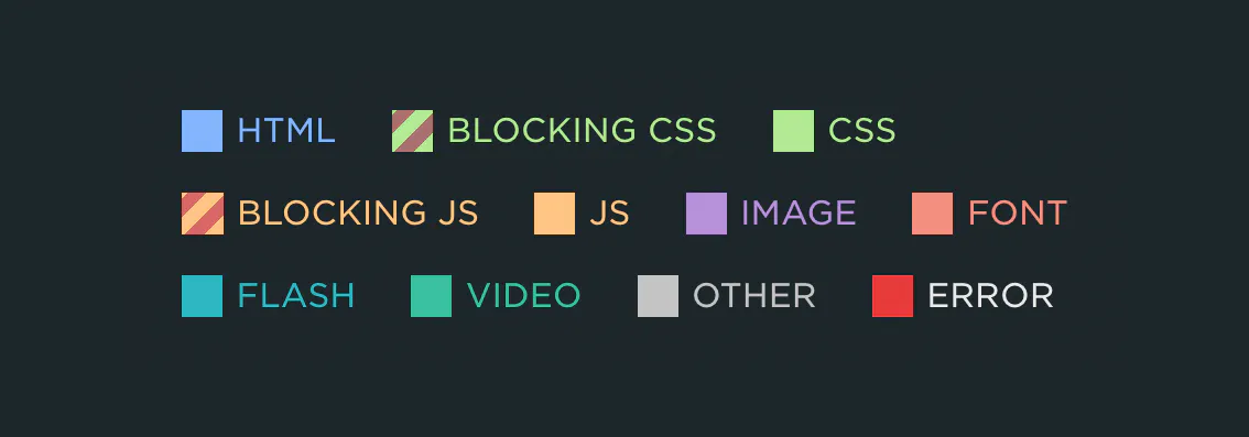
- Which resources are render-blocking — We also show you render-blocking resources (typically JS and CSS) by hashmarking the bar. A render-clocking resource is exactly what it sounds like: a request that blocks all subsequent resources on the page. Just one non-performant render-blocking resource can block your entire page.
Waterfalls: The good, the bad, and the ugly
Now that we have an understanding of what the bars mean, let's see them in the context of a waterfall chart.
The good
As a general rule of thumb, a good waterfall has few bars, and the bars are relatively short. This indicates that the page is lean and each resource downloads and renders fairly quickly. A good waterfall looks something like this:
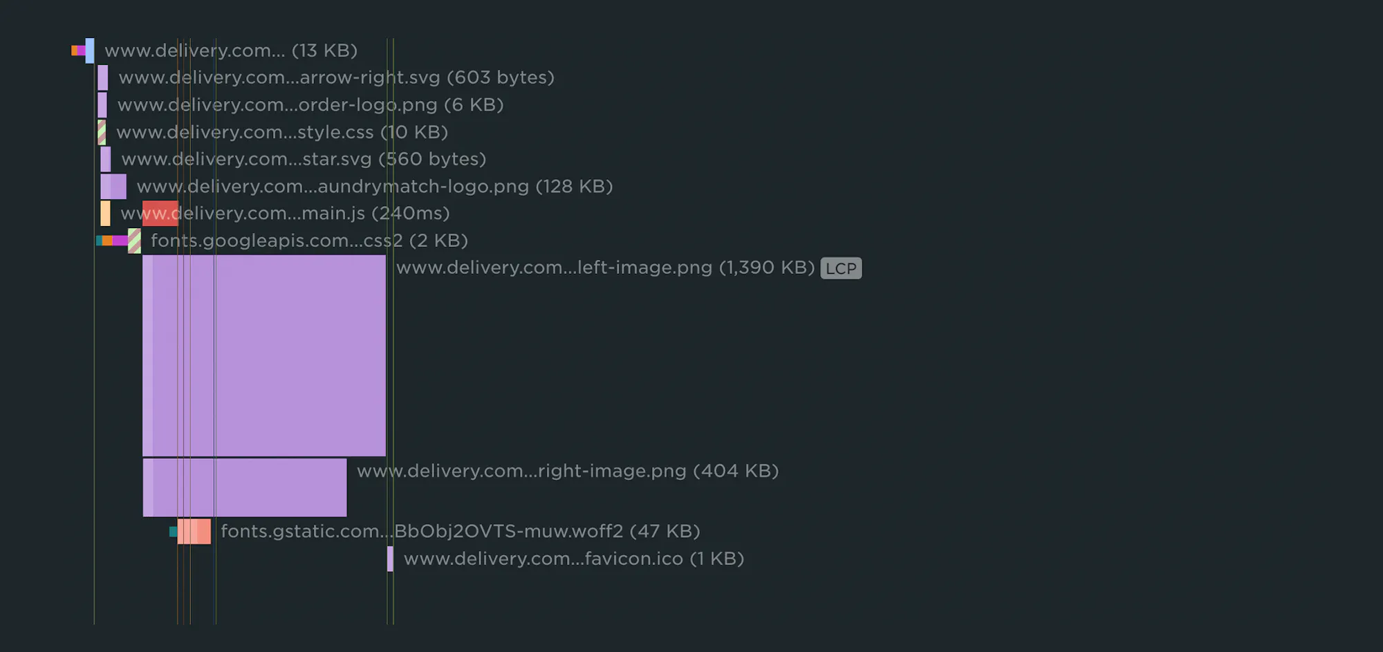
Looking at this little beauty, we see that this page contains just 12 requests. Not surprisingly, this page has a Start Render time of 0.8 seconds and a Largest Contentful Paint time of 2.21 seconds.
There's some room for improvement — the LCP element is the ninth resource request, so serving it earlier would improve the LCP time — but this waterfall is pretty good overall.
The bad
A bad waterfall is a waterfall that has a combination of (1) a lot of resources, (2) slow resources, and (3) excessive blocking resources.
This page contains 147 requests, which isn't great, but on the plus side, the LCP element is the fifth resource requested on the page. So despite this page containing a lot more resources than the "good" waterfall above, it has a better LCP time: 1.93 seconds.
However, all the JavaScript on this page adds up to almost 600 milliseconds of JS blocking time, which means this page is at risk of having poor response times (i.e., when a user clicks or otherwise interacts with the page).
The ugly
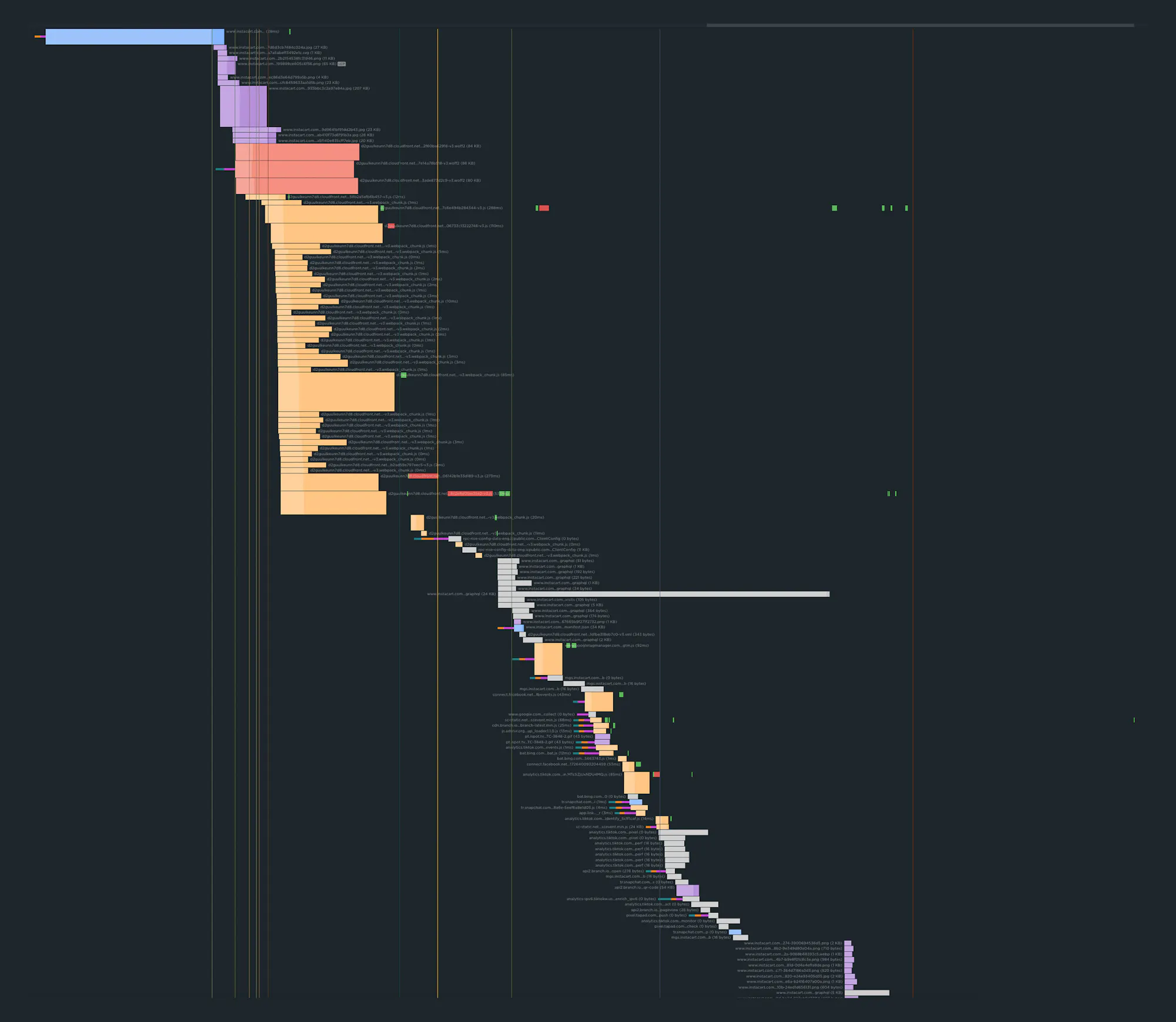
An ugly waterfall is a bad waterfall on steroids. You might want to take a few seconds to flex your scrolling finger before you check this out.

This majestic beast (which belongs to a US media site that I'm not going to name) contains a total of 1,562 resource requests. That's a lot. But believe it or not, there are bigger waterfalls out there!
Here's the nutty thing: while this waterfall is admittedly huge, and its 8.1 seconds of blocking JS time does pose a risk to its Interaction to Next Paint time, it has a 1.4 second Start Render time and a 2.09 second LCP time. In other words, it's LCP time is better than that of the lean waterfall I showed up top.
The takeaway: a page can be huge and contain literally thousands of resources (though that's not a recommended practice for a bunch of other reasons), but still render quickly from the user's perspective. That's the value of optimizing for the critical rendering path.
Critical rendering path
The critical rendering path is the set of steps browsers must take to convert HTML, CSS and JavaScript into living, breathing websites. To optimize for performance, you need to understand what happens in the steps between receiving the HTML, CSS, and JavaScript bytes and the processing that's required to turn them into rendered pixels.
In other words...
The difference between a good page and an ugly page is about more than just the number of resources. It’s also about things like:
- How much latency these resources experience
- The order in which they render on the page
- Whether or not they block other resources
It’s important to bear in mind that you can have a waterfall with very few bars, but if it experiences any of these problems, then you might be in no better shape than our Niagara Falls example up there.
Conversely, you can have a waterfall with a lot of bars, but if the most important content renders early, all those bars might not be anything to worry about.
Know your colours
In SpeedCurve, your waterfall chart is interactive. You can hover over each bar and see how that resource lines up to the rendering filmstrip at the top of the chart.
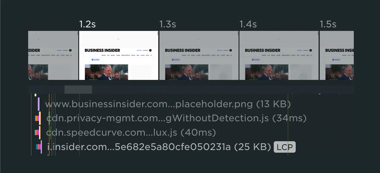
You can also click on any bar to learn more about the resource:
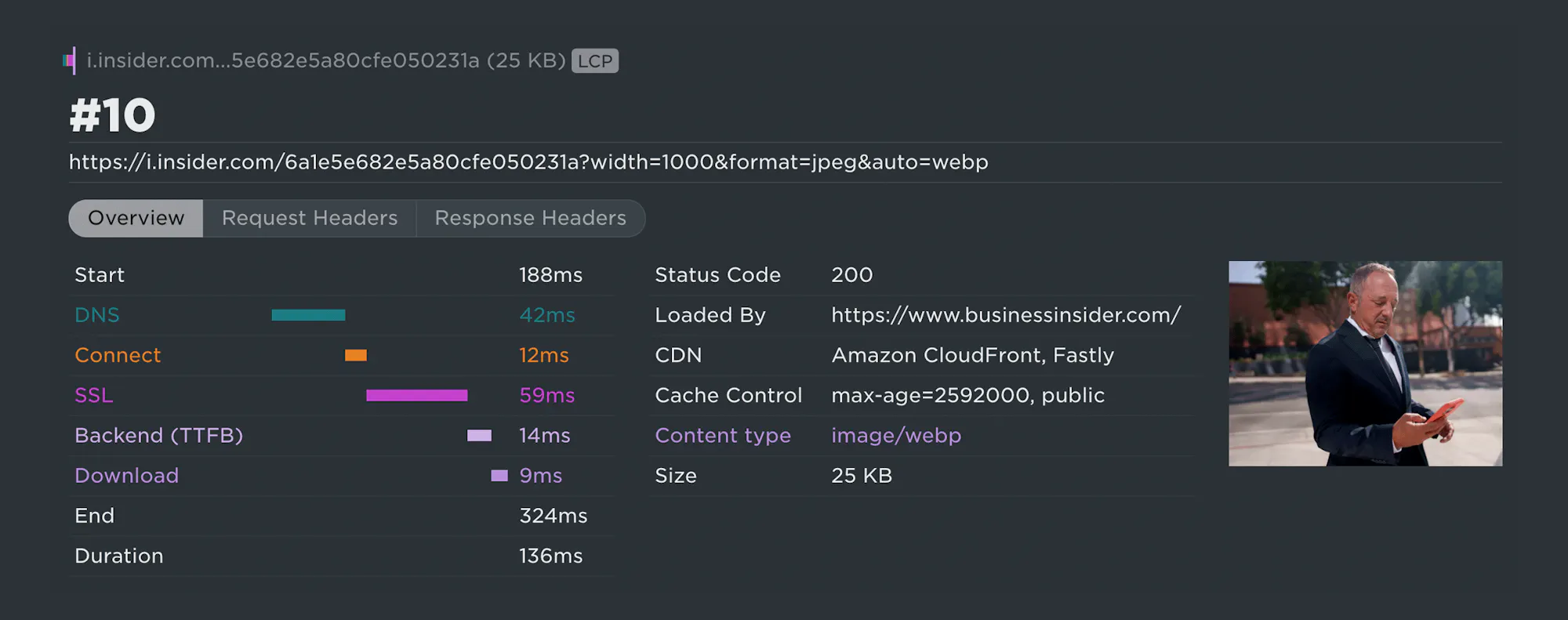
Each of the coloured bars in the resource details represents a different activity that happens as the resource is delivered to the browser. And each of these coloured bars can tell you a useful story about how that specific resource performs.
Green = DNS lookup
This is when the browser looks up the domain of the object being requested by the browser. Think of this as asking the “phone book” of the internet to find someone’s phone number using their first and last name.
How to use the green bar to identify problems: You can’t do much about the green bars and they shouldn’t be a problem on most sites.
Orange = TCP connection
Also called the three-way handshake, this is the process by which both the user and the server send and receive acknowledgment that a connection has been made and data can begin to be transferred. It’s not easy to speed up the TCP connection, but you can control how many times the connection takes place. This is a good thing to do, because too many connections will slow down performance.
How to use the orange bar to identify problems: If every other bar on your chart has orange in it, that’s too many orange bars. You can address this problem by having your developers use something called keep-alives to reduce the number of TCP connections.
Fuchsia = SSL
This is the duration required to establish a secure, encrypted connection (the SSL/TLS handshake) between a user's browser and a server.
How to use the fuchsia bar to identify problems: Modern optimizations shouldmake SSL time practically negligible, so if you're seeing long fuchsia bars, there a few things you can do, including making sure you're on the latest TLS standard and enabling HTTP/3.
Lilac = Backend time
This is the window of time between when the browser asks the server for content and when it starts to get the first bit back. The user’s internet connection is a factor here, but there are other factors that can slow things down: the amount of time it takes your servers to think of what content to send, and the distance between your servers and the user.
How to use the lilac bar to identify problems: The most common backend bottlenecks are database queries, third-party API calls, and server CPU/memory, so start by investigating those.
Lavender = Download
This is the time it takes for each page resource to be completely sent from the server to the browser.
How to use the lavender bar to identify problems: If there are too many lavender bars in your chart, then not only does the page contain too many resources, but each of these resources is too large. This problem can be fixed using a number of performance techniques, from fundamental best practices like resource compression to advanced treatments like auto-preloading.
When it comes to user-perceived performance, some bars are more important than others
In SpeedCurve, your waterfall chart is interactive. You can hover over each bar and see how that resource lines up to the rendering filmstrip at the top of the chart. This lets you see which resources are requested before meaningful content appears in the browser.
CHART
If you care about user-perceived performance, then you should care about each of those resources. Ask yourself:
- Are there any slow/large resources? If so, can they be optimized or deferred to render later?
- Are there any blocking resources? Do they need to be blocking, or can they load asynchronously instead? If they need to remain blocking resources, can they be deferred?
- Are there any resources with excessive Long Tasks times? Can they be optimized or deferred?
Learn more about each request
You can also click on each request in a waterfall chart to get a lot more information about that resource, including:
LIST
Identify first- and third-party request groups
MORE
Read Next

See how customers are using SpeedCurve to make their sites faster.