NEW! A trickle of updates to your waterfall charts

Waterfall charts are the workhorse of any web performance enthusiast. SpeedCurve's interactive waterfall is one of the first components I designed and built more than a decade ago. I've just given our much-loved waterfall chart some team-inspired updates that you may find helpful in understanding how page construction affects important user experience metrics.
At SpeedCurve, we love incremental updates based on both external and internal user feedback. We dogfood our own products, and while consulting with customers, our in-house performance expert Andy Davies is often confronted by the gulf between a customers questions and how he might answer those questions using the data we collect and the visulizations we wrap around it.
It's not always easy. Making data visible doesn't automatically mean it's useful in answering questions about the intersection of web performance and user behaviour.
Three years ago Andy asked me for a feature in the waterfall chart. I added it straight away, and to this day Andy has never discovered or used the feature!
"Wait, you can do that?" ~ Andy
If Andy uses SpeedCurve everyday, knows it inside out, and still can't stumble across a three-year-old feature, that's not Andy's problem. That's a problem with complexity in the user interface and feature discoverability. It's a common problem as software matures and features get layered on top of each other. What started out simple and easy to explore becomes complex and hidden behind a myriad of options.
Today I'm taking a crack at removing some options in the waterfall to reduce complexity and choice while exposing better defaults.
I'm hoping Andy sees the changes this time around and it helps answer more of his questions...
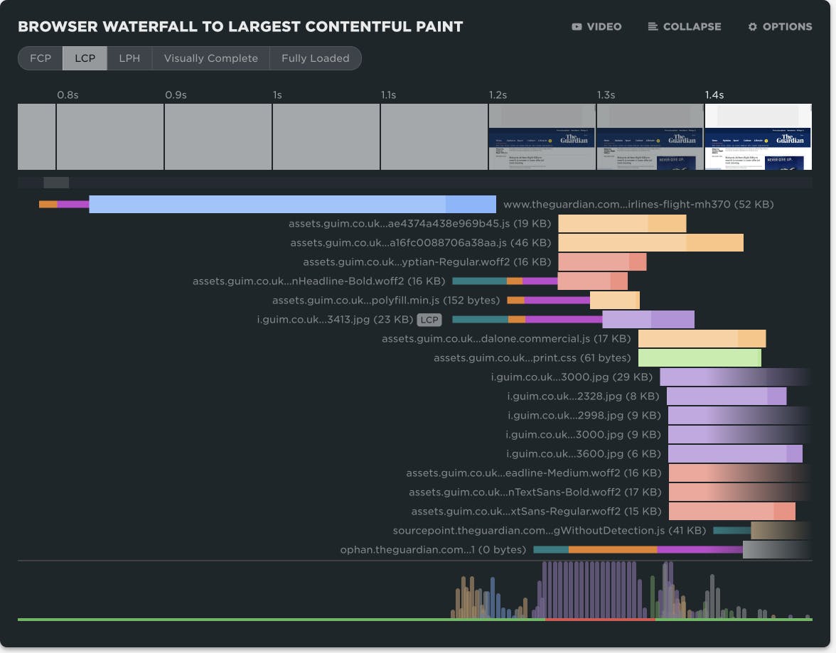
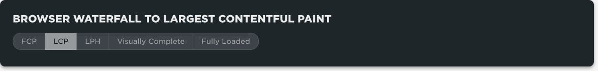
Trim waterfall to timeline events
You'd be horrified by how many requests we see in some web pages. Thousands! A waterfall that big can be unwieldy to navigate.
When you want to focus in on the critical rendering path and see what might be delaying an event like First Contentful Paint or Largest Contentful Paint, we now let you trim the waterfall to different timeline events. After the waterfall is trimmed, any requests that extend beyond the viewable timeline fade out to the right.
This feature was inspired by the many talks Tammy Everts has given on focusing on what matters.
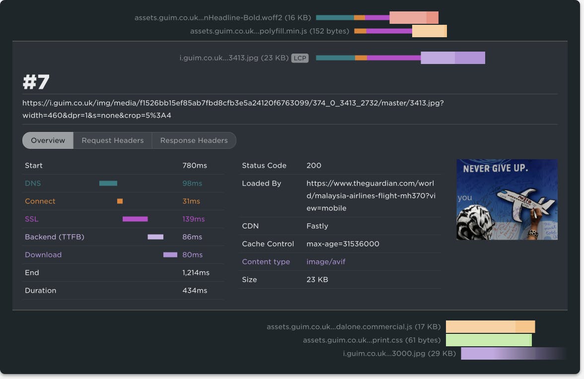
Connection phases & LCP badge

This one is all yours, Andy! For three years, you could toggle the request bars between content type or connection phase in the waterfall options. Now we've collapsed those options into the same view, taking inspiration from Pat Meenan's legendary WebPageTest.
The starting skinny bars shows the connection states of DNS, Connect, and SSL. The fat bar's colour shows the content type with the lighter shade at the beginning indicating time to first byte.
We also badge the request related to Largest Contentful Paint, making it easier to spot a late loading image in the waterfall. If LCP is a text node then the main HTML request will be badged.
Request headers & server timing
Cliff Crocker has been asking for this feature for years. When expanding a waterfall request, we now include tabs showing the raw headers. If you have any server timing headers, we yank them out into their own tab, making them easier to scan. You can really get deep into each request and diagnose exactly what the root cause of a performance issue is. No excuses.
What's missing for you?
The interactive waterfall is one of the first components I designed and built over a decade ago (don't look at the source, it's embarrassing) and it's surprising how long it can take to cycle back around and iterate on designs. To be honest, it still needs a full redesign and rebuild in something like WebGPU. But small improvements add up and the waterfall chart has always been the workhorse of any web performance enthusiast. It deserves more attention.
What small tweaks would make SpeedCurve more delightful and useful for you? Let us know.