2021 in review: It was a big year!


This is the most important question we ask ourselves regularly here at SpeedCurve:
Does this bring happiness?
"This" can mean anything from design and features to our own internal processes. We apply this litmus test to everything we do, and I believe it's the secret of our success. It's why we have such an incredible team, such wonderful customers, and such a heartfelt commitment to building tools that make your life easier... and ultimately make your users' lives easier, too!
2021 has been a full year. We celebrated our eighth birthday – which I think makes us about eighty-eight in tech years? We've also grown our team, expanded our customer base, completed a full-scale site redesign, launched our in-house consulting practice, and refined our tools and processes. Here are some of the highlights...
Elena Kay and Andy Davies joined our team!

Technically, Elena joined us at the very end of 2020, but since this marks the end of her first full year at SpeedCurve, I wanted to include her here. Elena is an invaluable member of our development team – and as an athlete, adventurer, and traveller, she's equally invaluable as an inspiration for living our best lives outside work hours!
Andy joined us in June, and since then he's already helped countless customers in his role as in-house performance consultant. If you've been working in this industry for a while, you'll no doubt be very familiar with Andy's work as an independent consultant. We're so happy to have him on Team SpeedCurve!
Continued focus on Core Web Vitals
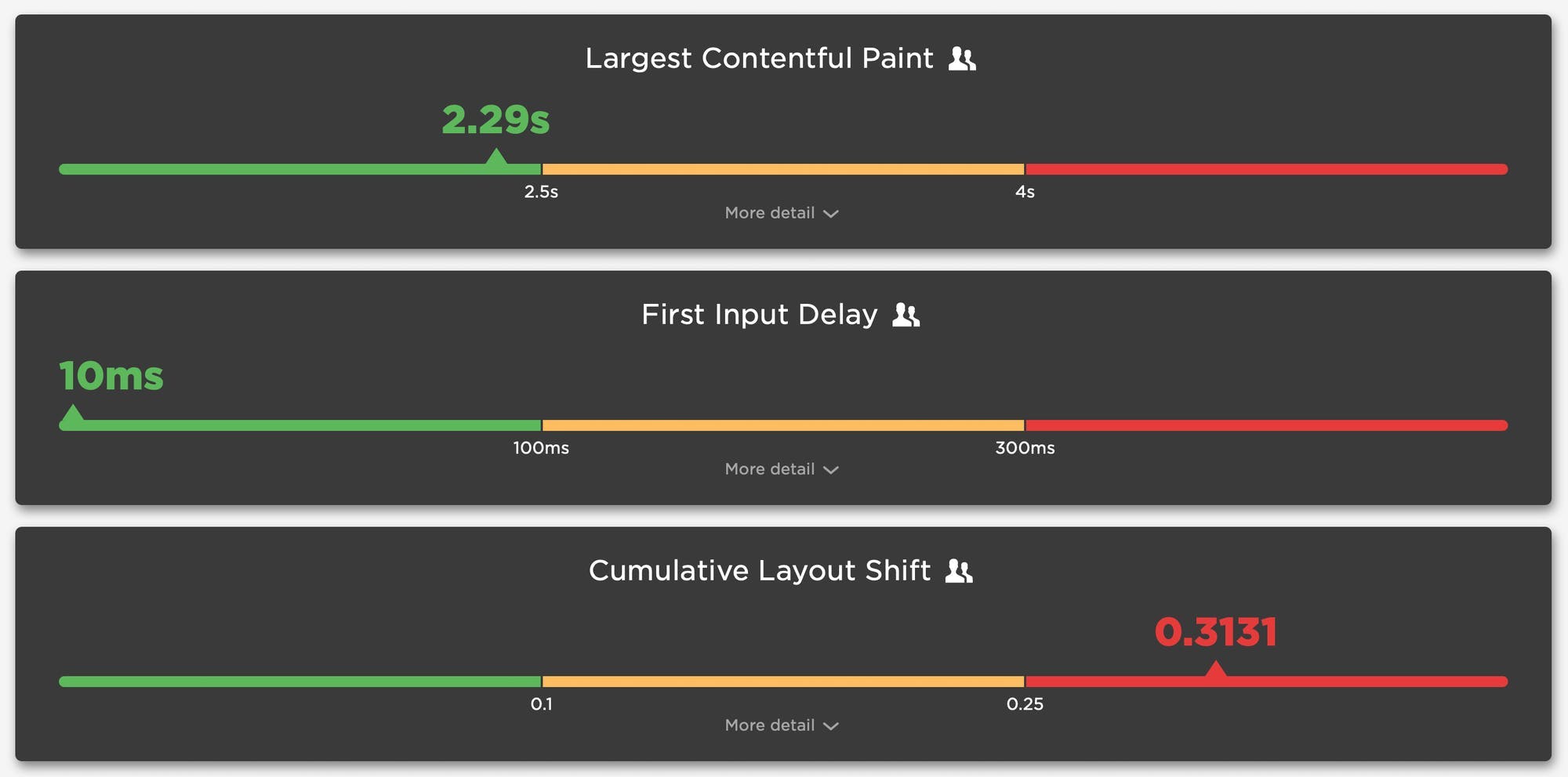
Google's Core Web Vitals have been a huge topic this year. We've been tracking these as individual metrics – Largest Contentful Paint, First Input Delay, and Cumulative Layout Shift – since before Google branded them as a set. In the past year we've expanded your tracking, budgeting, and alerting capabilities to help you get more insight into how these metrics measure user experience on your site.
- Vitals dashboard – This dashboard lets you see your Core Web Vitals at a glance, as well as drill down and get helpful visuals that show you what your users see when each metric is fired. (Watch a video walkthrough of the Vitals dashboard.)
- Custom Vitals tracking in your Favorites – Track Web Vitals in your Favorites, and set performance budgets for them in both SpeedCurve Synthetic and SpeedCurve RUM. (Watch a demo video showing how to create custom charts and performance budgets for Web Vitals.)
- Cumulative Layout Shift visuals – Because CLS is a score-based metric that's intended to let you know how janky a page is, it's tricky to understand what it means in terms of actual user experience. We show you screenshots of the visual elements on your pages that contribute to page jank. (This video shows you how to use SpeedCurve to investigate CLS issues.)
- Largest Contentful Paint element highlighting – As you focus on measuring Largest Contentful Paint as part of your Core Web Vitals tracking, you may find yourself wondering what the heck your largest painted elements actually are. We've made LCP events easy to spot by highlighting them in your Vitals dashboard, your test details, and your Sites dashboard, where you'll also see how key metrics are trending over time.
RUM Live dashboard
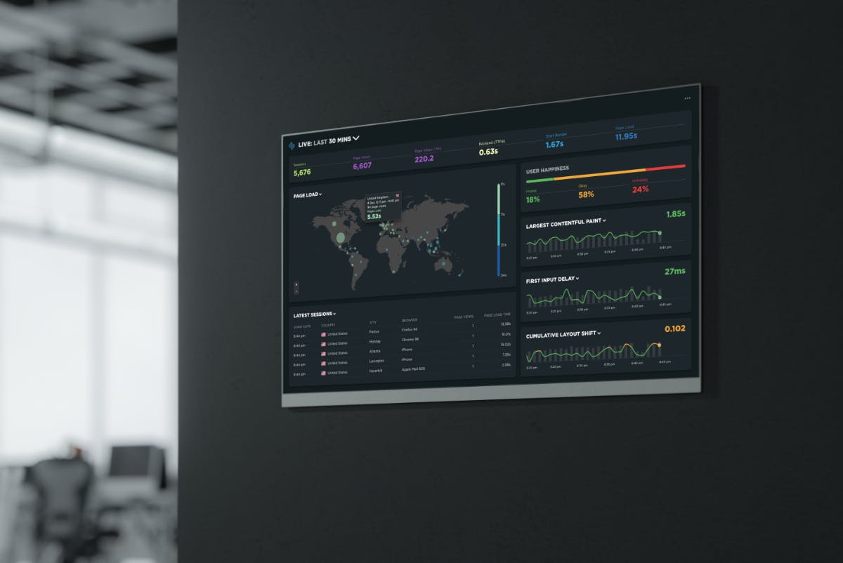
This is so new, you might not have discovered it yet, but we've completely redesigned our RUM Live dashboard to give you a much richer overview of realtime performance. When used in conjunction with TV mode, it's perfect for displaying in the office to get the whole team engaged in improving your performance culture. Visibility is the first step!
RUM Sessions dashboard
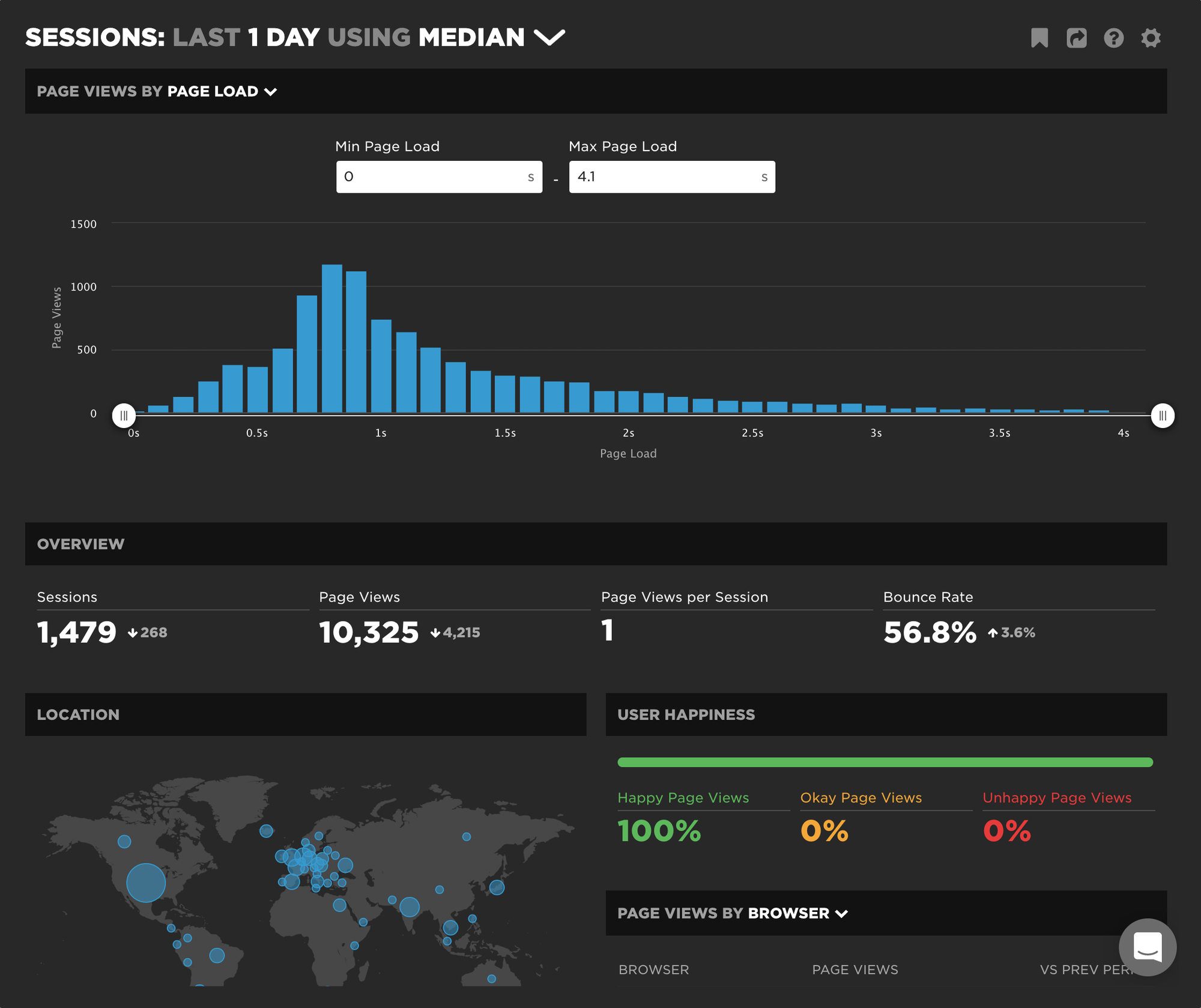
If you want to understand how people actually experience your site, then you need to monitor real users. With your RUM Sessions dashboard, you can investigate things like spikes, baseline changes, or segments from a specific distribution. Your Sessions dashboard lets you drill down and segment your RUM data by:
- Metric / duration
- Browser
- Location
- Time period
More: Watch this video for a walkthrough of the RUM Sessions dashboard. To see how this dashboard can be used to investigate anomalies, check out this deep dive.
Bookmarks dashboard
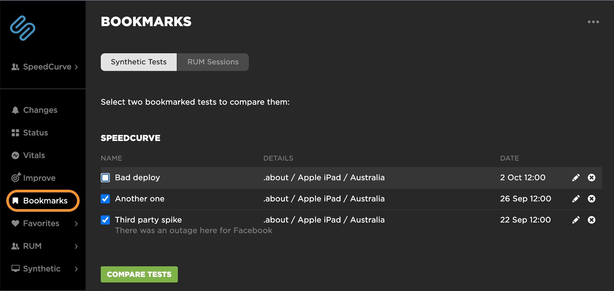
Being able to bookmark and compare your performance data is crucial for investigating anomalies and diagnosing issues. To that end, we've given you the ability to:
- Bookmark RUM sessions – Within the popup in any RUM time series chart, you can click on 'View Sessions' if you want to explore that dataset right away. Or if you want to save a dataset to explore and/or compare later, click 'Bookmark Sessions'.
- Access all your bookmarks within your Bookmarks dashboard – Now you can access all your synthetic and RUM bookmarks in the same location, making it even easier for you to bookmark and compare tests and other datasets.
Relaunched website

In the summer, we launched a brand-new version of our website! This was a monumental overhaul that featured:
- A fresh new look and feel, including energizing graphics from the talented Samantha Stokes.
- Updated copy to reflect all the ways that our tools and services can help you get fast and stay fast.
- Interactive pricing widget so you can have complete visibility into how to manage your spending.
New Support Hub
On the heels of our site relaunch, we also launched our new Support Hub! Eight years of building new features meant eight years worth of support docs. That's a lot of docs! Inevitably, some dead wood had accumulated, so we decided to give our docs a complete overhaul.
We worked hard to structure our support docs to make them easy to scan and quickly find what you need – from our step-by-step guides to getting started with Synthetic and RUM through to troubleshooting and FAQs. We also added a "Performance 101" section that includes articles like:
- Synthetic vs. Real User Monitoring
- Performance Budgets 101
- Performance Culture Best Practices
- Web Performance for Product Managers
- Web Performance for Retailers
- SEO and Web Performance
If you have any suggestions for articles and guides you'd like to see, let me know!
SpeedCurve recipes
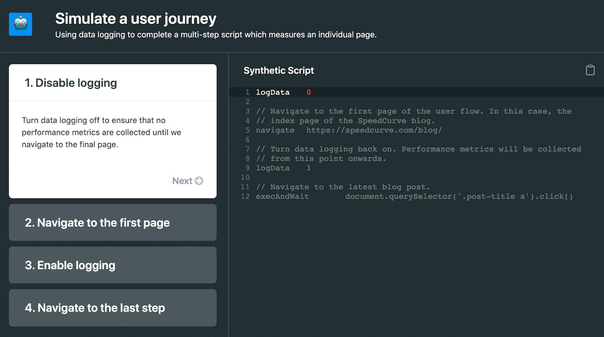
You'll find Recipes in our Support Hub, but I want to call them out separately here because they're that exciting. Recipes are detailed walkthroughs – including sample scripts – of multi-step tasks, such as:
- Simulate a user journey
- Simulate a SPA or AJAX navigation
- Submit a login form
- Add a repeat view
- Track size for a single resource
We'll be adding more recipes in the future, so send us suggestions for what you'd like to see at support@speedcurve.com.
Industry speed benchmarks for Japan
We have a number of SpeedCurve users who want an ongoing understanding of how popular Japanese websites perform, so we added Japan to our Industry Page Speed Benchmarks dashboard.
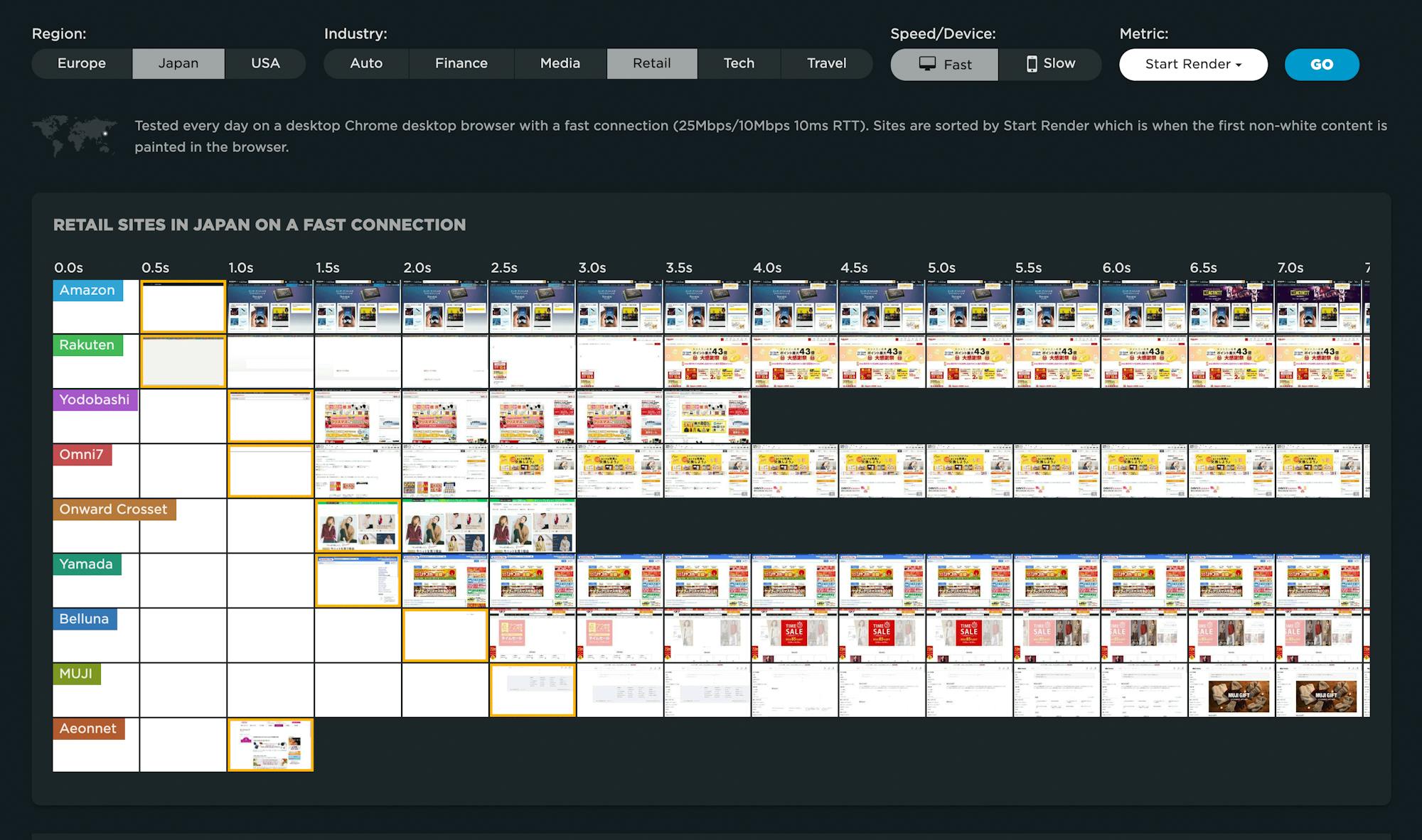
This dashboard gives you a high-level perspective into the performance of industry-leading sites, plus the ability to drill down and see detailed test results, including waterfall charts and Lighthouse scores. (This dashboard is public-facing so you don't need a SpeedCurve account to explore it.)
So many great customer stories!
We love it when our customers share their stories about using SpeedCurve and making their sites faster – and their users happier! Here are some favourites from the past year.
Gumtree: Introduction to performance monitoring
This is an excellent primer for anyone who's getting started with performance in general (and SpeedCurve in particular). Conor Malone explains the differences between synthetic and real user monitoring, how to create custom dashboards, and how to set up performance budgets and alerts.
The Five Pillars of Performance Engineering at Insider
Jason Merriman shares the five pillars of performance engineering – from content delivery to performance evangelism – at Insider.com. This is a great piece about how an organization with a lot of performance maturity got to this point.
Measuring Web Performance at Airbnb
Josh Nelson shares which web performance metrics Airbnb tracks (including Core Web Vitals) and why, how they measure them, and – importantly – how they consider tradeoffs between them in practice.
How real user monitoring will improve GOV.UK for everyone
Matt Hobbs shares how the team at GOV.UK rolled out real user monitoring (RUM) and why they believe it will help them improve accessibility and availability for all users.
Fostering a web performance culture at leroymerlin.fr
The strength of your company's performance culture is one of the best indicators of success. Bertrand Laot at French retailer LeroyMerlin shares how they use a combination of RUM and synthetic monitoring – including performance budgets and alerts – to keep their entire team up to speed.
How QuintoAndar increased conversion rates and pages per session by improving page performance
Daniela Sayuri Yassuda shares how a project that focused on optimizing Core Web Vitals and migrating to Next.js resulted in a 5% increase in conversion rates, an 87% increase in pages per session, and a 46% reduction in bounce rate.
Improving Cumulative Layout Shift at Telegraph Media Group
Chris Boakes explains how, within a couple of months, the leading UK news website managed to improve their 75th percentile CLS by 250% from 0.25 to 0.1.
That's our year in review
It's been a good one for us. I hope it's been good for you, too. :)