Monitor performance budgets at a glance with your Status dashboard

This may sound counter-intuitive, but we don't want you to spend countless hours using SpeedCurve. In fact, our goal is to make your web performance data so accessible, understandable, and actionable that you can get everything you need from us in just a few minutes.
That's why we're so excited to announce the brand-new Status dashboard – a visualization that lets you see at a glance all your web performance budgets, as well as which budgets have been violated.
Keep reading to find out how to start using your Status dashboard to diagnose and fix your performance pains. But first, let's talk about why we built this feature.
Why we created the Status dashboard
TLDR: To make your life easier.
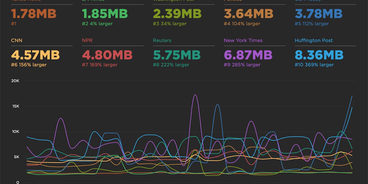
We're constantly debating the most important metrics to focus on and the most helpful ways to visualize your data for you. We have decades of collective web performance experience, which translates to a lot of strong opinions. You can see those opinions represented in the default charts in a few of your dashboards. These curated charts are a good way to get started. But they're just the beginning.
You know your site and your performance goals better than anyone. That's why last year we launched Favorites dashboards – where you can create your own custom charts and organize them in separate dashboards geared toward different teams and projects. And it's why we recently made it easy for you to create your own performance budgets within your Favorites dashboards. (If you're not familiar with web performance budgets and why they're essential, I encourage you to read this post.)
Some of our customers have dozens of Favorites dashboards, with dozens of charts on each. Many of our customers have signed up to get alerts when your budget thresholds are crossed, as well as weekly email reports that summarize the activity of your key metrics. These are all important features, but we wanted to do more. We wanted to make it even easier for you to see at a glance the status of all your performance budgets so that you can quickly home in on the metrics that are hurting the most.
How to use it
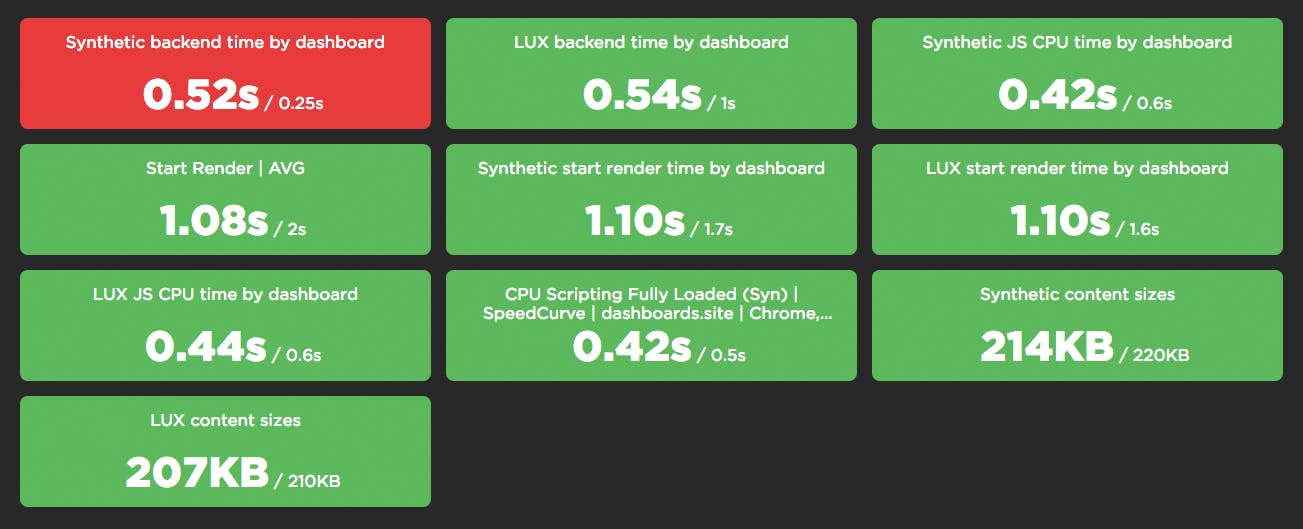
The Status dashboard is available as in your global left-hand navbar. Click on any budget to drill down into each metric.
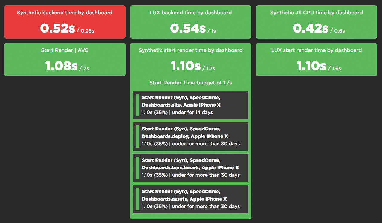
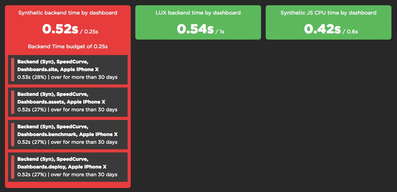
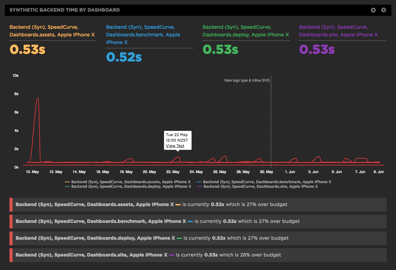
You're probably wondering about that red alert, am I right? Of course you are. Below you can see that while the target backend time is 0.25 seconds, the actual backend time is 0.52 seconds. When you expand this metric, you can also see that not only is backend time at least 27% over budget across all segments in this budget, it's been that way for more than 30 days.
To drill down into the charts for each budget, just click on the link for that metric. That will take you to the detailed time series chart in your Favorites dashboard. You can then click on any point in the series to drill down into the results page for that test:
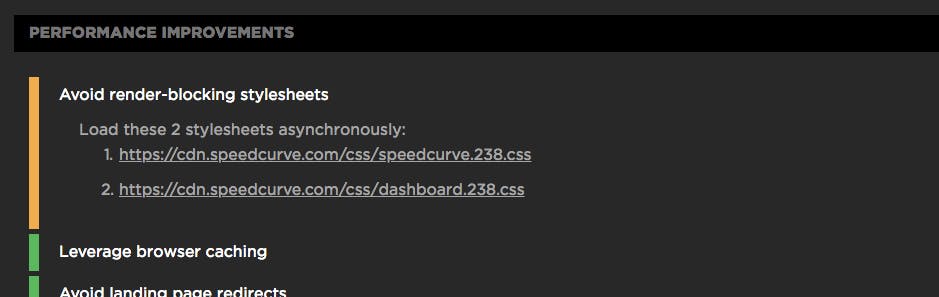
Your test results page contains a lot of great information, including suggested performance fixes for that page. Here are the recommendations for the page we've been tracking... and yes, I'm aware that it doesn't relate to back-end time. ;)
Getting started
We're super excited about the Status dashboard and its potential to simplify your daily workflow. If you're a SpeedCurve user, here's how to start taking advantage of it right away:
- If you've already created custom charts and assigned performance budgets for them, then your Status dashboard is live right now. Check it out and give us your feedback!
- If you haven't already done so, create some custom charts within your Favorites dashboard.
- Within those charts, create a performance budget for each chart.
- Go to your Status dashboard to see at a glance which of your metrics are over and under budget.
If you're not already a SpeedCurve user, we'd love to have you give us a try for free!