NEW! December product update


Holy cow, it's been a busy few months! SpeedCurve turned ten, we attended (and gave talks at) performance.now(), Firefox added support for Largest Contentful Paint (LCP), and oh yeah... we just shipped a ton of stuff! (We wanted to wait until the dust settled around Black Friday/Cyber Monday for all of our friends in retail, which led to a pretty monumental release.)
So get comfy and check out our holiday updates.
Improve your CI/CD workflow
Integrating SpeedCurve into your development pipeline – so you can catch issues before (or right after) they go into production – has been a popular practice over the last several years. In our last product planning session, we made the decision to invest a lot of time into improving the developer experience and the overall time to value for customers using us in their CI/CD pipeline.
Deployment dashboards
Previously, the Deploys dashboard (now renamed 'Compare' in the Synthetic navigation menu) was the only way you could see your recent and historical deployments. We've introduced two brand-new dashboards, with the goal of letting you see all of your deployments and their status in a single view, and then drill down into the details for each deployment.
Your Deployments dashboard is in the main navbar. Your deployments history (for the last month by default) is on display in the dashboard. At a glance you can see:
- The status of the deploy
- The status of your performance budgets (if you have created budgets)
- An aggregate metric for all of the URLs tested in the deploy (set to Largest Contentful Paint by default)
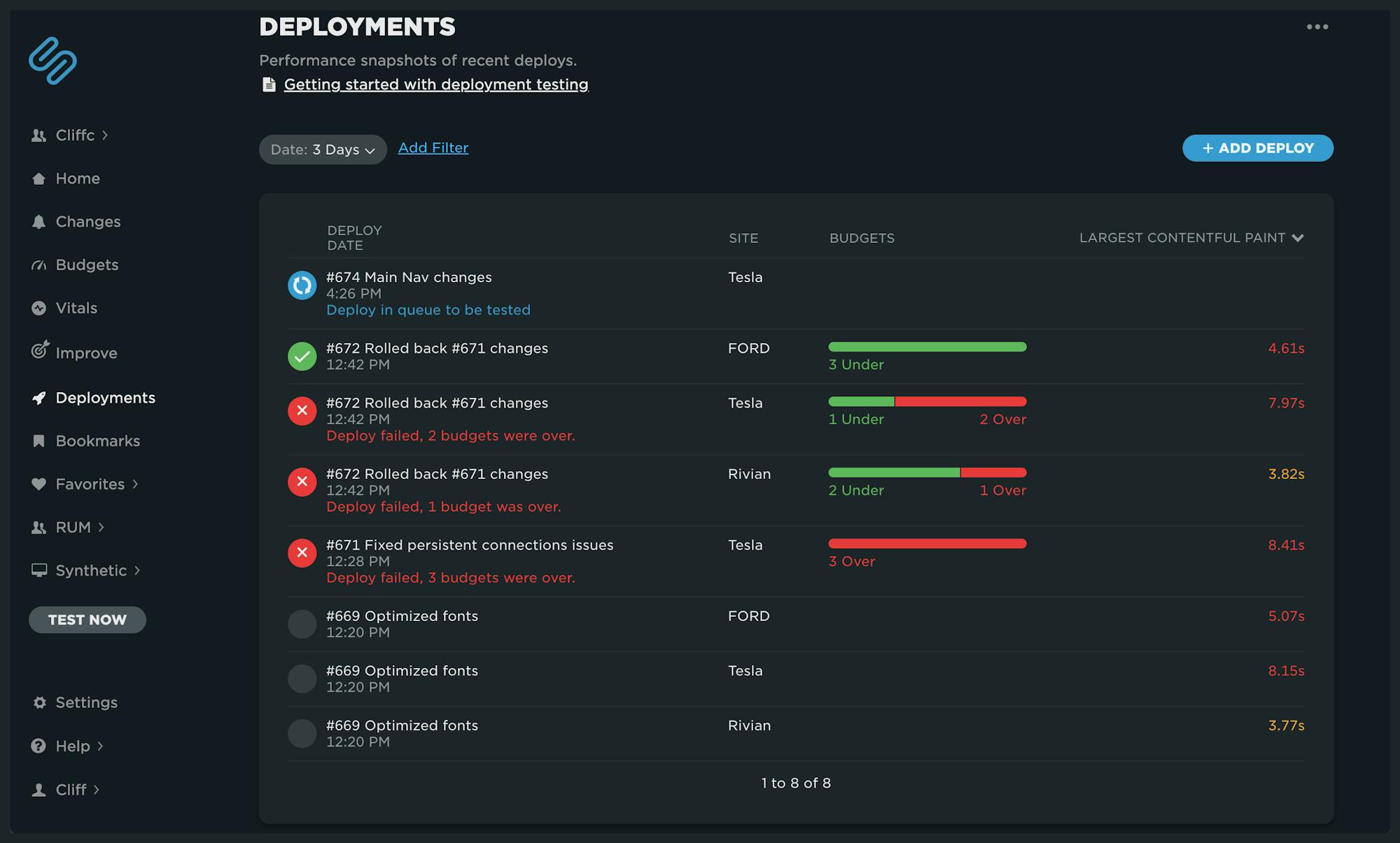
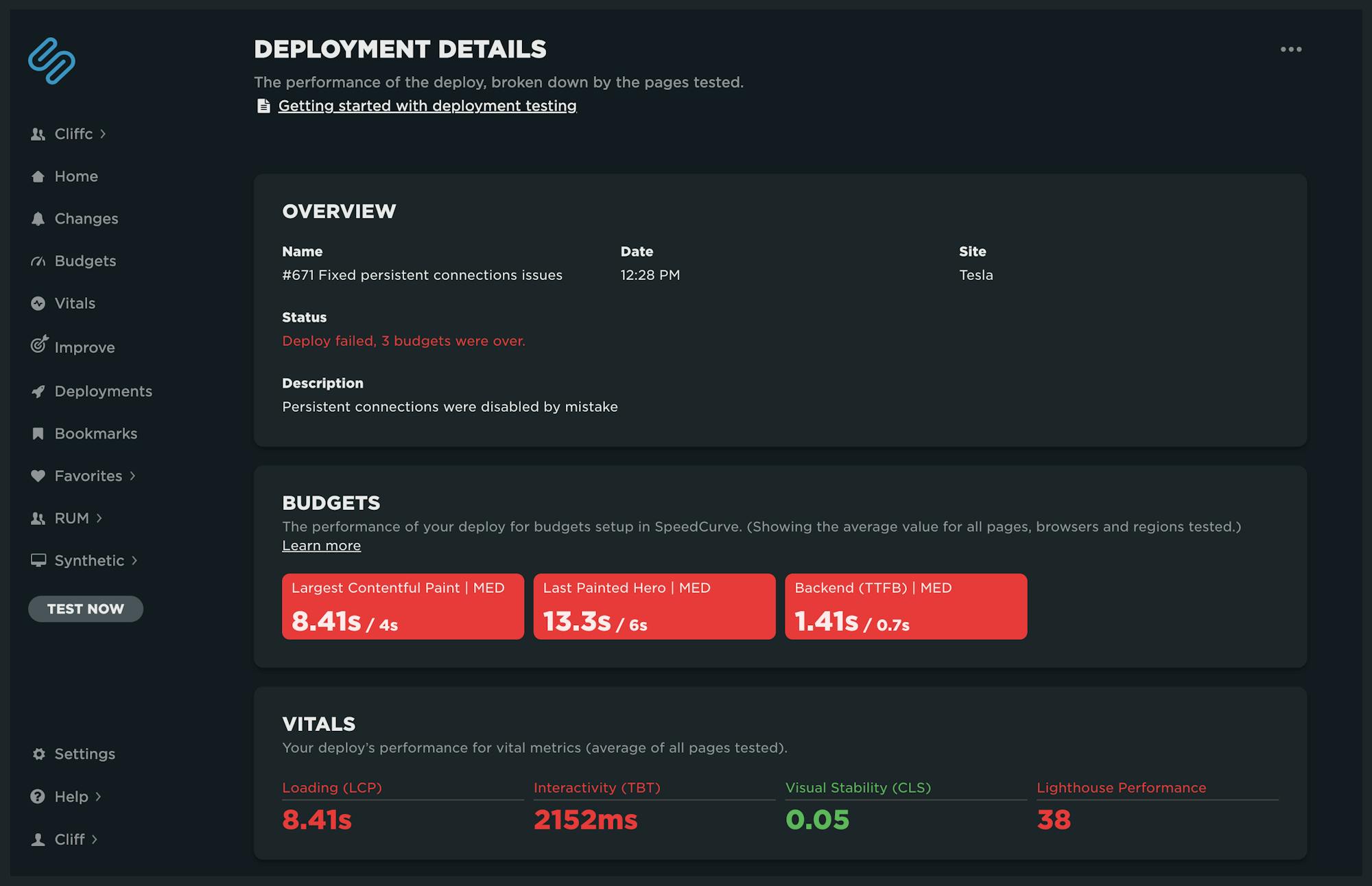
Clicking on any deployment in the list brings up your Deployment Details dashboard. This view is specific to that deploy. It includes:
- The status of your performance budgets
- An overview of your Core Web Vitals
- A breakdown of Core Web Vitals by each page
Notes cleanup
If you're one of the many SpeedCurve users who frequently deploy changes with notes – or if you have been taking advantage of adding notes manually – you're in for a treat.
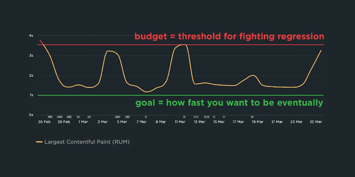
Previously, charts could get REALLY noisy and look something like this: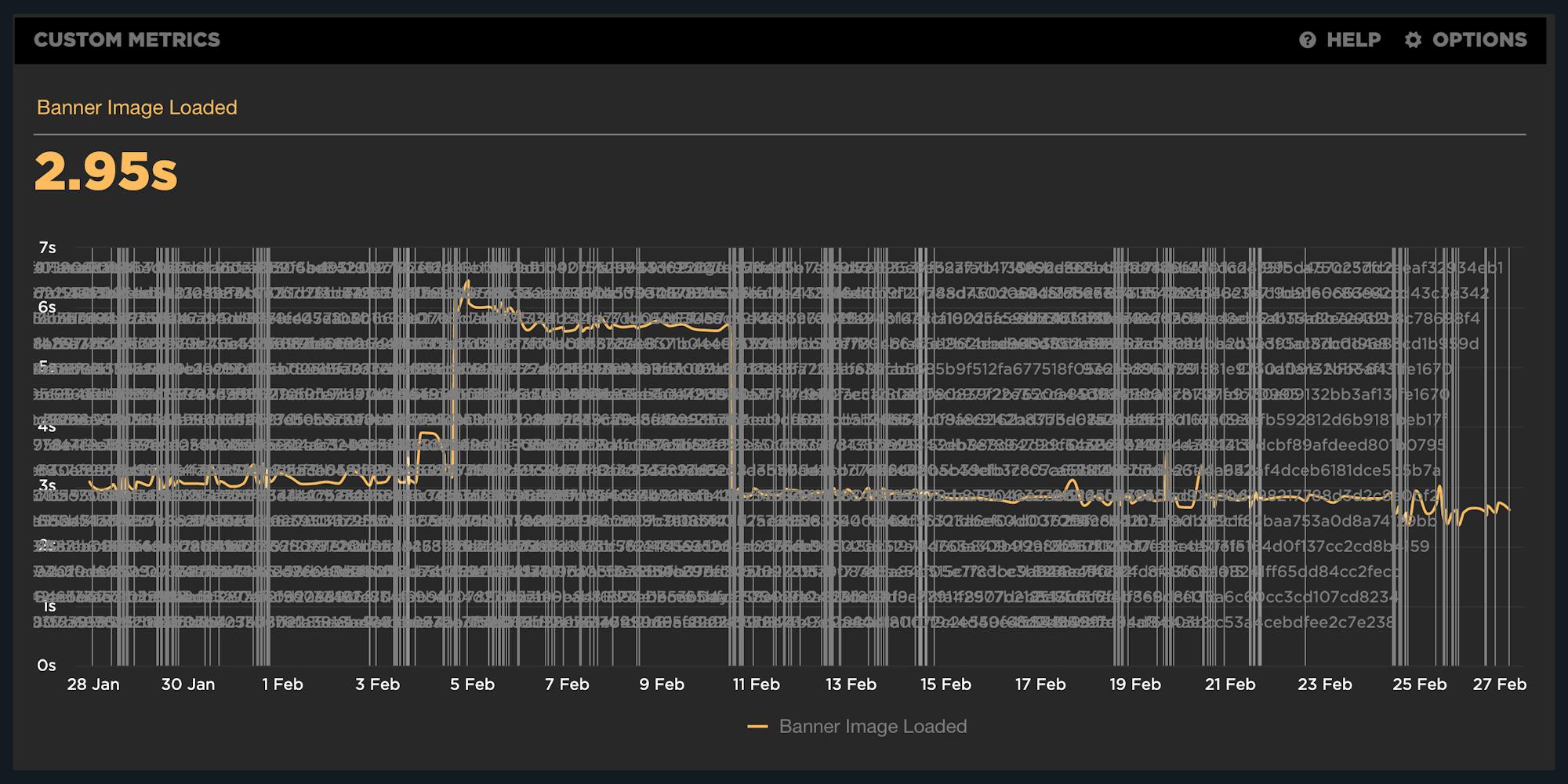
The chart above shows how the annotations – as well as the associated name for each deploy – made the data in the chart hard to read. We're happy to share that we've cleaned this up (to say the least).
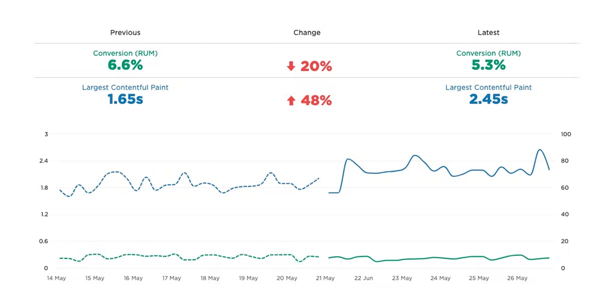
Now you'll see something like this:
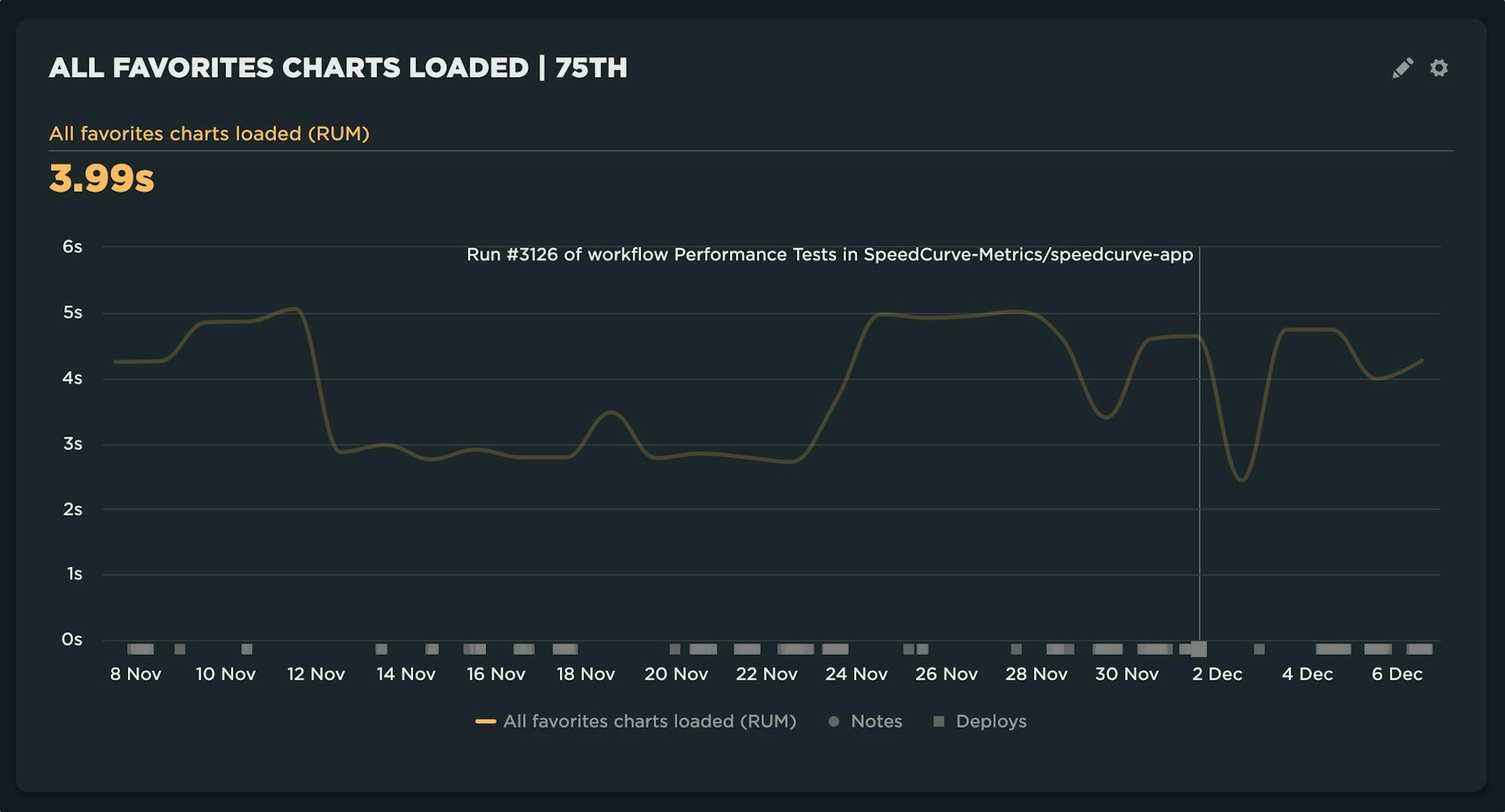
Below the x-axis, we've introduced markers to designate where deploys have occurred or notes have been posted. When hovering over each marker, you'll see a clear presentation of the associated name. The chart is now readable, but you still have the ability to see your deployments and find their details.
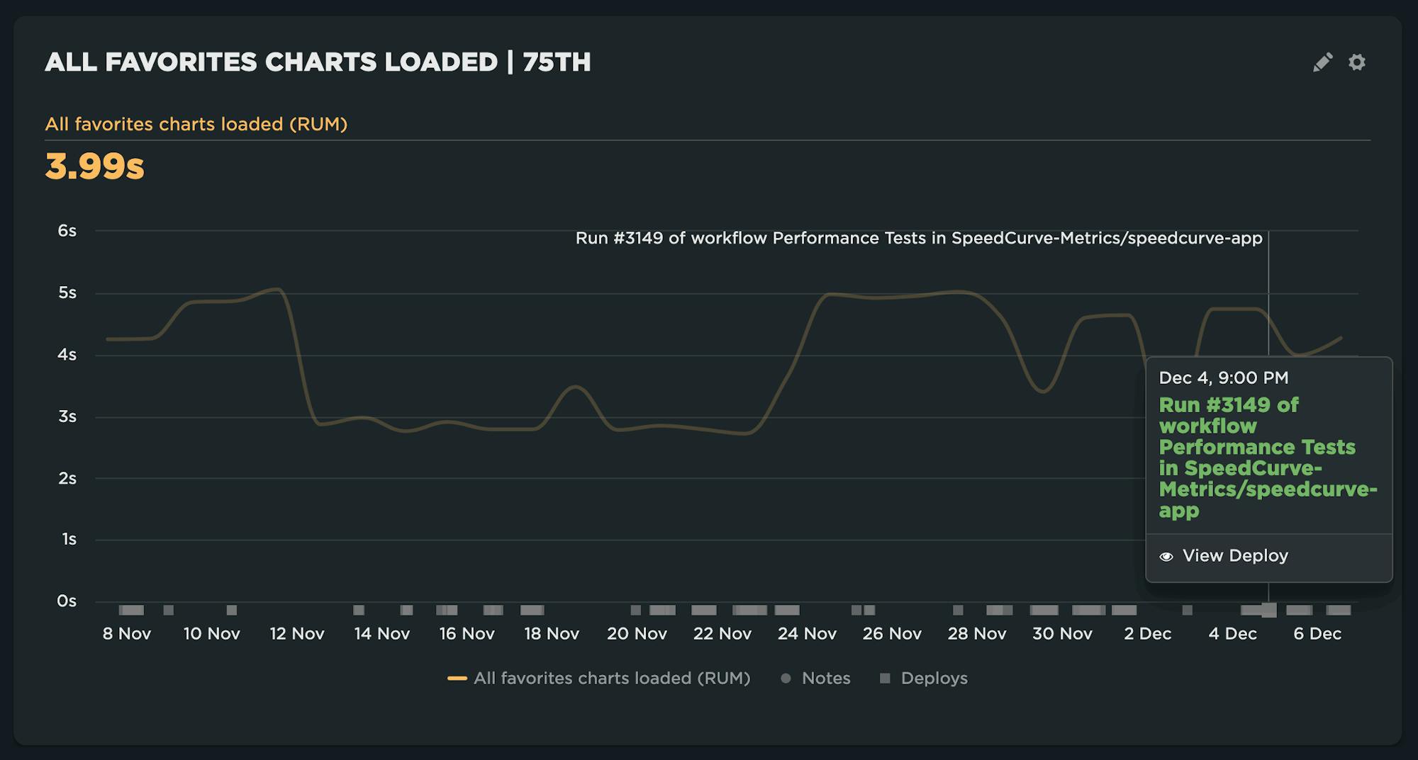
Clicking on a deployment brings up a tooltip with the full name associated with the deployment and the option to 'View Deploy', which takes you to the Deployment Details dashboard shown earlier.
Notes are now separate from deploys. Every deploy has an associated marker and the name provided for the deployment. In addition, if you choose to add a note from the chart or when using the 'Test Now' option, those will be shown as Notes alongside deployments.
Main navigation changes
There have been a few notable changes to the main navigation menu.
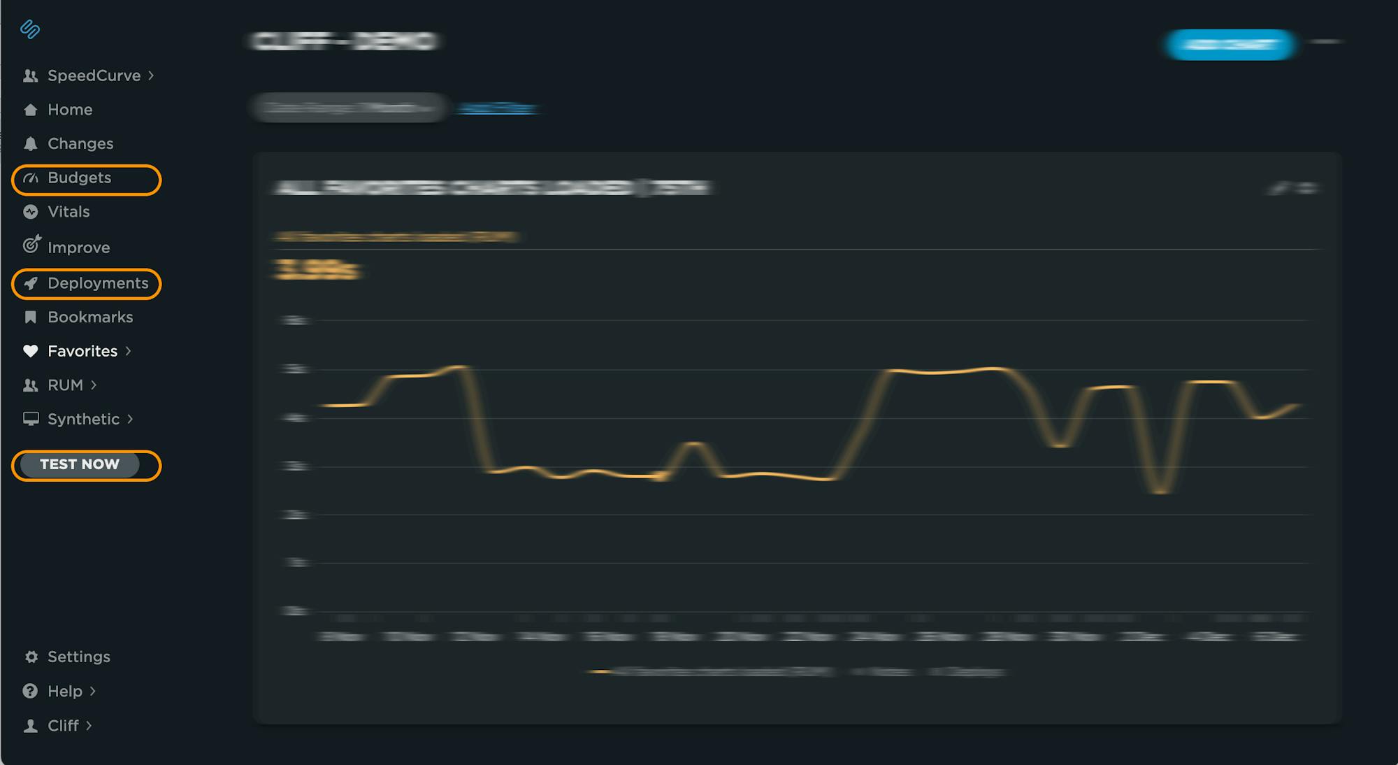
- 'Status' has been renamed 'Budgets' – The underlying dashboard is the same (for now!). The goal is to make it more clear that this is where to see the status of all your performance budgets at a glance.
- 'Deployments' has been added – As shown earlier, this takes you to your Deployments dashboard.
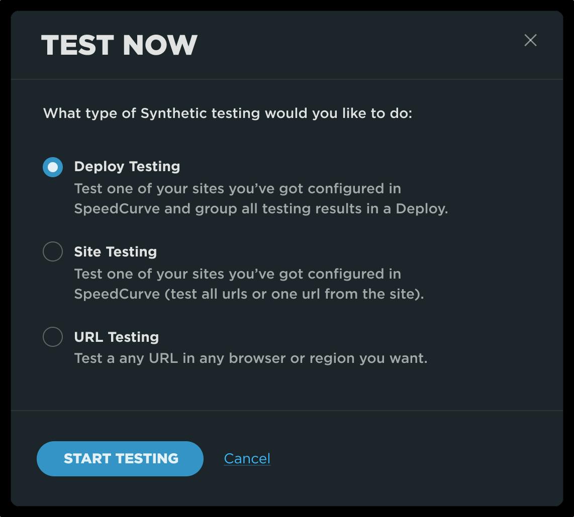
- 'Test Now' is now located in the navbar – Now you can trigger a test from any dashboard. Options for 'Test Now' include the ability to test a site(s) standalone or as part of a deploy.
Future CI/CD updates
We aren't done yet! This is just the start of building a more solid foundation for CI/CD. Here are a few more things we're progressing quickly on.
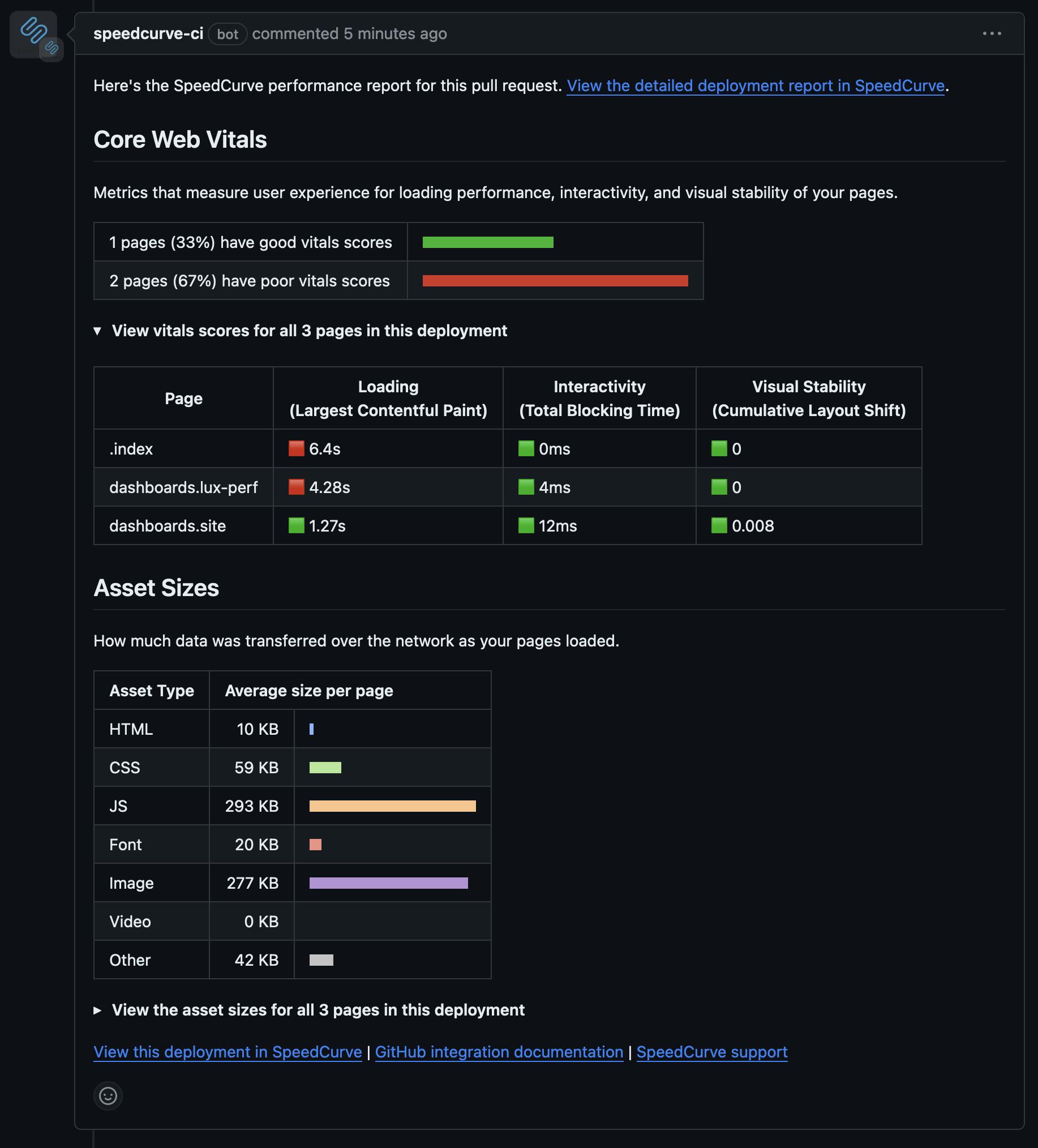
GitHub integration
This integration will provide the ability to link your GitHub repo to a site in SpeedCurve and automatically run performance tests against a GitHub deployment. Additionally, results will report back to the pull request for that deployment.
Adhoc testing
Soon you'll be able to run a test on demand that is scoped to:
- a deploy,
- a site,
- a URL within the site, or
- a specified URL of your choosing.
The ability to run adhoc testing has been a frequent request of SpeedCurvers for a while now, so we are REALLY looking forward to shipping this feature.
More powerful RUM
We've made some huge strides with real user monitoring (RUM) over the past couple of years. We're thrilled to see the appetite for RUM continue to grow across all industries.
Historically, RUM has been a bit challenging for some organizations. Making code changes to modify your configuration, collect custom data, or further segment your pages isn't hard, per se, but it's difficult and time consuming to make changes in production. This year we took some big steps to help remove some of this friction:
- Page labels via URL rules
- Updated conversion tracking
- Server timing support for custom data
We are continually looking for ways to make it easier to extract actionable data from RUM, and this month has been a big jump forward.
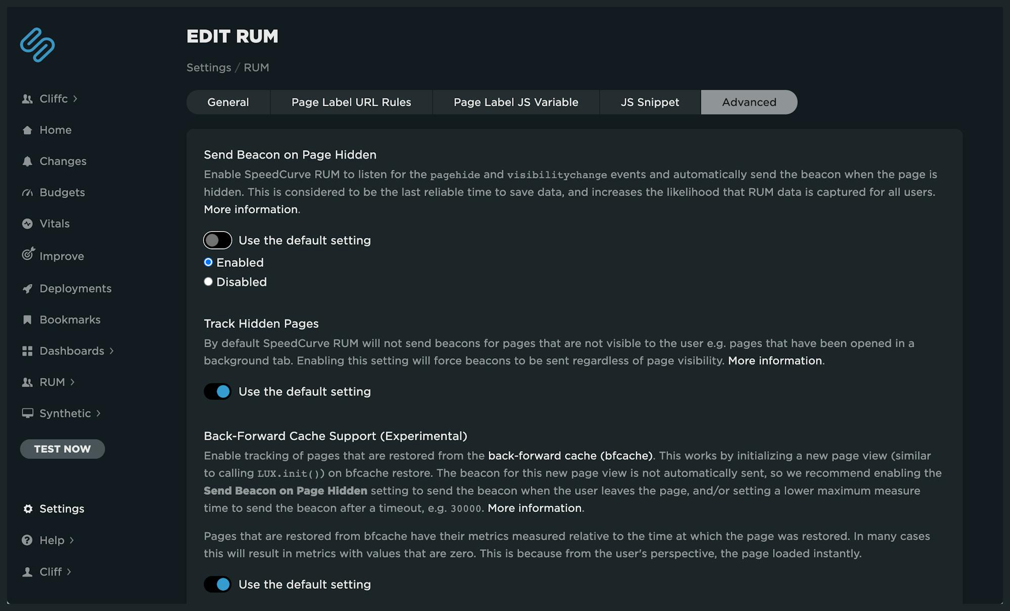
Advanced settings
The SpeedCurve RUM JavaScript API contains many properties, functions, and attributes that allow you to have more control around your integration. However, previously you were required to make code changes in order to take advantage of them. We've just introduced some advanced settings in RUM that allow you to make changes to some of these properties within our UI, with no coding required.
Now you have easier access to controls like:
- Control over when to send a beacon, such as sending on 'Page Hidden'
- Adjust the min/max measure time for a page
- Track navigations that were previously ignored, such as hidden pages and pages served from back-forward cache
- Control over JavaScript error collection
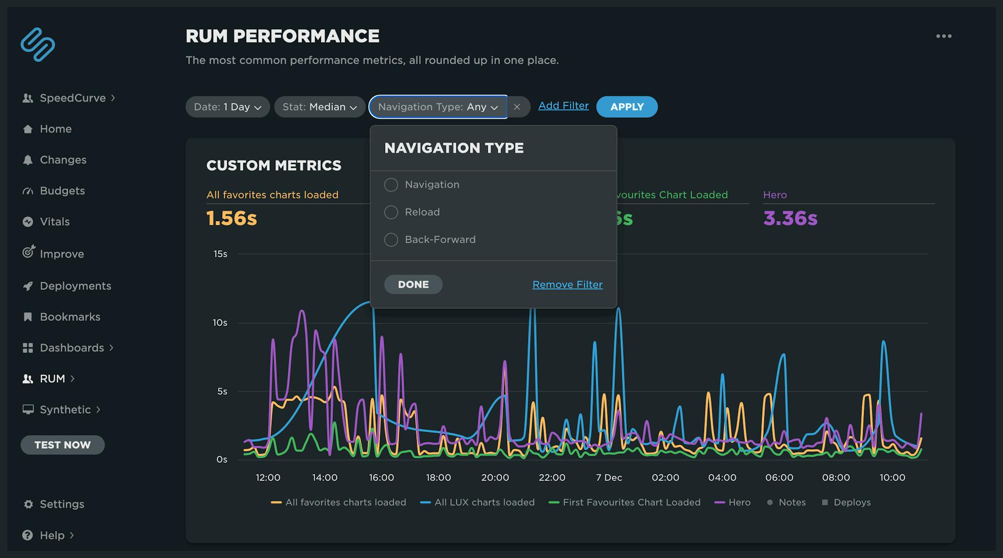
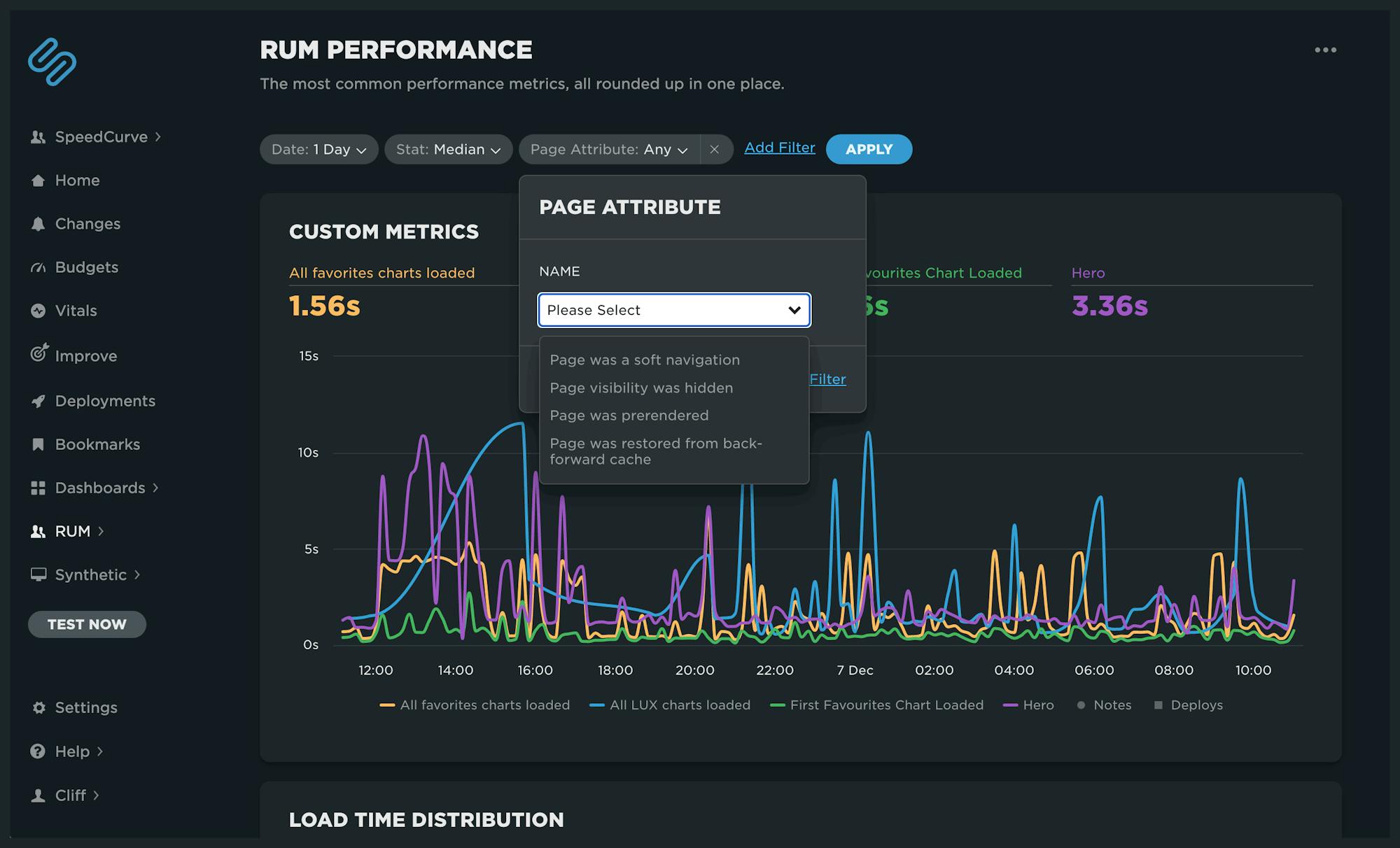
New filters for RUM dashboards
We've added two new filters to RUM dashboards that will be available for your Favorites (custom) dashboards.
The Navigation Type filter allows filtering on pages that were:
- a standard navigation,
- a page reload, or
- a back-forward navigation.
The Page Attribute filter selects different states of a page, including whether it was:
- a soft navigation,
- a hidden page,
- a pre-rendered page, or
- a page that was restored from the back-forward cache.
These filters will also be available in your custom Favorites dashboards soon. We are looking forward to seeing how different navigation types and states impact performance. More on that soon!
What's next?
We are pumped. These are exciting times in the world of web performance, and our backlog is full of amazing possibilities. What's on your feature wishlist? Please let us know!