NEW! A smarter way to spot performance issues

We’re excited to announce the launch of the Vitals Overview dashboard in SpeedCurve — your new starting point for exploring the performance of your site.
When it comes to improving web performance, the journey usually looks like this:
- Identify where the problems are
- Diagnose why they’re happening
- Fix the issues
- Validate that the fixes worked
Our new Vitals Overview dashboard is designed to make that critical first step — identifying performance issues — faster, clearer, and more actionable.
What are Web Vitals and why do they matter?
Web Vitals are a focused set of metrics that shine a light on the most important parts of the user experience. While SpeedCurve tracks a wide range of performance data, Vitals give you a quick, high-level view of where your site delights users… or where it’s letting them down.
Here’s a quick snapshot of what each Vital tells you:
- Backend (Time to First Byte) – How quickly your server responds
- First Contentful Paint – How fast something first appears on screen
- Largest Contentful Paint – How fast the main visual content loads
- Interaction to Next Paint (RUM) / JS Total Blocking Time (Synthetic) – How responsive your site feels
- Total Blocking Duration (RUM only) – How busy the main thread is
- Cumulative Layout Shift – How visually stable the page looks as it loads
Want to dig deeper? Check out our Web Performance Guide for a full breakdown.
A dashboard designed to guide you
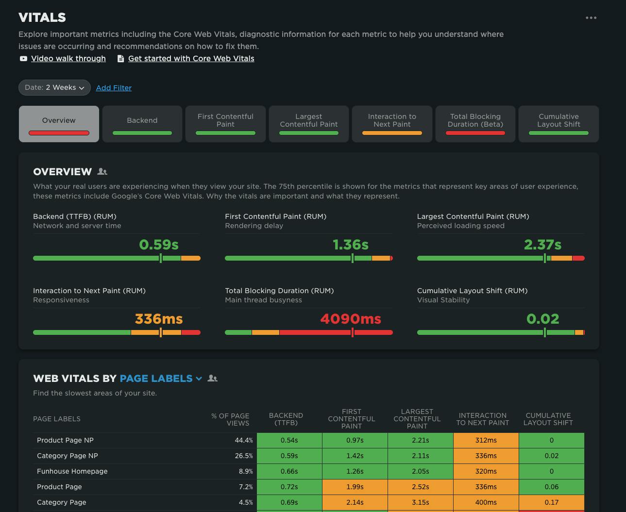
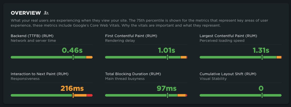
The Vitals Overview dashboard gives you a clear, color-coded snapshot of your performance at a glance:
- Green = good
- Yellow = needs improvement
- Red = poor (time to act!)
At the very top, you’ll see your 75th percentile performance across each vital. When using real user monitoring (RUM) you'll also see a distribution of how many of your actual users are in each threshold when experiencing your site.
The goal: move as many users as possible into the green.
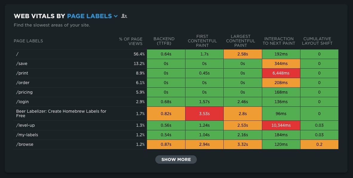
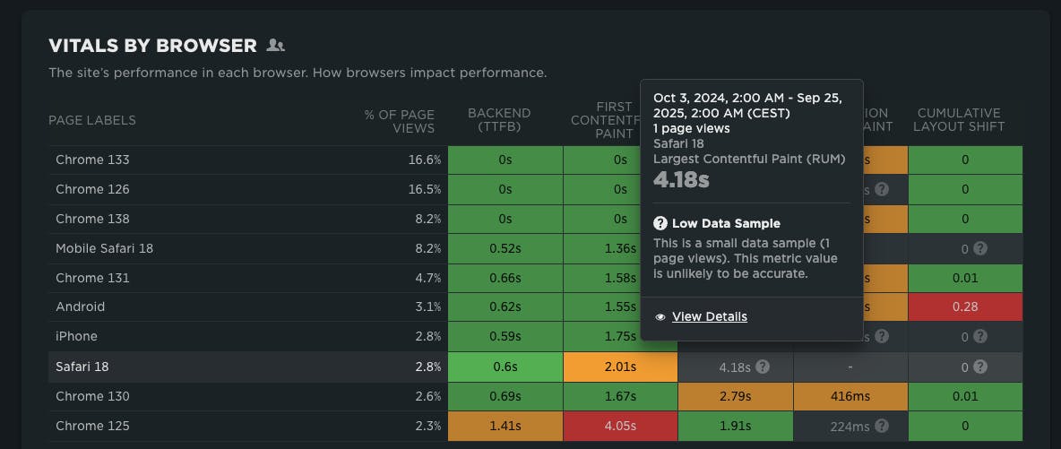
Spot issues faster with heatmaps
Below the overview, heatmaps break down your performance across different dimensions:
- By page – Quickly spot the pages that are dragging performance down (ranked by traffic when using RUM)
- By device type – Uncover layout or responsive design bottlenecks
- By browser – Zero in on browser-specific issues
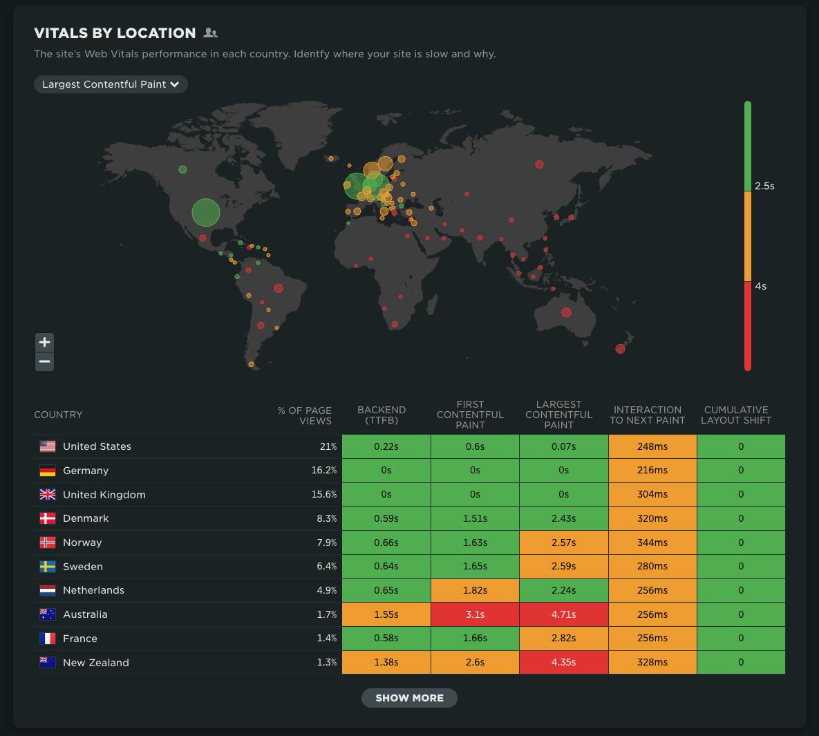
- By location – Understand geographic performance differences
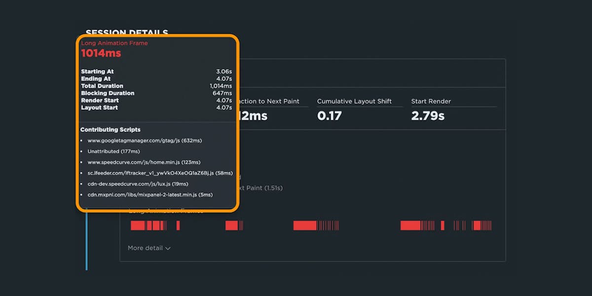
Each heatmap makes it easy to spot trouble areas. Just click into any yellow or red cell to drill deeper into diagnostics and start uncovering the “why” behind the issue.
Smarter insights, less noise
To make sure you’re not chasing false signals, we’ve also added a new low-sample data warning for RUM. This flags when data might be misleading because of a small sample size — helping you focus on real issues, not red herrings.
Start exploring today
The Vitals Overview dashboard brings clarity to complexity. It’s your fastest path to spotting performance problems, prioritizing fixes, and making sure every user gets the fast, stable experience they deserve.
If you're a SpeedCurve user – Log in today and check out your new vitals overview dashboard. We think it's a big step forward in identifying where performance issues are in your site.
If you're not yet a SpeedCurve user – Sign up for a free trial then navigate to your Vitals Overview dashboard. Or even better, set up real user monitoring, then navigate to your Vitals Overview dashboard.
Questions? We'd love to hear from you! Send us a note at support@speedcurve.com.