NEW! Home, Site, Page and Tests dashboards

Things have been busy over here at SpeedCurve HQ! Coming off of the back of our latest RUM Compare dashboard release, we are super excited to launch four new dashboards to make your life better, your work easier, and your websites faster.
- Home - Well, now you have one. We needed a place for folks to land when they were jumping into all that SpeedCurve has to offer. The newly released Home page is a great starting place, pulling together views of both RUM and Synthetic data and directing you on where to dig in next.
- Sites - We've rebuilt our Sites dashboard to give you a holistic look across all of the URLs you are monitoring. Start here to understand which areas of your site need the most attention and identify areas you can have the most impact.
- Pages - This detailed view gives you trended information for all the metrics you know and love. Easily identify areas of opportunity and how things are performing over time for specific pages you are monitoring.
- Tests - We've had a lot of requests for this, so we're happy to deliver it. You can now see a list of your latest synthetic tests and spot any failed tests.
Let's take a look!
Home
This is the new default dashboard you'll see when you jump into SpeedCurve for the first time. If you are using both RUM and Synthetic, you'll see both datasets reflected in this view. Otherwise, the metrics reflected will be from your synthetic data.
Beginning with a snapshot of your Core Web Vitals, this page highlights key areas of interest and a high-level snapshot for the selected site. Links from each section take you to a deeper look within other areas of your dashboards.
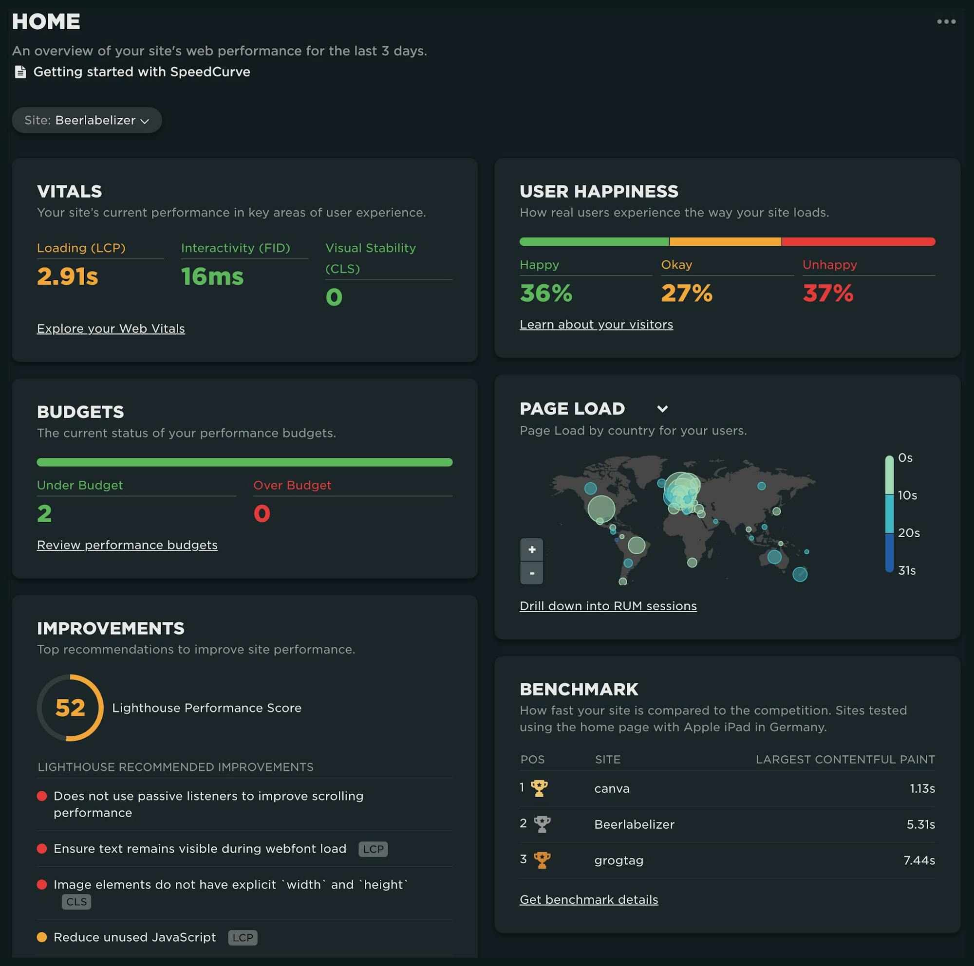
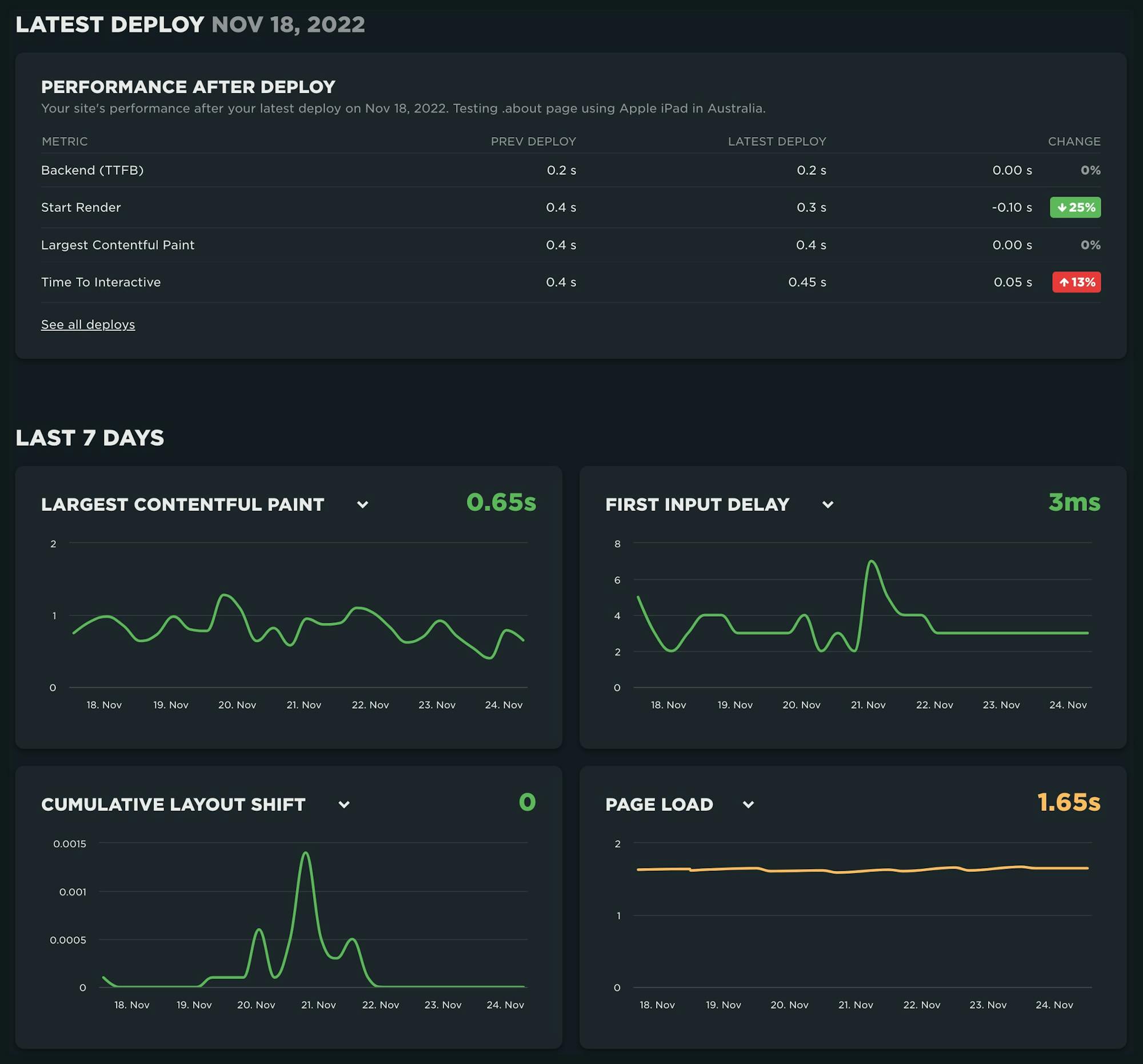
If you have integrated SpeedCurve into your CI/CD environment (leveraging the deploy API), or if you are manually running synthetic tests using the 'Test Now' option, you'll see the state of your last deployment compared to the previous. And finally, a 7-day trend is displayed for your most important metrics.
Site Dashboard
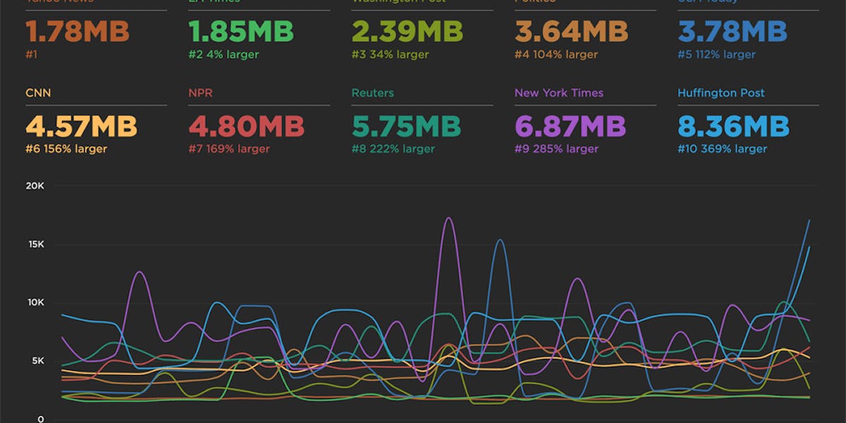
This view is intentionally focused on the latest data you've collected for your Site which gives you a great starting place when managing performance across various URLs. What pages have the slowest LCP? Home, Order and Print look like a good place to start digging.
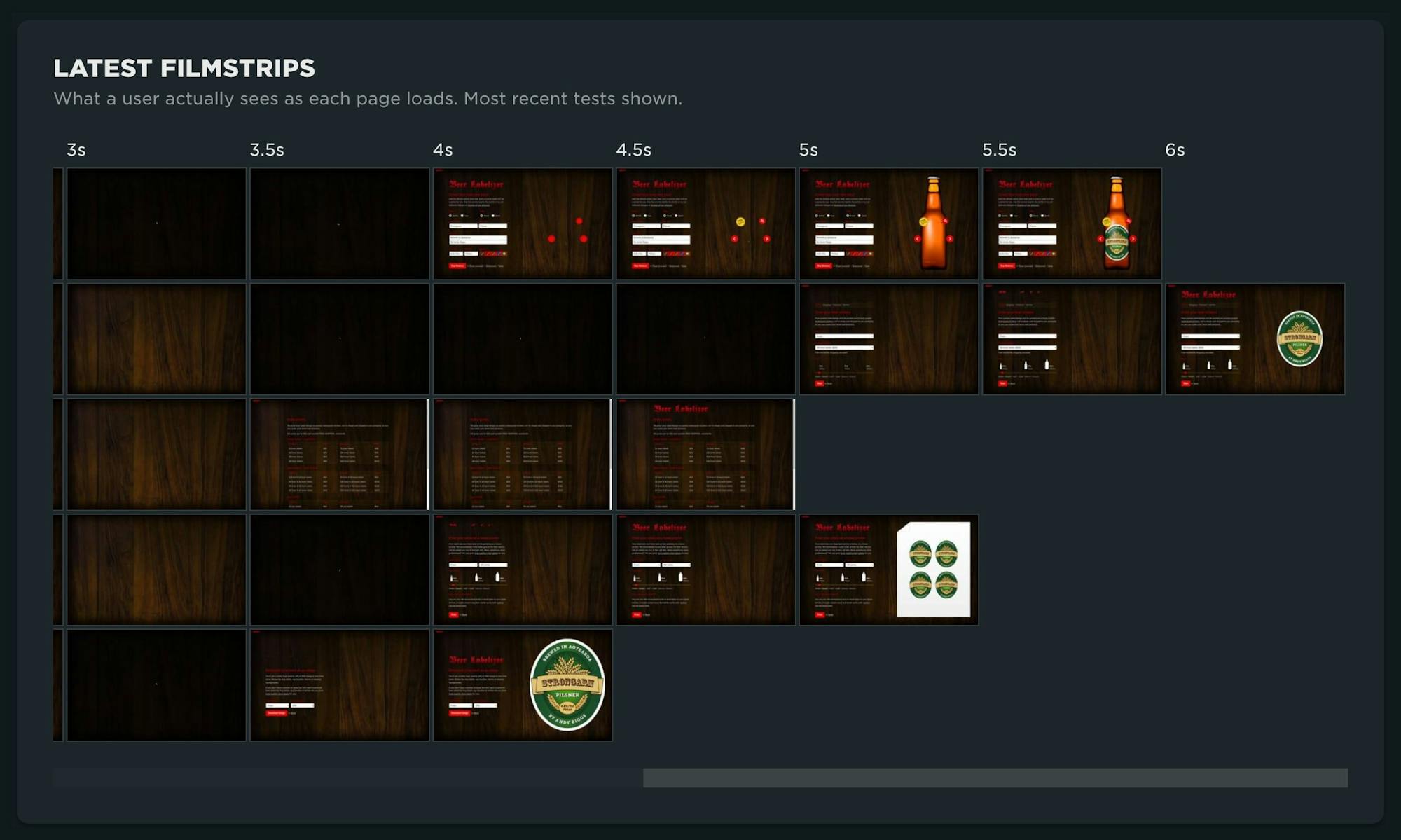
How are users perceiving the visual rendering of all the pages in my site? Which pages should I dive into first?
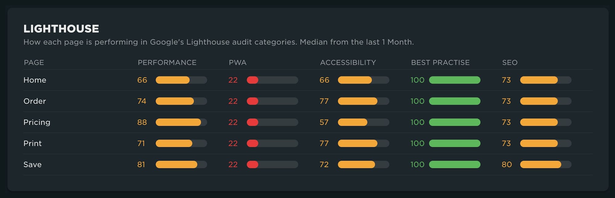
From the LightHouse audits run against your site, you can quickly see which pages need the most attention across the 5 areas of focus.
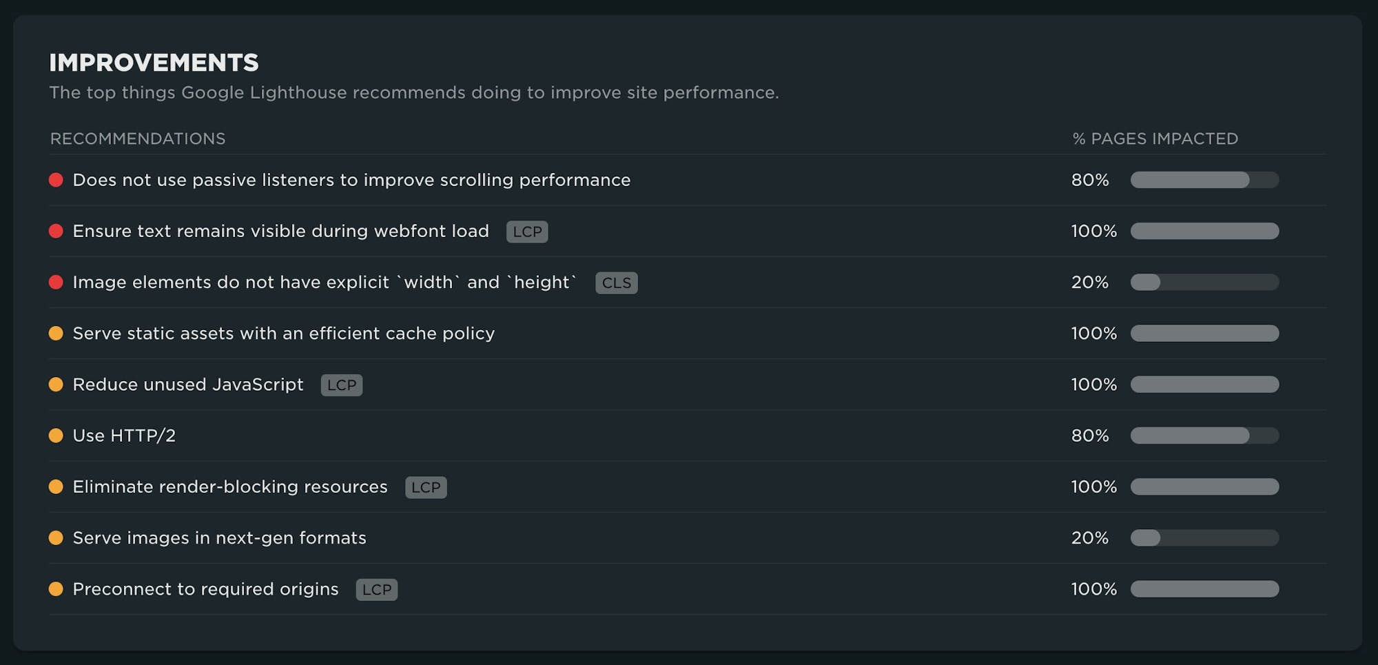
An aggregate view of the most critical areas for improvement identifies which recommendations will have the most collective impact across your pages.
Page Dashboard
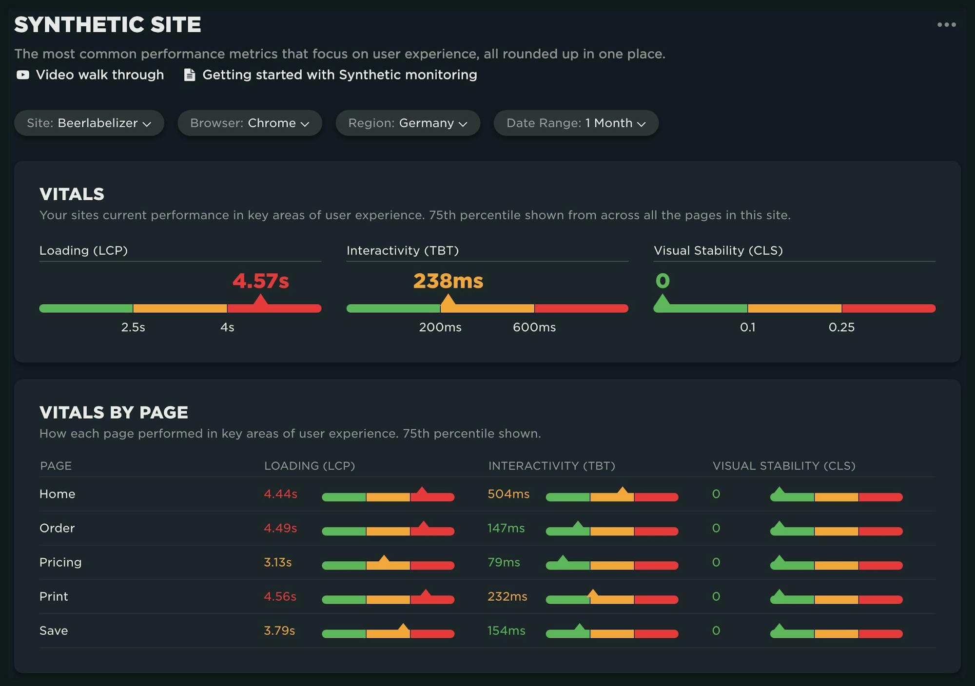
From the Site dashboard, you can narrow your focus and dive into the new Page dashboard. Here you'll see key metrics for the page trended over time. You can use the filters at the top of the page to further refine your data by browser, region, and date range.

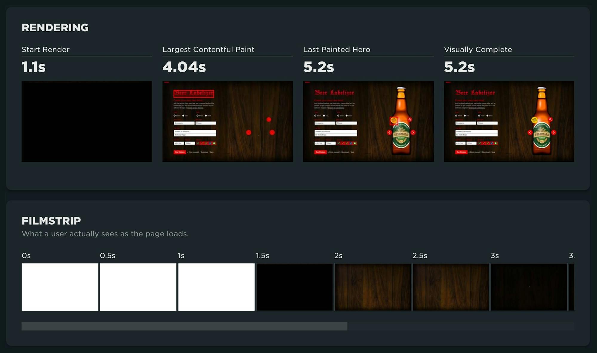
A look at the key rendering moments and a full filmstrip for the page focuses on user-perceived performance.
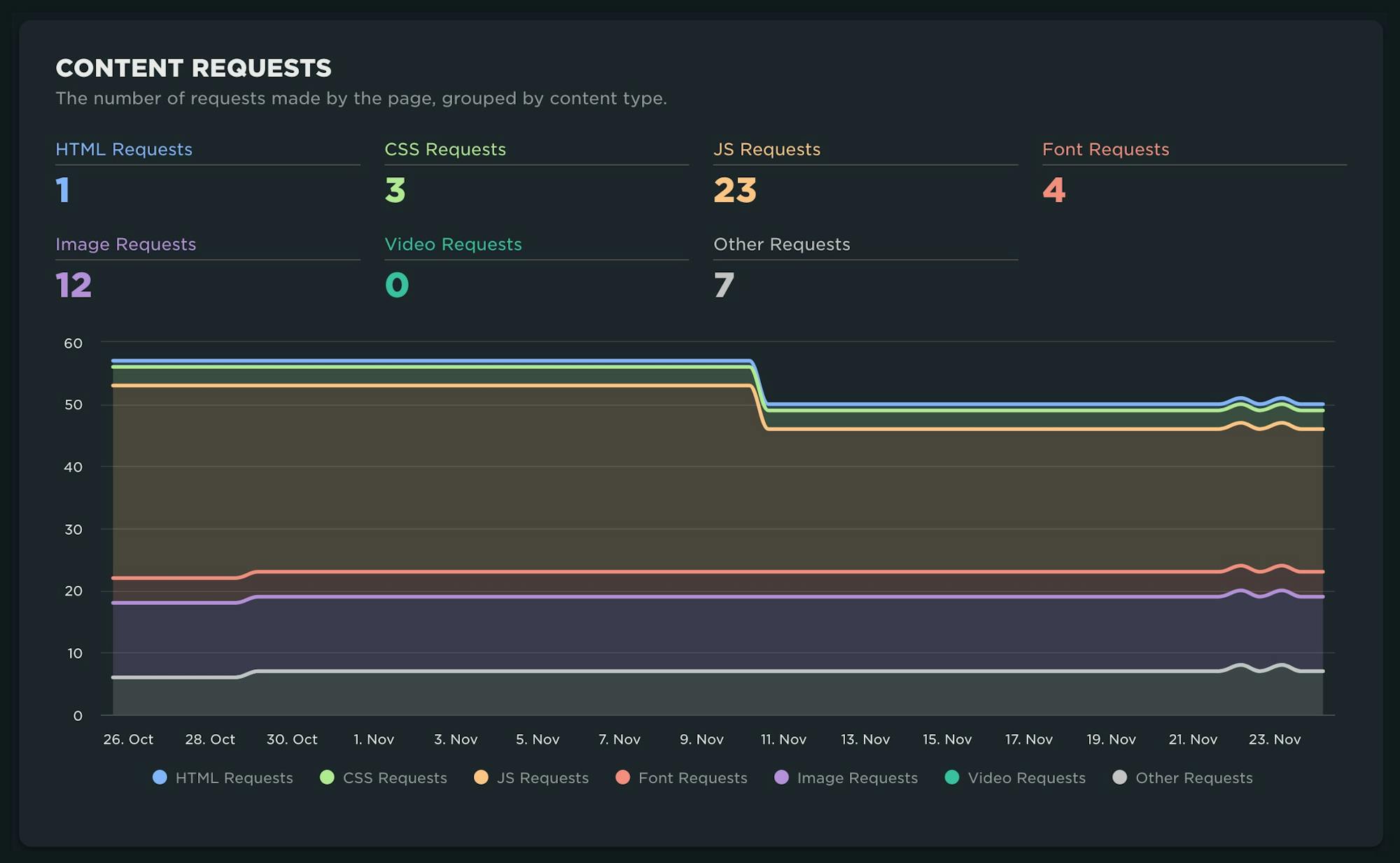
Now that you understand how the page is performing, you can take a look at how the construction for the page has changed over time and where optimization opportunities exist, such as reducing network requests and their file size.
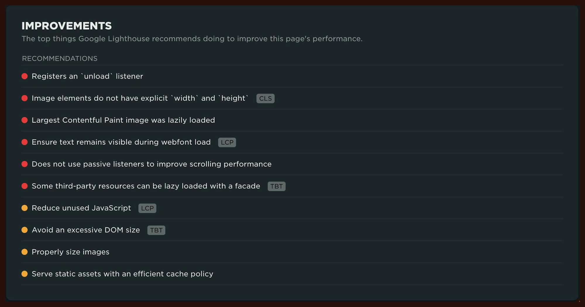
Finally, a list of prioritized improvements for the page is displayed. Pay special attention to critical recommendations that are flagged with the Core Web Vitals metrics. If you implement those recommendations, you should see an improvement in your Vitals.
Tests Dashboard
We love simplicity, and this dashboard is a great example of why. We have received a lot of feature requests such as "Just show me a list of the tests I've run recently" as well as "How can I quickly see which tests are failing?" This dashboard achieves both!
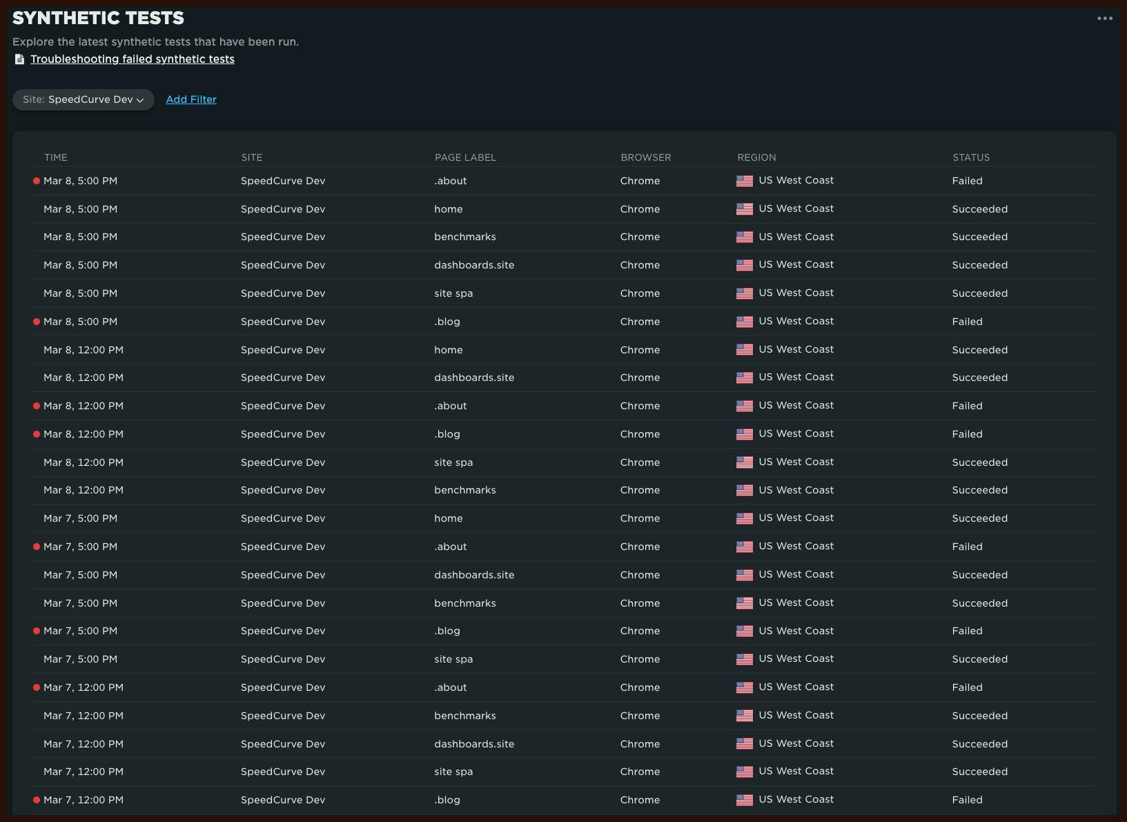
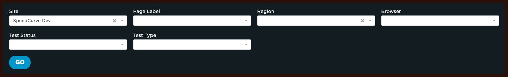
If you want to refine this view, you can apply filters to show you tests for a specific site, page, region or browser. You can also filter on test status ('succeeded' or 'failed') and test type ('scheduled test' or 'deploy').
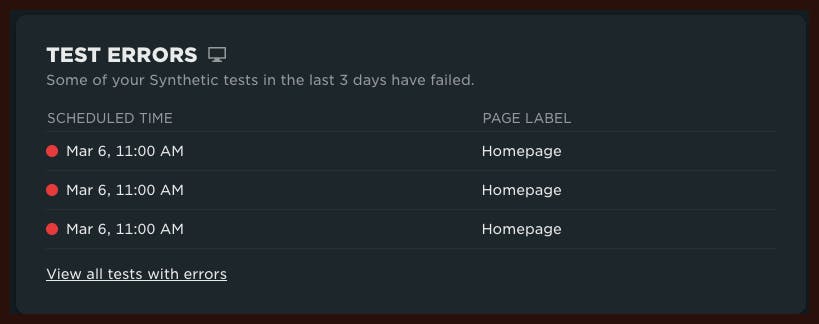
Finally, if you have any failed tests we'll show those at the top of the previously mentioned Home page in order to quickly alert you to the failures. You can then click through to the test details to determine why the test failed.
We hope this dashboard will help to quickly inform you so you can take action and protect your synthetic checks budget.
We hope you find these latest additions to SpeedCurve useful. As always, let us know what you think!